
Recommended
More Related Content
What's hot
Viewers also liked
Viewers also liked (20)
Similar to Matching Colors and Font Styles in Magazine Layout Design
Similar to Matching Colors and Font Styles in Magazine Layout Design (20)
Recently uploaded
Recently uploaded (20)
Matching Colors and Font Styles in Magazine Layout Design
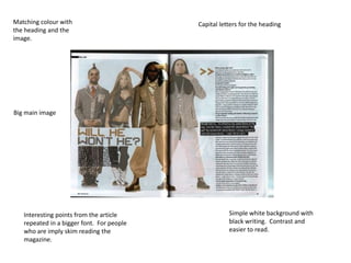
- 1. Matching colour with Capital letters for the heading the heading and the image. Big main image Interesting points from the article Simple white background with repeated in a bigger font. For people black writing. Contrast and who are imply skim reading the easier to read. magazine.
- 2. Same colours throughout the Heading in capital letters his is to attract whole double page spread. attention. Smaller images, the Article is in columns, easier to same contrast read, and can skim read.
- 3. Smaller images on side of the article. Can be a way to Colours are simply black & white. It is attract readers to reading different so it causes more attraction this article. Article is of either sides of the main image Article is in a small font, and in columns. Allows the reader is Small images overlap, be able to “skim read” interesting way of layout.