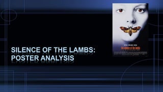
2. Image
This image is a close-up, which allows you to see details
better as well as filling the poster, and it uses direct
address to target the audience, making it appear more
assertive and personal. The pop of colour in the eyes
attracts the audiences attention and makes it feel more
personal for the audience as well as making them feel
uncomfortable. Additionally, the colour in the eyes
matches the butterfly on the face and the title of the film.
Low – key lighting is as there is harsh shadows on the
right side of the face, we can also see a lot of detail in
the left side of the face and the bleak, bland, blank
features portray an eerie, dark and atmospheric feel.
3. Film Title
The film title is the most prominent part of the poster as it
is a bright orange. This isn’t the normal convention with
horror movie posters which tends to be black, red and
white. It is the strongest colour on the page and contrasts
the white background. It is also good to notice the title is
lowercase letters, which is against the conventions of
movie posters. The use of these lowercase letters could
be a result of certain parts of the film being equally
important and not highlighting certain areas to look out for
as scary or dangerous as that would make the film
predictable.
4. Actors and tagline
The three leading actors in film are
separated by forward slashes just
above the film title. They are of the
same size as the tagline but are all
still noticeable meaning that fans of
these actors will be drawn to seen
the film.
Underneath the title there is a bold
tagline typed in lower case with a
white font on a thin black rectangle. It
reads: “from the terrifying best seller”
which directly addresses a previously
formed fan base due to the books
written by the author.
5. Billing block & Age Certification
This is a common convention with movie posters and it is usually placed at the
bottom of the film poster. The billing block includes a list of people that feature
and help with the production/making of the movie. This is a really important
aspect of the film poster when I design mine because it is very conventional and
represents a successful movie poster. The design used for this poster is
common among other film posters. A dark coloured font has been used to
refrain from standing out and capturing too much attention on the poster. This is
something I should be thinking about when I make my poster in order to keep it
sophisticated and professional.
6. Final analysis
1. Attention - Jump out from the wall
This poster captures attention most significantly through the use of direct address, the eyes are one of the most prominent parts because of the
personal feel and colour.
2. Iconography - Showing without telling
This poster is extremely good at aiming to show without telling. A lot of the poster is washed out by the harsh lights on the left side of the face, even
the main image of the poster conveys mystery.
3. Interest - Create an incentive to see the film
There is an interest to watch the film because it is already a best-selling book, this means that it already has an established audience and fan group.
4. Appeal - Create desire with fans and non-fans alike
The poster is an indication of what to expect from the film as well as indicating that the film is based on.
5. Style - A look that's consistent with the film
This style matches the type of film ‘the silence of the lambs’ is. It’s a cold and mysterious thriller.
6. Lasting appeal - A look that suits other formats
This is an extremely recognisable film poster and people still recognise it now when it was made in 1991.
7. Recognisability - If it's a sequel, make it obvious
This isn’t a sequel however it is recognisable from the fact it is a best – selling book.