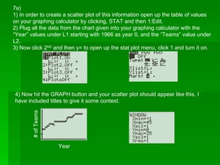
SlideShare a Scribd company logo
1 of 3
7a)
1) In order to create a scatter plot of this information open up the table of values
on your graphing calculator by clicking, STAT and then 1:Edit.
2) Plug all the data from the chart given into your graphing calculator with the
“Year” values under L1 starting with 1966 as year 0, and the “Teams” value under
L2.
3) Now click 2ND
and then y= to open up the stat plot menu, click 1 and turn it on.
4) Now hit the GRAPH button and your scatter plot should appear like this. I
have included titles to give it some context.
#ofTeams
Year
7b) Now that you have your graph it is very easy to determine a line or curve of
best fit, using a regression model.
• First turn your diagnostic on by hitting 2nd
and the “0” key, and scrolling down
to diagnostic on. Click enter on “diagnostic on” it will bring you back to the
main screen, hit enter once more so it says “done”. This allows you to see
the R2 value which shows you how well your new model correlates to your
data.
2) Now begin testing which equation to represent our data using regression
models. To start testing which regression model is the best fit for our data
click STAT, scroll over to the right to the CALC menu and use keys 4-0 in
order to test out different equations. I have found that the quadratic model
fits our data best as the R2
value is the greatest.
7c) An equation that can be used to model the given data is:
N(t) = -0.003t2
+ 0.621t + 11.003
Where N is the number of teams and t is the time in years.
*Values in equation are rounded off for simplicity.
This equation is found by using the data given by your regression model in the
previous step:

More Related Content

What's hot

Economic Forecasting Final Memo
Economic Forecasting Final MemoEconomic Forecasting Final Memo
Economic Forecasting Final MemoHannah Badgley
 
How to make Gantt chart in Excel
How to make Gantt chart in ExcelHow to make Gantt chart in Excel
How to make Gantt chart in ExcelNavjyotsinh Jadeja
 
How to plot a scatterplot
How to plot a scatterplotHow to plot a scatterplot
How to plot a scatterplotSaad Jan
 
Graphing with a calculater
Graphing with a calculaterGraphing with a calculater
Graphing with a calculaterwinhea55
 
Math in the News: 8/29/11
Math in the News: 8/29/11Math in the News: 8/29/11
Math in the News: 8/29/11Media4math
 
3 data analysis bar graphs may 27
3 data analysis   bar graphs may 273 data analysis   bar graphs may 27
3 data analysis bar graphs may 27mskarras
 
Electric Lighting Ecotect
Electric Lighting EcotectElectric Lighting Ecotect
Electric Lighting EcotectNYCCTfab
 
Lesson 15 Using What If Analysis
Lesson 15   Using What If AnalysisLesson 15   Using What If Analysis
Lesson 15 Using What If Analysisguevarra_2000
 
Making a Google Spreadsheet - Quadratic
Making a Google Spreadsheet - QuadraticMaking a Google Spreadsheet - Quadratic
Making a Google Spreadsheet - Quadraticjames.northrup
 
MS excel what if analysis
MS excel what if analysisMS excel what if analysis
MS excel what if analysisproactivecha
 
At2 bom data and graphs, solar generation
At2 bom data and graphs, solar generationAt2 bom data and graphs, solar generation
At2 bom data and graphs, solar generationDavid Smith
 
09 web-analytics secondary-dimensions
09 web-analytics secondary-dimensions09 web-analytics secondary-dimensions
09 web-analytics secondary-dimensionsMassimo Paolini
 

What's hot (18)

BuildHistoryfinal
BuildHistoryfinalBuildHistoryfinal
BuildHistoryfinal
 
Blair graphing
Blair graphingBlair graphing
Blair graphing
 
Economic Forecasting Final Memo
Economic Forecasting Final MemoEconomic Forecasting Final Memo
Economic Forecasting Final Memo
 
How to make Gantt chart in Excel
How to make Gantt chart in ExcelHow to make Gantt chart in Excel
How to make Gantt chart in Excel
 
Presenting statistics in social media
Presenting statistics in social mediaPresenting statistics in social media
Presenting statistics in social media
 
How to plot a scatterplot
How to plot a scatterplotHow to plot a scatterplot
How to plot a scatterplot
 
Graphing with a calculater
Graphing with a calculaterGraphing with a calculater
Graphing with a calculater
 
Math in the News: 8/29/11
Math in the News: 8/29/11Math in the News: 8/29/11
Math in the News: 8/29/11
 
Day 6 examples
Day 6 examplesDay 6 examples
Day 6 examples
 
Linear Modeling
Linear ModelingLinear Modeling
Linear Modeling
 
Creating a chart in Excel
Creating a chart in Excel Creating a chart in Excel
Creating a chart in Excel
 
3 data analysis bar graphs may 27
3 data analysis   bar graphs may 273 data analysis   bar graphs may 27
3 data analysis bar graphs may 27
 
Electric Lighting Ecotect
Electric Lighting EcotectElectric Lighting Ecotect
Electric Lighting Ecotect
 
Lesson 15 Using What If Analysis
Lesson 15   Using What If AnalysisLesson 15   Using What If Analysis
Lesson 15 Using What If Analysis
 
Making a Google Spreadsheet - Quadratic
Making a Google Spreadsheet - QuadraticMaking a Google Spreadsheet - Quadratic
Making a Google Spreadsheet - Quadratic
 
MS excel what if analysis
MS excel what if analysisMS excel what if analysis
MS excel what if analysis
 
At2 bom data and graphs, solar generation
At2 bom data and graphs, solar generationAt2 bom data and graphs, solar generation
At2 bom data and graphs, solar generation
 
09 web-analytics secondary-dimensions
09 web-analytics secondary-dimensions09 web-analytics secondary-dimensions
09 web-analytics secondary-dimensions
 

Similar to Answer to question 7(math wiki)

2.6b scatter plots and lines of best fit
2.6b scatter plots and lines of best fit2.6b scatter plots and lines of best fit
2.6b scatter plots and lines of best fithartcher
 
MAT 240 Random Sampling in Excel Tutorial This tutorial wi
MAT 240 Random Sampling in Excel Tutorial This tutorial wiMAT 240 Random Sampling in Excel Tutorial This tutorial wi
MAT 240 Random Sampling in Excel Tutorial This tutorial wiAbramMartino96
 
MAT 240 Random Sampling in Excel Tutorial This tutorial wi
MAT 240 Random Sampling in Excel Tutorial This tutorial wiMAT 240 Random Sampling in Excel Tutorial This tutorial wi
MAT 240 Random Sampling in Excel Tutorial This tutorial wiAbramMartino96
 
Determining a Line of Best Fit Using a Graphing Calculator
Determining a Line of Best Fit Using a Graphing CalculatorDetermining a Line of Best Fit Using a Graphing Calculator
Determining a Line of Best Fit Using a Graphing Calculatoremilybriggs
 
How to create graphs for science
How to create graphs for scienceHow to create graphs for science
How to create graphs for scienceBrad Kremer
 
1a s4 i creating runcharts final
1a s4 i creating runcharts final1a s4 i creating runcharts final
1a s4 i creating runcharts finalABCiABUHB
 
Linear Regression
Linear RegressionLinear Regression
Linear Regressionktini
 
Week 2 Project - STAT 3001Student Name Type your name here.docx
Week 2 Project - STAT 3001Student Name Type your name here.docxWeek 2 Project - STAT 3001Student Name Type your name here.docx
Week 2 Project - STAT 3001Student Name Type your name here.docxcockekeshia
 
How to combine interpolation and regression graphs in R
How to combine interpolation and regression graphs in RHow to combine interpolation and regression graphs in R
How to combine interpolation and regression graphs in RDougLoqa
 
Directions For Performing Linear Regression
Directions For  Performing  Linear  RegressionDirections For  Performing  Linear  Regression
Directions For Performing Linear RegressionSt. Mary Magdalen School
 
Directions For Performing Linear Regression
Directions For Performing Linear RegressionDirections For Performing Linear Regression
Directions For Performing Linear RegressionSt. Mary Magdalen School
 
Microsoft mathmatics step-by-step_guide
Microsoft mathmatics step-by-step_guideMicrosoft mathmatics step-by-step_guide
Microsoft mathmatics step-by-step_guideAnang Anang
 
Calculator Manipulation.pptx
Calculator Manipulation.pptxCalculator Manipulation.pptx
Calculator Manipulation.pptxfroilandoblon1
 
Excel Crash Course: Pivot Tables
Excel Crash Course: Pivot TablesExcel Crash Course: Pivot Tables
Excel Crash Course: Pivot TablesBobby Jones
 
Experiment parts technology2008
Experiment parts technology2008Experiment parts technology2008
Experiment parts technology2008rylempty
 
How To Use vLookup for Excel
How To Use vLookup for ExcelHow To Use vLookup for Excel
How To Use vLookup for Excelmikenobile
 
Creating a Normative Group
Creating a Normative GroupCreating a Normative Group
Creating a Normative Groupatsumagaysay
 
Dervy bis-155-i lab-8-week-7-descriptive-statistics-formatting--graphs-and-re...
Dervy bis-155-i lab-8-week-7-descriptive-statistics-formatting--graphs-and-re...Dervy bis-155-i lab-8-week-7-descriptive-statistics-formatting--graphs-and-re...
Dervy bis-155-i lab-8-week-7-descriptive-statistics-formatting--graphs-and-re...individual484
 
Excel Slope Instruction
Excel Slope InstructionExcel Slope Instruction
Excel Slope Instructiontotoros_girl
 

Similar to Answer to question 7(math wiki) (20)

2.6b scatter plots and lines of best fit
2.6b scatter plots and lines of best fit2.6b scatter plots and lines of best fit
2.6b scatter plots and lines of best fit
 
MAT 240 Random Sampling in Excel Tutorial This tutorial wi
MAT 240 Random Sampling in Excel Tutorial This tutorial wiMAT 240 Random Sampling in Excel Tutorial This tutorial wi
MAT 240 Random Sampling in Excel Tutorial This tutorial wi
 
MAT 240 Random Sampling in Excel Tutorial This tutorial wi
MAT 240 Random Sampling in Excel Tutorial This tutorial wiMAT 240 Random Sampling in Excel Tutorial This tutorial wi
MAT 240 Random Sampling in Excel Tutorial This tutorial wi
 
Determining a Line of Best Fit Using a Graphing Calculator
Determining a Line of Best Fit Using a Graphing CalculatorDetermining a Line of Best Fit Using a Graphing Calculator
Determining a Line of Best Fit Using a Graphing Calculator
 
How to create graphs for science
How to create graphs for scienceHow to create graphs for science
How to create graphs for science
 
1a s4 i creating runcharts final
1a s4 i creating runcharts final1a s4 i creating runcharts final
1a s4 i creating runcharts final
 
Linear Regression
Linear RegressionLinear Regression
Linear Regression
 
Week 2 Project - STAT 3001Student Name Type your name here.docx
Week 2 Project - STAT 3001Student Name Type your name here.docxWeek 2 Project - STAT 3001Student Name Type your name here.docx
Week 2 Project - STAT 3001Student Name Type your name here.docx
 
How to combine interpolation and regression graphs in R
How to combine interpolation and regression graphs in RHow to combine interpolation and regression graphs in R
How to combine interpolation and regression graphs in R
 
Directions For Performing Linear Regression
Directions For  Performing  Linear  RegressionDirections For  Performing  Linear  Regression
Directions For Performing Linear Regression
 
Directions For Performing Linear Regression
Directions For Performing Linear RegressionDirections For Performing Linear Regression
Directions For Performing Linear Regression
 
Microsoft mathmatics step-by-step_guide
Microsoft mathmatics step-by-step_guideMicrosoft mathmatics step-by-step_guide
Microsoft mathmatics step-by-step_guide
 
Modul 1 Scratch
Modul 1 ScratchModul 1 Scratch
Modul 1 Scratch
 
Calculator Manipulation.pptx
Calculator Manipulation.pptxCalculator Manipulation.pptx
Calculator Manipulation.pptx
 
Excel Crash Course: Pivot Tables
Excel Crash Course: Pivot TablesExcel Crash Course: Pivot Tables
Excel Crash Course: Pivot Tables
 
Experiment parts technology2008
Experiment parts technology2008Experiment parts technology2008
Experiment parts technology2008
 
How To Use vLookup for Excel
How To Use vLookup for ExcelHow To Use vLookup for Excel
How To Use vLookup for Excel
 
Creating a Normative Group
Creating a Normative GroupCreating a Normative Group
Creating a Normative Group
 
Dervy bis-155-i lab-8-week-7-descriptive-statistics-formatting--graphs-and-re...
Dervy bis-155-i lab-8-week-7-descriptive-statistics-formatting--graphs-and-re...Dervy bis-155-i lab-8-week-7-descriptive-statistics-formatting--graphs-and-re...
Dervy bis-155-i lab-8-week-7-descriptive-statistics-formatting--graphs-and-re...
 
Excel Slope Instruction
Excel Slope InstructionExcel Slope Instruction
Excel Slope Instruction
 

Answer to question 7(math wiki)

  • 1. 7a) 1) In order to create a scatter plot of this information open up the table of values on your graphing calculator by clicking, STAT and then 1:Edit. 2) Plug all the data from the chart given into your graphing calculator with the “Year” values under L1 starting with 1966 as year 0, and the “Teams” value under L2. 3) Now click 2ND and then y= to open up the stat plot menu, click 1 and turn it on. 4) Now hit the GRAPH button and your scatter plot should appear like this. I have included titles to give it some context. #ofTeams Year
  • 2. 7b) Now that you have your graph it is very easy to determine a line or curve of best fit, using a regression model. • First turn your diagnostic on by hitting 2nd and the “0” key, and scrolling down to diagnostic on. Click enter on “diagnostic on” it will bring you back to the main screen, hit enter once more so it says “done”. This allows you to see the R2 value which shows you how well your new model correlates to your data. 2) Now begin testing which equation to represent our data using regression models. To start testing which regression model is the best fit for our data click STAT, scroll over to the right to the CALC menu and use keys 4-0 in order to test out different equations. I have found that the quadratic model fits our data best as the R2 value is the greatest.
  • 3. 7c) An equation that can be used to model the given data is: N(t) = -0.003t2 + 0.621t + 11.003 Where N is the number of teams and t is the time in years. *Values in equation are rounded off for simplicity. This equation is found by using the data given by your regression model in the previous step: