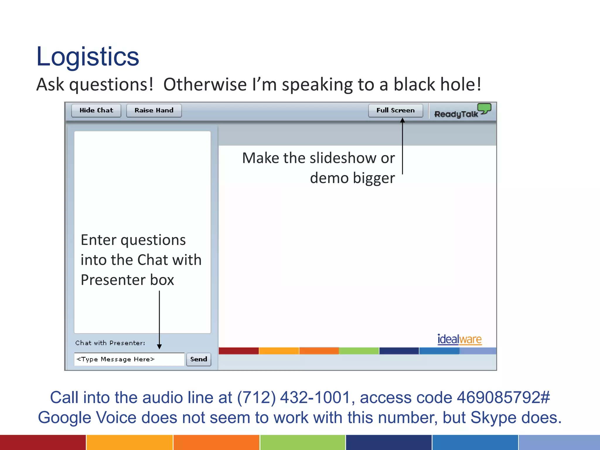
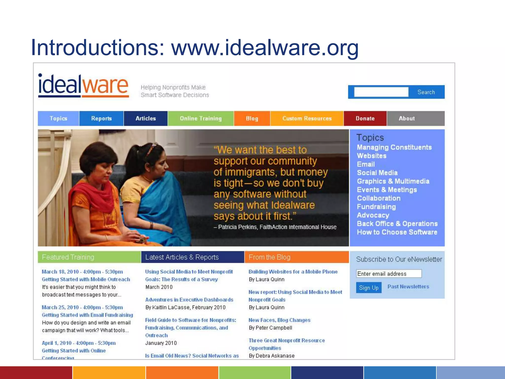
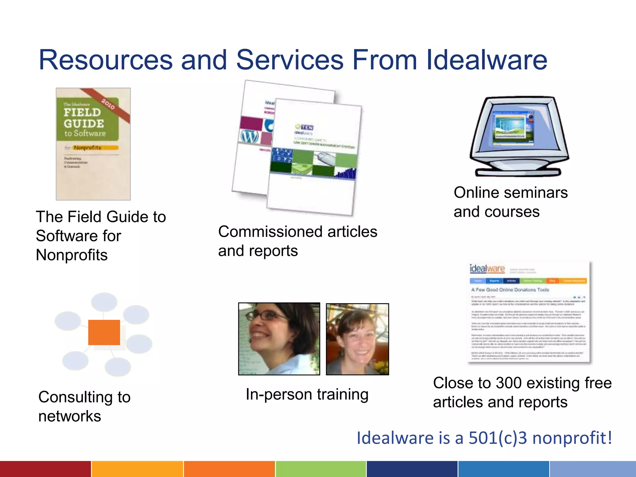
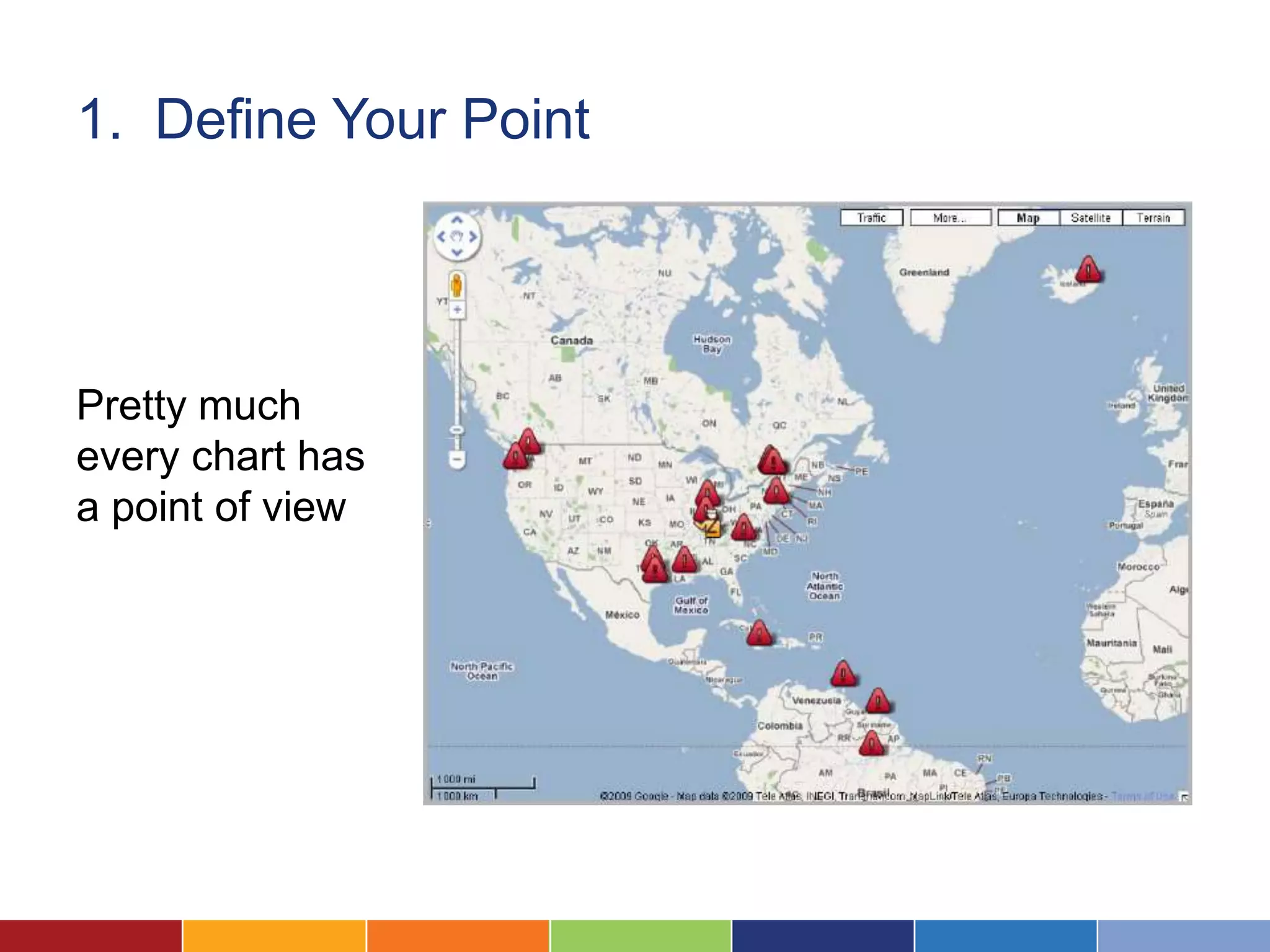
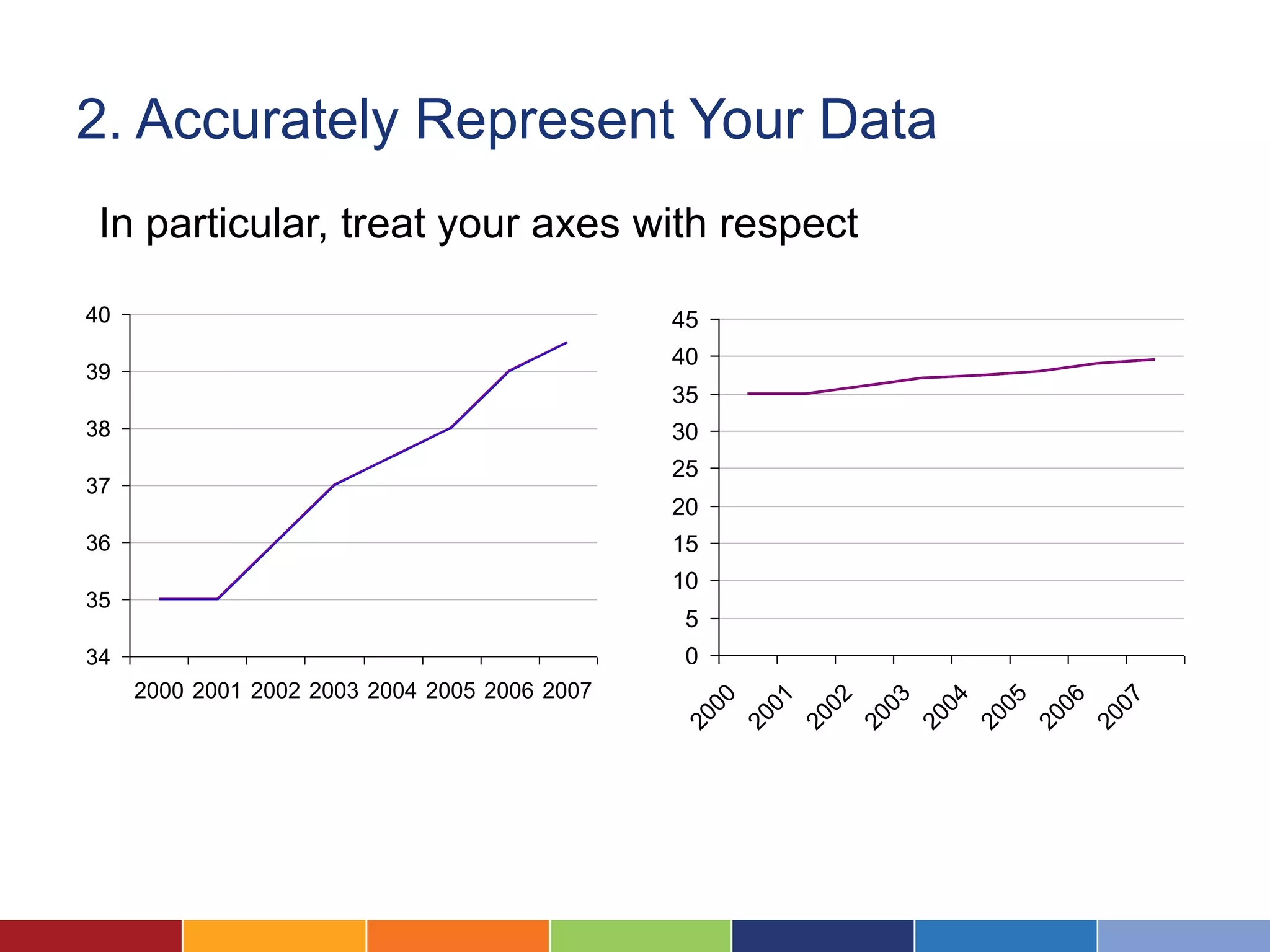
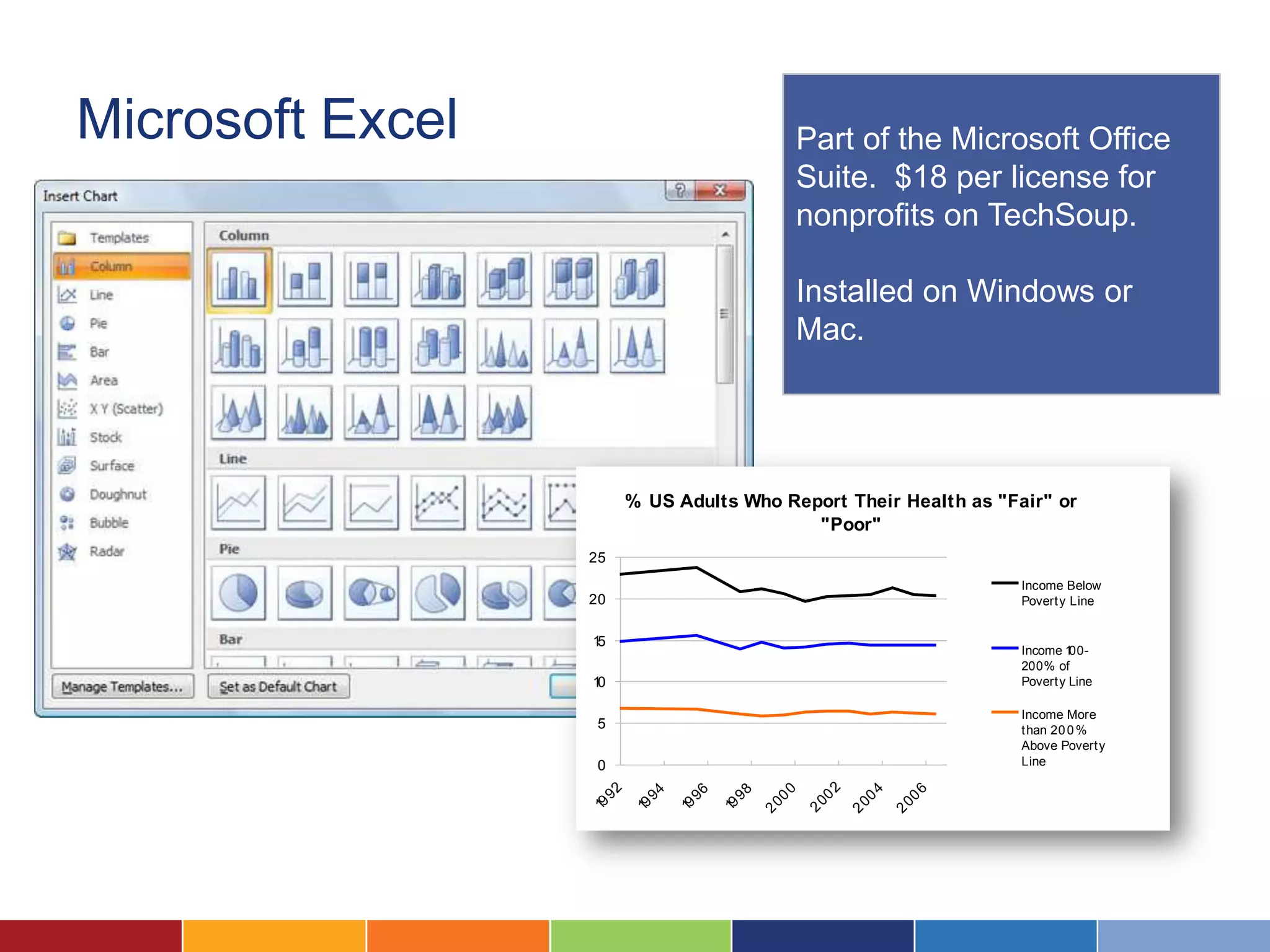
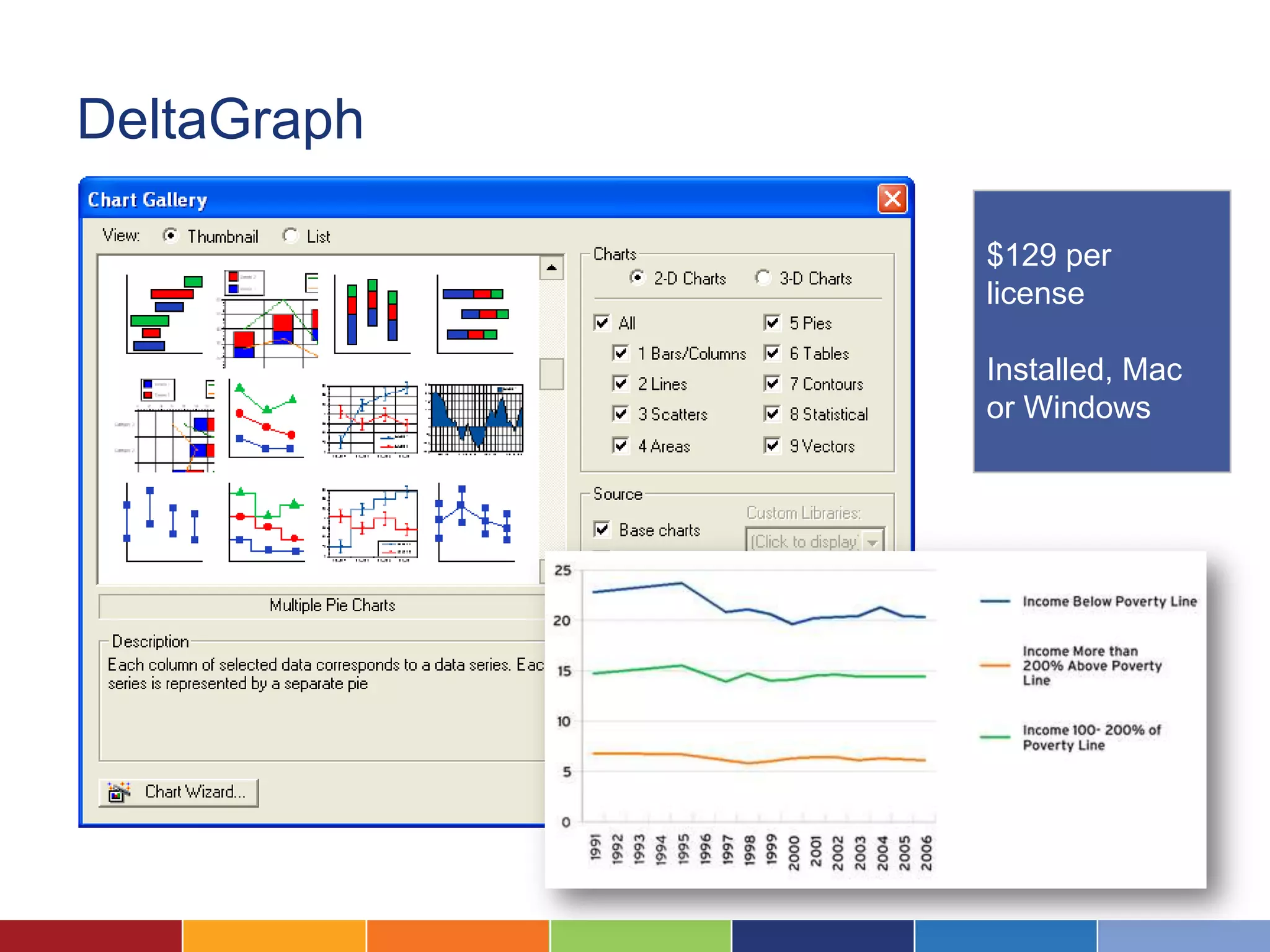
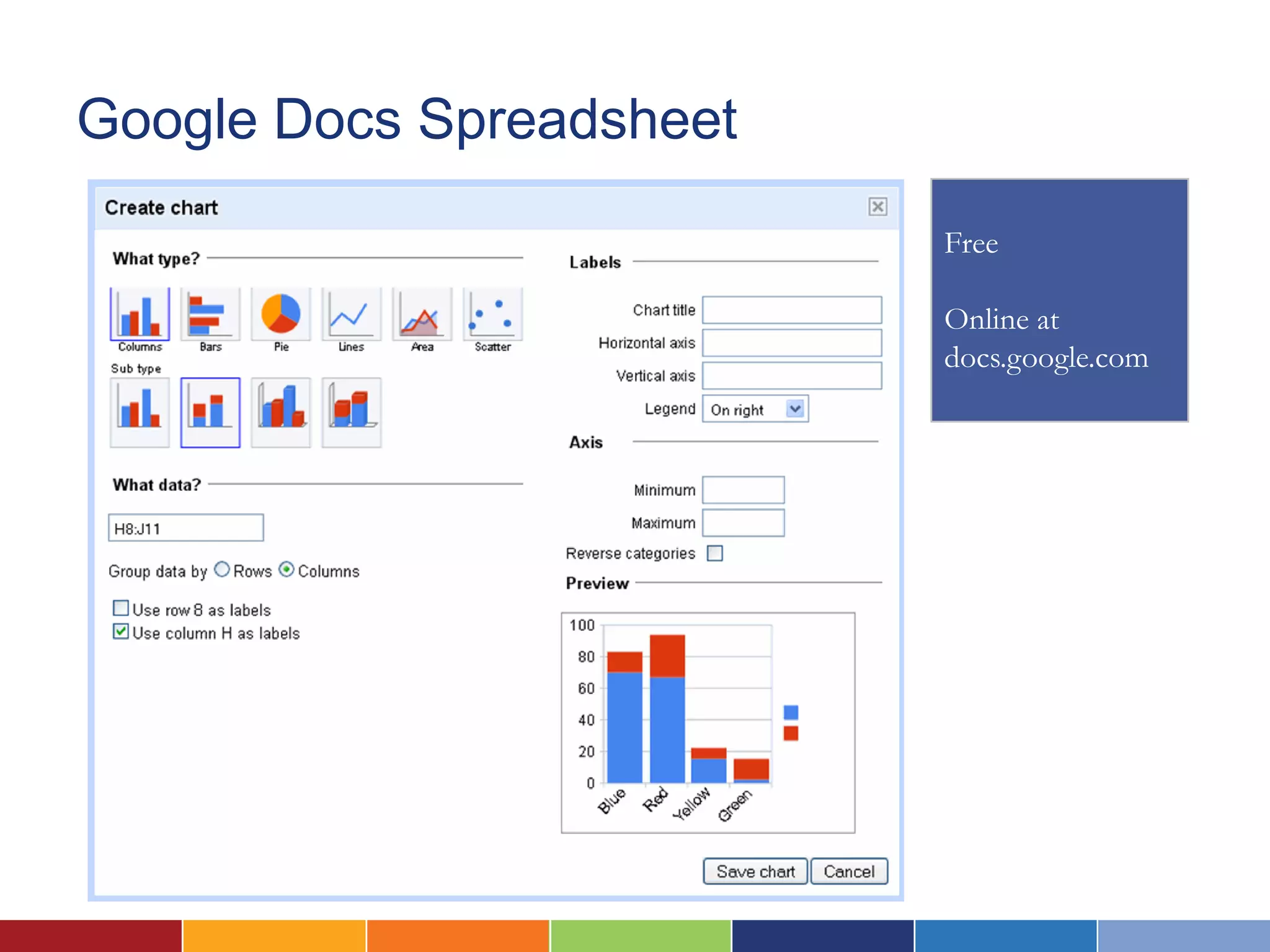
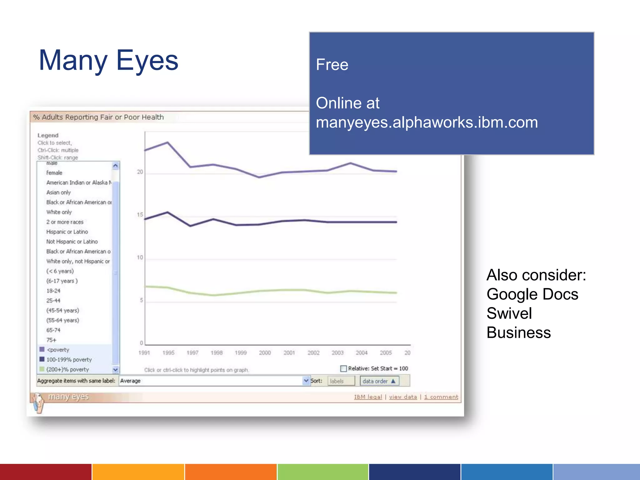
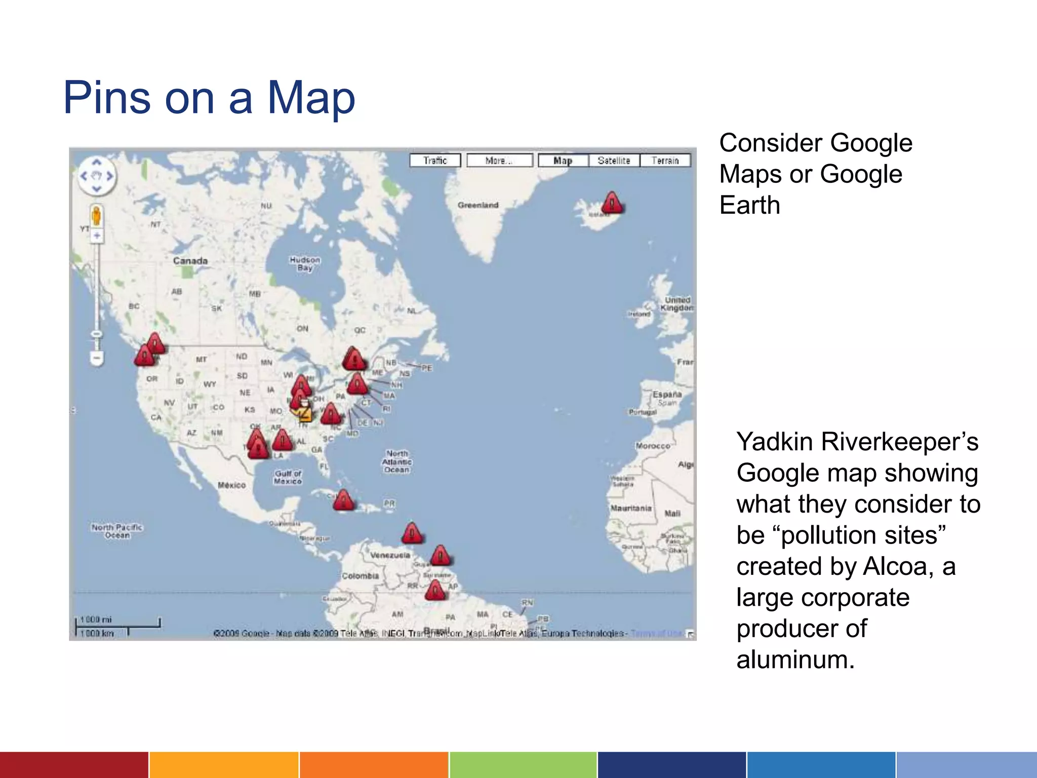
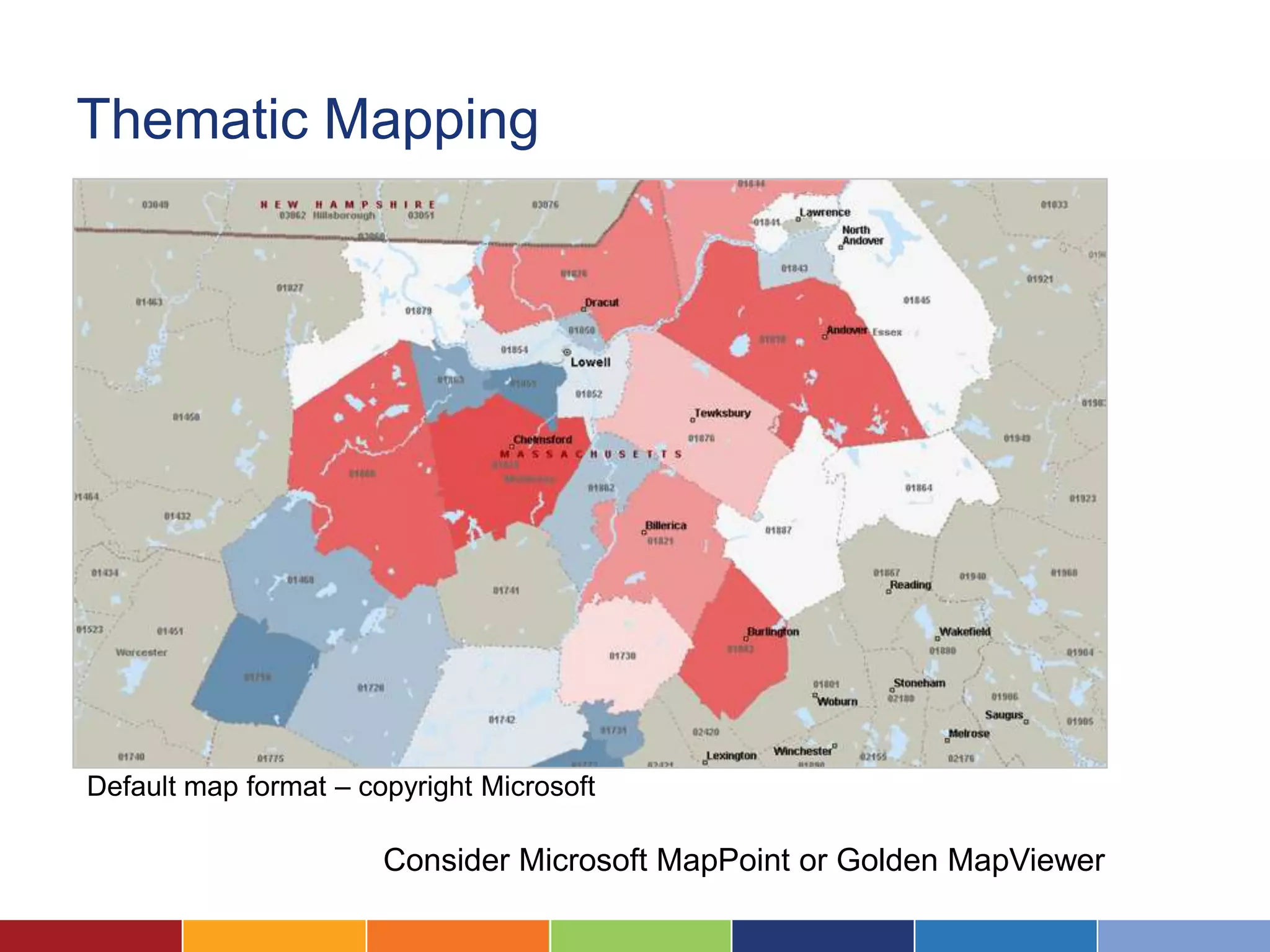
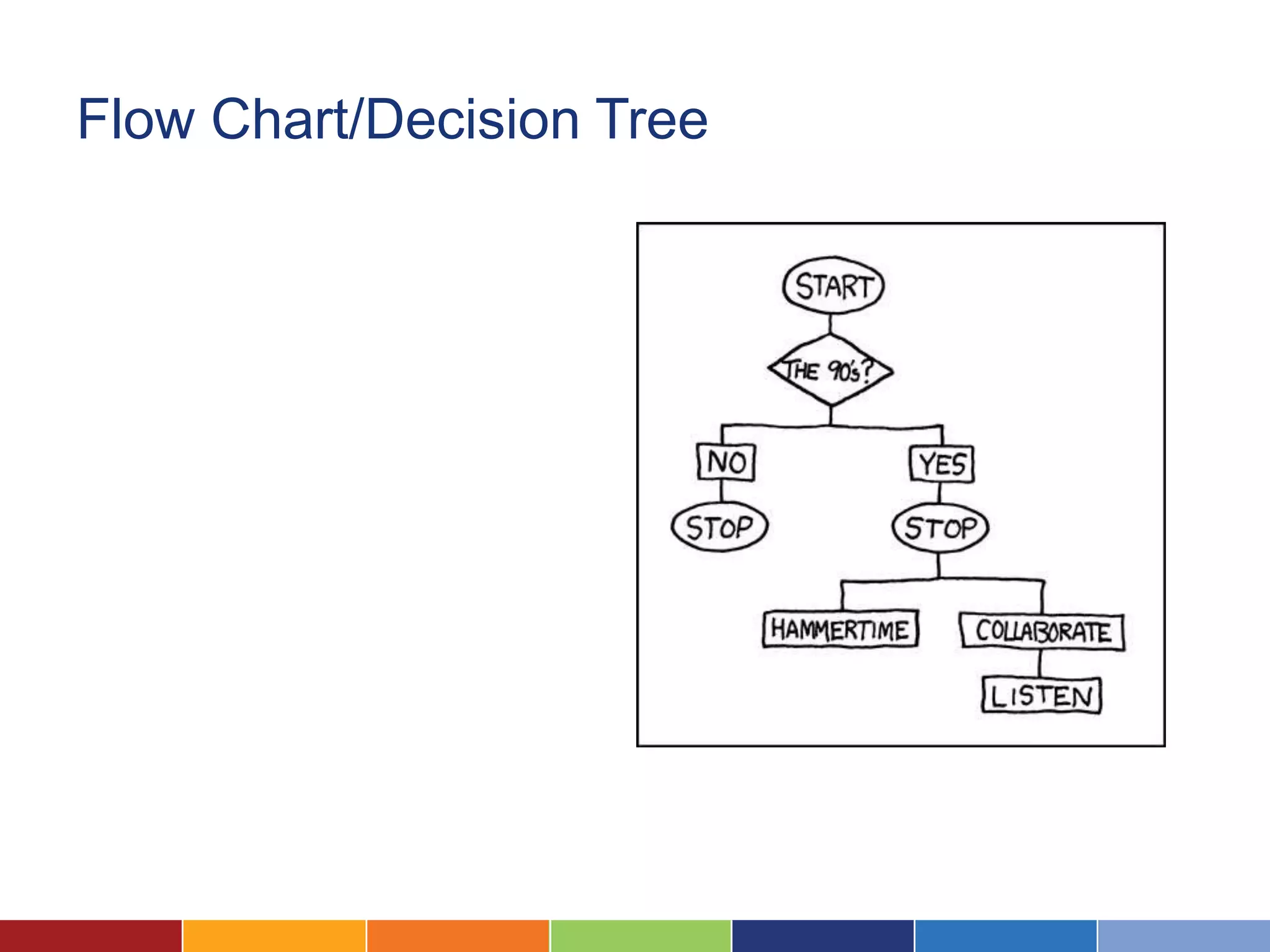
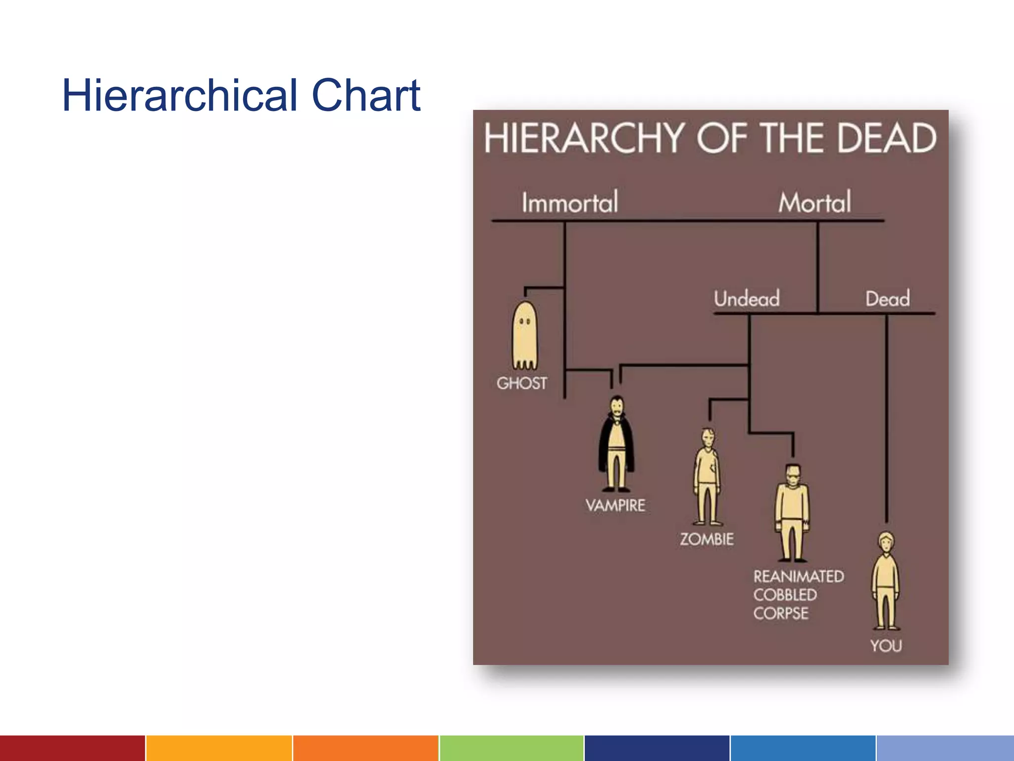
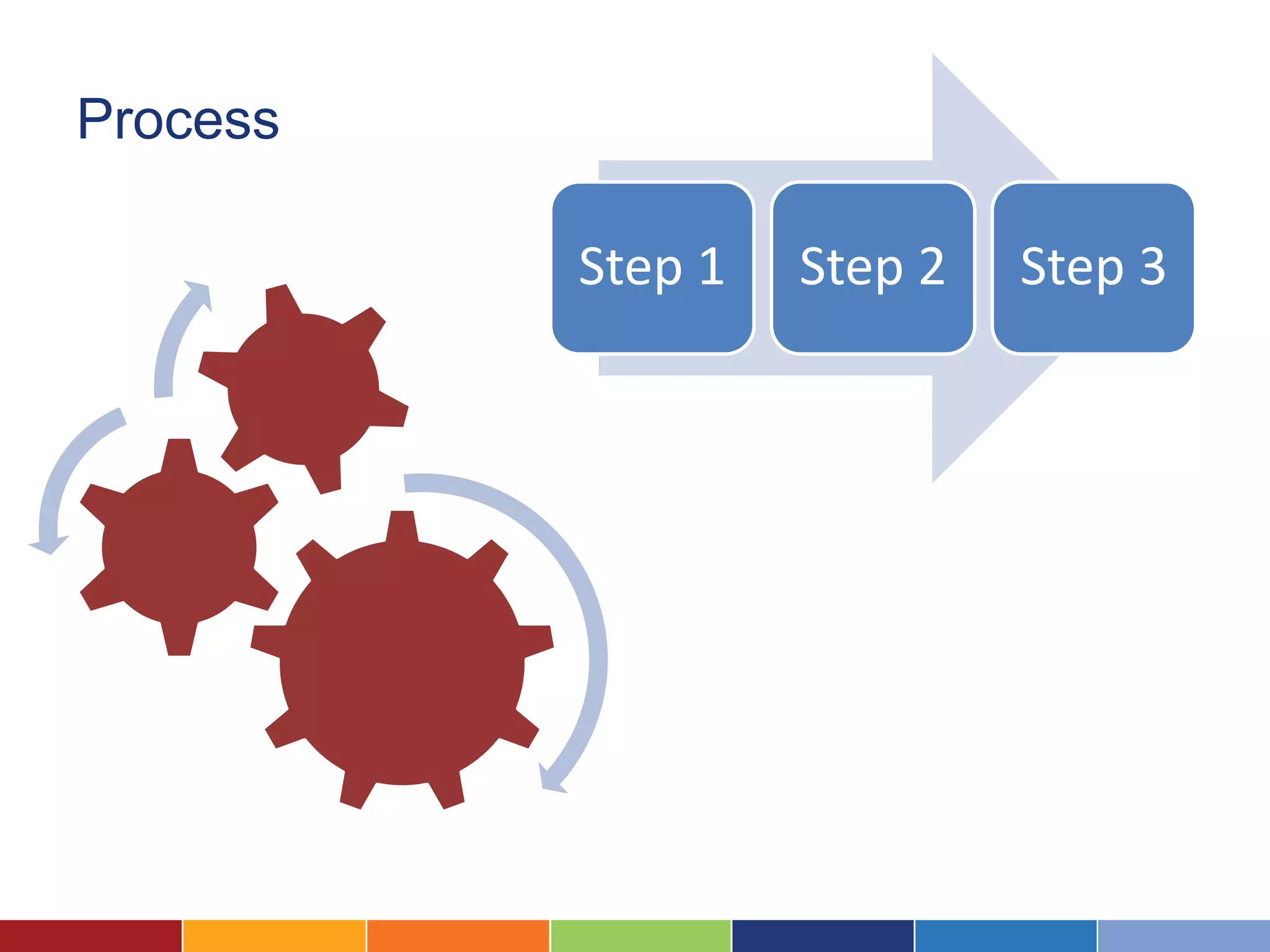
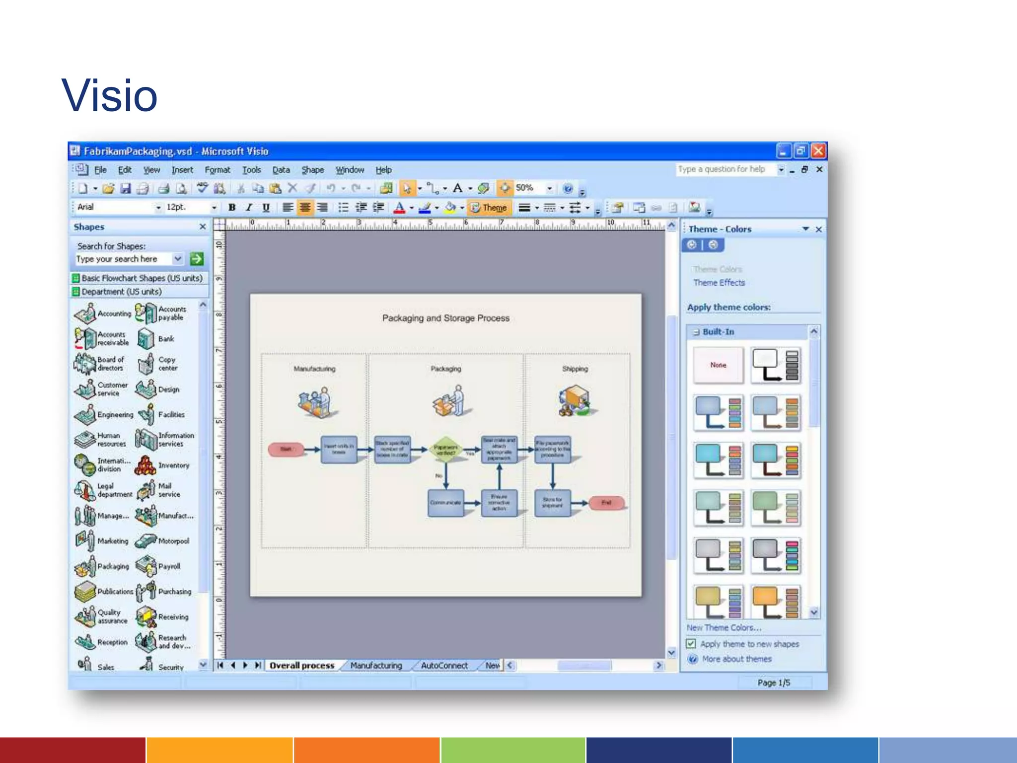
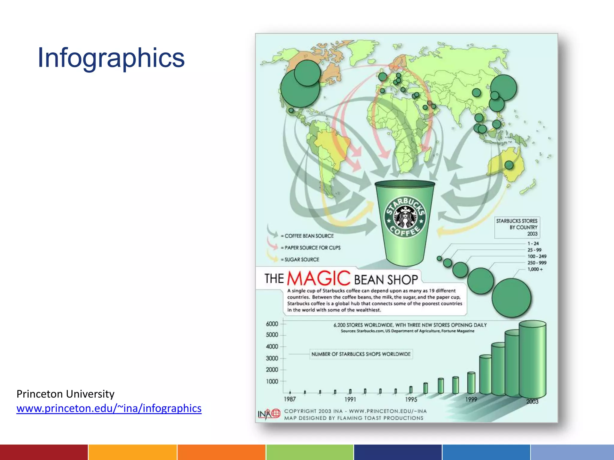
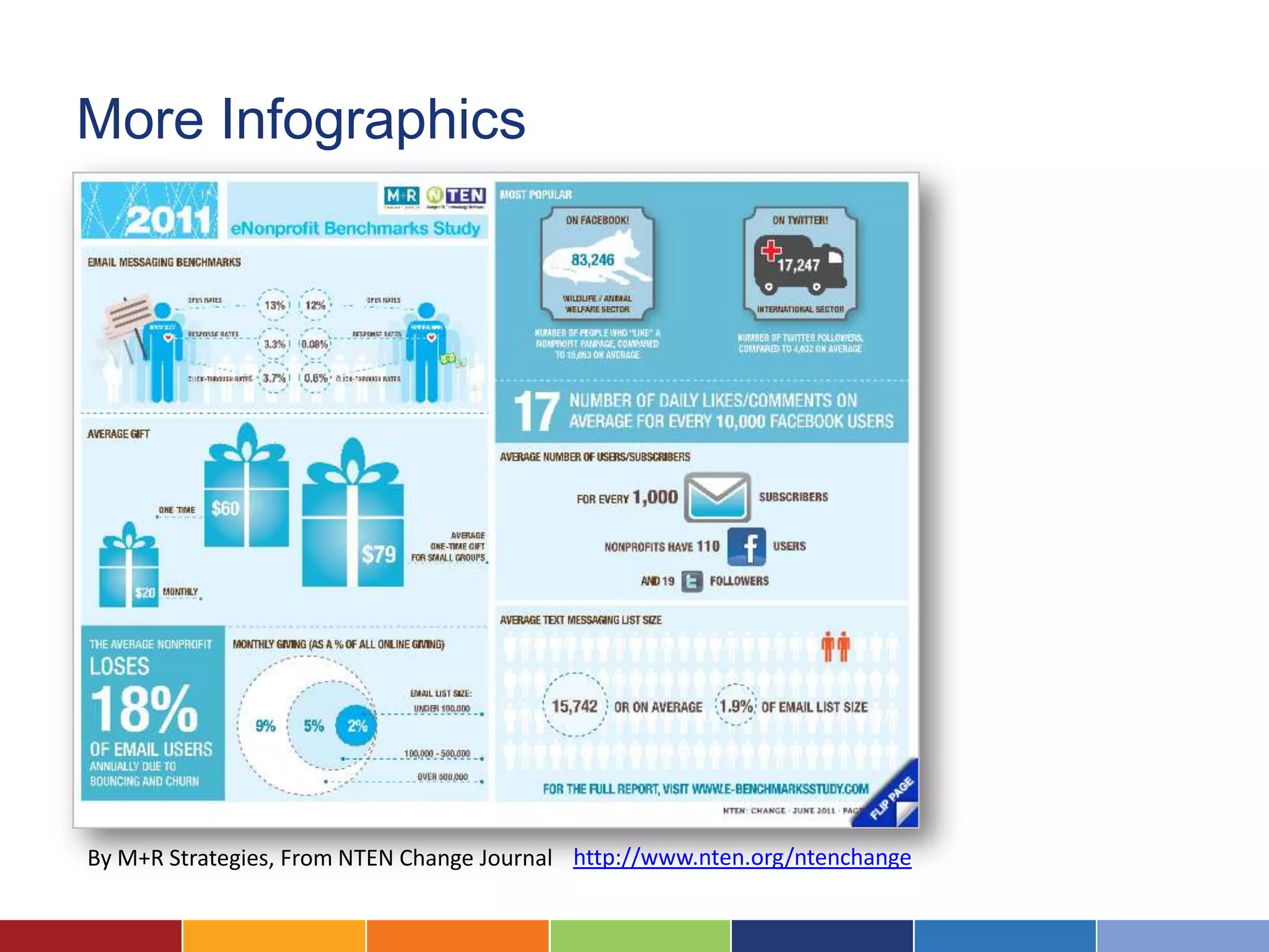
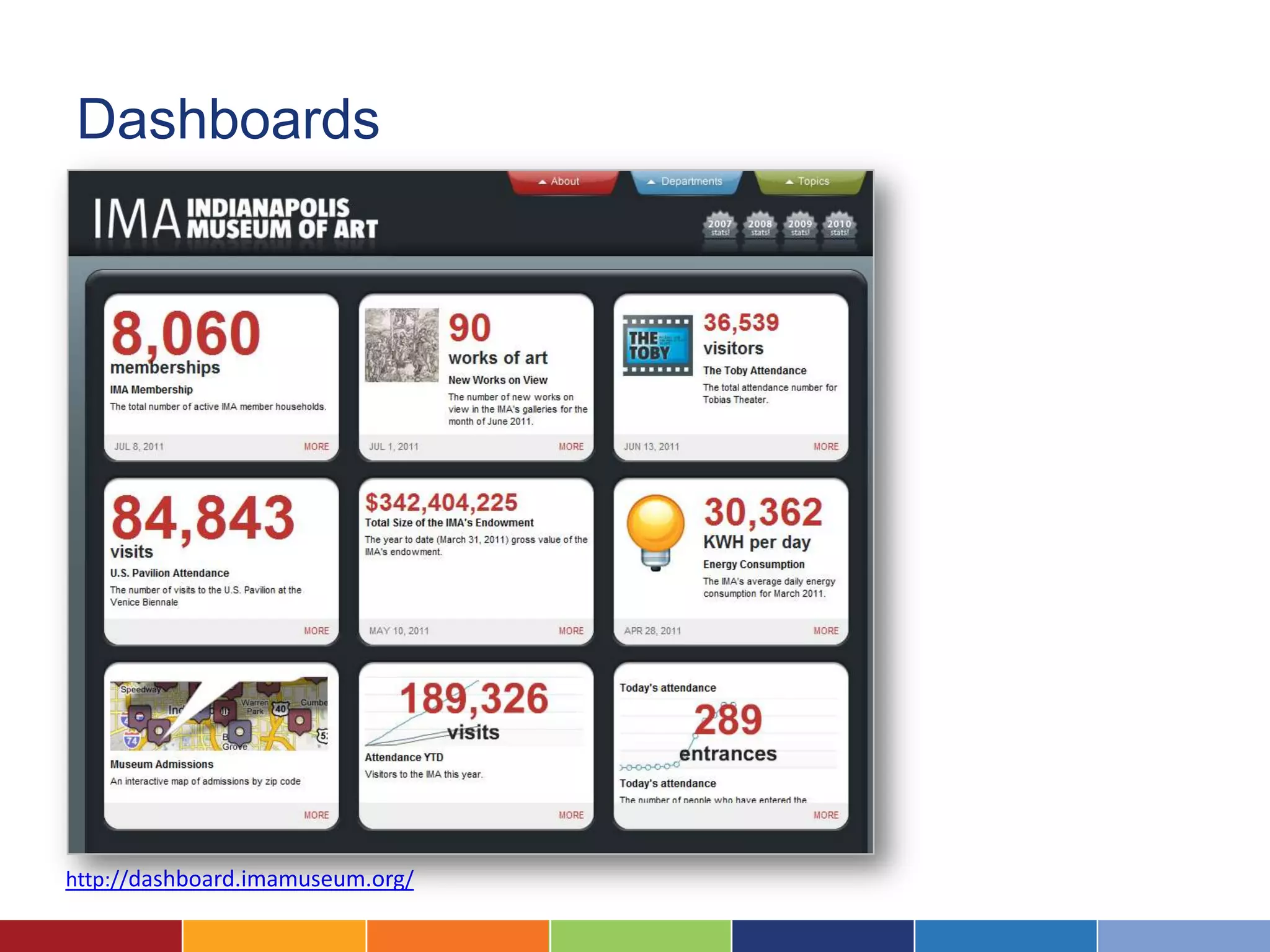
Creating Great Charts, Maps, and
                   Diagrams

                           April 2012


 Call into the audio line at (712) 432-1001, access code 469085792#
Google Voice does not seem to work with this number, but Skype does.
Logistics
Ask questions! Otherwise I’m speaking to a black hole!


                          Make the slideshow or
                                   demo bigger


     Enter questions
     into the Chat with
     Presenter box


 Call into the audio line at (712) 432-1001, access code 469085792#
Google Voice does not seem to work with this number, but Skype does.
Logistics

After the session, I’ll send out:
   • The slides
   • A link to the recording
   • Any links we’ve discussed


 Call into the audio line at (712) 432-1001, access code 469085792#
Google Voice does not seem to work with this number, but Skype does.
Introductions


                Laura Quinn
                Executive Director,
                Idealware


                                Kyle Andrei
Introductions: www.idealware.org
Resources and Services From Idealware


                                                    Online seminars
The Field Guide to                                  and courses
Software for         Commissioned articles
Nonprofits           and reports


                                                 Close to 300 existing free
Consulting to           In-person training       articles and reports
networks
                                        Idealware is a 501(c)3 nonprofit!
What We’ll Cover
 • Six principles of data graphics
 • What kind of information do you have?
   • Numeric
   • Location
   • Conceptual
 • Bringing it all together


 Call into the audio line at (712) 432-1001, access code 469085792#
Google Voice does not seem to work with this number, but Skype does.
Six Principles of Good
Information Graphics
1. Define Your Point


Pretty much
every chart has
a point of view
2. Accurately Represent Your Data
 In particular, treat your axes with respect

40                                             45
                                               40
39
                                               35
38                                             30
                                               25
37
                                               20
36                                             15
                                               10
35
                                                5
34                                              0
     2000 2001 2002 2003 2004 2005 2006 2007
                                                    00

                                                          01

                                                                02

                                                                      03

                                                                            04

                                                                                  05

                                                                                        06

                                                                                              07
                                               20

                                                         20

                                                               20

                                                                     20

                                                                           20

                                                                                 20

                                                                                       20

                                                                                             20
3. Tailor it to Your Audience


         From Princeton Election Consortium
4. The Simpler the Better


Both graphs
contain the
same info.
But the
second is far
easier to read.
5. Ensure it Speaks for Itself
6. Remove Everything You Can
      % US Adults Who Report Their Health as "Fair" or "Poor

 25


 20

                                                        Income Below Poverty Line
 15
                                                        Income 100- 200% of Poverty
                                                        Line
 10                                                     Income More than 200% Above
                                                        Poverty Line

  5


  0
                                                          % US Adults Who Report Their Health as "Fair" or
                                                                             "Poor"
   92

   93
   94

   95
   96

   97
   98

   99
   00
   01

   02
   03

   04
   05

   06
 19

 19
 19

 19
 19

 19
 19

 19
 20
 20

 20
 20

 20
 20

 20


                                                 25
                                                                                                           Income Below
                                                 20                                                        Povert y Line


                                                 15
                                                                                                           Income 1 00-
                                                                                                           200% of
                                                 10                                                        Povert y Line

                                                                                                           Income More
                                                  5                                                        t han 20 0 %
                                                                                                           Above Povert y
                                                  0                                                        Line
                                                                                          02
                                                      2


                                                                                    00


                                                                                                04

                                                                                                      06
                                                             4

                                                                    6

                                                                           8
                                                    9

                                                             9

                                                                    9

                                                                           9


                                                                                         20
                                                 19


                                                                               20


                                                                                               20

                                                                                                     20
                                                          19

                                                                 19

                                                                        19
What Kind of Information Do You Have?

             Numerical
Quantitative Data


     Bar Charts     Line Charts


    Plotted Chart    Pie Chart
Bar Charts: An Example


                         From Children
                         Now’s “2009
                         California Report
                         Card,” showing the
                         relationship between
                         race and preschool
                         enrollment
Bubble Charts: An Example


                            The Sunlight
                            Foundation’s
                            interactive Many
                            Eyes chart showing
                            the relationship
                            between political
                            party funding and the
                            party in power
Tools for Charting
Microsoft Excel                                       Part of the Microsoft Office
                                                      Suite. $18 per license for
                                                      nonprofits on TechSoup.

                                                      Installed on Windows or
                                                      Mac.


                           % US Adults Who Report Their Health as "Fair" or
                                              "Poor"
                  25
                                                                        Income Below
                  20                                                    Povert y Line


                  15
                                                                        Income 1 00-
                                                                        200% of
                  10                                                    Povert y Line

                                                                        Income More
                   5                                                    t han 20 0 %
                                                                        Above Povert y
                   0                                                    Line


                                                       02
                       2


                                                 00


                                                             04

                                                                   06
                             4

                                    6

                                           8
                     9

                              9

                                     9

                                            9


                                                      20
                  19


                                                20


                                                            20

                                                                  20
                           19

                                  19

                                         19
DeltaGraph

             $129 per
             license

             Installed, Mac
             or Windows
Google Docs Spreadsheet

                          Free

                          Online at
                          docs.google.com
Many Eyes   Free

            Online at
            manyeyes.alphaworks.ibm.com


                                Also consider:
                                Google Docs
                                Swivel
                                Business
What Kind of Information Do You Have?

           Location Data
Pins on a Map
                Consider Google
                Maps or Google
                Earth


                 Yadkin Riverkeeper’s
                 Google map showing
                 what they consider to
                 be “pollution sites”
                 created by Alcoa, a
                 large corporate
                 producer of
                 aluminum.
Thematic Mapping


Default map format – copyright Microsoft

                       Consider Microsoft MapPoint or Golden MapViewer
What Kind of Information Do You Have?

            Conceptual
Flow Chart/Decision Tree
Hierarchical Chart
Process

          Step 1   Step 2   Step 3
Relationships
Mind Map


           A Graphic Guide to Facebook Portraits
           BY DOOGIE HORNER
           http://www.fastcompany.com/1692957/facebook-profile-picture-flowchart
Tools for Conceptual Visualizations
Visio
Omnigraph
Gliffy
PowerPoint
FreeMind


           Also consider Mindmeister or
           PersonalBrain
Bringing them Together
Infographics


Princeton University
www.princeton.edu/~ina/infographics
More Infographics


By M+R Strategies, From NTEN Change Journal http://www.nten.org/ntenchange
Dashboards


http://dashboard.imamuseum.org/
Other Resources

• Visual.ly
• Periodic Table of Visualization Methods
• Infosthetics.com
Questions?
Upcoming Idealware Seminars
        7/19: Choosing a Low Cost Donor Management System

        7/21: Getting Started with Mobile Outreach

        7/28: Telling Your Story with Blogs, Photos and Videos

        8/11: Measuring Your Social Media Strategy


                          More at www.idealware.org/online-training
Have More Questions?


Ask Idealware…

On Twitter: @idealware

On Facebook: /idealware

Creating Great Charts, Graphs and Maps on a Budget

  • 1.
    Creating Great Charts,Maps, and Diagrams April 2012 Call into the audio line at (712) 432-1001, access code 469085792# Google Voice does not seem to work with this number, but Skype does.
  • 2.
    Logistics Ask questions! OtherwiseI’m speaking to a black hole! Make the slideshow or demo bigger Enter questions into the Chat with Presenter box Call into the audio line at (712) 432-1001, access code 469085792# Google Voice does not seem to work with this number, but Skype does.
  • 3.
    Logistics After the session,I’ll send out: • The slides • A link to the recording • Any links we’ve discussed Call into the audio line at (712) 432-1001, access code 469085792# Google Voice does not seem to work with this number, but Skype does.
  • 4.
    Introductions Laura Quinn Executive Director, Idealware Kyle Andrei
  • 5.
  • 6.
    Resources and ServicesFrom Idealware Online seminars The Field Guide to and courses Software for Commissioned articles Nonprofits and reports Close to 300 existing free Consulting to In-person training articles and reports networks Idealware is a 501(c)3 nonprofit!
  • 7.
    What We’ll Cover • Six principles of data graphics • What kind of information do you have? • Numeric • Location • Conceptual • Bringing it all together Call into the audio line at (712) 432-1001, access code 469085792# Google Voice does not seem to work with this number, but Skype does.
  • 8.
    Six Principles ofGood Information Graphics
  • 9.
    1. Define YourPoint Pretty much every chart has a point of view
  • 10.
    2. Accurately RepresentYour Data In particular, treat your axes with respect 40 45 40 39 35 38 30 25 37 20 36 15 10 35 5 34 0 2000 2001 2002 2003 2004 2005 2006 2007 00 01 02 03 04 05 06 07 20 20 20 20 20 20 20 20
  • 11.
    3. Tailor itto Your Audience From Princeton Election Consortium
  • 12.
    4. The Simplerthe Better Both graphs contain the same info. But the second is far easier to read.
  • 13.
    5. Ensure itSpeaks for Itself
  • 14.
    6. Remove EverythingYou Can % US Adults Who Report Their Health as "Fair" or "Poor 25 20 Income Below Poverty Line 15 Income 100- 200% of Poverty Line 10 Income More than 200% Above Poverty Line 5 0 % US Adults Who Report Their Health as "Fair" or "Poor" 92 93 94 95 96 97 98 99 00 01 02 03 04 05 06 19 19 19 19 19 19 19 19 20 20 20 20 20 20 20 25 Income Below 20 Povert y Line 15 Income 1 00- 200% of 10 Povert y Line Income More 5 t han 20 0 % Above Povert y 0 Line 02 2 00 04 06 4 6 8 9 9 9 9 20 19 20 20 20 19 19 19
  • 15.
    What Kind ofInformation Do You Have? Numerical
  • 16.
    Quantitative Data Bar Charts Line Charts Plotted Chart Pie Chart
  • 17.
    Bar Charts: AnExample From Children Now’s “2009 California Report Card,” showing the relationship between race and preschool enrollment
  • 18.
    Bubble Charts: AnExample The Sunlight Foundation’s interactive Many Eyes chart showing the relationship between political party funding and the party in power
  • 19.
  • 20.
    Microsoft Excel Part of the Microsoft Office Suite. $18 per license for nonprofits on TechSoup. Installed on Windows or Mac. % US Adults Who Report Their Health as "Fair" or "Poor" 25 Income Below 20 Povert y Line 15 Income 1 00- 200% of 10 Povert y Line Income More 5 t han 20 0 % Above Povert y 0 Line 02 2 00 04 06 4 6 8 9 9 9 9 20 19 20 20 20 19 19 19
  • 21.
    DeltaGraph $129 per license Installed, Mac or Windows
  • 22.
    Google Docs Spreadsheet Free Online at docs.google.com
  • 23.
    Many Eyes Free Online at manyeyes.alphaworks.ibm.com Also consider: Google Docs Swivel Business
  • 24.
    What Kind ofInformation Do You Have? Location Data
  • 25.
    Pins on aMap Consider Google Maps or Google Earth Yadkin Riverkeeper’s Google map showing what they consider to be “pollution sites” created by Alcoa, a large corporate producer of aluminum.
  • 26.
    Thematic Mapping Default mapformat – copyright Microsoft Consider Microsoft MapPoint or Golden MapViewer
  • 27.
    What Kind ofInformation Do You Have? Conceptual
  • 28.
  • 29.
  • 30.
    Process Step 1 Step 2 Step 3
  • 31.
  • 32.
    Mind Map A Graphic Guide to Facebook Portraits BY DOOGIE HORNER http://www.fastcompany.com/1692957/facebook-profile-picture-flowchart
  • 33.
    Tools for ConceptualVisualizations
  • 34.
  • 35.
  • 36.
  • 37.
  • 38.
    FreeMind Also consider Mindmeister or PersonalBrain
  • 39.
  • 40.
  • 41.
    More Infographics By M+RStrategies, From NTEN Change Journal http://www.nten.org/ntenchange
  • 42.
  • 43.
    Other Resources • Visual.ly •Periodic Table of Visualization Methods • Infosthetics.com
  • 44.
  • 45.
    Upcoming Idealware Seminars 7/19: Choosing a Low Cost Donor Management System 7/21: Getting Started with Mobile Outreach 7/28: Telling Your Story with Blogs, Photos and Videos 8/11: Measuring Your Social Media Strategy More at www.idealware.org/online-training
  • 46.
    Have More Questions? AskIdealware… On Twitter: @idealware On Facebook: /idealware