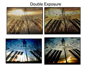
4. • This theme for double exposure photographs veered away from my original plans slightly. I had taken a picture of a clock in
my kitchen quite close up. The part of the clock that was closest to the camera is in focus and it fades towards the back of
the clock. I thought this image would be quite interesting to incorporate into a few different designs. I begun experimenting
with the image of the clock and a picture of a sunset. It wasn’t fully what I had planned but it incorporated parts.
• I think this image does look quite interesting. It includes three different photographs. One is of the clock which is found
throughout this set of ideas, another is of some birds and then a picture of a sunset. The images on their own are quite solid
and in clear focus. To make this image more interesting I used the twirl tool to make it look although the landscape was
getting pulled into some kind of vortex. The clouds look quite interesting after using the twirl tool. The sky almost looks
although it has been painted. All the colours contrast well throughout the image and there’s nothing that looks too out of
place.
• I would say the strongest aesthetic quality of this piece is definitely the sky, the swirl looks interesting to look at and looks
like its part of the clock. I wanted the twirl effect to make it look like some kind of vortex sucking in the landscape bellow. I
think I managed to create my desired effect. I think the weakest aesthetic quality in this image is the birds because they do
look slightly out of place but I tried the image without them and it looked a little bit empty so I thought I would keep them. I
like how the sky looks although its part of the clock.
• I put the two main images together and they were the sky and the clock itself. I combined them in Photoshop by using the
blend mode ‘darken’. After doing this I added the picture of the birds and moved them around until I found a position I liked.
I lowered the exposure of the sun a tiny bit. After doing this I added the twirl which is under the ‘filter’ section in Photoshop.
I chose the amount that the effect changed the photograph until I found what I wanted. I then made a few final touches to
make sure it looked like the sky was on the clock and not the other way around. I think that this piece does look quite
interesting and it didn’t have loads of technical difficulties. I think if I were to change one thing it would maybe be that I
would change the placement of the twirl to where the hands begin. With that said it might not have had the look that I
desired and could have looked out of place.
• I think that this idea could possibly be taken further, but I would need to take more pictures of the clock itself to get some
better angles to be able to create more images. I would also need more landscape images that would suit the clock. I have
created a few varied designs but they all use the same clock image as the base.
• I think the thick black numbers on the clock create quite a strong frame for everything within the image and because they
are above everything they make it look like that’s the design on the clock. It has a clear focus which fades towards the back
into a slight blur. This makes the centre of the image stand out more.
4