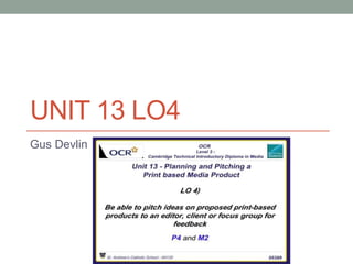
5. Environment of Presentation
This environment of the presentation was very important as I needed to be fully aware
on how the clicker works and what slide followed what on my Prezi presentation so I
was fully aware on what I needed to say.
7. VIDEO OF PITCH
• https://www.youtube.com/watch?v=0OUkztHqyYY
• https://www.youtube.com/watch?v=M-pD7leSOzo
• These two links are both videos of my pitch, one of them is the pitch in full, and the
other is a Q & A of the audience asking questions about the pitch and the product
itself.
• The two images below are screenshots from my pitch in which was filmed by the
publisher.
• Prezi Link: http://prezi.com/26qqta5kxyro/?utm_campaign=share&utm_medium=copy
• http://prezi.com/8tcksgyl3bo5/?utm_campaign=share&utm_medium=copy
8. Feedback from head publisher
These are some feedback comments in which I have received from the publisher in
order to improve my pitch/presentation. I can clearly see that the publisher has
suggested that I should make improvements based on the teacher feedback in which I
have done as I have slightly altered the costs of the salaries in order to fairly meet the
requirements, this feedback has made me realise that I need to gather the feedback
from survey monkey which I have done in order to evaluate how people thought my
presentation went in terms of the content, suitability & optimization of my
pitch/presentation.
9. Feedback (Survey Monkey)
Above are 2 questions which were from my feedback
questionnaire &the majority of the responses were
positives with the exception of some negatives but I will
take on those negatives on board so that I can turn
those negatives into positives. Furthermore the very first
question from my questionnaire was “Was all of the
content fully understood within my presentation?”, Out
of 9 people, 8/9 answered Agree, with 1 audience
member voting Disagree which hopefully we can find
out what parts of the presentation he did not understand
as it may be how I come across when pitching this idea
for a UK Music Magazine. The next question was as
follows “Was there any content that could be added to
the presentation?”, out of 9 people, 2/3 of the audience
said yes and 1/3 said no, I am looking to see what kind
of content I should be adding in order to make this
presentation better so that my idea for a UK Music
Magazine becomes more viable and more likely for
publishers to join us.
10. Feedback (Survey monkey)
• Above are 2 questions which were from my feedback questionnaire &the majority of
the responses were positives with the exception of some negatives but I will take on
those negatives on board so that I can turn those negatives into positives. Furthermore
the very first question from my questionnaire was “Was all of the content fully
understood within my presentation?”, Out of 9 people, 8/9 answered Agree, with 1
audience member voting Disagree which hopefully we can find out what parts of the
presentation he did not understand as it may be how I come across when pitching this
idea for a UK Music Magazine.
11. Feedback (Survey Monkey)
• The next question was as follows “Was there any content that could be added to the
presentation?”, out of 9 people, 2/3 of the audience said yes and 1/3 said no, I am
looking to see what kind of content I should be adding in order to make this
presentation better so that my idea for a UK Music Magazine becomes more viable
and more likely for publishers to join us.
12. Changes to calculations
As you can see this was the improved version of my costs
however the publisher who I pitched informed me that he
did not know how I got these costs so I had to break them
down even further e.g. include sources. The image to the
left of me was the original profit/loss breakdown, but we
and the publisher in who we pitched to felt that I needed to
review my profit/loss breakdown as it seemed too brief in
terms of where did I get the costs from.
To the left of me is the before changes of costs in which I
did use websites for these costs but the websites now
seem unreliable as the publisher in who I pitched to has
informed me that the costs look very unrealistic for the
requirements I have defined for each role. I have
therefore taken these comments on board and improved
the costs which is the image above in order to make the
costs more satisfaction for the publisher.
13. Changes Based On Feedback
As you can see, I have re done the profit/loss
breakdown and have incorporated even more
costs in order to solidify my profit/loss
becoming more legitimate. I have
accumulated how many magazine sales I am
projecting to have over the year and how
many copies we need. In the top image, it
demonstrates simple advertisements of a full
page, a full page advertisement page & half
of a page in order to gain income from
advertisement which you can clearly see I
have accumulated as there are variety of
advertisements in our music magazine.
14. Survey Monkey Feedback
The last question in this questionnaire which I
formatted to the entirety of the audience which
states “Do you have any other comments,
questions or concerns?” The audience voiced
their concerns and comments one of the
comments was “Very well presented in a
confident and persuasive manner, he didn’t read
from a script and the eye contact with the
audience was impressive” the comment was
very pleasing and satisfying for me, but also the
publisher voiced his concern in the following
“Instagram page set up had a screen grab with
ruler lines in the image, salaries were too low,
source?, could you provide a clearer breakdown
of costs/income, advertising £1.5m, how?, full
page?, half page?
15. Survey Monkey feedback
• The comments that the main publisher
has voiced to me was very helpful as
with his constructive criticism will
hopefully help me make my pitch in
future presentations more appealing
towards other publishers. I especially
think in order for my music magazine to
become visibly appealing to potential
investors, I would definitely need to
improve my front cover and double page
spread in order to achieve this goal and
for publishers/investors to become much
more enticing and appealing towards the
publisher.
16. Survey Monkey Feedback
• One of the comments in which I
received from one member of the
audience was the following:
"Salaries were too low especially
when you stated you want to recruit
high calibre candidates". As a result
of this comment, I have changed
the salary in order to meet the level
of workers we are looking to hire for
our Music Magazine. (The image
below indicates the before and after
changes that I have made)
19. Step by Step (Front cover)
Firstly, I had to select my background colour which would
need to be “repeated (Steve Neale 1980)” from my magazine
of inspiration which is “Clash Music Magazine” and I found
this colour by utilizing the paint bucket tool.
Next, I had to draw out the grid lines so I knew
where the masthead was going to go. I used
www.dafont.com in order to select the font which
was fit for purpose for my proposed music
magazine. The text I ended up selecting was
“Myriad Pro” in which I made the outside shadow
to look more conventional.
20. Step by Step (Front cover)
In order for the cover lines to not look confusing for the customers of our
music magazines we needed to separate the cover lines and therefore
by using the ruler tool drew a line under Iggy Azalea to prevent confusion
from the other music artists.
To make sure that I did not have to select ruler tool and press this,
instead I held down shift on the line that had already been created and
simultaneously press (CTRL +C) and paste the line to where it should go.
This is essentially important as it gives our music magazine a certain
level of consistency through the form of our Front Cover.
21. Step by Step (Front cover)
Within various Front Covers of music magazines you need to have
barcodes in terms of the legal obligations you have to abide by in order
to sustain ourselves as a formal and professional music magazine and
this will be demonstrated through our Front Cover & DPS.
By adding into the barcode, logo of distribution company, issue 1 text and
social media sites. It enables our barcode to look more tidy and more
presentable when in a pitch to a publisher who we want them to invest in
our music magazine. I had to link these together in order to move these
and I did this by selecting one of them and then pressing (CTRL) and
then selecting all of the layers that I want and then right clicking any layer
and pressing link layers. This helped me a lot as it was more fluid and
easy for me to move these layers collectively.
22. Step by Step (Front cover)
Due to the background of the clothing that our cover
music star was wearing this text was difficult to read
from our perspective so we knew that we needed to
use a particular tool which would change this and
therefore we used the rectangle tool in order for the
text to be more recognisable for the buying customer.
Now by adding a shape which is done by selecting
the rectangle tool and inputting the shape needed
around the text, this allows the text to therefore be
more easy to read for the human eye when the
customer purchases a copy of our music magazine.
23. Step by Step (Front cover)
This is an old masthead in which we created
in order to see how we could develop this
into something better, we then found out that
we should add some effects and drop
shadow was the one particular effect we paid
much attention to.
We added these effects by double clicking on
the layer which is attached to this particular
text and adding the Drop Shadow effect
which enables our masthead to look more
conventional and hopefully it will reach out
and appeal to the customers in which then
we will generate more sales.
24. Step by Step (Front cover)
I then had to add more grid lines so I could fit in the picture
onto my Front Cover, I then had to go out of my way on
school grounds and take this picture. Furthermore, I utilized
the quick selection tool to get rid of the background from
the original picture.
In order for layers to work for your Front Cover of
your music magazine you must design grid lines
to enable the strapline to be fit for purpose for
our music magazine. This is done through the
form of the text tool so I can type in the text that I
want.
25. Step by Step (Double Page Spread
For the Double Page Spread, I selected a
background colour which was white as it is plan and
it makes the main image stand our for the reader. I
did this by using the paint bucket tool and the
gradient tool in order to do this and we chose such a
plain cover as a result of our magazine of inspiration.
Next, I needed to design the grid lines so that the
picture that I have taken is fit for purpose in terms of
its placement and selection for this Double Page
Spread. I purposely informed the music star to stare
away in which we will “repeat (Steve Neale)” in order
for our Double Page Spread to become more
conventional.
26. Step by Step (Double Page Spread)
I had to design some grid lines to create
some space for the masthead to go,
furthermore I used the text tool to input the
text in which I wanted for the masthead. The
site in which I imported the text from was:
www.dafont.com and this helped me create
some ideas for the masthead.
Brand Identity is vitally important for us as
we need our music magazine to be
conventional in terms of the house style,
colour scheme & page numbers. All of
these aspects which I have just listed are
taken inspiration from Clash Music
Magazine which will be “repeated( Steve
Neale 1980)” throughout my double page
spreads.
27. Step by Step (Double Page Spread)
As you can see there is very little text as there is only the
Drop Capital & the pull out quote from DPS interview with
“Eminem”. Therefore I needed to put text in as this
interview needed content to solidify it as a professional
music magazine DPS interview.
Now by using the text tool I was able to create the text
boxes that were necessary in order for the content to be
available to be inputted so that our DPS for our debut
edition would look more professional and formal.
28. Step by Step (Double Page Spread)
You can just about see the text that is used for the pull
out quote but obviously due to the fact that you can’t see
this and we can’t afford to let this happen as fans might
not be able to see this pull out quote.
Therefore I used the rectangle tool to create a shape
which would act as the background for this text as it
would not only look conventional but also to make sure
that the text is readable by adding a rectangular shape
and a black background.
29. Step by Step (Double Page Spread)
As you can see we need the masthead/title of this
DPS interview to firstly be conventional in the sense
that it does not look out of place from rival music
magazines. This is very important as we need the
masthead to stand out but at the same time not
become too wacky and out of the ordinary.
With the utilization of the eye dropper tool I was able
to take the colour from the Drop Capital which has
made it able to change the same colour for the Drop
Capital as it is for the Masthead in order to retain the
consistency of he house style and repetition
throughout our music magazine.
30. Step by Step (Double Page Spread)
This music magazine has everything such as Masthead, Social Media,
E-Media Links & Drop Capital to just name a few except for a puff
promotion to excite the fans with an opportunity to win something.
Therefore I decided to add a puff promotion and I did this by using the
Rectangle tool and then changing the tool so I could draw a circle and
this would be where the puff promotion would go.
I decided to use bold text to lure the customers in and therefore using
similar colours to the colours that I am using within my music
magazine to give us a sense of convention and repetition. The main
reason behind this is that it gives the reader a fantastic opportunity to
win some prizes and all they have to do is buy our music magazine.
31. Step by Step (Double Page Spread)
As you can see from the screenshot to the left of
this text, I used the Pen Tool to make sure that the
text would not overlap into the main image on this
Double Page Spread. With the utilization of the
Pen Tool, I was able to make a text box using the
pen tool and I made sure that some of the pointers
from the Pen Tool was an CM to make sure that
the text would definitely not overlap on the main
image on the Double Page Spread. This is
essentially is important as it would look utterly
unprofessional and completely informal if the text
was overlapping on the main image as it would be
very difficult for the customers to read the text & we
would look very poor here in terms of our rival
competitors laughing at us on our debut edition.
32. Front Cover (Magazine Page
Improvements)
As you can see, the magazine front cover to the bottom left is an old draft in which I
created in order to understand what I wanted on my Front Cover. In comparison to the
Front Cover to the bottom right, you can see a lot of conventions and components which
I have adapted, for example the cover lines, Bar Code & Text of the masthead, world
exclusive text along with the name “Eminem.
As you can see from both of the
arrows we needed to add actual
cover lines with the use of the
shape tool in order to properly
separate the cover lines. This is an
important convention as you need
cover lines so that the customers
know what the actual cover lines are
as the names may be confused with
another convention of this Front
Cover.
33. Front Cover (Magazine Page
Improvements)
As you can see, the magazine front cover to the bottom left is an old draft in which I
created in order to understand what I wanted on my Front Cover. In comparison to the
Front Cover to the bottom right, you can see a lot of conventions and components which
I have adapted, for example the cover lines, Bar Code & Text of the masthead, world
exclusive text along with the name “Eminem.
Another convention which was on
our old draft in which we have
increasingly changed is the actual
Font Style behind the masthead not
only have we made the “SMASH”
much bigger and bolder which will
lure the customers. This is very
important as the Masthead to the
left of this text looks very bog
standard and therefore very
unprofessional, however the
masthead to the right of this text
looks very magazine like.
34. Front Cover (Magazine Page
Improvements)
As you can see, the magazine front cover to the bottom left is an old draft in which I
created in order to understand what I wanted on my Front Cover. In comparison to the
Front Cover to the bottom right, you can see a lot of conventions and components which
I have adapted, for example the cover lines, Bar Code & Text of the masthead, world
exclusive text along with the name “Eminem.
One last convention which I will be
covering is the barcode, in the draft
to the left of this text all of the layers
are unlinked which makes the
barcode look very informal and
therefore does not look right.
However in comparison with the
draft to the right of this text, the
barcode looks more professional as
all the layers used within the
barcode area are all linked, for
example the publisher, social media
sites and the issue number.
35. Double Page Spread (Magazine
Improvements)
Two of the screenshots below are both drafts of my Double Page Spread for our music
magazines, as you can see the first draft is the screenshot to the bottom left in which
there is very little colour scheme in the sense that it is not repeated throughout the
Double Page Spread. Furthermore there are many conventions that the screenshot is
missing such as an attractive and luring pull out quote as well as the smash media
website link.
As you can see, every music magazines need a puff promotion in order to lure
customers in with offers which would attract the everyday customer. Now the puff
promotion is existent within the screenshot to the bottom left but it is very vacant and
unattractive, plus when you compare it to the screenshot to the right it looks very
exciting with all of its bright text and circle shape.
36. Double Page Spread (Magazine
Improvements)
Two of the screenshots below are both drafts of my Double Page Spread for our music
magazines, as you can see the first draft is the screenshot to the bottom left in which
there is very little colour scheme in the sense that it is not repeated throughout the
Double Page Spread. Furthermore there are many conventions that the screenshot is
missing such as an attractive and luring pull out quote as well as the smash media
website link.
Another convention in which I needed to change was the type of font styles and the edits
of the masthead font styles as the masthead on the first draft screenshot looks very
basic and in comparison with the font style to the right it looks very bold and distinctive.
This is very important as customers may be detracted from the magazine as a result of
the unattractive font style when in comparisons with the magazines pages.
37. Double Page Spread (Magazine
Improvements)
Two of the screenshots below are both drafts of my Double Page Spread for our music
magazines, as you can see the first draft is the screenshot to the bottom left in which
there is very little colour scheme in the sense that it is not repeated throughout the
Double Page Spread. Furthermore there are many conventions that the screenshot is
missing such as an attractive and luring pull out quote as well as the smash media
website link.
Within all Double Page Spreads of music magazines, you need an introduction just to let
the customer know a bit about how the interview will roll on in terms of the content that
we will be covering within this specific Double Page Spread. As you can see from the
bottom left screenshot, it is a very vague and not detailed description which may make
the customer not buy our magazine. In contrast with the bottom right screenshot, there
is a very detailed description which includes stats to give the reader a great opportunity
to see what we will be covering within this Double Page Spread interview.
38. Conclusion
• Within this LO, I had to conduct a pitch towards my peers which meant that I
needed to create a script for this pitch as well as learning that script so that
my pitch looked very well presented. Furthermore after this pitch was
conducted, I sent out a survey so that my peers could fill out the survey. This
was done in order to make any improvements to my magazine idea or to
make any necessary adjustments and improvements to presentational skills.