2. Content
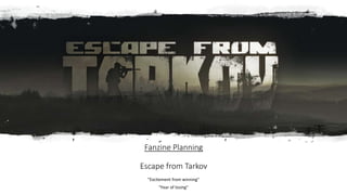
Escape from Tarkov:
• Initial points
First person hyper realistic shooter
One of the first games of a new genre
• Battlestate games (developers)
Russian
Gender roles within the game
Why are there no female characters and how does that effect the game?
Independent developer
Small production team
"in progress"
They have a clear vision for the game
Only so much they can achieve
Large influx of players since late 2019
Large increase in revenue
How has that effected production of Escape from Tarkov?
In conjunction with a large increase of 'hackers'
How has that changed the game?
What are the positive and negative effects to the large increase?
Escape from Tarkov has plenty of things to write about. But in the 12 pages that I want
to write, I want to go over the points I bring up within these next slides. These are only
brief bullet points which I will expand on in the magazine.
3. Content
§ Gameplay
Sound design
How was it recorded?
The impact on the gameplay
Ø Mechanics
§ Hardcore survival
§ A story driven multiplayer walkthrough
Ø Genre
§ Hyper realistic
§ Realistic bullet and medical systems
§ sensation of reality
§ excitement from winning
§ Fear of losing
§ "Gear fear"
§ Multiplayer
§ Player vs player vs environment
§ Who is friendly and who is not?
§ "Chads and Rats"
Ø Graphics
Hyper realistic
Part models are 3D scanned and implemented into the game
Actual industrial weapon parts
4. Content
Gameplay
Setting
§ The City of Tarkov
§ North Eastern Russia
§ Apocalyptic/War torn
Date
Current date (2019/2020)
Backstory
The different cultures
PMC's
USEC
BEAR
Scavs
Local natives
Raiders
Scav Bosses
Glukhar
Shturman
Reshala
Killa
Sanitar
Terra group
Marked circles
The Cultists
5. Visuals
I want to include edited in game images. This will be to
illustrate the points I want to make. This will include
screenshots of maps, guns, people ect. I won't just leave the
images bare as if they were ripped straight from the game. I
understand that I need to add an extra element to improve
the image for my magazine.
What I was thinking of adding to these images were edits like
adding a background which has a basic style but focusing in
on a certain object or person. This will focus the reader onto
said item, because it’s the primary object within the
image/page.
I want to incorporate the apocalyptic style that Escape from
Tarkov uses without moderation. But I'm not sure at this
time how effective it will look within my magazine.
6. Style
Tarkov has a very sophisticated style which I want to expand on.
By using images of the game along with an overlayed edit on top,
will separate my magazine from the game itself and give my
magazine its own brand look.
Deeper colors like dark reds, greens and blues will suit Tarkov as
a game, being quite dark itself.
Escape from Tarkov markets itself with Modern and futuristic
Blues, Grays and blacks on their website. It might be sensible to
follow a similar color scheme taking inspiration from their
different media outlets.
The Tarkov wiki includes its own fonts, images and color
schemes, giving its own feel compared to their website and
game. I want to include this styling of font within my magazine,
because it looks informative and detailed. And to the average
player who visits the wiki often, they will recognize the style and
acknowledge the usage.
Image of the
Escape from
Tarkov wiki.
Looking at the
style of font.
7. Font
Tarkov uses many different fonts for different reasons. The different font
groups are: The Official website, The Tarkov Wiki and the game itself. These 3
groups however have one connecting font and that the title: Escape from
Tarkov, which is always the same across each medium.
https://www.clipartkey.com/view/xbTRRb_escape-from-tarkov-font-png-
download-escape-from/
This link shows the Tarkov font, which I can download for my own magazine.
It’s the same style of font as the title of the game. On the official website, the
wiki and the game itself.
https://escape-from-tarkov.fandom.com/wiki/Style_Guide
For my magazine, I want to incorporate the different fonts used within Escape
from Tarkov. The fonts from the official website, wiki and the game itself are
all different but easy to read. I want to incorporate the different sizes and
styles found in the game and other sources. The main thing I want to take
away from all the fonts, is the styling of the text. With the text being an off-
white color. And highlighted information being a beige yellow, which stands
from the dark gray background. The primary reason why I want to use this
type of font is to reference to the wiki for Tarkov. By referencing this, my
magazine will appeal to the people who know about the wiki and will
understand the connection between an informative website and fan made
magazine. But the connection is still there.
A screen shot
from a mission
directive within
the game.
8. Fanzine layout planning
I want my fanzine to be 12 pages. This will include all the
topics I planned to talk about. But in more detail.
Because my fanzine is only talking about the game, I will have
to make sure that each subject is correctly broken up from
page to page.
Animated images
9. Front cover: Page 1
The first thing I want to decide is the title font, and I stuck between 3 different
fonts.
1 - https://www.dafont.com/gulag-decay.font
2 - https://www.dafont.com/chernobyl.font
3- https://www.clipartkey.com/view/xbTRRb_escape-from-tarkov-font-png-
download-escape-from/
The first font captures the apocolyptic style that Tarkov incoporates. The second
font carries a similar style of war torn apocolyictic style, but the font is more
ridged and firmer compared to the first font. And the last choice is the same
font from the title of the game, found on the offical websise, wiki and the game
itself.
The last part of the page is the backgrond, and im stuck between what I want to
do with it. My initial thoughts were to colour it a dark background colour and
leave the objects standing out. But another idea is to highlight the objects with
a border which extends from said objects on the page. Furthur highlighing them
to the reader.
"Excitement of winning, Fear from losing"
*I want the bottom of the image to
include an image of something
happening ingame. I would take out the
unnecessary parts of the image and
leave some significant objects for the
reader to look at.*
Topics:
- Development progess
- Understanding Battlestate games
- A hardcore survival shooter
- why is tarkov fun?
*These are only
examples of the
topics I want to
cover*
10. Pages 2 & 3
What is?
Escape From Tarkov
A summarized paragraph of
escape from Tarkov. To
give the reader a brief
understanding of the game.
So everyone can be on the
same page, and not
confused about what I'm
talking about.
What these shapes are illustrating
is the type of image I want to use
on page 2. I want to use a scope
with the recital either taken out or
faded so that you can read the
text.
I want to fade the bottom of the image so
that I can have extra space to write on.
On the last part of the page I will talk
about my experience with the game.
Where is?
Escape From Tarkov
What I understand already, is that if I don’t correctly layout the page
and use the right colours, the page might come out chaotic and hard
to read. So I will have to find a way to colour the images I'm using so
that I can incorporate them into my fanzine.
What I'm thinking of
including on page 3 is
a large building/ man
made structure within
Tarkov. But I will
remove the sides and
top so that I can fit
text beside, below
and above. The
reason I'm thinking of
using a building is
that is a static
location within
Tarkov, and
references to the title
of the page.
The city of Tarkov
The subheading I
want to use,
incorporates the
location in which
the game is set.
This section will
describe the
location of the
game.
The last section of the page will look at the amount of
variety that the locations have between maps. Only a
brief description because the different maps are all
different which is part of gameplay description.
What I want to continue
from page to page is the
styling of the background.
Some sort of pattern, or
colour which is sort of
similar to the game.
11. Pages 4 & 5
When is?
Escape From Tarkov
Why is?
Escape From Tarkov
This part of the
image will be
taken up by the
ULTRA tower
found on the
map
interchange
Describing
when escape
from tarkov is
set.
The equipment,
buildings and
nature found in
and around the
city of Tarkov.
Going indepth into the
backstory of Tarkov. Why did
this happen? Text will be
wrapped around the "marked
circle"
in general, I want my magazine to
be dark and gloomy. This doesn’t
mean its will be hard to read, this is
because the text I might use could
be an off-white/off light brown. So
that the text is still readable on the
dark layers it is sat on. Image of "Marked cirlce"
Breifly touch on the different
groups formed prior and after
Tarkov was in ruin. Terra group,
PMC's, Scavs, Raiders, Scav Bosses.
12. Pages 6 & 7
How is?
Escape From Tarkov
Talk about the backstory and
the current lore of Escape From
Tarkov, and what we currently
know in 2020. Also touching on
that the lore is always evolving
as the game continues to
develop.
I was thinking of having
this page be lighter and
brighter, depending on
what image I use at the
bottom.
Image of some sort of team or art about
the game. But I would want to make sure
that the top of the image had 1 consitant
colour which I could then put across the
whole page.
Just bare in mind, these
are not the final ideas of
what I want the titles of
each page to be.
Locations to Explore
each blue box will be a different
screen shot of different locations,
talking about the style of maps
and the different situations you
can find yourself in.
text about map
text about map
text about map
text about map
Image of one of
the areas/maps in
Tarkov
Image of one of
the areas/maps
in Tarkov
Image of one of
the areas/maps
in Tarkov
Image of one of
the areas/maps
in Tarkov
Image of one of
the areas/maps in
Tarkov
13. Pages 8 & 9
I want this page to be the first double page
spread. After going through the basics of the
game, the fanzine can get more into the
theroy of why Escape From Tarkov is
different from other more casual FPS games.
The experience of Tarkov
This being the first
double page spread, I
want to include a
screenshot of some
gameplay, of my
character shooting
another person. This is
the experience you will
have within the game.
I will have to
find an area
where I can
easily apply text
to the image. Be
it a wall or some
sort of object
which has a
solid colour
across it. This is
so the text is
readable across
the serface I
apply it too.
The centre
of
these pages
will be
taken up by
the
gameplay
which I will
either have
static or
animated
scene.
Across both pages I
will talk about the
experiences you
might (will) have
when playing the
game. Referencing
the opening screen
you read when you
first play the game. It
mentions how you
WILL die. And to not
get mad about it.
Again, I will find an
area where I can
apply the text to. Like
a wall
14. Pages 10 & 11
The Different groups in Tarkov
The last pages I wanted to
talk about the different
people you will encounter
within the city of Tarkov
Images of the different traders
An
image/video
of Scavs, the
most
common
people you
encounter.
Image of
scav bosses
Image of
raiders
this page is
dedicated to
talking
about the
main
groups,
being PMC's
and Scavs.
image of
perspective when
playing a PMC
Section talking about the traders
you can buy and sell items to
Raiders and how
they are a
challenge to kill, as
well as backstory.
The last group of
people to encounter,
and how they are the
hardest people to kill.
Summerise the different groups, and how
they are only made up, and yet they have
so much personality.
15. Page 12
The last page I want to talk about the
game as a whole. Summarizing what
I've talked about, and how much there
is to know.
Speaking about how I've only briefly
described the tip of the iceberg when it
comes to Escape from Tarkov.
In Summery
Include an image either
symbolizing exiting or
conclusion.
being the last page, I must come to a conclusion when it
comes to talking about Tarkov. There are many things I didn’t
touch up on, and I can list the sheer amount of things I
didn’t include. But it's important to keep it brief as a
summery. I don’t want to flood the page with text.
I'm initially thinking of having the text centered on the page.
The page in of itself should symbolize conclusion, as if to
show that the fanzine is ending. Otherwise it might look
clumsy if I don’t finish on an image or text referencing
conclusion.
To keep consistency across all the pages I wanted to keep
the font of the titles the same, as well as the font for the
text. Other fonts like ones to complement images or
reference a source could be a different colour to highlight
them. But I haven't decided on what colours to use at this
stage.
16. Image planning for my fanzine
For this last slide I wanted to plan the types of images I could include
in my fanzine. What images I want to use as well as the placement on
the page.
17. Page 1
"Excitement of winning, Fear from losing"
*I want the bottom of the image to
include an image of something
happening ingame. I would take out the
unnessaserry parts of the image and
leave some significant objects for the
reader to look at.*
Topics:
- Development progess
- Understanding Battlestate games
- A hardcore survival shooter
- why is tarkov fun?
*These are only
examples of the
topics I want to
cover*
What I want to do, is
continue the colours
found at the top of the
screenshot. So for
example the top of the
image is skyblue. I
would take this colour
and copy it across the
top of the page. What I
have to do is make sure
that the top of the
screen is a mix of
similar colours. In this
example, most of the
top of the image is
1(ish) colour. I could
also texture this area
slightly, because the
top of images are not
always the same colour,
and currently this page
is hard to look at.
18. Page 2 What is?
Escape From Tarkov
A summarized paragraph of
escape from Tarkov. To
give the reader a brief
understanding of the game.
So everyone can be on the
same page, and not
confused about what I'm
talking about.
I want to fade the bottom of the image so
that I can have extra space to write on.
On the last part of the page I will talk
about my experience with the game.
The challenge of this page
is finding that balance
between, visual and
readable text. In the
example image on the
right, the scope is quite
cluttered, so it will be hard
to find an area which has
similar colours in the
scope. The best I could do
with this scene, is a short
clip of me shooting
someone. I could then
export the clip in .gif and
loop the clip. But like
always with this image, it
might be hard to read.
Instead of cropping the
image at the bottom, I will
want to fade it into the
dark pattern I want to
include across my fanzine.
What is?
Escape From Tarkov
19. Page 3
Where is?
Escape From Tarkov
What I'm thinking of
including on page 3 is a
large building/ man made
structure within Tarkov.
But I will remove the
sides and top so that I can
fit text beside, below and
above. The reason I'm
thinking of using a
building is that is a static
location within Tarkov,
and references to the title
of the page.
The city of Tarkov
The subheading I
want to use,
incorporates the
location in which
the game is set.
This section will
describe the
location of the
game.
The last section of the page will look at the amount of
variety that the locations have between maps. Only a
brief description because the different maps are all
different which is part of gameplay description.