
Recommended
More Related Content
What's hot
What's hot (20)
Viewers also liked
Viewers also liked (20)
Similar to Magazine analysis
Similar to Magazine analysis (20)
Recently uploaded
Recently uploaded (20)
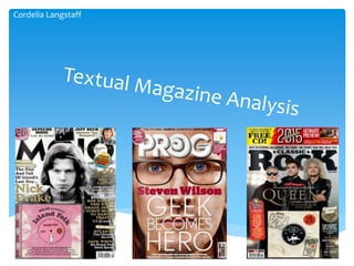
Magazine analysis
- 2. PROG FRONT COVER the colours of the headline and text compliment the background Extreme close up shouts out and colours of his features. To the reader.(intriguing) bold text tells us who the article is about. Headline intrigues the reader (big, stands out) Quote of the article Barcode and prices informs the at the bottom of the page reader of essential information Very bold colours stand out from the neutral colours of the background IE; his eyes from his face. Studio shot photograph
- 3. PROG CONTENTS PAGE Funky headline text intrigues readers and makes it interesting to look at. Page number and quote give you immediate detail as to where the article is and what its about. Bold sub headings makes it easy to find what you want quickly. Studio shot photograph – looks professional Three main colours (red black and white) make it easy to read. Randomly placed shapes break up the page to add effects
- 4. PROG DOUBLE PAGE SPREAD Picture even though in the background the caption stands out and ends up drawing attention to the face. The introduction quickly informs the reader to the contents of the article and intrigues readers Photos break up the text to make it easier for the reader. Bigger font in text as “FACE” links to the front cover to tell the reader they are on the right article.
- 5. MOJO FRONT COVER The colour scheme of the black and white make it look like a traditional magazine The gold writing stand out from the plain background drawing the readers eye to all of the contents of the magazine The pink “free CD” stands out to a read persuading them to buy the magazine Smaller images in colour break up the front cover. Small text in bright colours contrast with the front cover drawing attention to what edition the magazine is. Nick drake in bold shows that he is the feature article of the magazine.
- 6. MOJO CONTENTS PAGE Names of locations match with the articles in the magazine. Date shows what issue it is. A few main features shown in contents shows articles readers would most want to read. Cover story excluded at the bottom for if people want to go straight to that article. Quotation from the person in the picture forms a relationship with the reader Colour scheme makes the white writing stand out and emphasises the red page numbers.
- 7. MOJO DOUBLE PAGE SPREAD White background contrasts with colours that build up the face. Which draws attention to this side of the spread. Pictures that build up the full images is more creative than a simple photo. Contrasting black and white double page spread show a simple difference from each page. The writing is on the right hand side as the brain is programmed to read from right to left. The pink writing links to the CD on the front cover which links the artist to the CD. The white writing contrasts the black backgroun d so it stands out.
- 8. CLASSIC ROCK FRONT COVER The price is small as the producer does not want it to stand out to the buyer Free CD persuades people to buy. Red and yellow draws peoples eyes to the “buzzword” ultimate preview which is a unique selling point. Sub-heading is catchy to gain the readers attention and with the black writing shows contrast of colours. The main image in the background uses direct address by the three of them looking into the camera and creating a relationship with the reader. The layout contains a good colour coordination scheme with red writing that stands out. It’s a more expensive magazine as the front cover is not jam packed with different articles.
- 9. CLASSIC ROCK CONTENTS PAGE Image gives the focus of the cover article. Black and white image contrasts with opposite image showing an older artist. Mentioning the CD linking to the front cover. Simple black and white writing keeps things easy for the reader but the red writing stand out as the important parts. Splashes of red link to the front cover and is shown to be a colour scheme throughout the magazine. Page numbers for important articles and larger to draw the readers attention.
- 10. CLASSIC ROCK DOUBLE PAGE SPREAD The title is on a tilt which adds emphasis to it and makes it stand out. The quote gets readers interested as it gives them a taster towards the article. The colour scheme here is simple but has a positive affect as it is easy to read. The stance and the medium shot represents power and the most power lies with the man at the front as attention is immediately drawn to him. The date shown here shows its new music and recent from this year. The black background adds depths to the article and brings forth the writing and pictures in different colours. The writing curves around the photo to avoid covering it and all and have a lessening affect of the dominance in the picture.