GV'S 24 CLUB & BAR CONTACT 09602870969 CALL GIRLS IN UDAIPUR ESCORT SERVICE
Film poster conventions that scare viewers
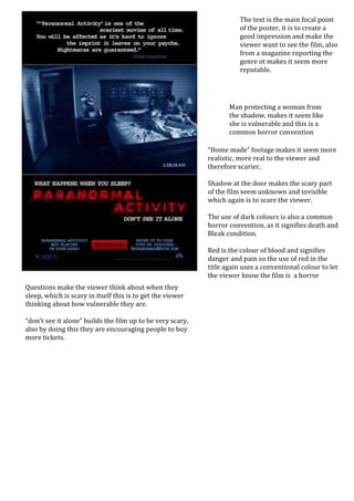
1. The text is the main focal point
of the poster, it is to create a
good impression and make the
viewer want to see the film, also
from a magazine reporting the
genre ot makes it seem more
reputable.
Man protecting a woman from
the shadow, makes it seem like
she is vulnerable and this is a
common horror convention
“Home made” footage makes it seem more
realistic, more real to the viewer and
therefore scarier.
Shadow at the door makes the scary part
of the film seem unknown and invisible
which again is to scare the viewer.
The use of dark colours is also a common
horror convention, as it signifies death and
Bleak condition.
Red is the colour of blood and signifies
danger and pain so the use of red in the
title again uses a conventional colour to let
the viewer know the film is a horror
Questions make the viewer think about when they
sleep, which is scary in itself this is to get the viewer
thinking about how vulnerable they are.
“don’t see it alone” builds the film up to be very scary,
also by doing this they are encouraging people to buy
more tickets.