
Recommended
Recommended
More Related Content
Recently uploaded
Recently uploaded (20)
Featured
Featured (20)
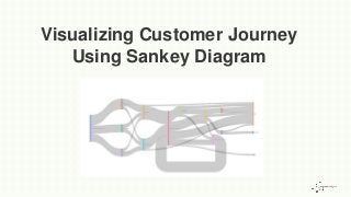
Visualizing customer journey using sankey diagram
- 1. Visualizing Customer Journey Using Sankey Diagram
- 2. Customer journey mapping is the visual process of plotting a customer’s journey and analyzing their interactions with a brand. This helps companies look at their business from the customer’s viewpoint. That, in turn, helps a business get insights into a customer’s pain points to be able to resolve them. This can be accomplished by preparing charts, heatmaps, and other interactive visualizations, including the Sankey diagram. But running analyses with some numbers in a sheet for this kind of mapping does not inspire thought.
- 3. What is needed then is well-constructed, easy-to-grasp visualization to understand how your customers move and interact with your brand. There are several interactive visualizations available for this purpose such as charts, heat maps, and so on. Also on the list is the Sankey diagram, offering a better understanding of the complex data needed for customer path analytics, though it has its own limitations that we shall discuss later in the post. As we had said in one of our earlier blog posts on the Sankey diagram, this type of visualization is generally used to depict “a flow” from one set of values to the next.
- 4. Main Components Of A Sankey Diagram It consists of the following: Nodes: Representing the events in each path, a “Node” is an element linked by “Flows” Flows: They link the nodes. Each flow is specified by the names of its source and target nodes in the “from” and “to” fields.The value in the width field defines the thickness of the flow. Drop-offs: A drop-off is a flow without a target node, and refers to the link that ends at the present node. It occurs when at least one of the paths continues beyond a node.
- 5. What Is A Customer Journey Map? Before delving deeper into the Sankey Diagram let’s first understand what exactly is a customer journey map. Like we said earlier in this post, it is a visual representation of the buyer’s movement across all touchpoints of your brand. The latter is in the form of a website, social media channels, live chat, and even offline channels. This customer journey mapping helps businesses get insights into common customer pain points which, in turn, allows them to better optimize and personalize the customer experience. An example: This kind of user journey can help you scientifically understand why a customer abandoned his cart on your e-commerce website and reduce such instances.
- 6. Was it because the payment gateway was too cumbersome to use? Or because the link to the gateway showed a 404 error? Another example could be of a buyer shopping for a specific item on your website, then moving on to one of your social media channels to continue his shopping there. Mapping Buyer Journeys With Sankey Diagrams Sankey diagrams and Sankey charts were originally used for visualization and the analysis of energy flows but they are a great tool to depict the flow of money, time, and resources, too. Directional arrows between the nodes show the flows in a process, production system, or supply chain.
- 7. What they help any business to do is to effectively communicate the data-based messaging to external or internal stakeholders like your customers or marketing teams, respectively. In fact, a Sankey Diagram or Sankey chart can be very useful in digital marketing analysis. Benefits of using Sankey diagrams Simply collecting your customer’s behavior is not enough for any business. It needs to analyze the same for actionable insights. Sankeys can do that by: • supporting multiple viewing levels wherein one can drill down to granular insights or see specific detail • making your most prolific shoppers stand out • showing areas that can be improved upon • showing areas with the largest opportunities
- 8. Drawbacks in using a Sankey diagram • Sankey diagrams get cumbersome to draw when presenting complex data, say with three or more nodes. But this downside can be circumvented today with the availability of open-source tools • When presenting a Sankey diagram, remember the one golden rule that the width of the lines and arrows represent the actual amounts or volumes of resources. Often, developers make a mistake here • Overly complex data is a bit difficult to depict using a Sankey Diagram • Not best for comparison of values
- 9. How To Create A Sankey Diagram To Map A Customer’s Journey Our in-house data analyst Mehar Singh Gambhir explains how to actually develop a Sankey diagram to map a buyer’s journey: In this particular example of visualizing a customer’s journey throughout his/her buying experience, we start by listing the various touchpoints (nodes) that a customer goes through before a purchase is made. We have considered a basic e-commerce platform for this exercise, and have depicted its traffic flow based on our experience of using and working with such platforms. From landing on an online shopping website or opening an app, to make a purchase, there are several nodes involved at various stages along which traffic is directed.
- 10. A company can track customers proceeding from one buying stage to another, or find out how many of them have left abruptly. A graphic visualization like the Sankey diagram, depicting the flow of traffic across several buying stages, is a handy tool for this purpose. The nodes at each level can vary based on the company and depending on what data points the company wants to be covered. A customer’s journey starts from landing on the company’s website or its app from different sources.The most common event cases can be listed as: • Direct logging into the website/app and browsing products • Landing via organic search (redirected from a search engine based on a product search without ad/promotion) • Clicking on an advertisement link from an external website or social media
- 11. From our experience of working with various retail firms, these are the most common data points and links considered for mapping a customer’s journey in a Sankey diagram. Based on whether the customer has the app installed, the next level involves browsing from a mobile app or the website. From here on, there are several possibilities of how this journey may end: • If they are really interested in the product, they view the product features in detail along with its price, while some leave without any further activity • Some may also read the reviews and ratings about the product and then add it to their carts, leave the page or click on some other product • Others may only be visiting to review their previous purchase. These link helps to understand customer behavior online and how he reacts at different steps
- 12. Some customers may proceed to checkout after adding items to their cart, while others may shop for more products and add further to their cart Some customers may abandon their carts or clear their cart and exit. Even at the checkout point, it does happen that some customers decide against purchasing. Or, they may encounter some issue during payment, which means loss of a sale This information can be used to find the weak links in the website/app and make respective improvements. So, once the nodes and links were finalized, we started building this diagram. There are various tools available online through libraries from Python, R, and Javascript. For our purposes, we used the Plotly library from Python to construct the Sankey diagram. Original Source: https://expressanalytics.com/blog/sankey-diagram/
- 13. Follow Us on Facebook: https://www.facebook.com/expana/ Instagram: https://www.instagram.com/expressanalytics/ Linkedin: https://www.linkedin.com/company/express-analytics Twitter: https://twitter.com/expranalytics Subsrcibe to Our channel: https://www.youtube.com/channel/UC4gfApL4ib2spXOARqe0cHw
- 14. Thank You