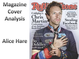
2. Firstly, the masthead of the
magazine is done in a bold font,
and in the classic “Rolling Stone”
shade of red. This has been done
to create a logo for Rolling Stone
magazine, and has made Rolling
Stone famous for their house
style.
The red is brash and
easily recognisable. As well as
this, the R in the far left section of
the cover makes it easy for the
audience to identify the
magazine, because many people
recognise the Rolling Stone “R” as
it is a key feature of the
masthead.
The Rolling Stone
masthead has been rarely
changed across the issues, except
the odd couple of variations, but
this title has remained as part of
the house style, making the
magazine famous for it.
3. The visual centre of the
magazine cover focuses on
the main image of Chris
Martin, lead singer of
Coldplay. More specifically,
it centres around the hand
on his heart which could
show he’s making a
dedication or a confession.
This could be linked to the
text in the left third where it
says “Coldplay’s Chris
Martin: Confessions of an
Anxious Rock God”
As well as this, his facial
expression and the way he
stares can be used to draw
in the audience and pull
them into the magazine.
4. The colour scheme of the
cover keeps to 3 mains
colours: red, black and white.
The red used in the masthead
matched the clothing the
artist is wearing, as well as
this, the white matches
elements of his collar and
sleeve, and the main black
fabric of the artist’s jacket,
keeping to the house style of
Rolling Stone magazine.