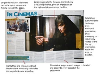
1. Large image sets the focus on the film being
a visual experience, gives an impression of
the style and atmosphere of the film.
Large title indicates the film to
catch the eye as someone is
flicking through the pages.
Details box
overlayed onto
the image
gives
additional
information,
often
interesting or
not directly
related to the
film e.g.
information
about the
actor or
director.
Highlighted and emboldened text
breaks up the monotony and makes
the pages look more appealing.
Film review wraps around images, is detailed
and goes into every aspect of the
production.
2. Large image
dominates
the page,
gives reader
a good
impression
of the films
demeanour
and genre.
Q&A with star
actor to build
interest in
them and the
movie,
presented in a
box as it is
separate from
the main
review
Massive title
catches
readers eye
and hammers
home the
name, review
is also broken
down into
simple
digestible
parts by bars.
Release date
features
largely to
build
audience
anticipation
for its release.
3. Border unites the
article and keeps it
neatly confined.
Tells the audience at a
glance where they can
consume the film.
Clear house style is
present, oranges and a
few different types of
text, looks visually
pleasing.
Large image, gives the
reader an impression
of the film visually.
A verdict, can give
justification to some
readers to see the film.
The large block of text
about the film in a
small font means that
the reviewer can fit a
great deal of text in.
By breaking it into
columns and breaking
it up with emboldened
text it keeps the reader
from getting more
bored.