I am Independent Call girl in noida at chepest price Call Me 8826255397
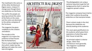
Architectual digest
1. The masthead is the same as
all the other Architectural
Digest covers, it doesn't’t
change even though there
are celebrities on the front.
The magazine company have tried to
widen their audience by putting
celebrities on that everyone knows.
The outfits the people are
wearing contrast the colors
of the fonts on the cover,
and the colors are dominant
to the whites and greys of
the furniture.
The encode to this
magazine is to inspire the
audience to have houses
like the Kardashians.
The photographers are using a
extreme long shot to get the full
background as that’s is what the
magazine spread is about.
There is direct mode in the shot
because the celebrities are
directly looking at the audience.
There is natural lighting in this
shot which makes low key
lighting and makes the room
look lot brighter.
The magazine has given
credibility to the creators
and editors.
This cover gives gratifications to
the audience which gives them
aspirations of what they want
their house to look like .
Its principal subject is interior
design, rather than
architecture more generally.
The magazine is published
by Condé Nast.
2. The mise-en-scene in the scene is about
luxury but simplistic. The pictures connote
rich tenants who have the time to clean or
the money to pay someone to clean.
There is gratifications to entice the audience
to strive to have a house like this, it has gold
throughout the multiple pictures.
The social class of the target audience would
have to be people with a stable job and
mortgage. You would see this magazine in a
doctors which shows its sophisticated and
abnormal to the real world. There is quite a
lot of writing in this double page spread
which shows that its for people aged 35 to
around 45 year old who like to take the time
in reading every word because teenagers
wont like to read it as they would get bored.
The magazine is challenging the codes and conventions as there is no bold
header and quite a few dominant images which could show they are trying
to widen the audience to more younger ages. Also in the caption it tells us
who the home owners are and why they decided to decorate their home
like this. In very small writing at the bottom of the page we see the
magazines website which is to entice the audience to look on there and
possibly subscribe to the magazine.
3. READER PROFILE
02-UK 10:36
Interior design of a
living room In Los
Angles, California.
• Gender: male and female (mostly female)
• Age: 35 to 45.
• Location: LA, California and London,
England.
• Income: £100,000 to £120,000 a year.
• The person who owns this house like this
would likely only have around 1 child in
any, there would probably no dogs and
have someone who cleans the house.
• The social class the audience would be in
would be A.
• The audience would likely be settled down
and not go out every weekend but would
drink in there house.
• They would more than likely spend
thousands of pounds on a shopping day.