
Recommended
More Related Content
Similar to Insert Production (prop).docx
Similar to Insert Production (prop).docx (20)
More from AmyKilbride2
More from AmyKilbride2 (20)
Recently uploaded
Recently uploaded (20)
Insert Production (prop).docx
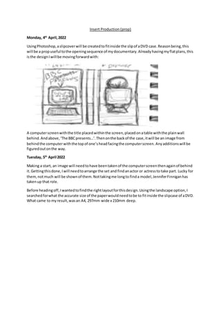
- 1. Insert Production (prop) Monday, 4th April,2022 UsingPhotoshop,aslipcoverwill be createdtofitinside the slipof aDVD case.Reasonbeing,this will be a propuseful tothe openingsequence of mydocumentary.Alreadyhavingmyflatplans,this isthe designIwill be movingforwardwith: A computerscreenwiththe title placedwithinthe screen,placedonatable withthe plainwall behind.Andabove,‘The BBCpresents…’.Thenonthe backof the case,itwill be an image from behindthe computerwiththe topof one’sheadfacingthe computerscreen. Anyadditionswill be figuredoutonthe way. Tuesday, 5th April 2022 Making a start, an image will needtohave beentakenof the computerscreenthenagainof behind it.Gettingthisdone,Iwill needtoarrange the set and findanactor or actressto take part. Lucky for them,notmuch will be shownof them.Nottakingme longto finda model,JenniferFinniganhas takenup that role. Before headingoff,Iwantedtofindthe rightlayoutforthisdesign.Usingthe landscape option,I searchedforwhat the accurate size of the paperwouldneedtobe to fitinside the slipcase of aDVD. What came to myresult,wasan A4, 297mm wide x 210mm deep.
- 2. Needingtofindthe middle,Ihadusedthe ‘rectangle marquee tool’tohelpme determine wherethe middle wouldland.Drawingapatternto mark it,I had thenfilleditoutwitharandomcolour (red) allowingme tokeepthisshape soitis there readyforwhenI needit.
- 3. Havingthe photoshootdone now,outof the selectionthese are the twoIhave decidedtomove forwardwithas theyhave resultedclosestasto whatI am after...
- 4. The firstimage has beenplacedonrightside of the page,so itlandsas the cover.Realisingnow though,the paperis quite noticeable.Especiallyatthe bottomleftseenbelow the computerscreen. It has beensuggestedtome thoughtocolourthat area inso it blendsinwiththe backdropaimingto make it unnoticeable.
- 5. Before adjusting,Iplacedthe secondimage in.Straightaway,Iwasn’ta fanof the size difference,so managedto crop the frontcover allowingthe computerscreentoresultbigger.Thatwayas well, there ismore room for the title tobe fitted. Usingthe ‘clone stamptool’now,Ihave attemptedblendingthe topof the paperinwiththe wall. WorkingI guess,butthe image isjusta messnow.I can’tmove forwardwiththis.
- 6. Restarting,Iam happierwiththe newresult.Youcanstill tell thatsomethingisoff withthe tophalf, but it’sall I can do.Nowonto the bottomhalf. Reallydon’tlike thisturnout,butitwill have todofornow.If I have time,Iwill tryfix this,but there’sonlysomuchtime whichI don’tbelieve Ihave. Thursday, 7th April 2022
- 7. Notwantingto leave the picturesasis, beginningwiththe frontcoverIhad gone throughthe processof adjustingthe shadowsandhighlightsfoundwithinthe image,the brightnessthen contrasts.Andbefore movingontothe backcover,I had changedthe hue slightlymakingthe picture bluishwiththe saturationbeingtoneddownallowingthe computerscreentoresultdarker comparedto before butstill givinganaturalistsetting.
- 8. Doingthe same adjustmentforuneditedsidenow,the shadowsandhighlightshadbeenchanged allowingthe setupto standout witha more settledcolourscheme. Headinginanotherdirectionwiththis,the posterize optionhadcome touse as I had the ideato create more of an illustratedbackdrop.Notwantingittoappeartoo animatedthough,ithadtaken
- 9. me a fewadjustmentstofigure outthe rightnumbertomove forwardwith.Thatfinallybeing36 as it wasstill realisticwithahintof illustration. Findingthe image abittoo dark, the brightnesshadbeenliftedaswell asthe contrastbeingchanged hopingtocreate a clearerfocus.Once that wasdone,itwas ontothe colourbalance.Testingoutthe colouroptions,Iquite likedhowthe blue settledstill resultinganideal posterwithoutchangingthe colourentirely. Finishededitingthe photographsalone,it wasnow ontothe details.The firstaddition,the client's logo.Whenitcomesto the designsof real,more officialslipcoversforDVDS,youusuallyfindalogo placedto showthe companybehindthe release.Like WarnerBrothersandFox,eventhe client I have for thisproject,theyall have it.So,aftera few searches,Ihad come across ‘Pinpng’whohad whatI was lookingforandright awayit wasdownloaded.
- 10. Knowingwhere Iwantedittobe placed,the left-handcornerof the frontcoveriswhere it had been setonce downloaded. Before findingthe rightplacementforthe logo,itseemedbesttoaddthe textaswell.Thatway,I can get a betterideaof where tositthe heading.Otherwise,if Ihadsettledthe brandname where the ‘presents’wouldn’t fit,Iwouldonlyhave torearrange the text.
- 11. Leavingthe logoas is,the piece of texthadbeenrelocatedfurtherbeneathyetnotexactly.Addinga slightangle andavoidingthere beingtoomuchblankspace. Choosingthe font,athoughthad come to mind.Doesthe BBC have a particularwordingstyle?Turns out,theyhave theirownsetsof fonts.Withthis,Icouldgo more professional withthe ‘presents’ part linkingittothe clientbetter.Withthisthough,rulescome intoplace whenitcomestogranting access to thisfont.Readingthrough,Ihadanotherread throughwhobelievesitshouldn’tcome of issue if Iwere to downloadthe font.AndthatI did. Receivingawhole fileof options,personallyIhadfoundthattheyall more or lesslookedthe same. OnlygettingthinnerasIscrolledthrough.The one inthe clippedimage isthe one Imovedforward withgoingreadable,andstraightforward. Thisis the turnoutonce the fonthad beenadded.
- 12. Addingmore text,the title hasbeenstarted.Asimagined,straightawaythe title hasbeensetinside the computerscreencreatingthe visual thatthe documentaryisplayingonthe computerasshown. To showthe importance,the mainwordshadbeencapitalisedhighlightingwhatthe documentaryis. As forthe font,I can’t thinkwhyor howbut the structure to me fitswiththe wording.Thin,readable and nottoo strict withthe funkyishedges. Browsingthroughthe filteroptions,Iwantedtomake the title lookmore as if itwas a part of the computerscreen.NotgettingwhatIwas after,the onlywayI got to blenditcausedthe title to
- 13. actuallyblendinwiththe colourscheme.Leadingtoitbeingbarelyseeable.Fixingthisthe onlywayI could,the optionhadbeenremoved. Rearrangingitslightly,the texthadbeenmade toaligninthe middle ratherthansittingatthe left like itwas.Once that was done,the texthadbeenresizedsoitwouldfitthe computerscreenbetter. Anotherthingdone thattooka fewtries,wasliningthe textupwiththe computerscreenasfrom the image takenthe productdoesn’treallysitstraightly.Soof course,the texthadto lookmore fitting,evenif thatmeanthavingitdippedtothe left. Gettingontothe middle now,the same pngfile hadbeenreusedbutthistime fittingatthe middle- bottomof the coverto add emphasise onwhoisbehindthe product.The same asmost slipcover designsdo. Touchingup the title some more,the highlightsassuchandbeenplayedaroundwithinattemptto have the textlookapart of the computerscreenaswanted.Isomewhatgotthere inthe endhaving
- 14. the edgesdarkenslightlywiththere beinghighlightsandshadowsfoundratherthanhavinga flat white title. Notstoppingthere,the toningonthe ‘presents’parthadalsobeen changedasI foundthe plain blackhad startedto lookto plainandforced.Usingthe colour overlayedit,the titlehadbeen switchedtoa greycolour butmore of a fadedgreywiththe blackif thatmakessense asagain,I wasn’tmuch forthe flat colour. Evenif thisisgoingto be on filmfortwo seconds. Havingto finishthere asI wantedtogetthe filmingdone the same day,Ihadto printthe image out twice.Neithergoingthe wayitshouldhave withthe firstpicture beingblackandwhite thenthe secondbeingcolourthistime butdarkened.
- 15. But beingina rush as I hadfilming(foranotherproject) togetdone,Iwasup for movingforward withthe darkenedprint.
- 16. Notbeingthe rightsize,I foundmyself alrightwithtrimmingthe posterdownto fituntil itgotto the pointof beingtoomuch where Iwouldhave hadto remove whatmade the slipcover,aslipcover. Notwantingto go aheadwiththis,Ihad decidedtocontinue the editingprocesstomorrow anddo whatI could withrearrangingthe pieces.Withthisthough,Icango furtherwithaddingmore detail ontothe designsowiththat,I don’treallymind.Onlythingis,withmovinghousestomorrow also, the shot will have tobe done differently. Friday, 8th April 2022
- 17. Firstthingsfirst,those placedatthe top of the coverhad beenmovedfurtherdowngivingme more space I can willinglycutoff once printed. The textpresentingthe title hadbeenchangedupsome more havinga3D lookto it whichI have come to findworksinhighlightingthe textaswell asmakingitfitintothe screenbetterimproving the visual.
- 18. Dislikingthe layout,there wasanattemptto locate a betterplacementof the ‘presents’textasto me it didn’treallyseemtofitwell intothe poster.Aftertryingunderneaththe BBCpng,Ithenwent ontotryingto line itup withthe topof the computer.Havingto have iton an angle though,there seemedtobe to muchunneededroombetweenthe twofiles. Anotherideathatcame to mindwas to add the word‘The’as inthe BBC present,butthatjust lookedoutof place as well.
- 19. Movingon, whatonce was red,had beenturnedblue.Butmore of a greyish,greeny-blue type colourfor the middle asitblendedinwell withthe colourscheme asyoucan see above.Withthe red,it didn’tmatchwithanythingasotherthan the middle there wasnootherredsectionstobe found,butthere wasplentyof blue tobe found. Usingthe website PNGAAA,anotherfilehadbeendownloaded.Youknow how DVDswill have their ownsymbol toshowthe discisa DVD,same as Blu-raysand videogames,well thatiswhatI did. Foundthe DVD videosymbol,andhadthatplacedinthe middle toagainshow thispropisfor a DVD.
- 20. Againwiththe PNGS,a barcode was evenaddedtothe back covergettingon furtherwiththe designs. Addingontothe title,Ibelieveditwouldbe besttoinclude mytitleforwhatthe documentary focuseson.‘Howour generationimpactsthe filmindustry’.Inthe same place withinthe computer screen,same as before tohighlightwhatis beingplayed. Goingin anotherdirectionwiththis,Ilikedthe ideaof havingthe secondpiece of textbeing differenttothe one above to showthe firstismore of a finalized,presentingwaywhilstthe nextis the focus.Kindof like howa trilogywill work,youwill have the maintitletoshow whatthe filmisa part of,thenwiththe sequel ithasan additional piece of text,sopeople don’tgetconfused. Onlywiththisfonttriedinthe snip,definitelydidn’tfit.
- 21. Findingafontto use,it resultedtolookmore like general textusedwhilsttyping,simplebutworks. Anotherthingyouwill notice done,the ‘presents’isnowhere tobe seen.Ihaddecidedtoremove that as it came across unnecessaryandunneeded.Toooutof place even. Messingagainwiththe title,furtherattemptwasputinto blenditinwiththe computerscreen.This ledto the textturningscreenwhichdidwhatI wasafter,justnot the way itwas supposedto.Giving up,the attemptwasscrapped.
- 22. Couldn’tgowithoutacertificate nowcouldwe.Due toconversationsthatgoon throughoutthe documentary,Ibelievedmaybe aPGwouldbe the bestoptiontorate the product.A U didn’treally seemlike the bestidea,thenthe 12A ratingseemedunnecessarysointhe middle iswhere this landed. To add some colour,more of the greyishblue hadbeentonedintothe image placedonthe rightso it wouldblendinbetterwiththe restof the colourscheme.Avoidinggoingtoofarwiththis,the small hintof the colour addsquite a bit to the designasa whole. I didn’tinserthere animage of the blurbI had puttogetherto ad ontothe design,butforsome reasonthe screencapture wentdodgyand wouldn’tappearhere onthisdocument.Inthe result belowthoughyouwill be able tosee justoverhalf of the text.
- 23. Almostdone now,the exposure hadbeenadjustedallowingthe colourtohighlightthe picture better. Andto finishoff,the title hadbeenonce againwrittenout,onlythistime downthe sideof the middle asanyotherslipcoverwouldbe designed.Lookingatitnow it doesn’tlookthe straightest, but withnothavinganymore time tocarry on,I couldonlydo whatwas done. The colour andfont hadbeenchangedas the blackappearedtostand out betterthanthe white,as well asthe choice of fontworkedinstructuringthe textbetter. All finishednow,the designisreadytoprintand be placedreadyfor filmingthe storyboardedscene.