For my task I analyzed two magazines - Crime Monthly, a true crime magazine printed monthly in the UK, and Weir & Sons STYLE, a digital fashion magazine promoting an Irish jewelry store. Both magazines adhere to conventions of their genres yet also take unique approaches. Crime Monthly uses bold colors and excess information to immerse readers as amateur detectives, while Weir & Sons focuses on luxury and features high-end jewelry through interviews and photos. Both magazines effectively target their audiences through visual elements, topics of interest, and alignment with parent brands.
1. For my task I decided to analyse Crime Monthly which is a true
crime magazine that is released once a month. It is a magazine
meant to educate audiences about past crimes and recent ones
as well, it also shows a guide on TV shows about crime and
books. The masthead stands alone and is in the main colours of
the magazine which is red and white. Red, white and black are
the main colours which are all colours that connote death and
danger. The colour scheme can also be seen throughout the
magazine and makes it stand out on a shelf.
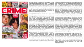
Crime Monthly is a true crime magazine that is known to be
specifically targeted towards women as it looks into
psychological analysis of famous serial killers. The magazine also
as the plug at the bottom states it also includes a “ 16-page
crime TV guide ” which is targeted towards those who do enjoy
watching television. The dominant image is of Fred and Rose
West who were famous for killing 12 young women. The fact
that the main sell-line is that ” Rose was the real monster ”
shows that she is more powerful than her husband which shows
female power as the magazine is targeted towards women. The
dominant image also shows both of them looking very guilty
which represents their crimes and Fred West’s eventual guilt
and suicide. The sub image of Louise Porton who killed her
children, the picture shows her looking confident which shows
her lack of remorse for killing her daughters.
By using the caption “ The escort who murdered her children “
it removes the human and identifiable qualities of her as she
isn’t classed as much of a human anymore because she
murdered two children in cold blood. It makes people want to
pick it up to read about who she is and what her name is and
how and why she murdered her children. The withholding of
information makes it evident that they want people to read on
and pick it up to find out what awful crimes she has committed.
The tagline ‘ the darkest crimes and evil minds’ makes it seem a lot
more important and as if they have actually looked into those evil
mind. It gives the audience a bit of inclusivity that they might enjoy
being part of. The plug that is layered on top of Fred and Rose
West’s picture is in a bright red that stands out, the phrase ‘ world
exclusive’ in capitals makes it more obvious and stand out more. It
also shows that the reader can be involved in the minority of people
who have the knowledge about it which employs the uses and
gratifications theory of personal relationships. This means that
people will read it to be involved in on the discussion about the
world exclusive which a lot of people want to do in order to fit in
they will buy and read the magazine in hope to join the discussion.
The skyline includes two sub-images and sell-lines show pull quotes
of the articles they are from which will most definitely catch the
eyes of readers or those looking at it on a shelf. The quote ‘ black
widow gangster’ was actually what initially drew me in as she was
seen as feared and quite threatening also the fact she ‘ slapped
Myra Hindley in the face’ could be seen that she was quite tough,
slapping a notorious murderer in the face but it also shows that she
is a strong woman which is what the main premise of the magazine
is. The yellow plug in the top left corner about it being a ‘ new true
crime mag’ it shows a bit of an informal tone as ‘mag’ is quite slang
and short for magazine. It will also draw in readers of previous true
crime magazines as the following of such magazines is quite strong
and it has an avid fanbase in the genre.
The bottom banner includes both a sub image and sell line and a
barcode. The subtext talks about the truth behind the Netflix
documentary, it shows exclusivity since Netflix is a subscription
based service which shows documentaries about subjects such as
this it is for a certain audience. With the magazine cover itself being
quite cluttered it may give the impression that it is a children's
magazine but it provides escapism and a change from the average
day for people who can put themselves in the shoes of an
investigative reporter.
2. The purpose of this double page spread is to
provide information regarding the death of
Tupac Shakur’s death, a case that has been
open since 1996 and his murderer still hasn’t
been found to this day. It is an extremely public
case that had a very large press following when
it happened. The article starts with a large
headline that goes along with the color
scheme of the rest of the magazine which
black, white and red. It just demonstrates the
continuous nature of the magazine as all the
colors that they have chosen are to do with the
nature and them of the magazine.
The ’anatomy of a crime scene ‘ suggests
the theme that continues throughout the
magazine about the investigative role
that readers can take on which is Crime
Monthly’s mission in a way. The page
itself uses the main background as the
dominant image of Tupac’s car it layers
red boxes and sub-images on top to
ensure that readers eyes are caught by
the bright colors to read the various
points. The dominant image of Tupac's
car shows various points that relate to
the case that can be quite important to
put readers into shoes of investigators and
the reporters who were looking at the
case. This doesn’t typically look like a
conventional double page spread as there
are no gutter lines. This may interest
people who only typically see the normal
double page spread layout as the
magazine genre isn't that typical either so
it could interest people like e who are
picking up this type of magazine for the
first time. The layout of the magazine as a
whole is pretty interesting and not very
normal which can be strange to those who
are used to normal layout magazines .The
sub-heading provides information about
the case to readers so that they can learn
abut it themselves to not only interest
themselves but since the majority of the
target audience for this are women and
since the most profitable genre for
women is actually mystery and detective a
crime magazine makes perfect sense for
the magazine.
The headline is in a very bold and brightly
colored font it suggests that it wants to
stick out while flicking through people
would instantly be drawn to read this
article. It is bold and in a matter of fact
kind of font as after all it is fully factual
and it gives it the impression of being a
statement.
The sub-image of Tupac in the top left
corner of the second page of the spread
stands out most as goes over both the
dominant image and the outside border of
the page. It gives it the impression of going
outside the border because it is a very
important picture. Showing the victim of the
crime gives the audience a bit of clarification
because if like me, they have heard of him
but never seen what he looks like then it
clears up quite a lot for them. The picture is
also of him holding up his middle finger,
which shows what kind of person he is and
the nature of the magazine as it is for more
mature audiences and not just children.
The sub-heading ‘ shooting of Tupac Shakur ‘
gives not just information but can draw in
attention, majority of people who will be
reading this have heard of the shooting at
the time of it happening in 1996 as the
target audience are women who are above
the age of thirty. This allows them to learn
about the developments and discoveries
found out over twenty-three years ago.
3. For my digital magazine I decided to
analyse STYLE magazine by ‘Weir &
Sons’. This is a digital magazine for the
Dublin Jewellery store by the same
name, it both advertises the latest
jewellery trends but also new and
upcoming designers and trends that
they advertise in store. The magazine is
meant to order for those who are
either interested in jewellery or are
frequent visitors to the store.
The white masthead uses a very
elegant and bold font that contrasts
the dominant image on the front cover
in white. The masthead has a very
simple name that clearly states what
genre the magazine is and clearly
indicates the audience it is meant for
by the dominant image that they
decided to use of a woman sweeping
up caviar off the floor. The woman is
also wearing quite expensive jewellery
seen in the picture which is also
another theme which magazine uses
quite a lot as Weir & Sons is actually a
jewellery company.
The tagline above the t and y in style
shows the brand that the magazine
mainly promotes and belongs to which
is Weir & Sons which, as previously
stated is a high end jewellery shop in
Dublin. It shows the type of audience
they are wishing to appeal to as it is
quite expensive and professional there,
therefore they aim to create the same
atmosphere in their magazine as they
have in-store.
The magazine cover is quite typical for
one of this genre and is quite
conventional too, it has very clear sell-
lines and the main sell-line is “ a life less
ordinary” stays throughout as the
theme of being different and being
individual is kind of what your jewellery
combinations can make you different
makes the magazine quite individual
and different in that sense.
However, it is also different to normal
magazines as there is no barcode, issue
number, price or date on the front
cover but these may be included on the
back on the inside cover.
4. The dominant image of Jillian Bolger, one of
the guests of this edition the magazine
Weir & Sons is placed so that it takes up
both the left page of the two page spread
and half of the right page. It shows how
important she is in the interview and it puts
the jewellery she is wearing front and
centre. The magazine is primarily fashion
but this interview regards the fact that she
is a fourth generation jeweller for the FOPE
brand which specialises in luxury jewellery
which she demonstrates in the picture of
the left. The pose she is in suggests that she
is very luxurious and everything that she
wears costs quite a lot of money. The way
that is she is directly staring at the reader
addresses them personally while also
demonstrating that she is better than them.
Her pose also puts the jewellery she is
wearing front and centre because that is
what her and her family are well known for.
The plush red velvet chairs behind her also
show luxury and elegance putting her above
those reading showing that the magazine
itself is targeted towards people who have
quite a lot of money and are just as glamorous
as her to buy FOPE jewellery.
The headline ‘ La Dolce Vita ‘ means ‘ the
sweet life ‘ coupled with the dominant image
highlights that she is indeed leading a very
good life. Her company is extremely high and
end earns a lot of money which is why she
looks so lavish and can afford to wear such
clothes. Her company also targets jewellery
towards those who are indeed living a very
sweet life as the audience for such expensive
jewellery are highly paid rich people. The font
is also quite lavish and also refers to the fact
she is living quite a good life and the colour
picked, against the white background shows
quite an elegant pairing even though it is
grey-scale it still compliments the picture with
its elegance.
The introduction also gives the readers a bit of
a clue as to who is both in the picture and
who is being interviewed. It introduces us to
Julia Bolger who is the fourth generation
jeweller from FOPE jewellers. This article
discusses its Solo MiaLuce range which brings
its Italian heritage front and centre much like
the picture and the headline is also in Italian
showing constant themes all the way through.
The drop cap at the start of the main text
shows a very glamourous style to the article
as it is the same text size as the headline
which draws attention to the main article so
that readers will stick around the read the rest
and not just look at the picture of
Jillian Bolger. The article itself
doesn’t use conventional neat
gutter lines to show that the
jewellery itself isn’t normal or
following modern trends as there
is ‘nothing average about a piece
of FOPE jewellery.’ The lack of
neat gutter lines also contradict
the normal look of the article as
the rest of it looks very proper
and neat compared to it. So it can
be perceived as quite lazy as a
normal high-end fashion
magazine may have very uniform
and neat gutter lines unlike this.
The folio in the bottom left corner
of the left page and the bottom
right corer of the right page use
contrasting colours to their
backgrounds. As the left one uses
white and the right one uses
black so it stands out from the
back grounds so readers can use
the contents page at the very
beginning to navigate their way to
their preferred article(s) so this
needs to be visible throughout
the magazine otherwise people
would just be flicking and the
contents page would be pretty
useless.
5. In the end after looking at both crime monthly and Weir & Sons STYLE magazine it shows that even though they are both of different genres, they both
stick to some conventional traits of their genres. For example, Weir & Sons STYLE magazine shows a very elegant and refined magazine for a wealthier
audience as it is for those who visit the jewellery store in Dublin in which it hails from. While Crime Monthly has quite a busy set up which is common
to children's magazines not adult true crime, but it shows just how full of information it is which can be extremely useful to show on a front cover.
Crime Monthly uses very bold colour schemes but mostly just red, white and black because those colours can relate back to old film noir.
A noticeable disadvantage for digital is both accessibility and reading them, online a lot of free-to-access digital magazines are either fan-made, not
professional ones or are of cost, even when having to pay for them, having to zoom in on each little bit of text can be extremely tiring and tedious for
readers who may just opt to pick up a print copy instead if it means they save time for the same quality and money. A lot of people also like having a
hard copy in their hands, which you don’t get with digital, though some places provide monthly subscriptions were you can get an unlimited amount of
magazines free other offer monthly subscriptions for certain magazines which cost a lot more than those websites which offer a range of magazines for
a monthly subscription charge. Another disadvantage is that digital may be quite hard to access as you are required to both have internet and internet,
which some people don’t, elderly people like to go out and buy magazines as it gets them out the house which makes it more practical for them.
However it can also be helpful, for those who want to go paperless it is definitely the eco-friendly option and for those with children who may be too
busy to make us a magazine daily, having an online subscription means they can check it while they are out an about or when they have any free time.
A disadvantage for print is that for those who are quite busy and struggle to get out it is pretty much inaccessible for them as it may not be available
online, meaning that if someone does have children and leads quite a busy life they can’t catch up on their favourite magazine or elderly people who
struggle to get out a lot. Also hard copies can get lost and damaged quite easily so having a digital version can benefit those who do have busy lives
with kids who may spill something on a newly bought magazine or when they accidentally leave it on the bus. Another disadvantage is the fact that
print isn’t very eco-friendly and with the rising crisis of de-forestation a lot of people are choosing to move to paperless options too save the
environment. However an advantage would be that it is very easy to access and that only a minority cannot get access to print, it can also be cheaper
for those buying it in the long run as they can choose which ones to buy as they might not want every week like an online subscription would give you.
Technical considerations also need to factor into this for magazine distribution as print will cost a lot more than updating a website weekly and both
the cost of the materials, machines and the staff to operate and distribute the magazines will be a lot more than digital as the materials, machines and
those distributing it will not need to be employed, just a group of people who staff the website and keep the servers running smoothly. Colours and
paper sizes will also need to be considered as it can take up a lot more ink for certain fonts or font colours on A4 or even A5 depending on what it is
printed on as it may look different once transferred from print to digital.