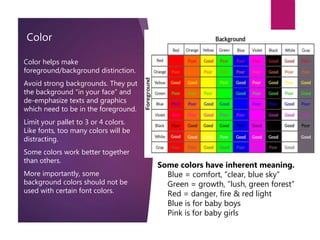
2. Things to Consider
Your audience
Age level
Grade level
Reading level
Ethnicity
The equipment
What equipment do you have for:
Creating
Displaying
Transporting
What will the cost be?
What is your skill level?
How much time do you have?
3. Organization
Make detailed outline before you turn the computer on.
Refine each section and subsection according to a consistent
pattern.
Order the information:
Chronologically
By development
According to topics
From general to specific
From problem to solution
4. Story Board
What is?
The purpose of the story board is to
allow to collect your ideas, order the
material, and make revision before
investing time and effort in the
mechanics of creating the project.
It is much easier to make changes in
sketches than after several pages
have been created in the application.
How to
Begin with an outline.
“Lay-out” the macro order of the
information – sections, headings,
etc.
Put the pages in sequence. (Index
cards are very useful here.)
“Sketch” each page/slide/screen
indicating text, graphics, colors,
and/or sounds.
Note any transitions and
animations.
Make off-page notes where
helpful.
Review and revise (ad nausem)
5. Design
The appearance of information, text or graphics, affects the way we perceive it.
It impacts the content.
Clean – Keep it uncluttered. Too much information in a space is confusing. The
hierarchy should be easily seen. More important material should be at the top
and/or the left.
Consistent – The mind orders information based, in part, on the perceptual
environment. Constantly changing environments require constant mental
adjustment. This can interfere with the content.
Tip: To see the consistency of the entire presentation, view it in the Slide Sorter View
Contrast – Can be accomplished with text, color, shape proximity, size, location, or
with any combination.
Variety within a consistent environment draws attention.
It emphasizes
Gives weight
Creates interest in specific items.
6. Alignments
Horizontal
Don’t mix alignments
Center = balance
Left & Right = movement
Text has a baseline which is the
line that text and graphics sit
on.
Vertical
We read from top down.
Therefore the top is the most
important position.
Top
Middle
Bottom
7. Proximity
Proximity ties the various components
together.
”White space” is the unused areas of a
page or screen. Graphic designers
realized long ago that is important for
clarity and appeal. Don’t crowed your
materials. Leave plenty of open space.
Too close = cluttered,
confusing.
Too far = weak, confusing.
8. Typography
Tips:
Use only 2 (3 at the very most) fonts
in any document.
Let size and style (bold, italic,
underline) create contrast.
Avoid the use of all caps. All
capitalized texts have no variety in
shape. Therefore, they are more
difficult to read.
Avoid all bold. Constant emphasis is
no emphasis. Connect the style to
the meaning of the text.
{Fonts}
Serif fonts – A Serif is a
terminating mark at the end of a
letter stroke.
Sans-Serif fonts – Fonts without
terminating marks.
Studies indicate serif fonts work
best for the printed page and
sans-serif are best for computer
monitors and projectors.
9. Color
Color helps make
foreground/background distinction.
Avoid strong backgrounds. They put
the background “in your face” and
de-emphasize texts and graphics
which need to be in the foreground.
Limit your pallet to 3 or 4 colors.
Like fonts, too many colors will be
distracting.
Some colors work better together
than others.
More importantly, some
background colors should not be
used with certain font colors.
Some colors have inherent meaning.
• Blue = comfort, “clear, blue sky”
• Green = growth, “lush, green forest”
• Red = danger, fire & red light
• Blue is for baby boys
• Pink is for baby girls
10. Form and content
The balance between form and content is an age-old issue in art and in
communication.
Content is the material to be learned. Content must have some form, but there
needs to be a a balance that allows the form to focus attention on the content.
Form is the way in which that material is presented. Form should enable the
content but not detract from it. Form can engage learners but it must not
distract them from the content.
Objects – too many graphics can be confusing.
They are inherently more attractive than text.
Movement is even stronger.
Balance objects on the page.
Objects require much more computer memory than text.
13. Finally It’s not about you!
Its about the content!
Your students do not need to
know what your fsvorite color is,
or your fsvorite sport, animal, or
flower. Nor is it important what
you think is pretty, cute or “cool.”
What your students need is a
learning experience that is clean,
clear and consistent.
KEEP
IT
SIMPLE
STUPID/SWEETI
E
THE END