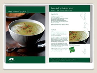
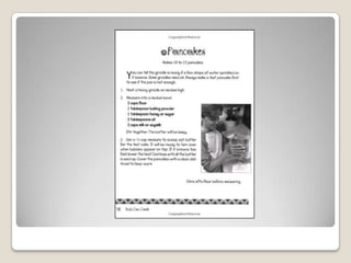
Vegetarian Recipe
            Cards
              Abbey
 A vegetarian is a person who does not eat anything of which an
  animal would have been killed for and so do not eat meat – beef
  and chicken for example and also they do not eat fish.
 A veganis someone who will not eat anything that has come from
  an animal – they will not eat meat or fish. They also will not eat
  things such as; eggs or drink milk, instead they would
  eatthingssuch as; fruit, vegetables and pasta.
 The companies that produce recipes for vegetarians and vegans
  are; Quorn, Redwood and the Vegetarian society.


Vegetarian
   This leak and ginger soup would be very suitable for both vegetarians
    and vegans. I think this soup would be appealing to adults and young
    adults, for children I'm not so sure, as the taste may not be
    appealing to some of them.
   The layout of the recipe card is quite standard but formal and simple
    to read at the same time – you have your photograph of which is a
    reasonable size and it also has a clear view of the soup on one side of
    the page, of which the image has been taken at a good angle as you
    can see the bowl and top of the soup rather than just straight
    downwards. Then you have the recipe on the other side of the
    page, the recipe is set out very clearly so it is easy to follow the
    instructions, the ingredients is at the top and the method at the
    bottom. However the only downside to the layout is that whilst the
    font is ok and easy to read, the green colored font maybe difficult to
    read as it is quite a pale green. The colours of the recipe card are all
    the same, a mixture of green and white, so the recipe card doesn’t
    really stand out.
   This recipe card looks like it has a clear Christmas theme to it, for
    the colours they are using a pale colour scheme and so it
    matches the theme and so again like the previous one it doesn’t
    stand it too well and catches the eye, it is a very boring colour
    choice. Again the layout is very similar to the previous one with a
    photograph of the food on one side and the recipe on the other
    side. The photograph is very clear and the food has been
    positioned well well it was taken, as you can see the whole of it
    not just the top. As for the recipe, the method and the
    ingredients are separated out so they are easy to see, as for the
    writing there looks to be quite a bit of it, which makes it look
    more complicated then it needs to be but it is set out well so it
    would be easy to follow.
   This looks like a classic recipe book layout style. It look like a
    recipe for adults as it is not simple enough for children, it is all
    words and not set out in picture form like some children's recipe
    books. The layout is the same as a normal recipe with the method
    on one side and the photograph on the other, I personally think
    that this layout is very popular as you have the writing for the
    recipe set out clearly on one side of the page and you have an
    image to compare your finished product to. There looks to be
    quite a bit of writing on the page, making it look more
    complicated then it needs to be however it is spaced out well with
    ingredients in a corner and then the method taking up the rest of
    the page. They are using a standard font and colour which makes
    it easy to read. The photograph from my perspective is very dull
    and quite dark, it could have done with more lighting in the
    image, but as for the layout, it is done quite well you can see how
    it looks, but it looks a very basic image which could have been
    taken by the person themselves.
 This looks like another classic recipe book recipe. I think this
  would mainly be for adults as like I said before it would be to
  complex for children, as mostly they have picture format recipe
  books.
 The layout is very clear and everything is spaced out well, the
  recipe side looks well laid out in just a standard black and white
  form, the writing and the font colour is in a formal and easy to
  read font, the size at of the font is also good as it is clear. At the
  other side of the double page is the image of the food, it is a
  good image – it shows you what you need to see but is not
  anything fancy, the person themselves could have taken it, but
  the lighting is set up well. I think the layout of the recipe pages
  could be better, for example they could have had the pages a bit
  brighter or taken the image from an interesting angle to make
  the pages more eye catching.
 This recipe looks like something from a website. I think this
  recipe would be more for adults – again, as it looks a bit complex
  to actually make for children.
 The layout of this recipe is bizarre, it has an image at one side
  showing the soup and then a small clump of writing for the
  recipe. The image looks a little tacky as the colours are all very
  pale in the image and then you have this bright red in the middle
  of the image, compared to other kinds of food images I have just
  looked at, they all look professionally done compared to this one
  of which doesn’t look ‘real’. The text in this image is all clumped
  together, it lists all the ingredients you need to use at the
  bottom, where as other recipes have them at the top, then you
  have your method, but that is not in stages it is just a paragraph.
  The size of the font is ok and easy to read, however there is just
  to much going on, you have a bold bright blue title which is
  underlined and in italics, and then there is the method in a plain
  black standard font which is the only good thing, and then the
  ingredients in a a difficult to read pale blue in a completely
  different font.
   This recipe looks like it is from a children’s cookery book. You can
    tell that this recipe is for children just by the way it is set
    out, mostly with pictures instead of a lot of words so it is easier
    for the children to understand.
   All of the images and text on the page look quite cramped up
    together which is quite confusing, they could have spaced it all
    out into two pages so then it would be more spaced out for the
    children to read. The text is in a standard clear font in a formal
    colour so it is clear to read. The images in the method look
    illustrated – and therefore look good however they could have
    done with brighter colours being used as the whole page is
    consisting of the same pale colours. The image of the salad looks
    ok, but strange next to illustrations, to make it look better they
    could have taken images for the method instead of illustrations.
 This recipe again looks like it is from a children's recipe
  book, from the way that it is set out with images explaining the
  method. But it does look like it could be from an adult recipe
  book as well.
 The layout of the page is good as it is all nicely spaced out and
  not clumped together, which makes it easy for people to
  understand and so they can quickly read it, it also has an image
  in the corner and the ingredients in the other corner leaving room
  for the method below. The text is clear and in a formal
  font, colour and size making it easy to read. The images are all
  very clear – the images for the method look illustrated and the
  main image for the end result looks like it is an image that was
  taken but has an illustrated effect. All of the page has the same
  colour scheme of which is quite pale and it is all of the same kind
  of colour through out.
   This is from a children’s recipe book you can tell as the
    instructions are quite simple.
   The layout of the recipe page is quite plain – it is all black and
    white which is not very appealing to children, so they could have
    included colour on the page which would have made it more fun
    and eye catching to the children rather than just making the page
    balck and white. The text, size and colour are all quite formal and
    easy to read for a child. The image on the recipe page is just of a
    child cooking – not of a finished product of which the recipe is
    telling you how to make, they should have included an image of
    some pancakes to tell you how it was going to look like.The
    actual way how the text is set out is quite bizarre as you have a
    small explanation then an instruction and then your ingredients
    and then another instruction. To improve this they should have
    written down the instructions of the ingredients first and then the
    method to make it simpler for the child, and then also it would
    have been set out correctly in an original recipe layout.

Vegetarian recipe cards

  • 1.
    Vegetarian Recipe Cards Abbey
  • 2.
     A vegetarianis a person who does not eat anything of which an animal would have been killed for and so do not eat meat – beef and chicken for example and also they do not eat fish.  A veganis someone who will not eat anything that has come from an animal – they will not eat meat or fish. They also will not eat things such as; eggs or drink milk, instead they would eatthingssuch as; fruit, vegetables and pasta.  The companies that produce recipes for vegetarians and vegans are; Quorn, Redwood and the Vegetarian society. Vegetarian
  • 4.
    This leak and ginger soup would be very suitable for both vegetarians and vegans. I think this soup would be appealing to adults and young adults, for children I'm not so sure, as the taste may not be appealing to some of them.  The layout of the recipe card is quite standard but formal and simple to read at the same time – you have your photograph of which is a reasonable size and it also has a clear view of the soup on one side of the page, of which the image has been taken at a good angle as you can see the bowl and top of the soup rather than just straight downwards. Then you have the recipe on the other side of the page, the recipe is set out very clearly so it is easy to follow the instructions, the ingredients is at the top and the method at the bottom. However the only downside to the layout is that whilst the font is ok and easy to read, the green colored font maybe difficult to read as it is quite a pale green. The colours of the recipe card are all the same, a mixture of green and white, so the recipe card doesn’t really stand out.
  • 6.
    This recipe card looks like it has a clear Christmas theme to it, for the colours they are using a pale colour scheme and so it matches the theme and so again like the previous one it doesn’t stand it too well and catches the eye, it is a very boring colour choice. Again the layout is very similar to the previous one with a photograph of the food on one side and the recipe on the other side. The photograph is very clear and the food has been positioned well well it was taken, as you can see the whole of it not just the top. As for the recipe, the method and the ingredients are separated out so they are easy to see, as for the writing there looks to be quite a bit of it, which makes it look more complicated then it needs to be but it is set out well so it would be easy to follow.
  • 8.
    This looks like a classic recipe book layout style. It look like a recipe for adults as it is not simple enough for children, it is all words and not set out in picture form like some children's recipe books. The layout is the same as a normal recipe with the method on one side and the photograph on the other, I personally think that this layout is very popular as you have the writing for the recipe set out clearly on one side of the page and you have an image to compare your finished product to. There looks to be quite a bit of writing on the page, making it look more complicated then it needs to be however it is spaced out well with ingredients in a corner and then the method taking up the rest of the page. They are using a standard font and colour which makes it easy to read. The photograph from my perspective is very dull and quite dark, it could have done with more lighting in the image, but as for the layout, it is done quite well you can see how it looks, but it looks a very basic image which could have been taken by the person themselves.
  • 10.
     This lookslike another classic recipe book recipe. I think this would mainly be for adults as like I said before it would be to complex for children, as mostly they have picture format recipe books.  The layout is very clear and everything is spaced out well, the recipe side looks well laid out in just a standard black and white form, the writing and the font colour is in a formal and easy to read font, the size at of the font is also good as it is clear. At the other side of the double page is the image of the food, it is a good image – it shows you what you need to see but is not anything fancy, the person themselves could have taken it, but the lighting is set up well. I think the layout of the recipe pages could be better, for example they could have had the pages a bit brighter or taken the image from an interesting angle to make the pages more eye catching.
  • 12.
     This recipelooks like something from a website. I think this recipe would be more for adults – again, as it looks a bit complex to actually make for children.  The layout of this recipe is bizarre, it has an image at one side showing the soup and then a small clump of writing for the recipe. The image looks a little tacky as the colours are all very pale in the image and then you have this bright red in the middle of the image, compared to other kinds of food images I have just looked at, they all look professionally done compared to this one of which doesn’t look ‘real’. The text in this image is all clumped together, it lists all the ingredients you need to use at the bottom, where as other recipes have them at the top, then you have your method, but that is not in stages it is just a paragraph. The size of the font is ok and easy to read, however there is just to much going on, you have a bold bright blue title which is underlined and in italics, and then there is the method in a plain black standard font which is the only good thing, and then the ingredients in a a difficult to read pale blue in a completely different font.
  • 14.
    This recipe looks like it is from a children’s cookery book. You can tell that this recipe is for children just by the way it is set out, mostly with pictures instead of a lot of words so it is easier for the children to understand.  All of the images and text on the page look quite cramped up together which is quite confusing, they could have spaced it all out into two pages so then it would be more spaced out for the children to read. The text is in a standard clear font in a formal colour so it is clear to read. The images in the method look illustrated – and therefore look good however they could have done with brighter colours being used as the whole page is consisting of the same pale colours. The image of the salad looks ok, but strange next to illustrations, to make it look better they could have taken images for the method instead of illustrations.
  • 16.
     This recipeagain looks like it is from a children's recipe book, from the way that it is set out with images explaining the method. But it does look like it could be from an adult recipe book as well.  The layout of the page is good as it is all nicely spaced out and not clumped together, which makes it easy for people to understand and so they can quickly read it, it also has an image in the corner and the ingredients in the other corner leaving room for the method below. The text is clear and in a formal font, colour and size making it easy to read. The images are all very clear – the images for the method look illustrated and the main image for the end result looks like it is an image that was taken but has an illustrated effect. All of the page has the same colour scheme of which is quite pale and it is all of the same kind of colour through out.
  • 18.
    This is from a children’s recipe book you can tell as the instructions are quite simple.  The layout of the recipe page is quite plain – it is all black and white which is not very appealing to children, so they could have included colour on the page which would have made it more fun and eye catching to the children rather than just making the page balck and white. The text, size and colour are all quite formal and easy to read for a child. The image on the recipe page is just of a child cooking – not of a finished product of which the recipe is telling you how to make, they should have included an image of some pancakes to tell you how it was going to look like.The actual way how the text is set out is quite bizarre as you have a small explanation then an instruction and then your ingredients and then another instruction. To improve this they should have written down the instructions of the ingredients first and then the method to make it simpler for the child, and then also it would have been set out correctly in an original recipe layout.