Download as PDF, PPTX
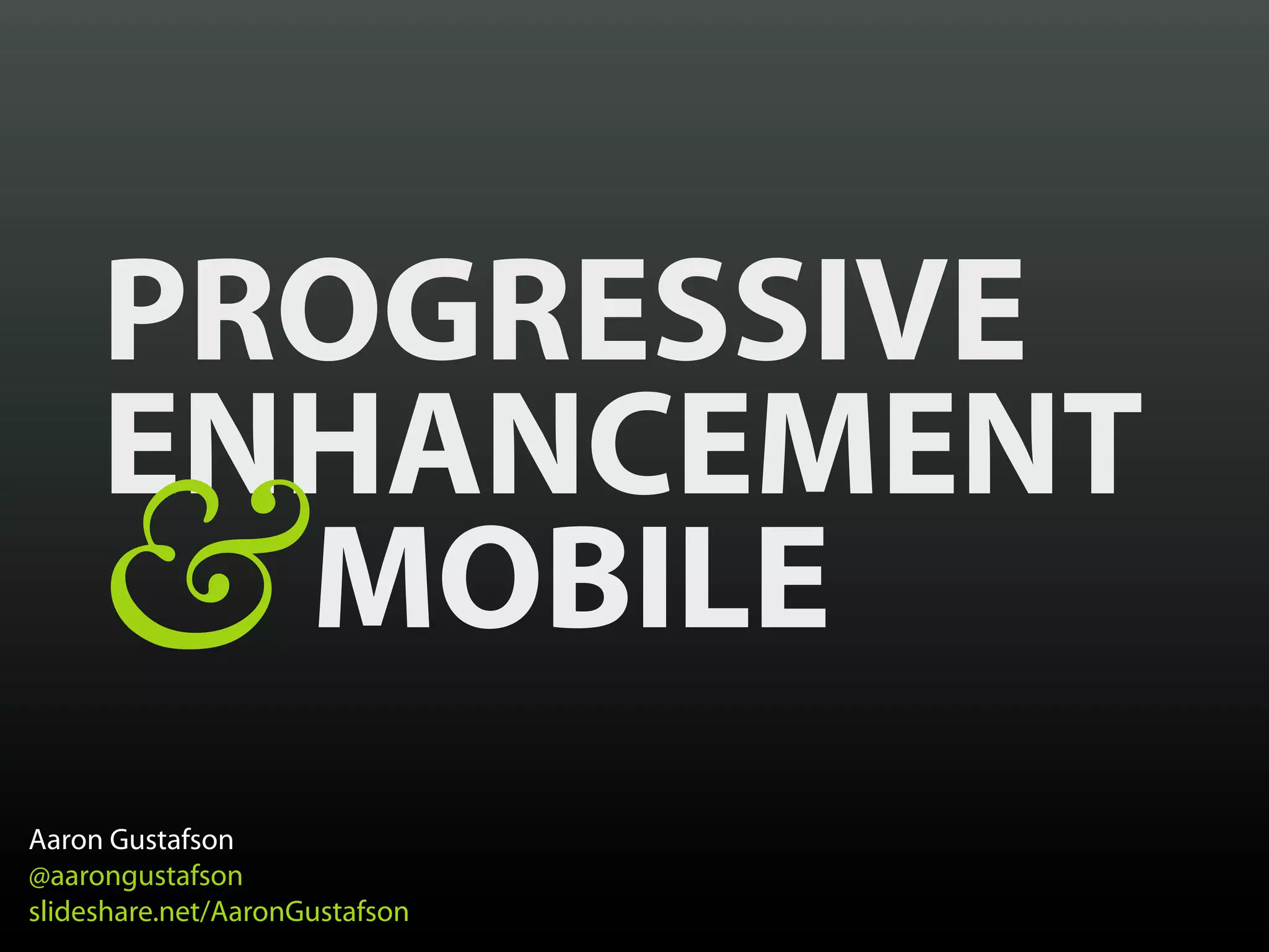


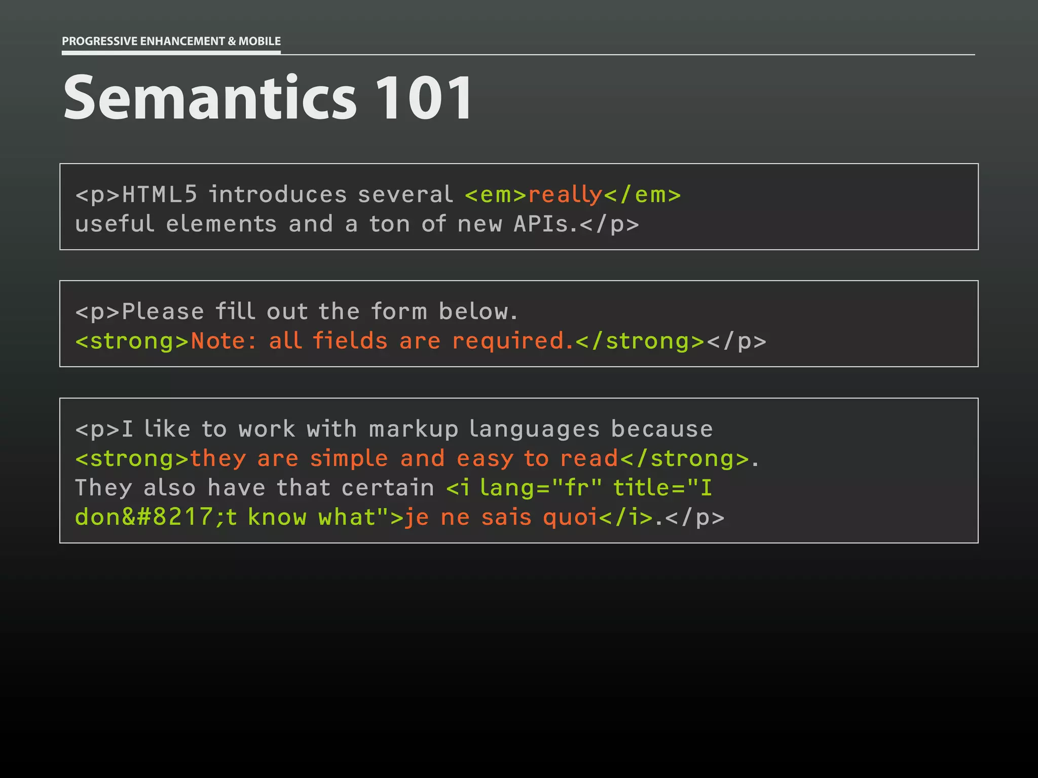
![PROGRESSIVE ENHANCEMENT & MOBILE
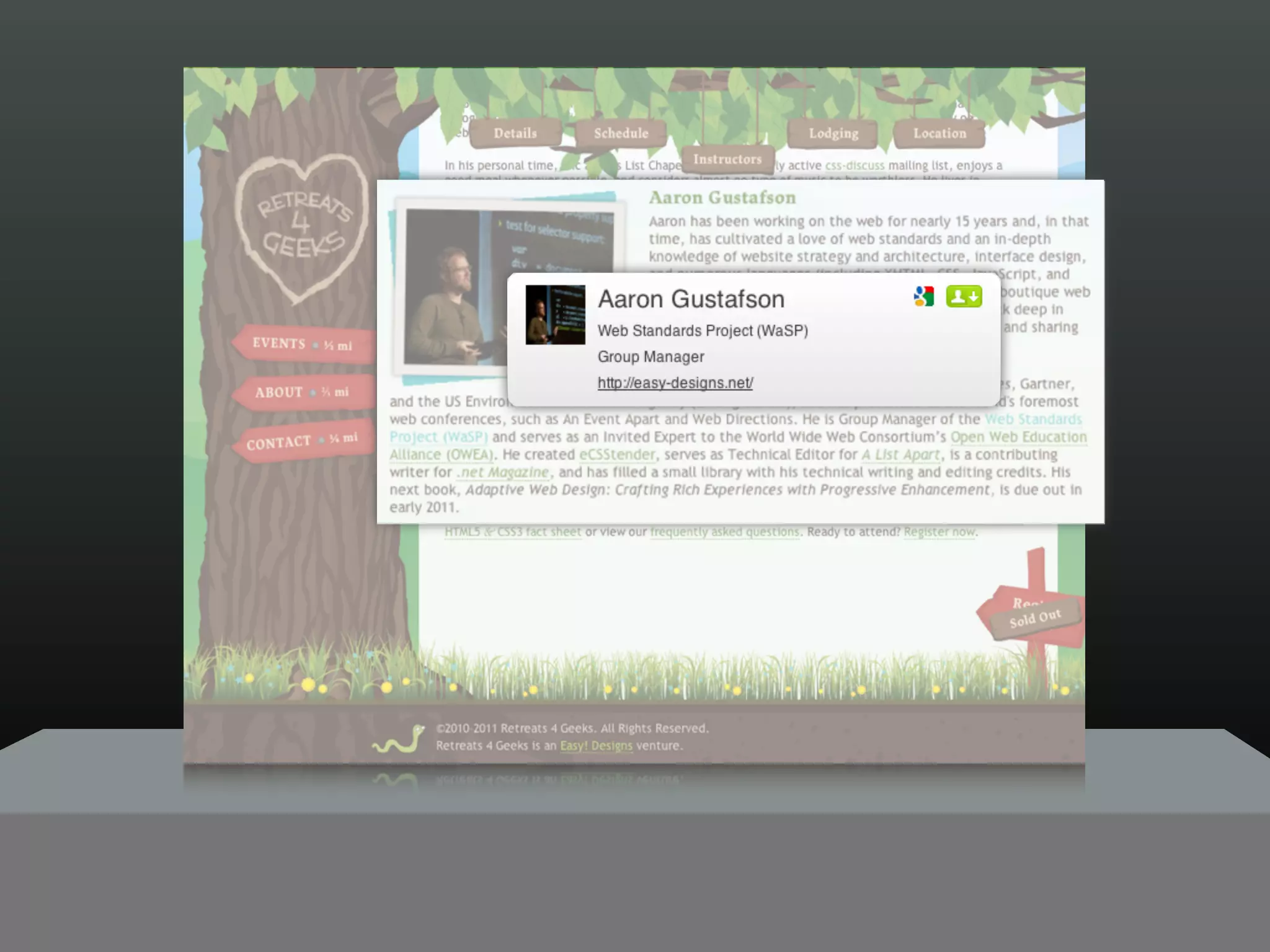
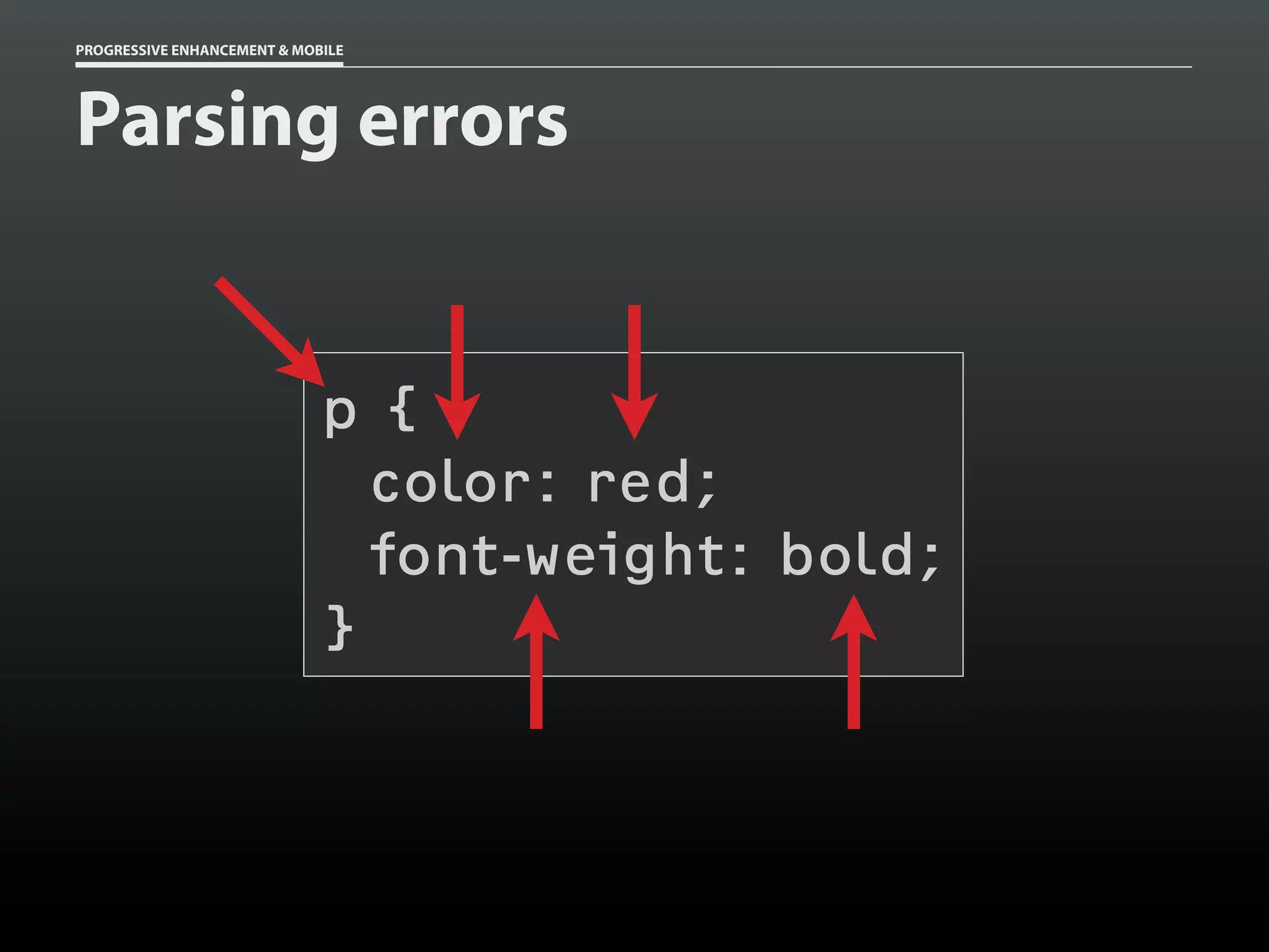
Parsing errors
html[lang] p {
color: #ccc;
color: rgba( 0, 0, 0, .5 );
}](https://image.slidesharecdn.com/progressiveenhancementmobile-121029180440-phpapp02/75/Progressive-Enhancement-Mobile-HOW-Interactive-2012-107-2048.jpg)
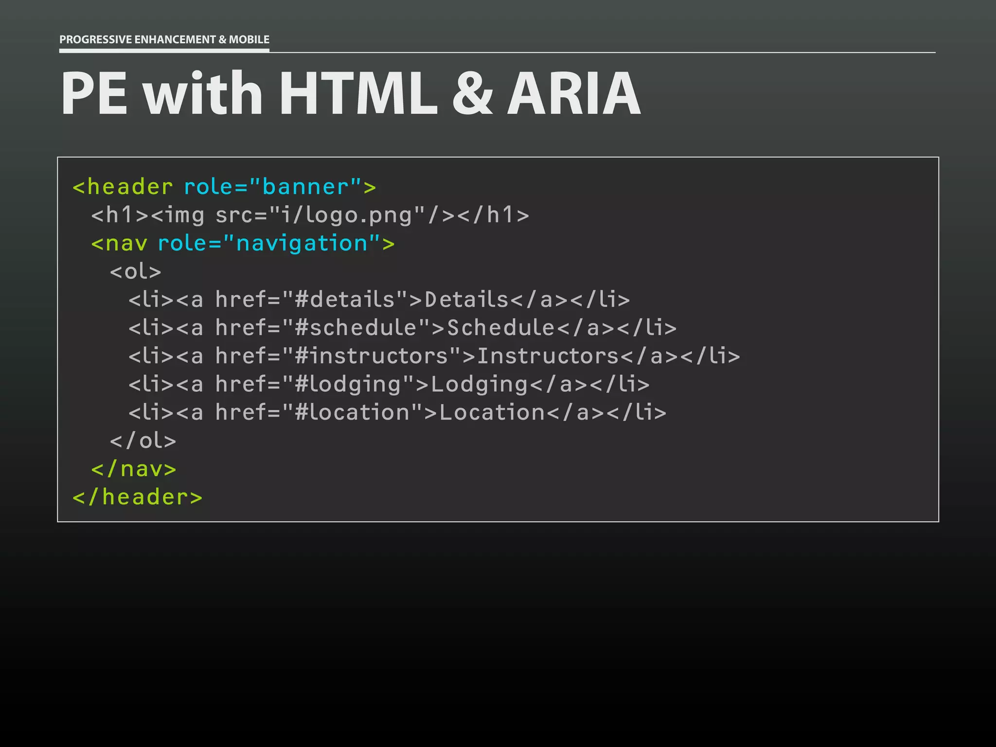
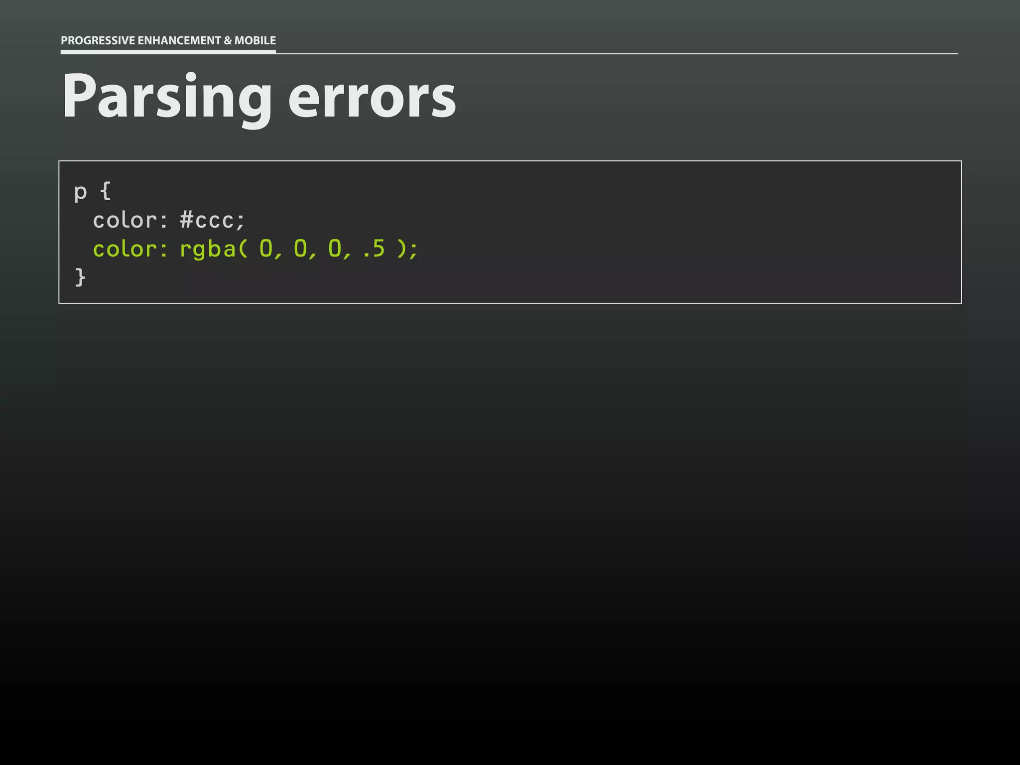
![PROGRESSIVE ENHANCEMENT & MOBILE
Parsing errors
@-moz-document url-prefix() {
html[lang] p {
color: #ccc;
color: rgba( 0, 0, 0, .5 );
}
}](https://image.slidesharecdn.com/progressiveenhancementmobile-121029180440-phpapp02/75/Progressive-Enhancement-Mobile-HOW-Interactive-2012-108-2048.jpg)
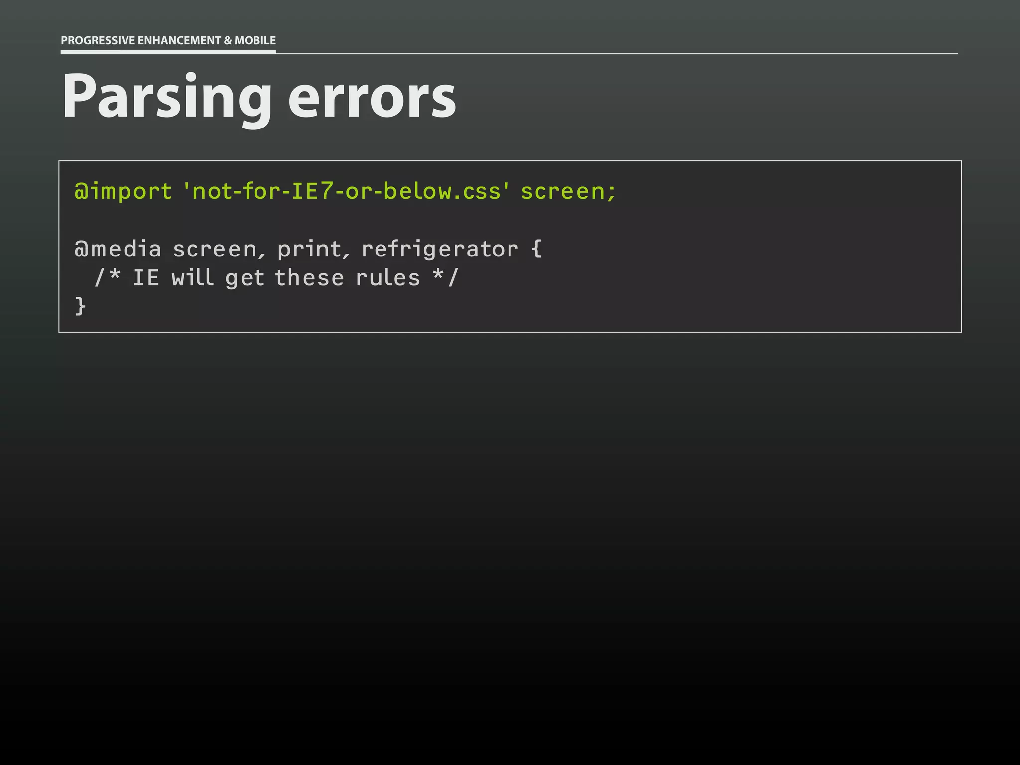
![#intro {
/* Basic Layout */
}
/* ... */
body[id=css-zen-garden] #intro {
/* Advanced Layout */
}](https://image.slidesharecdn.com/progressiveenhancementmobile-121029180440-phpapp02/75/Progressive-Enhancement-Mobile-HOW-Interactive-2012-109-2048.jpg)
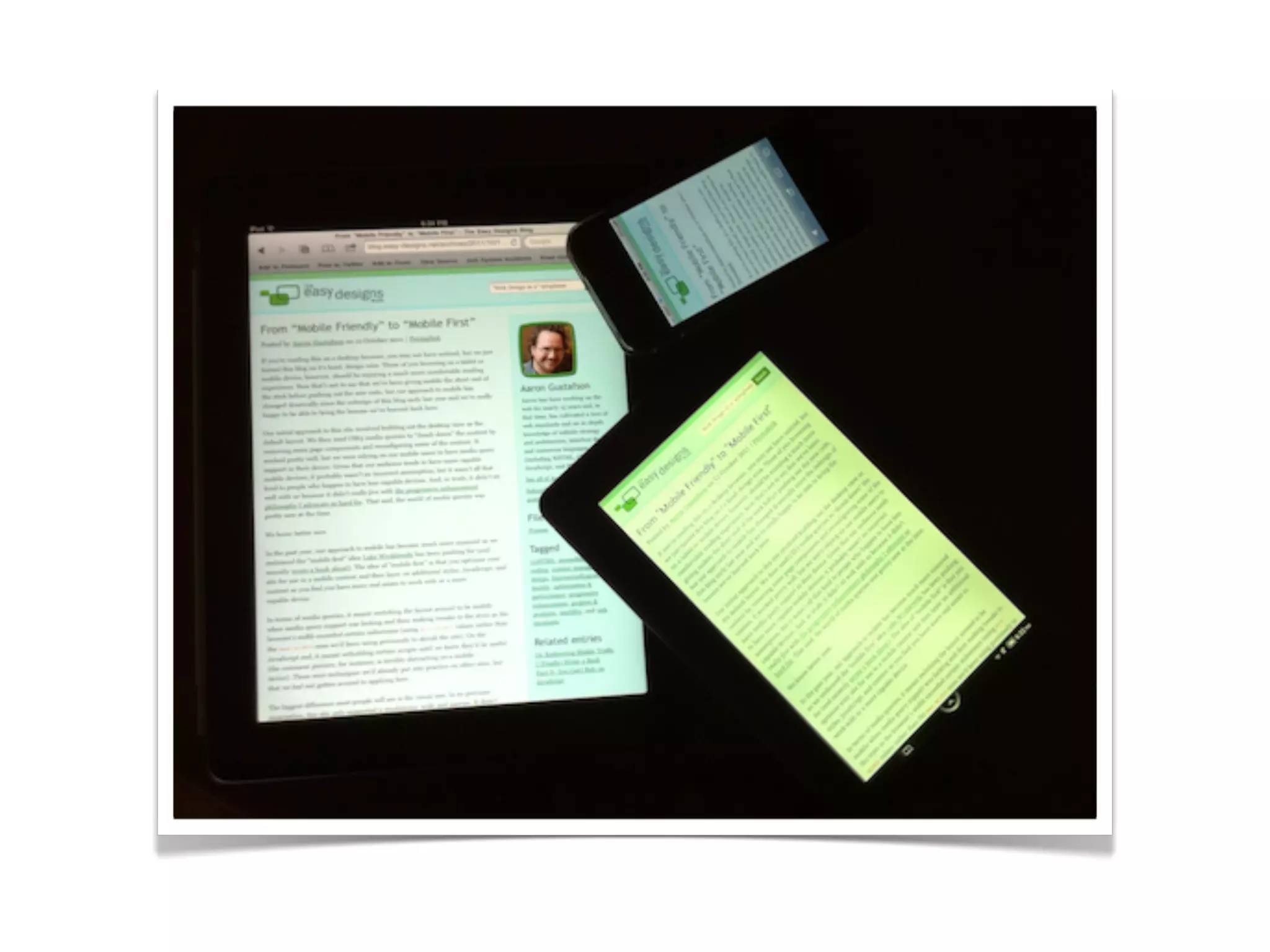
![#intro {
/* Basic Layout */
}
/* ... */
[foo], #intro {
/* Advanced Layout */
}](https://image.slidesharecdn.com/progressiveenhancementmobile-121029180440-phpapp02/75/Progressive-Enhancement-Mobile-HOW-Interactive-2012-110-2048.jpg)
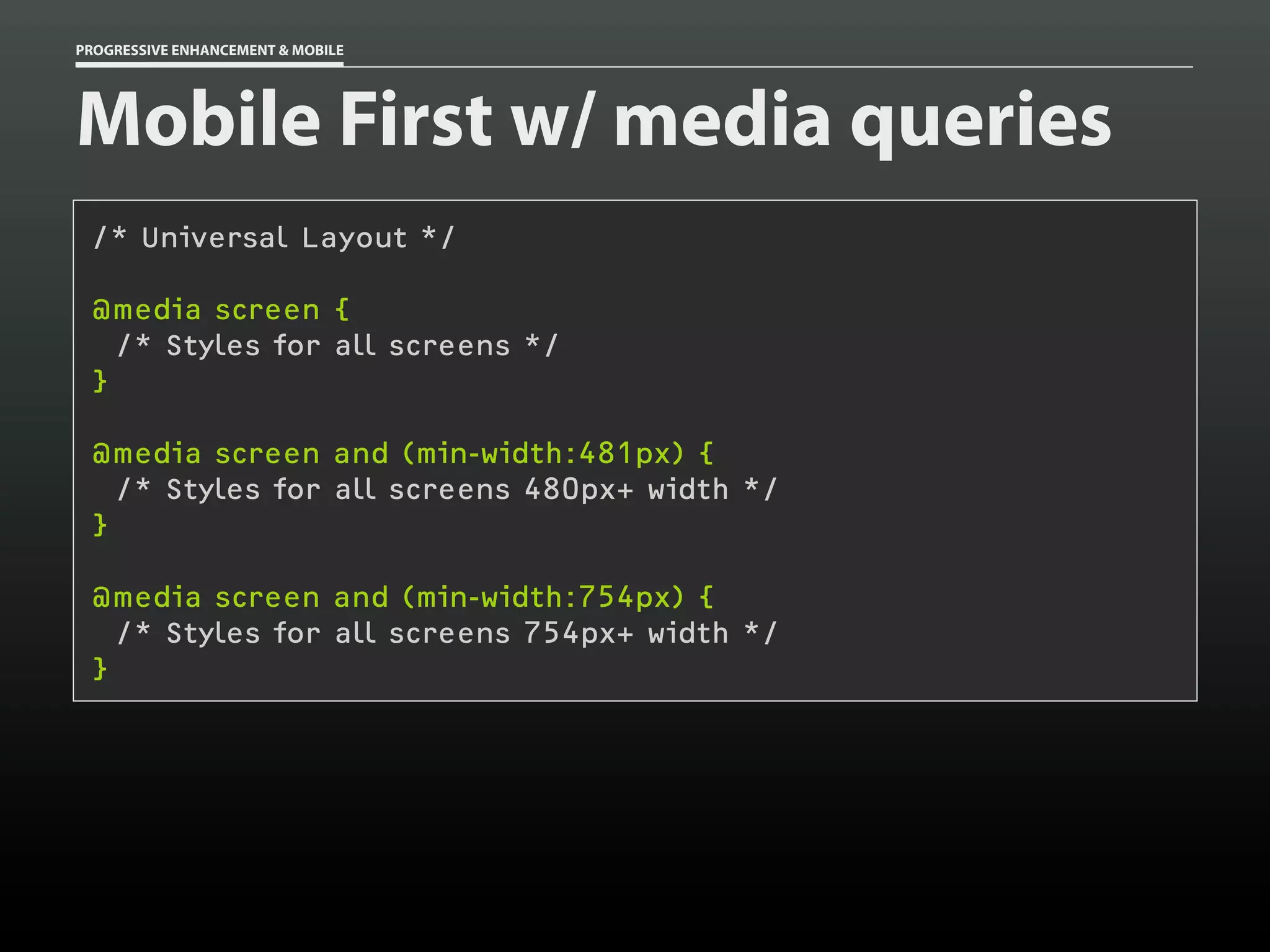
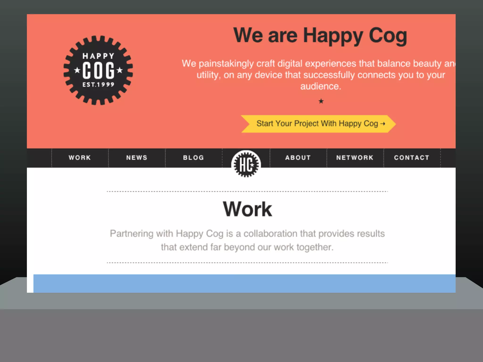
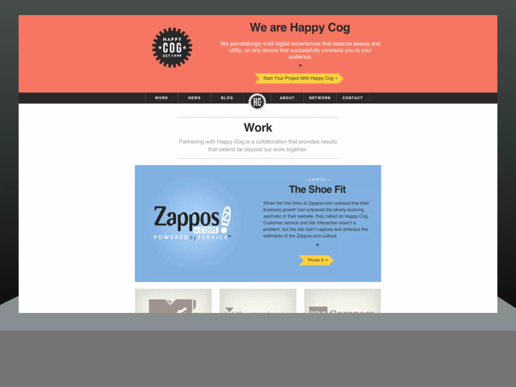
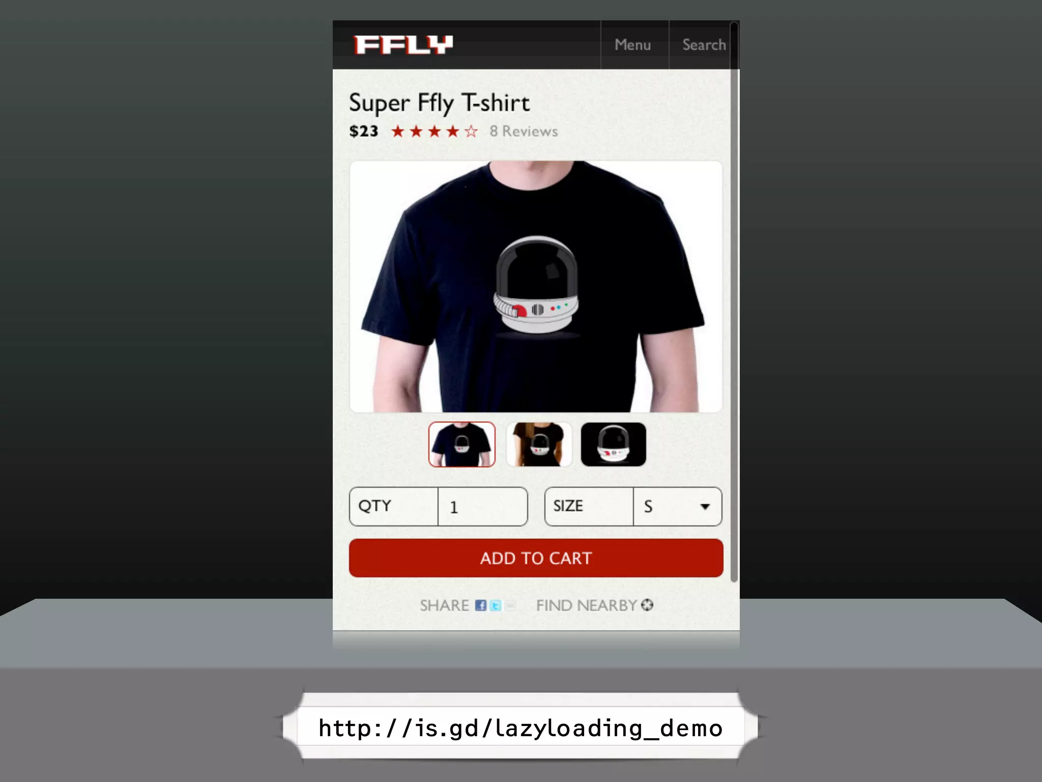


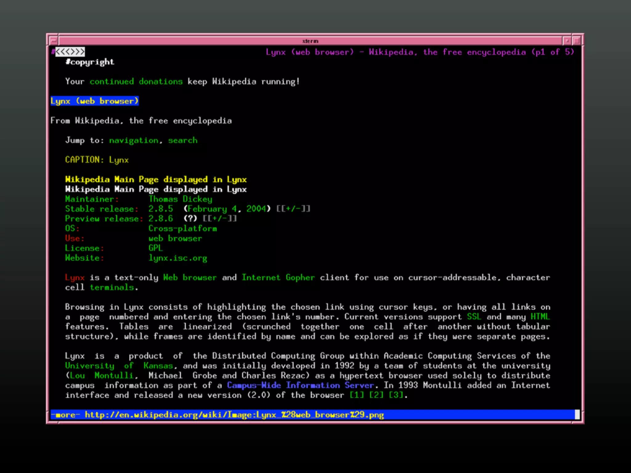
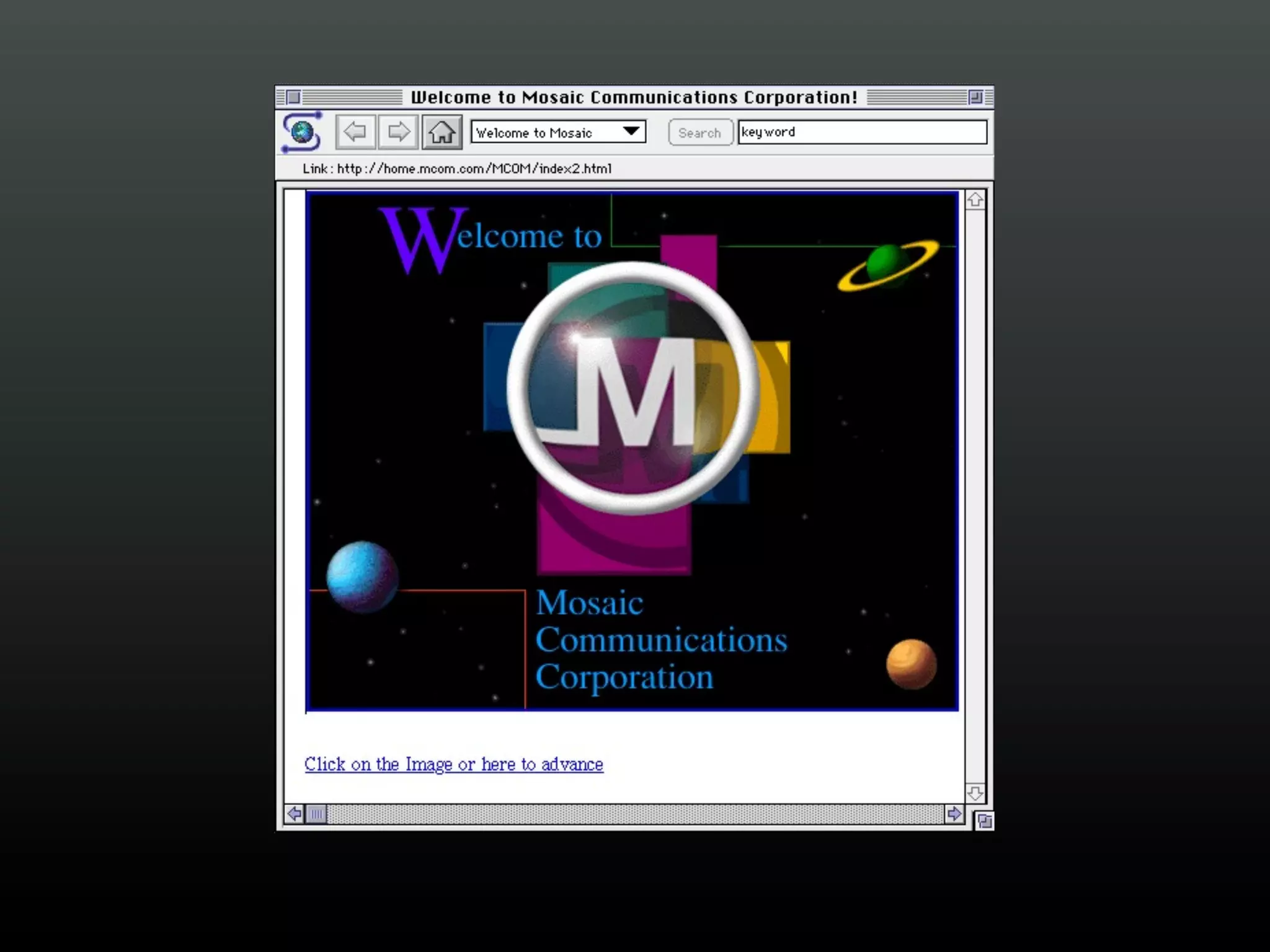
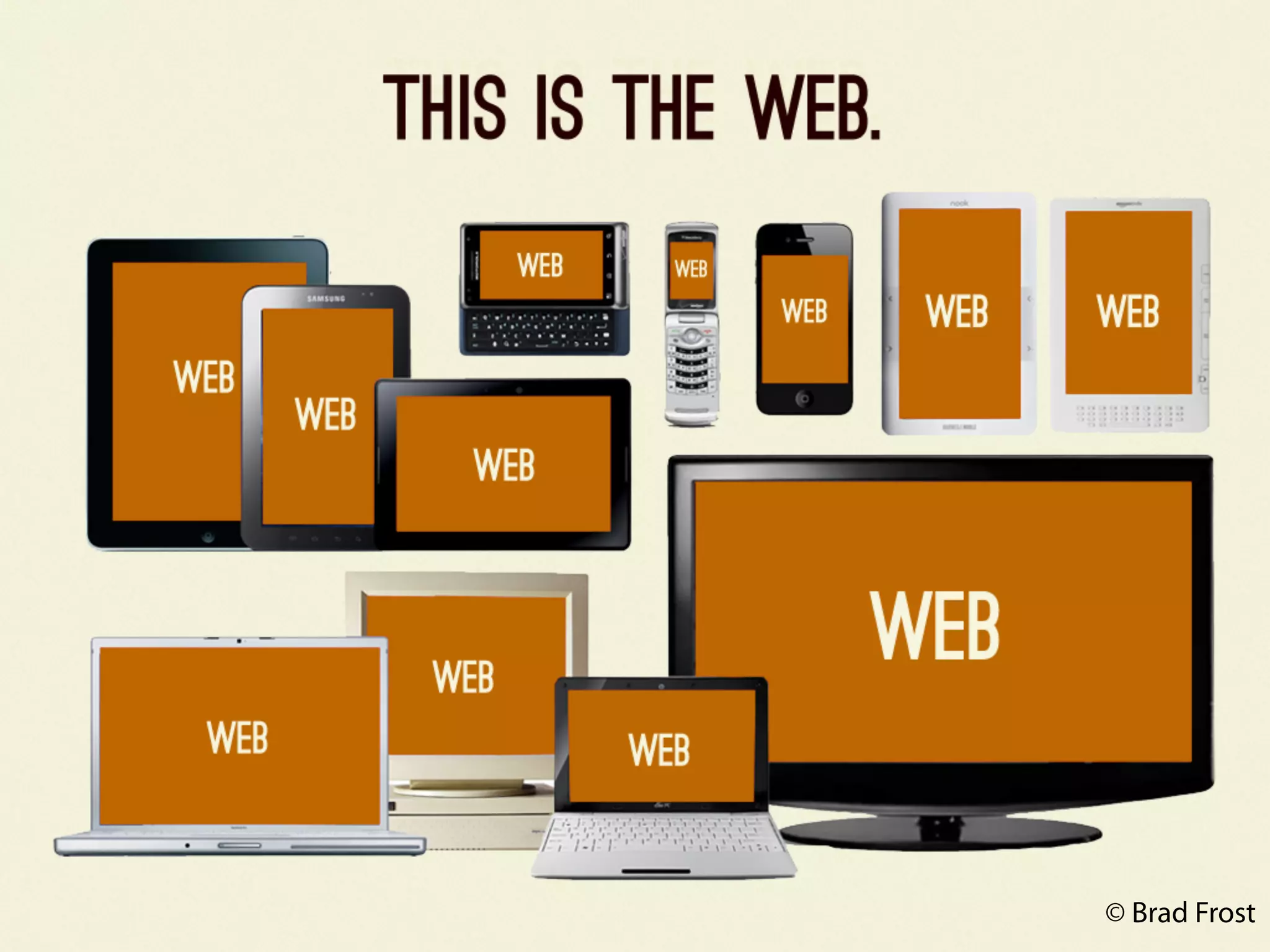
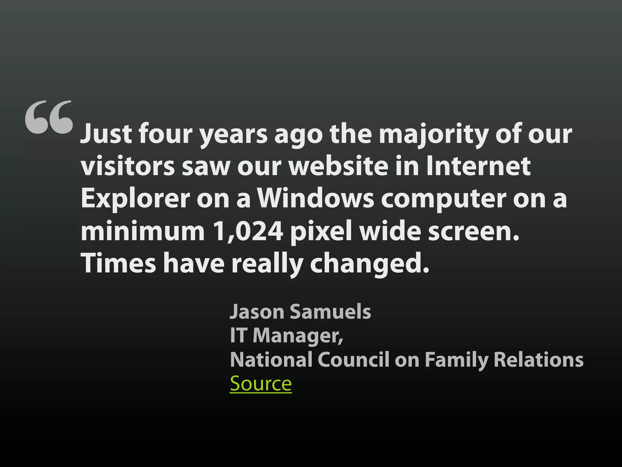
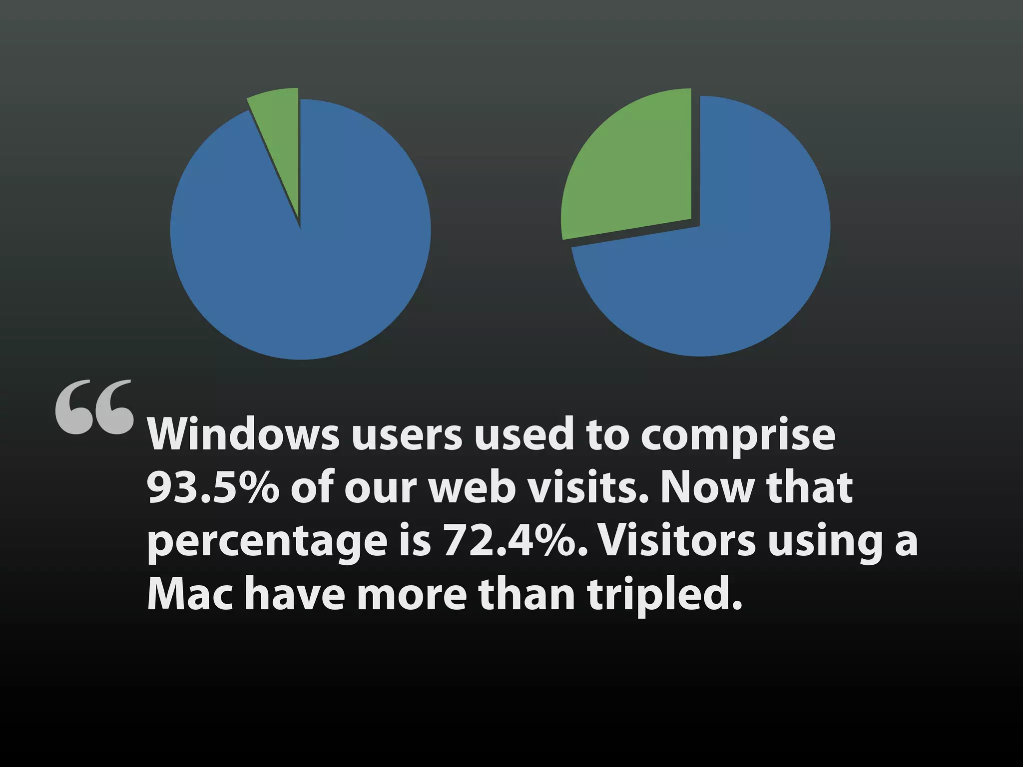
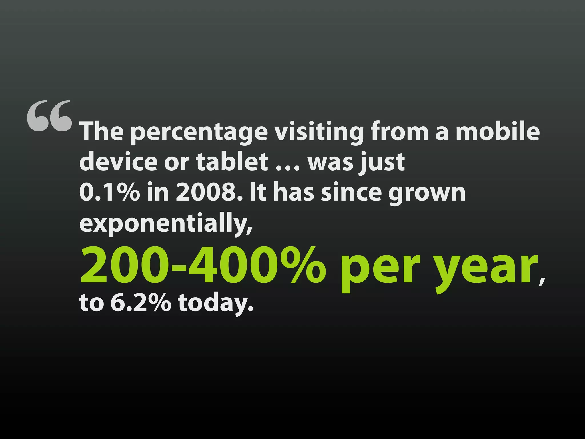
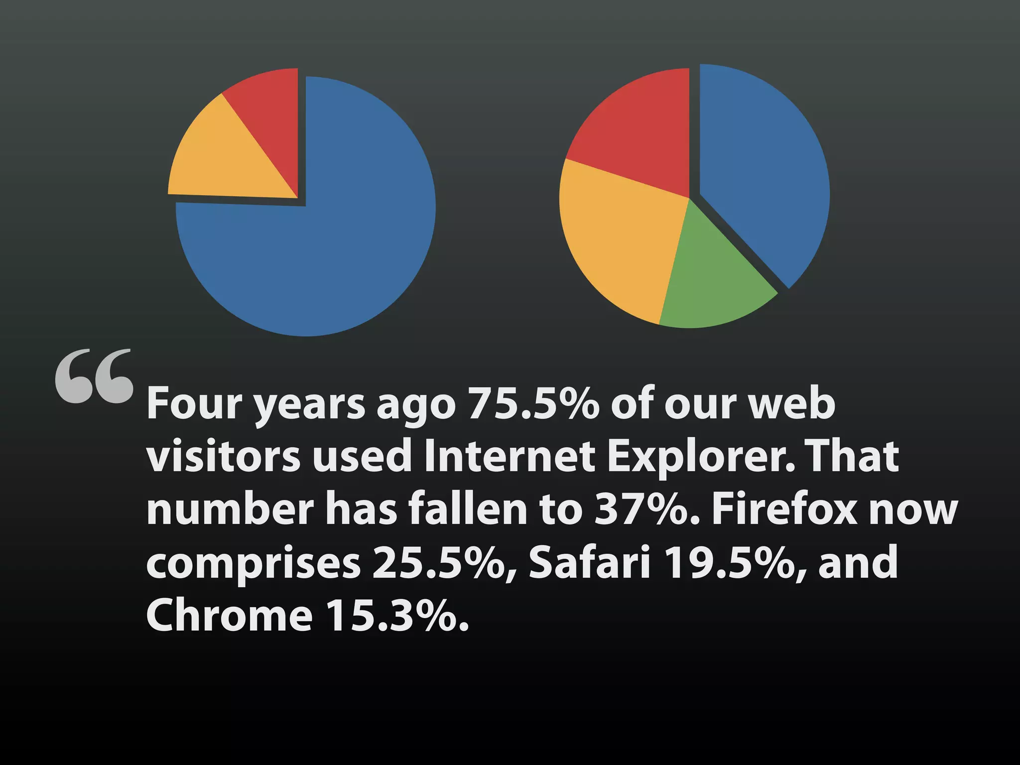
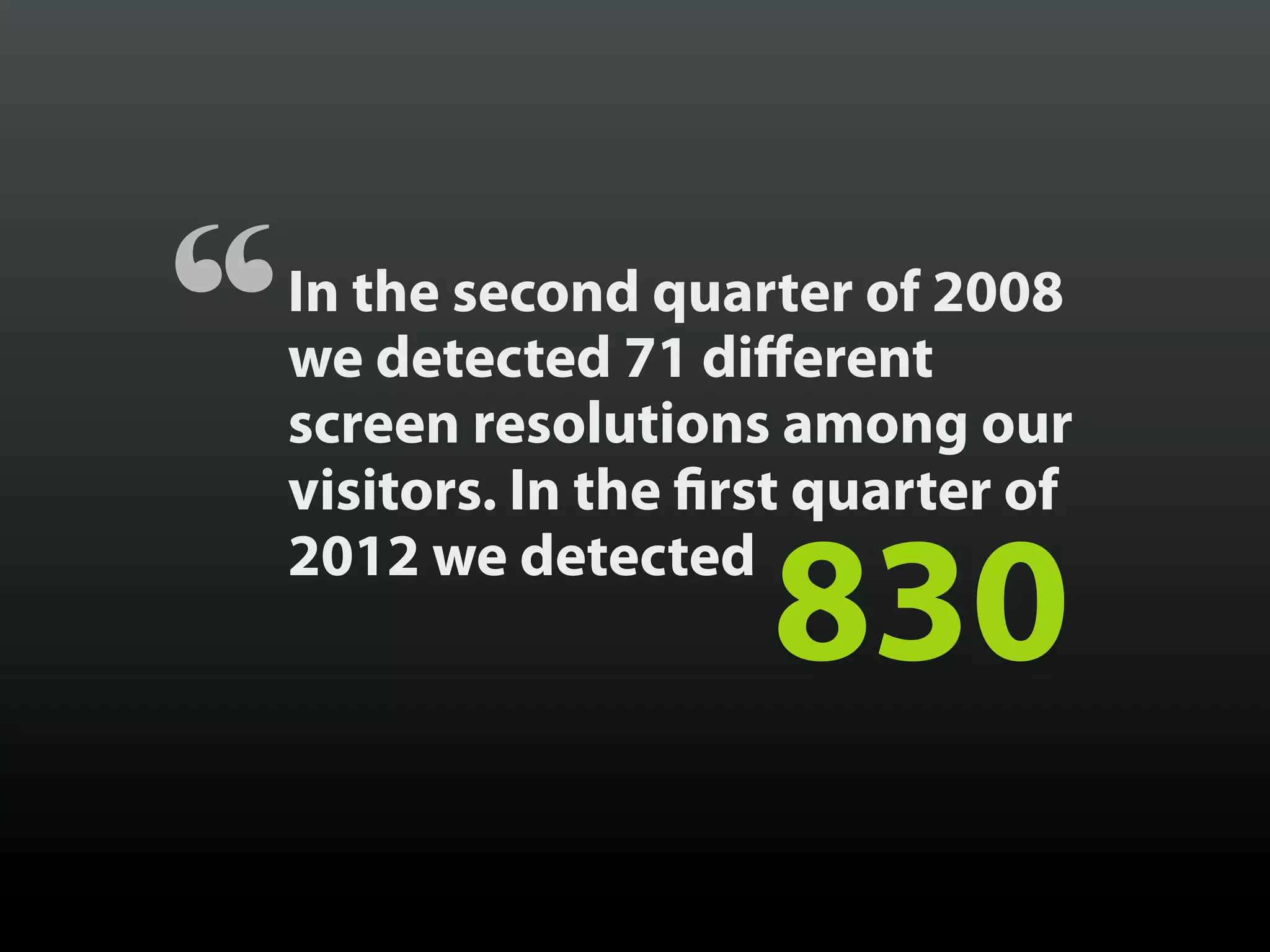
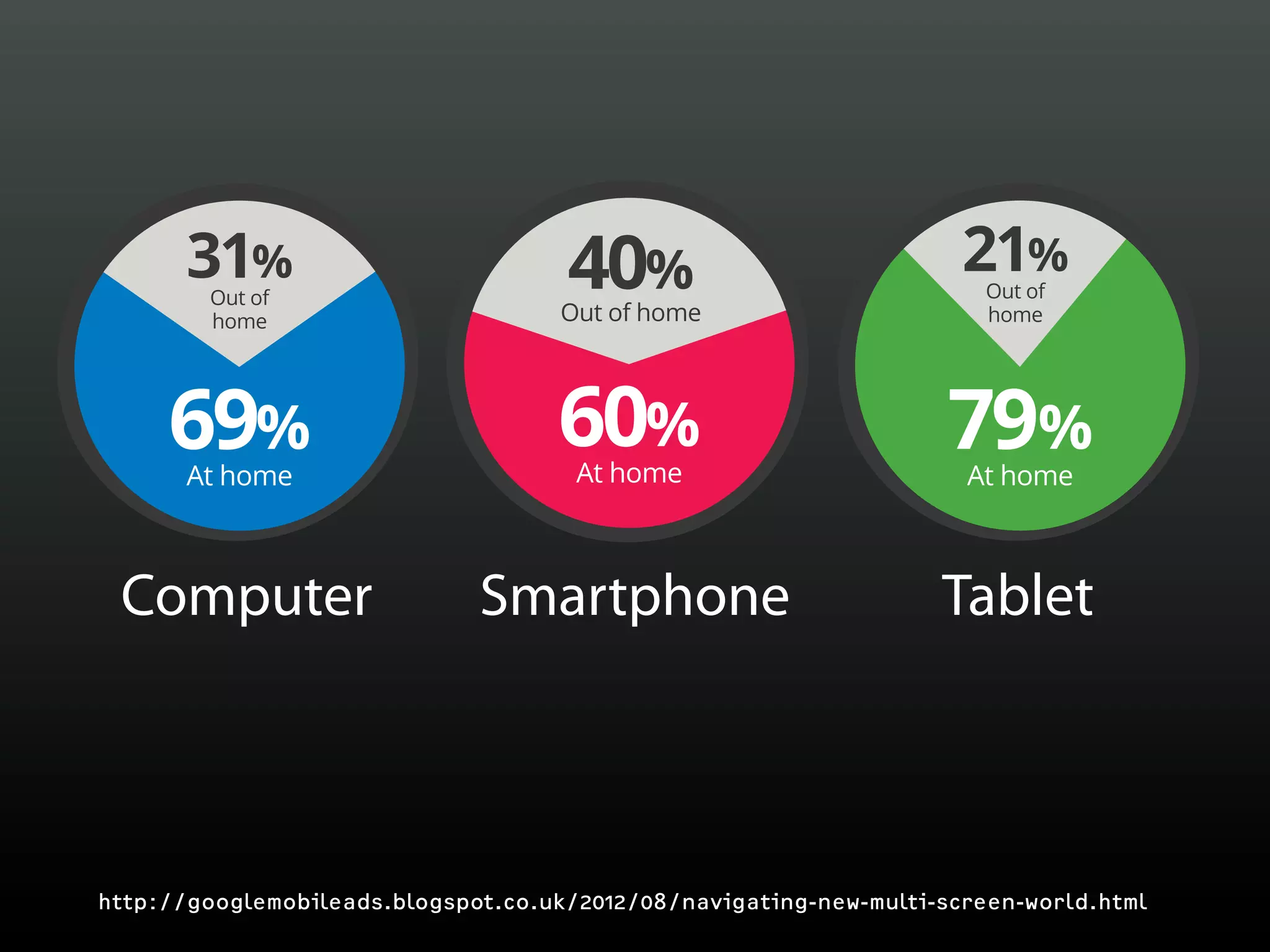
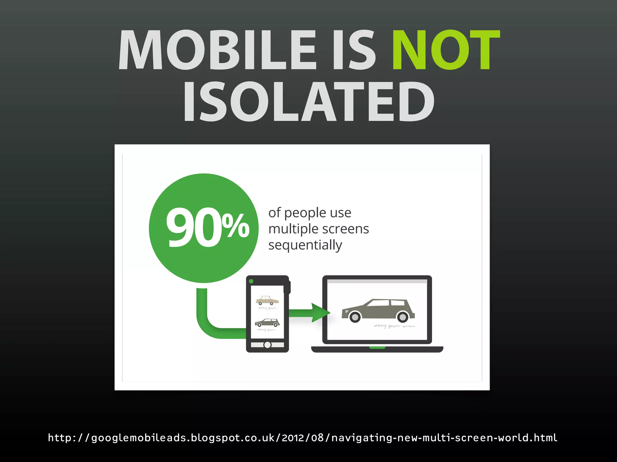
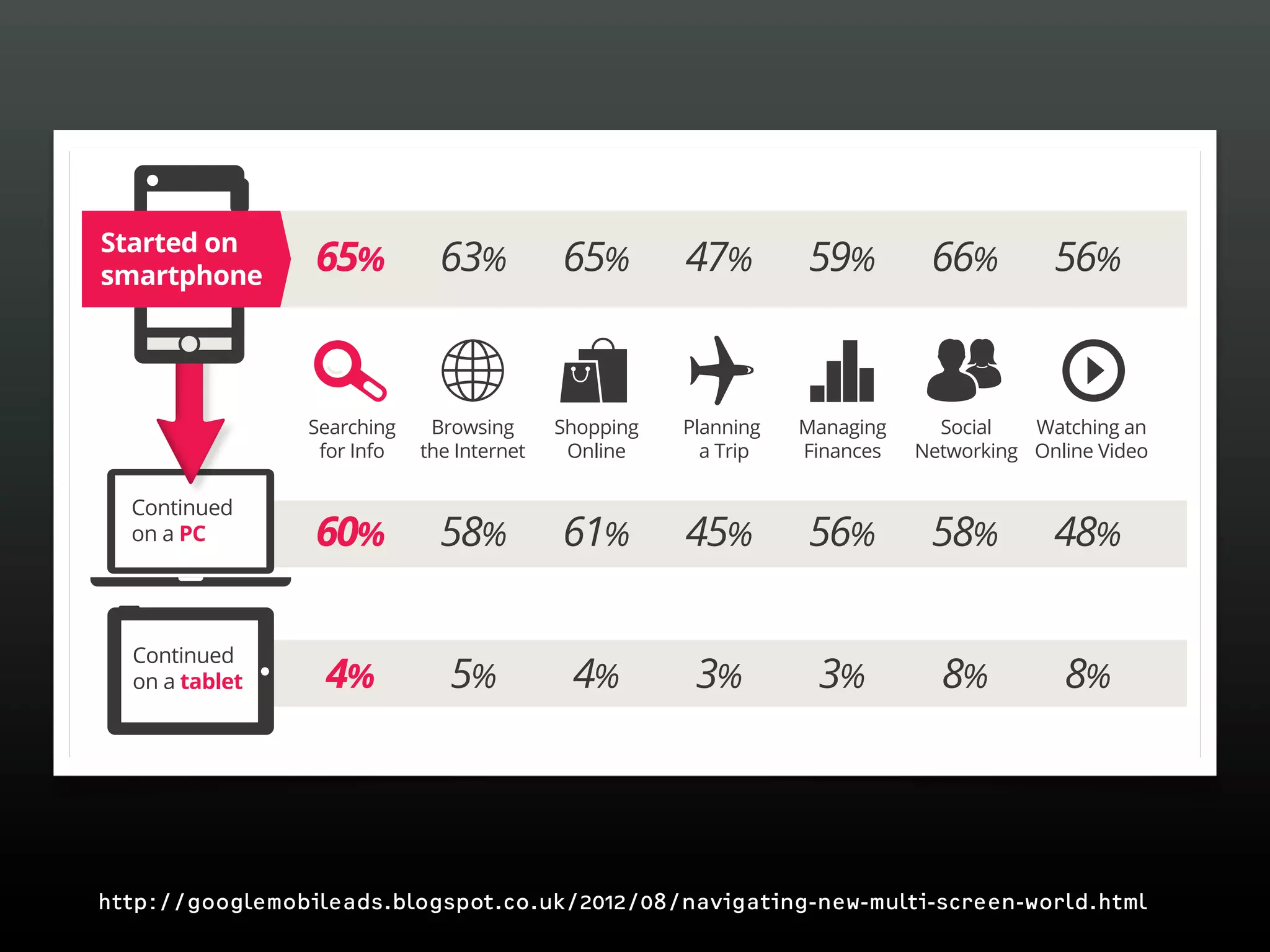
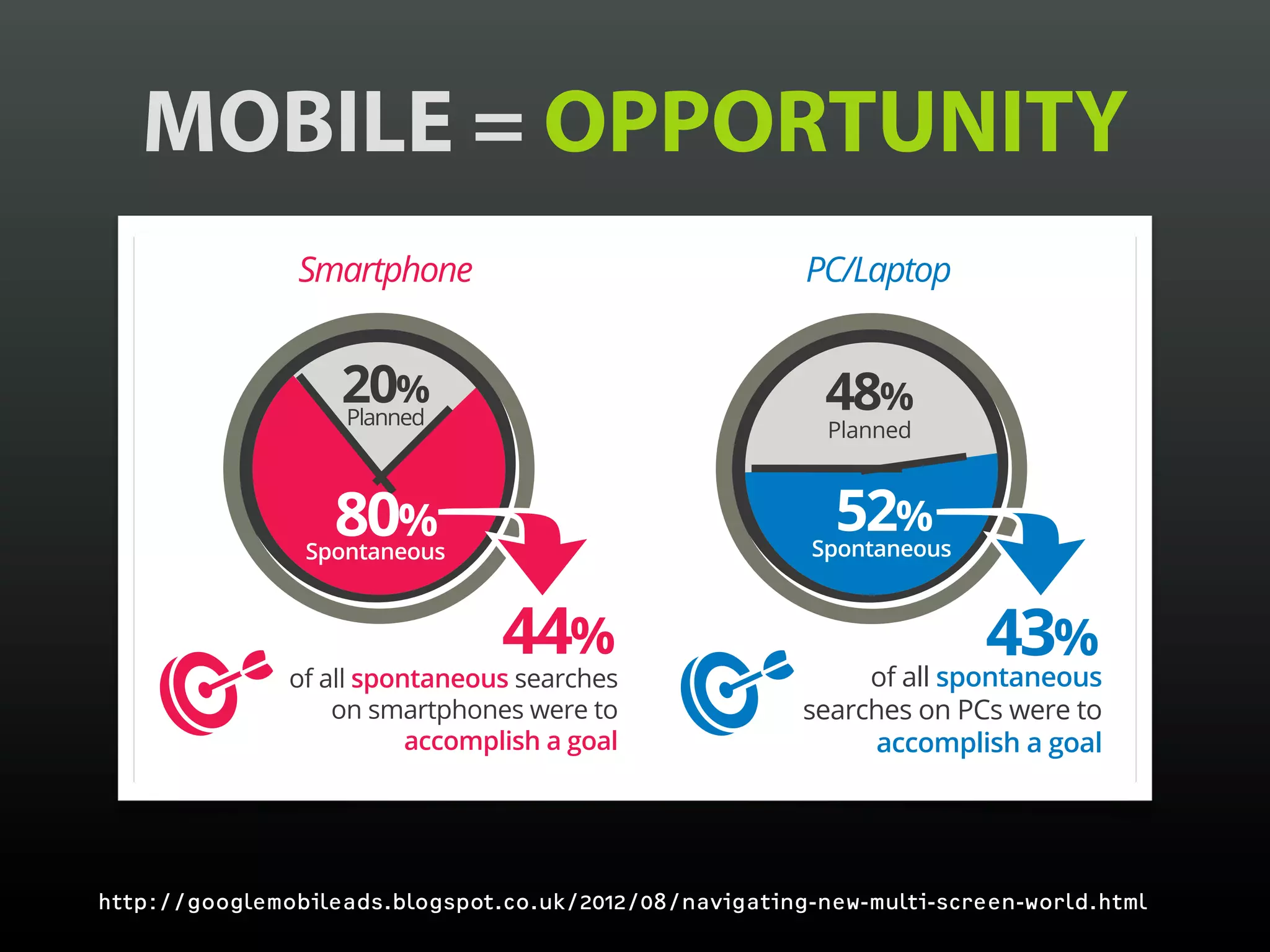
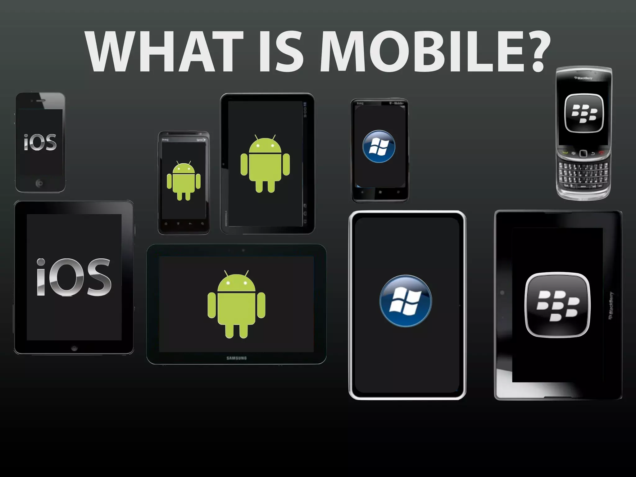
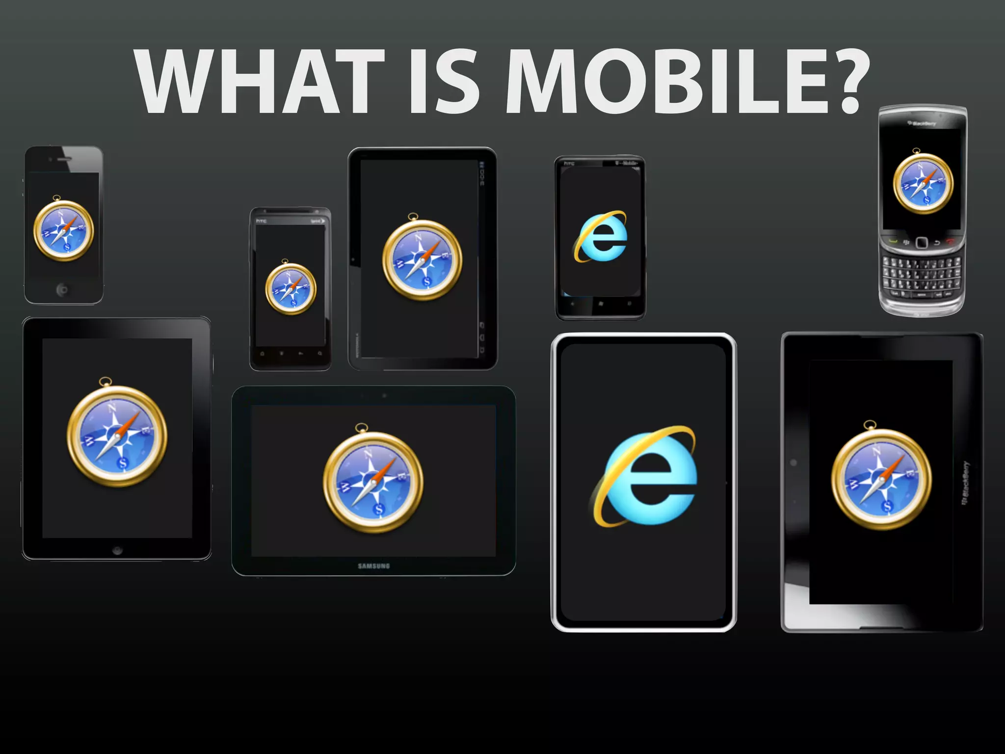
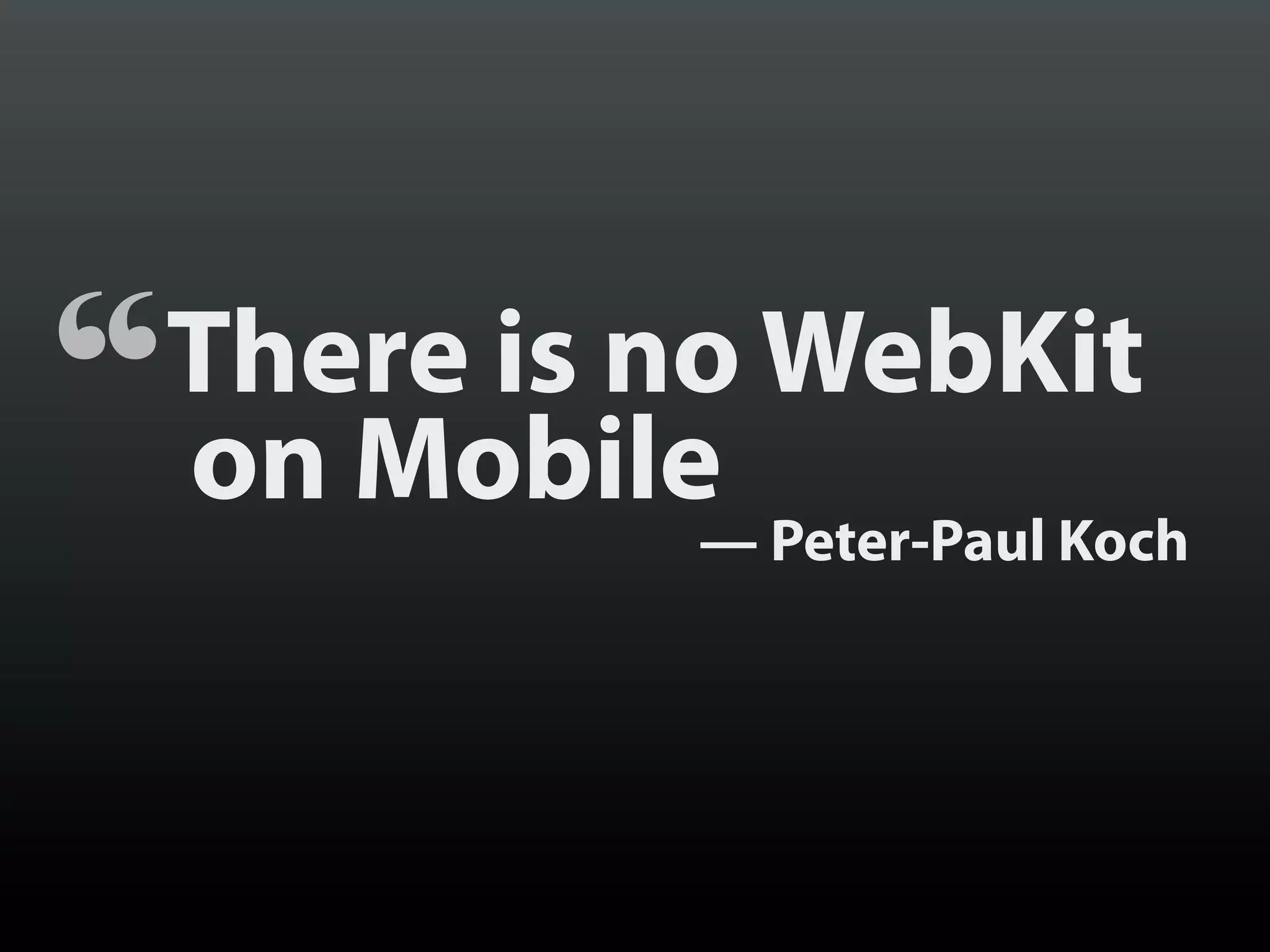
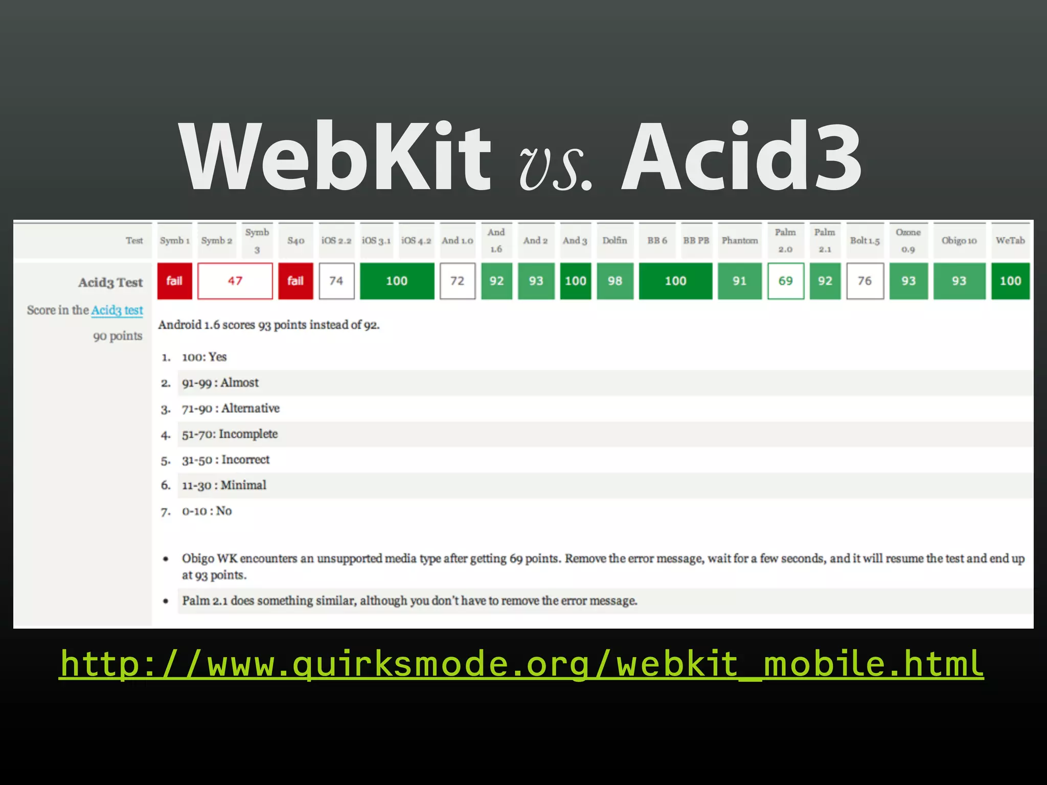
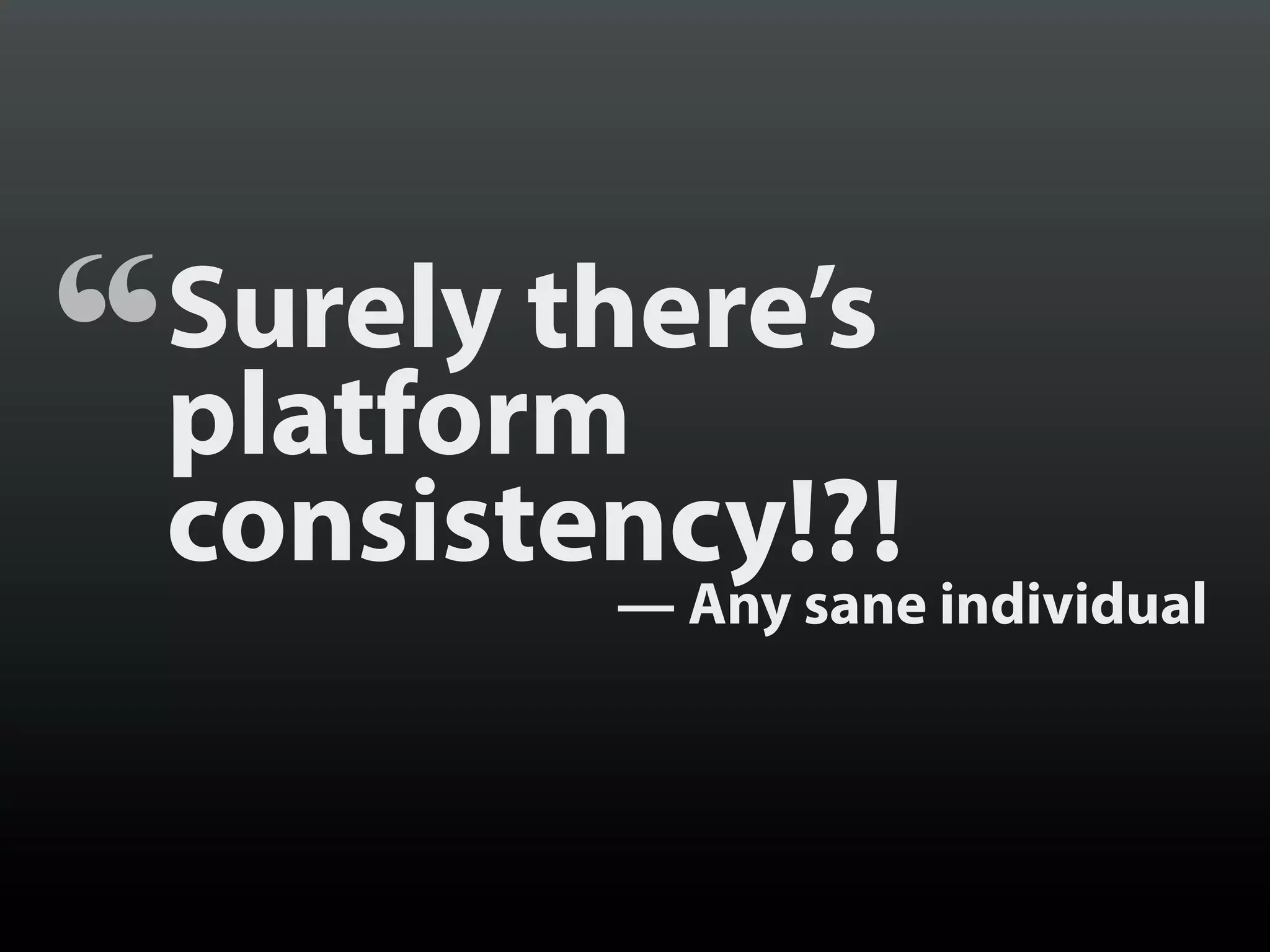
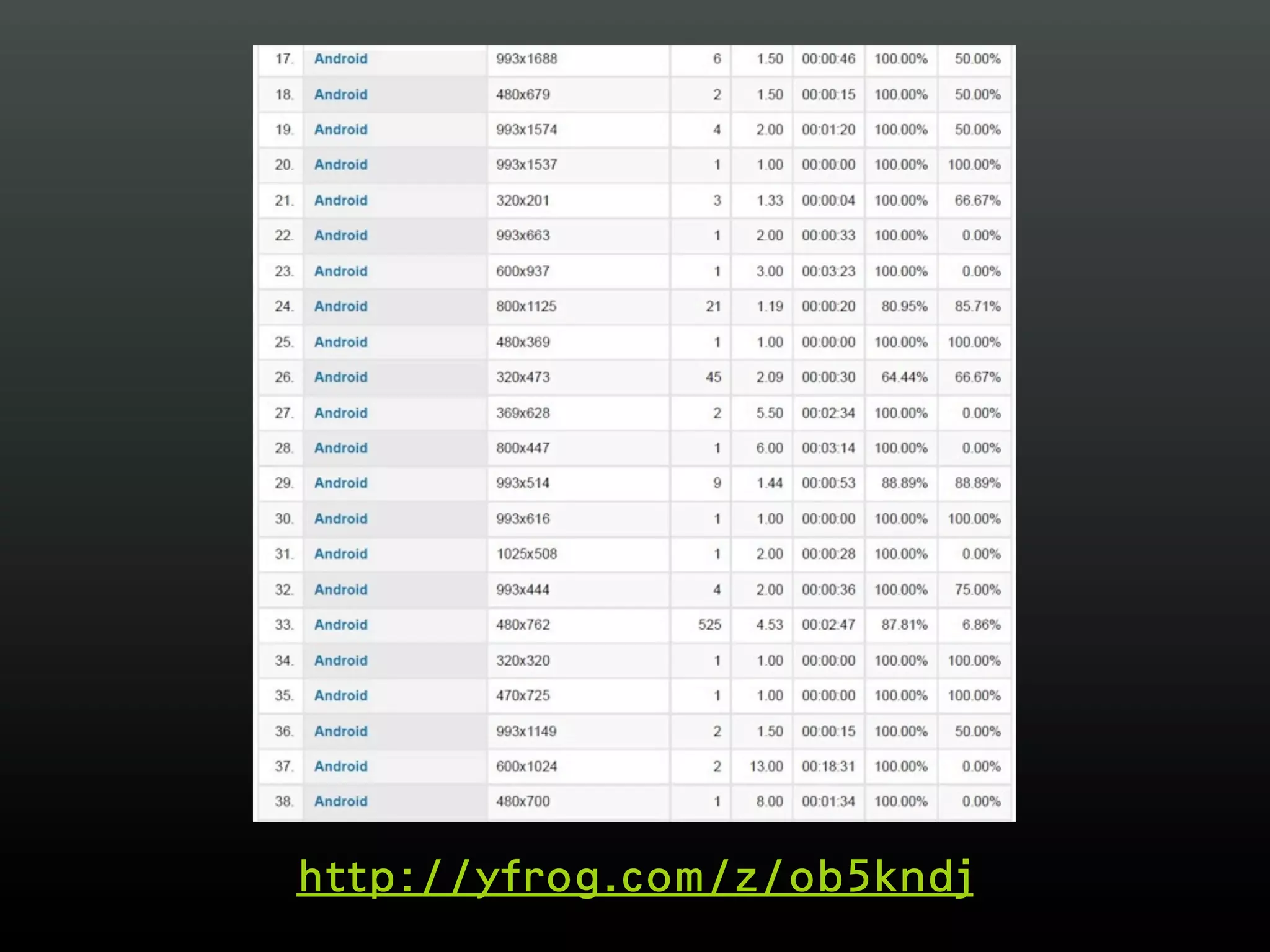
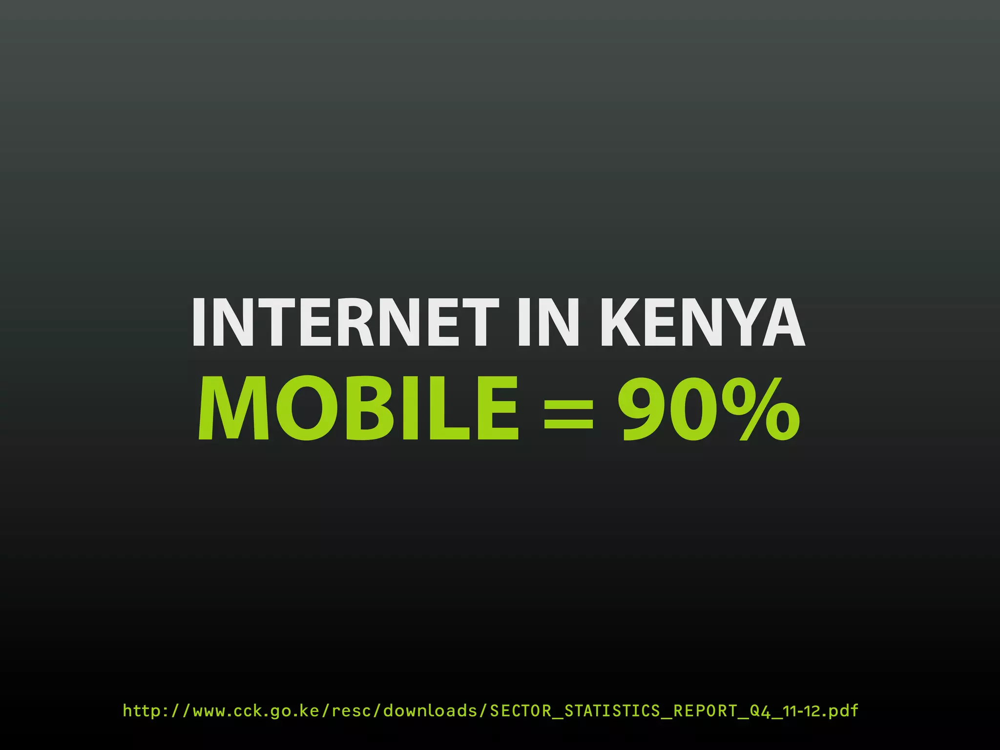
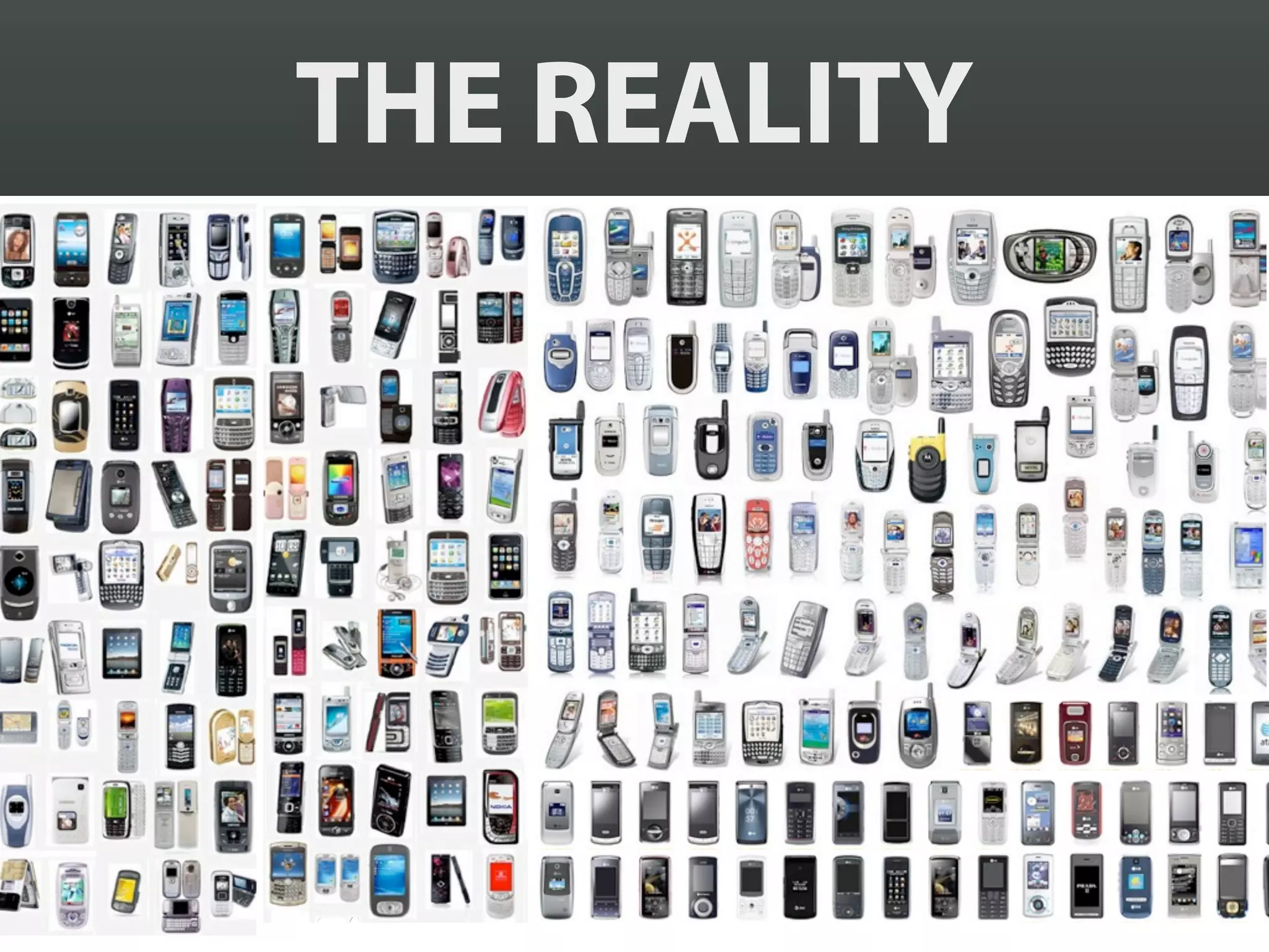
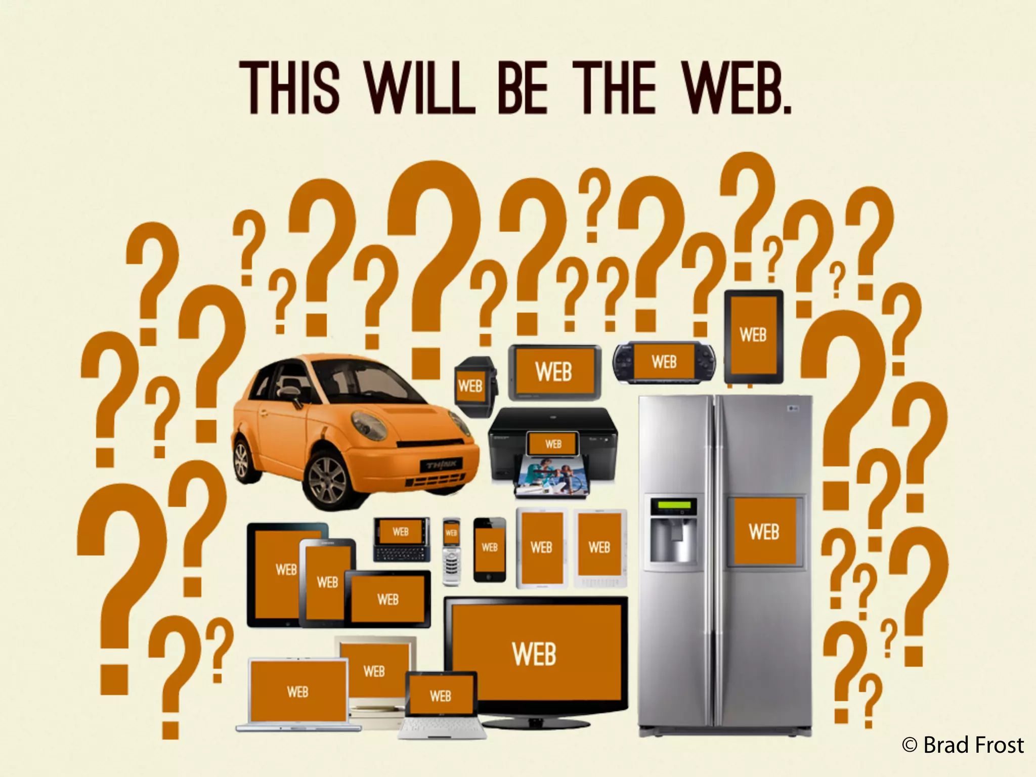
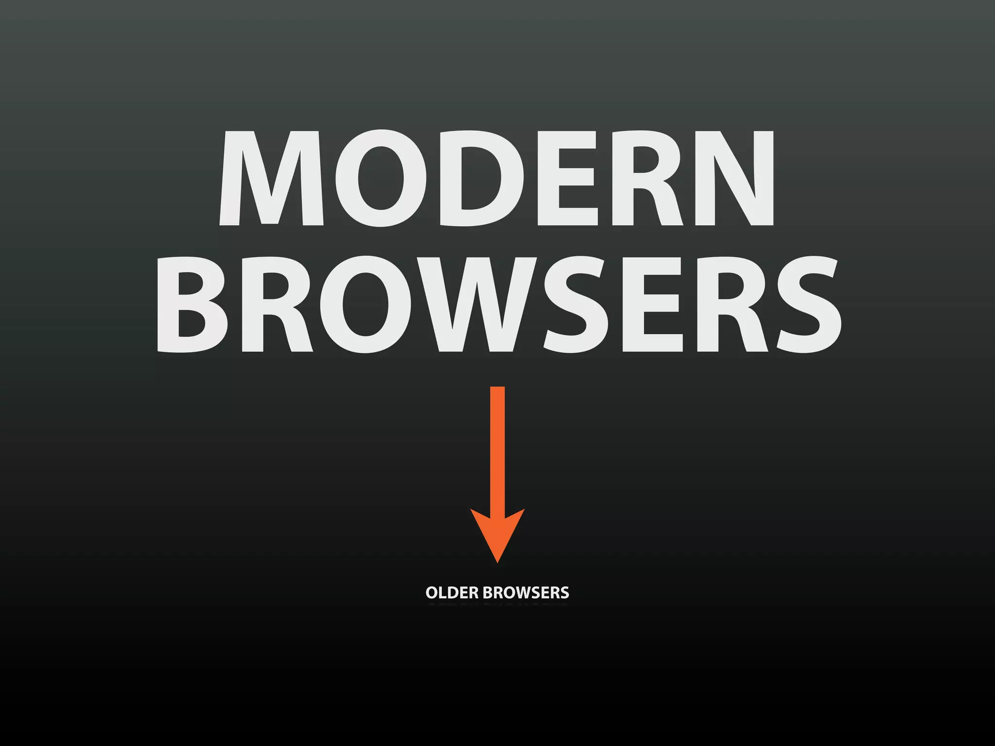
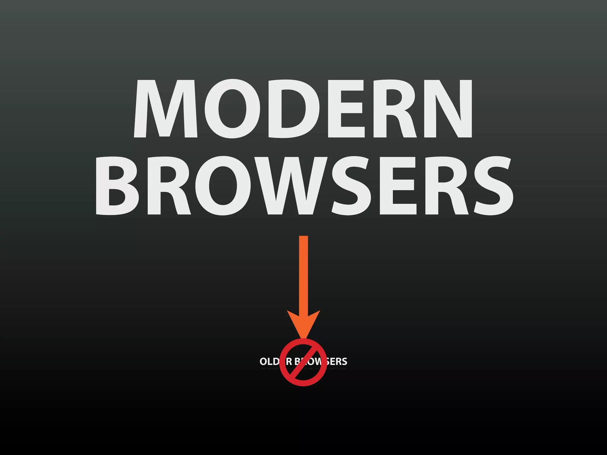
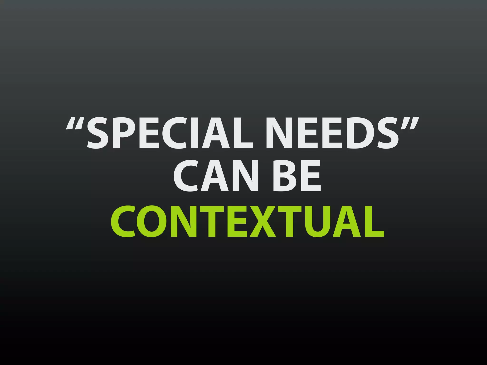
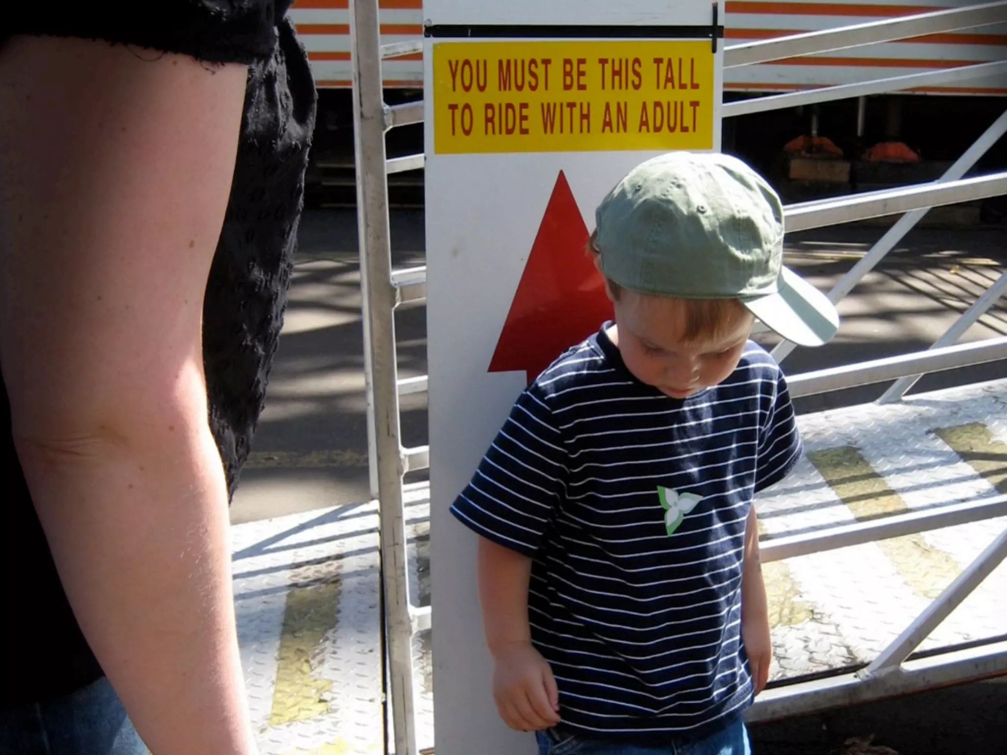
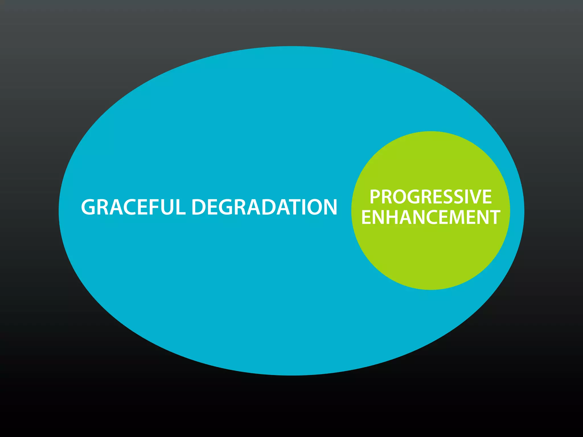
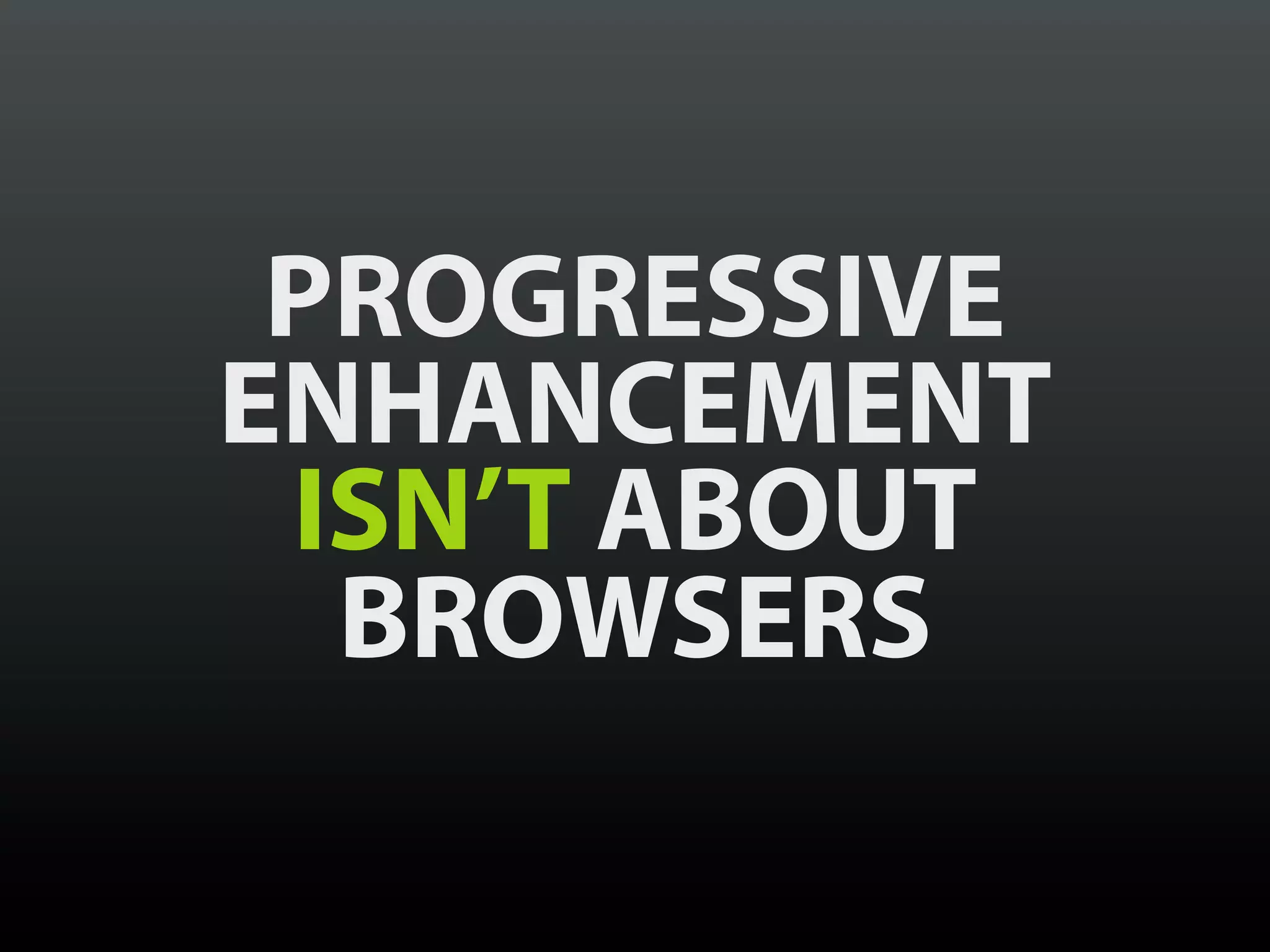
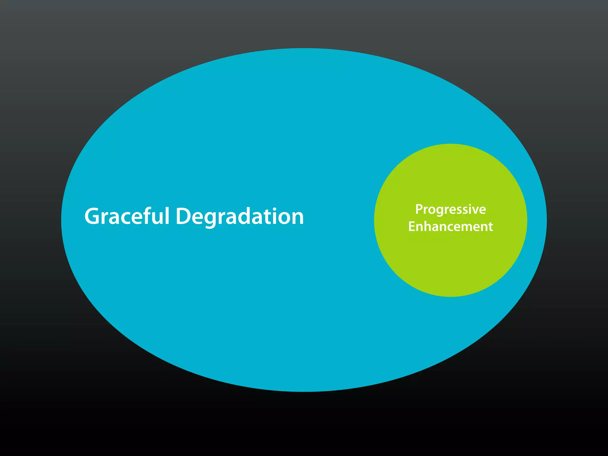
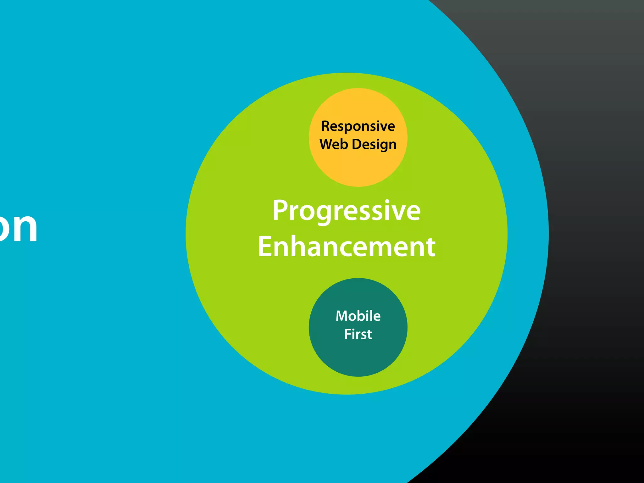
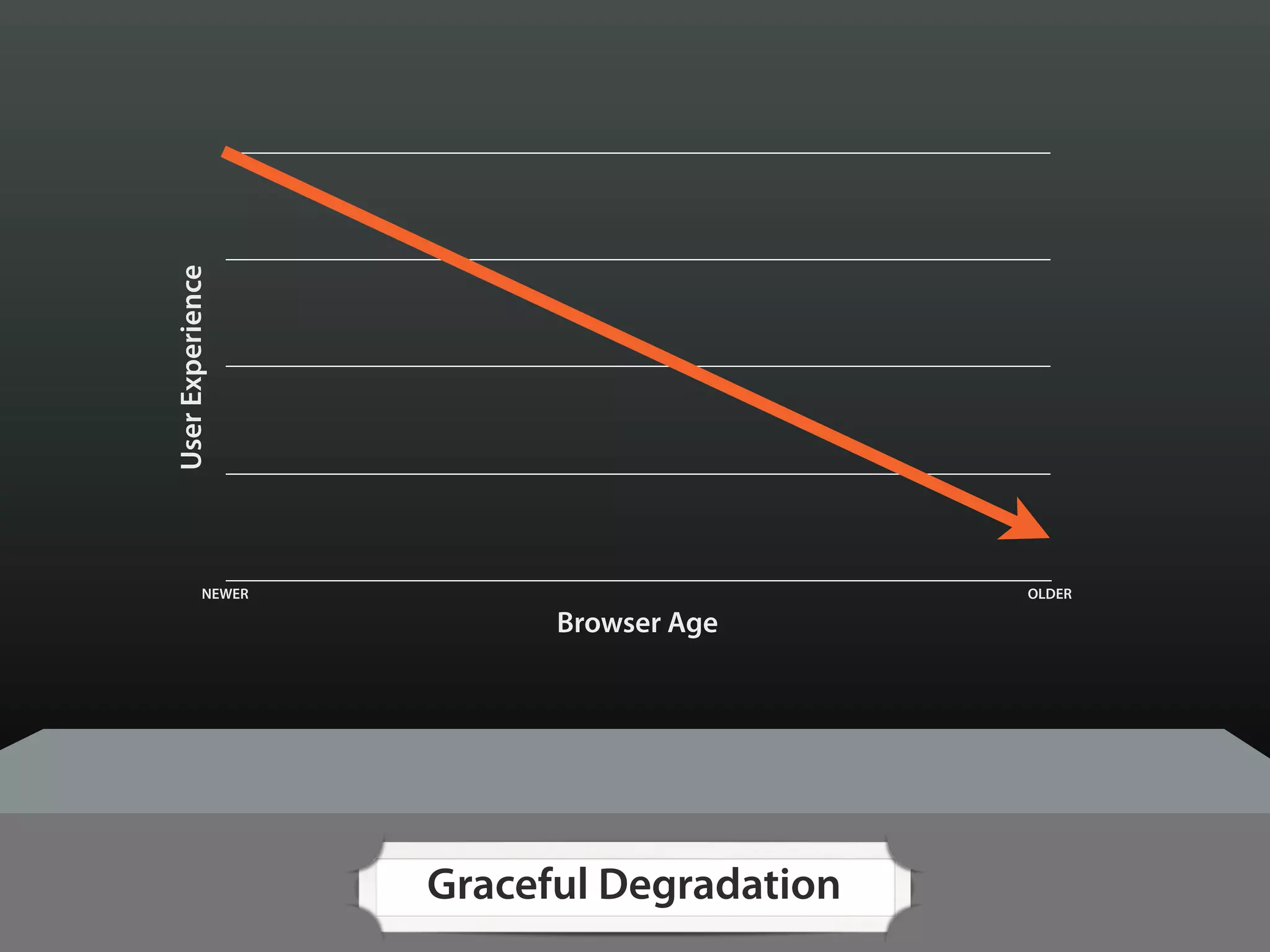
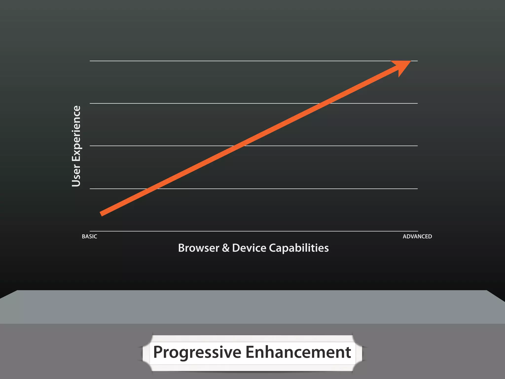
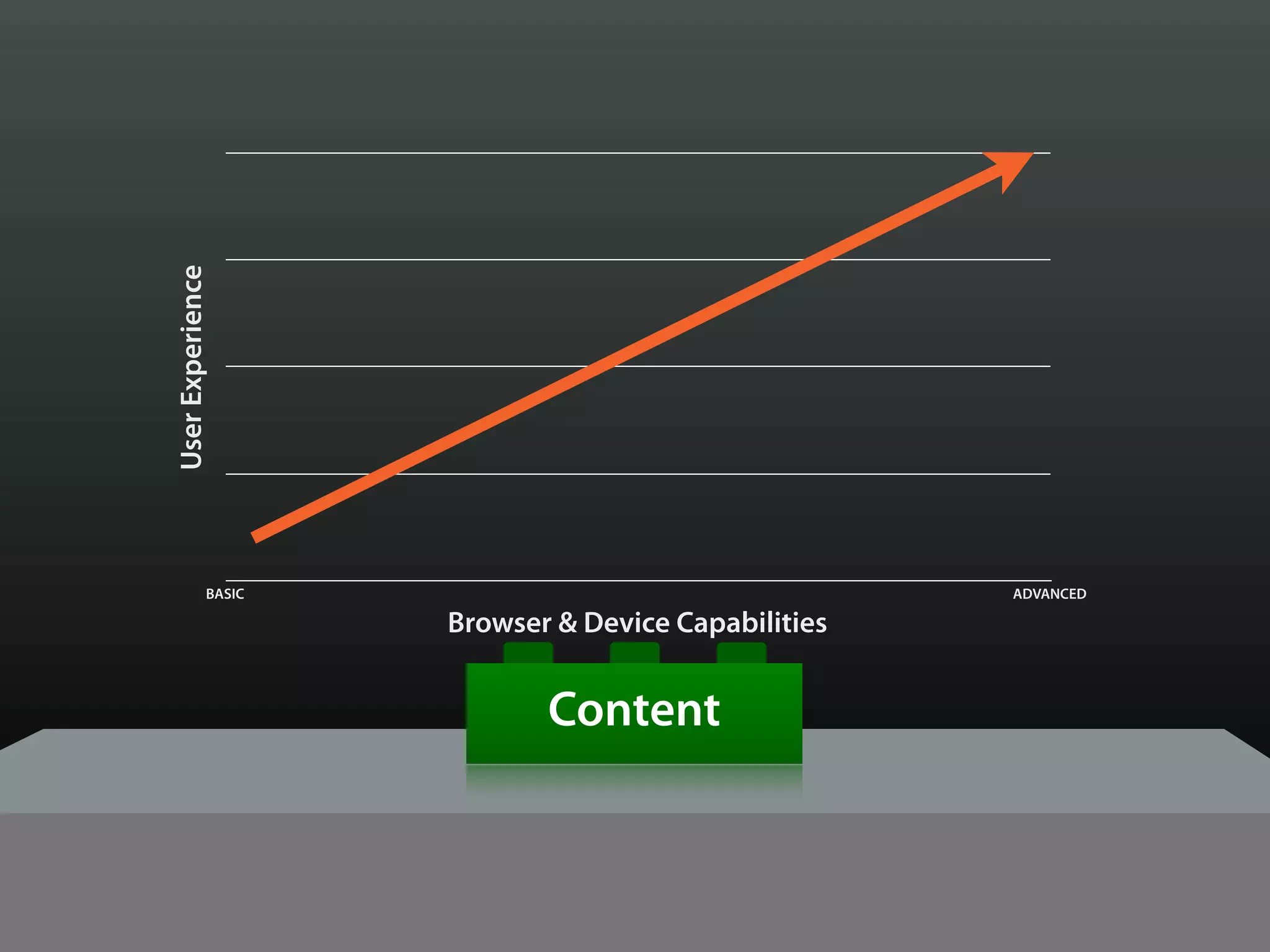
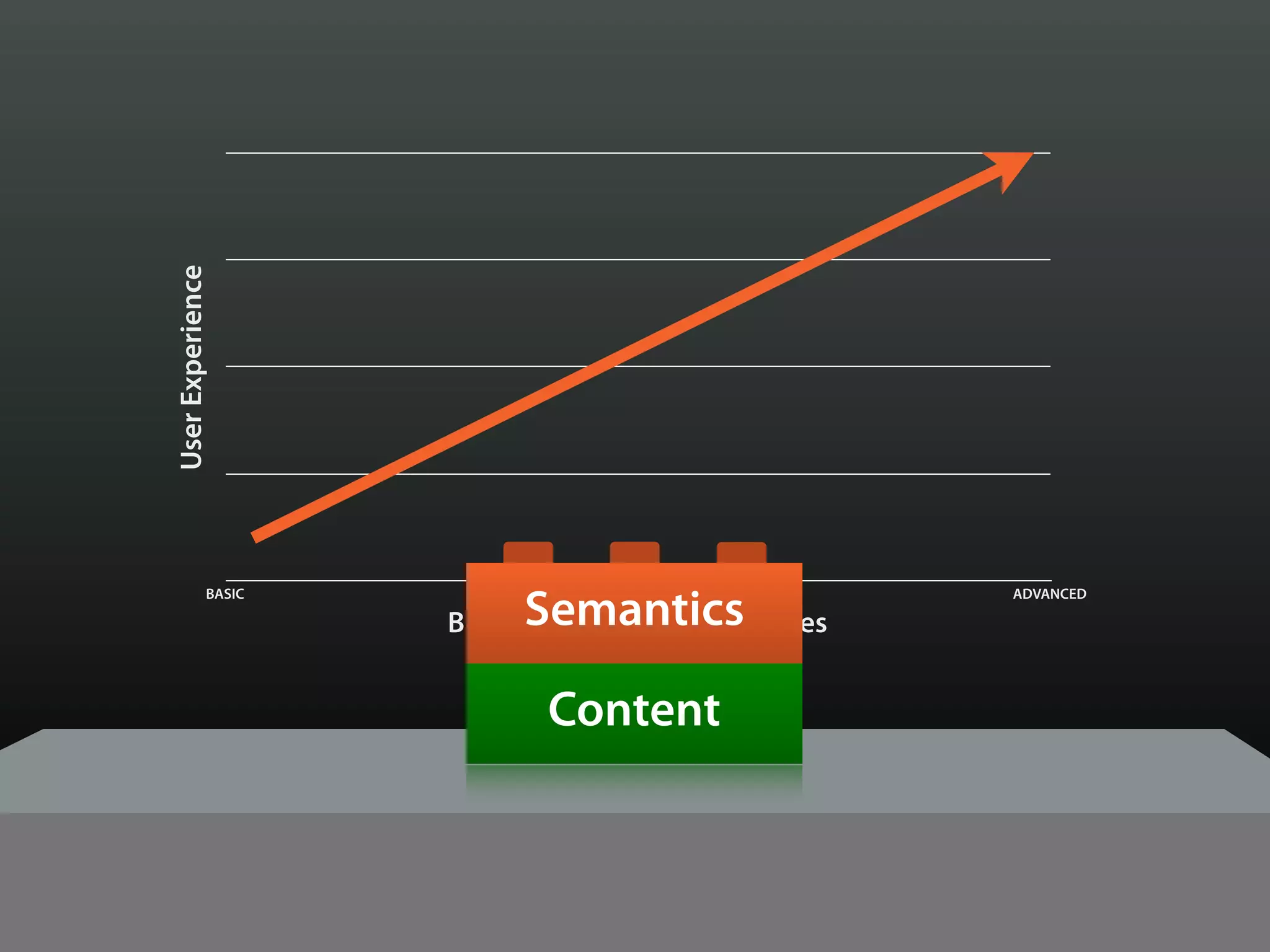
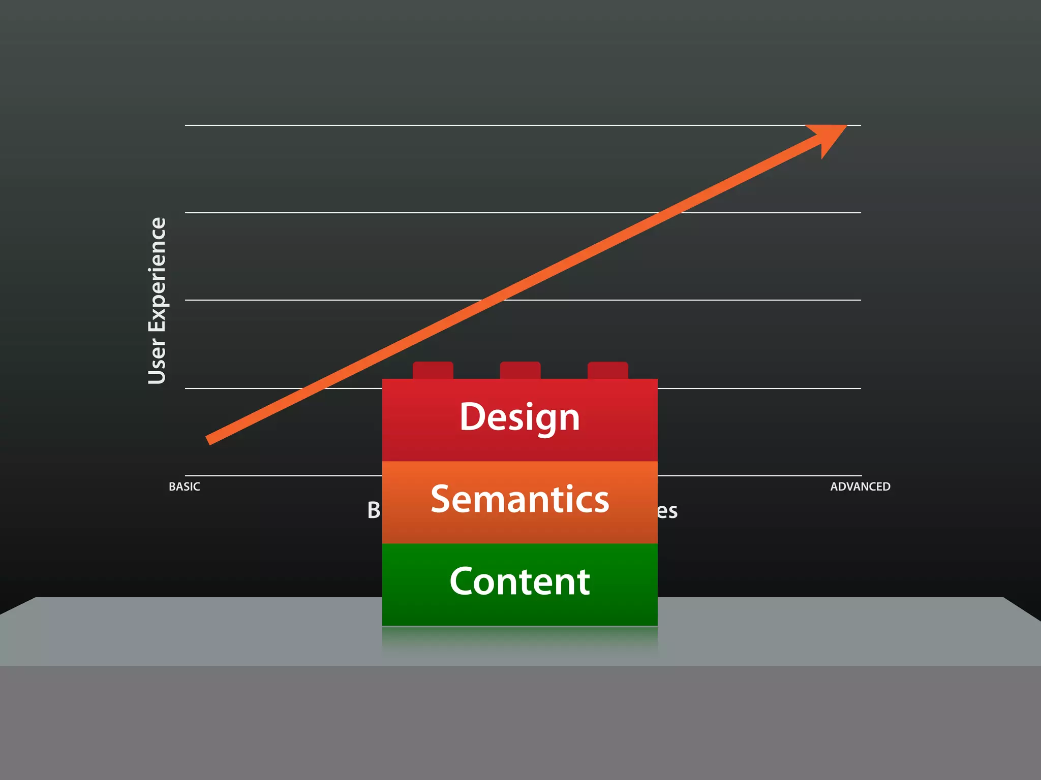
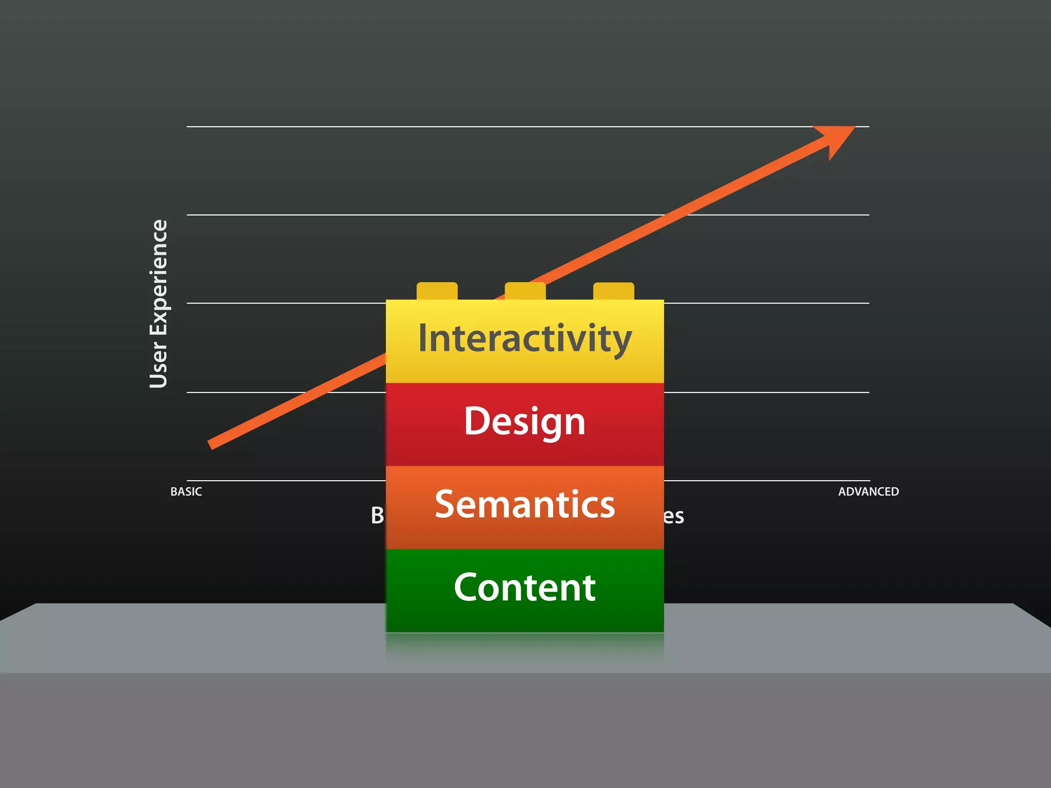
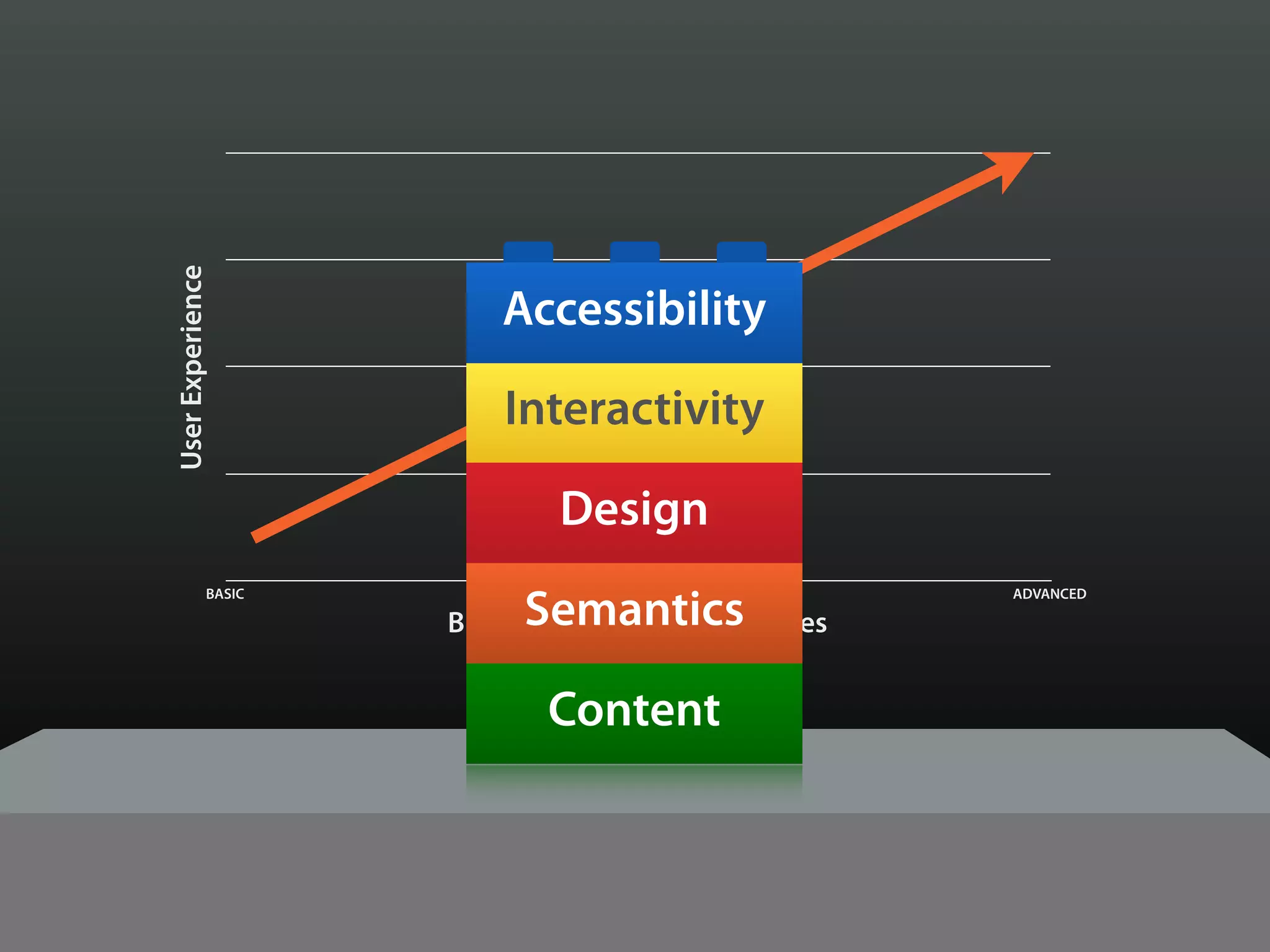
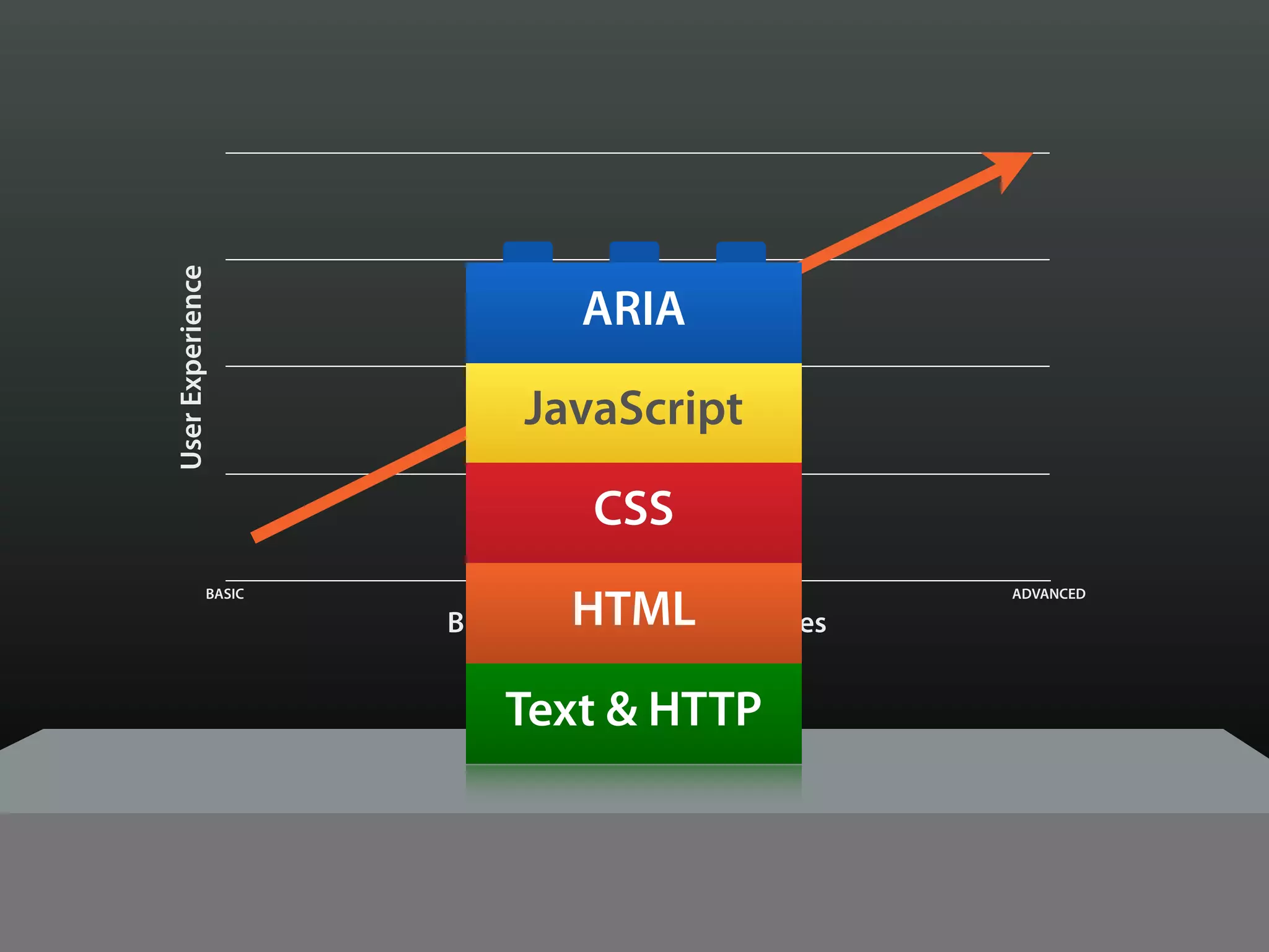
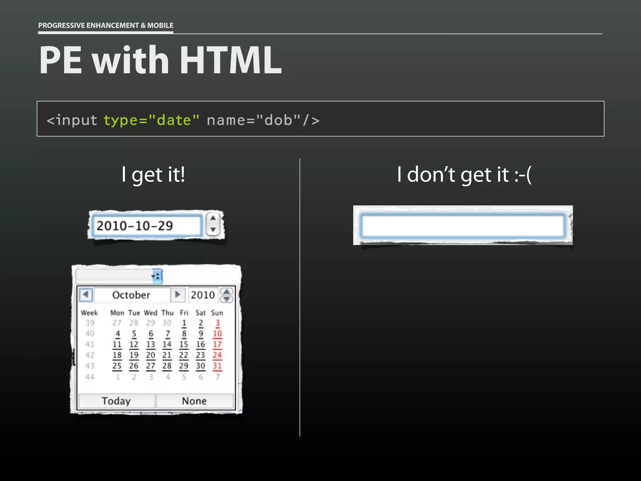
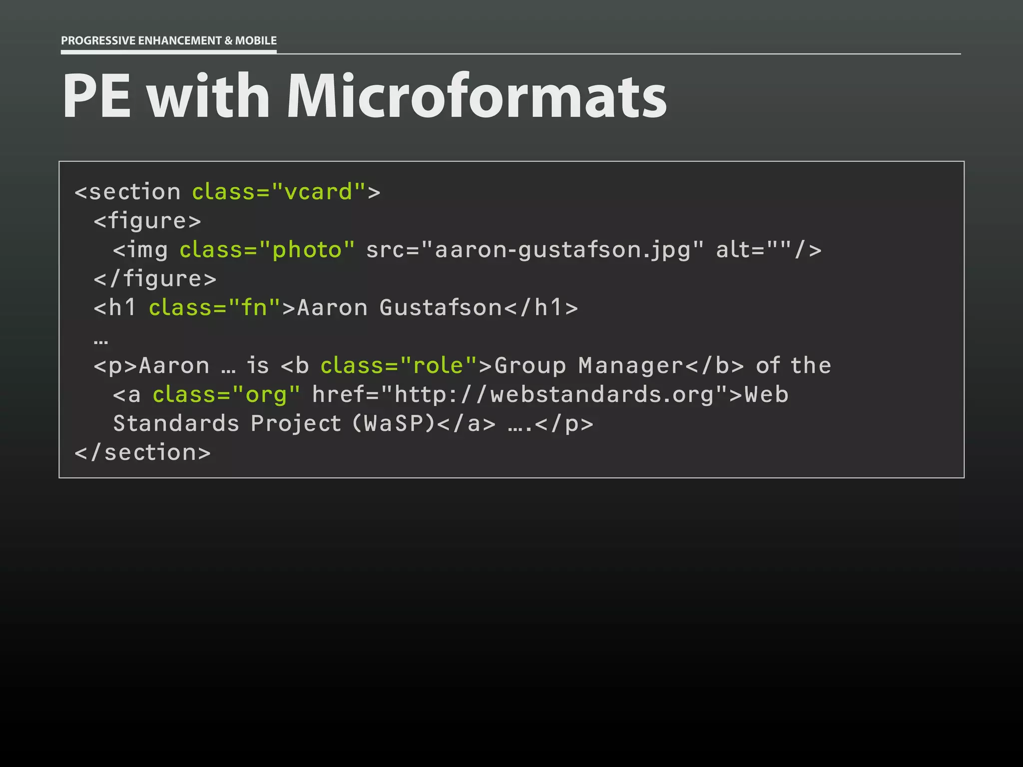
Progressive enhancement and graceful degradation are important principles for building websites that work across different devices and browsers. The document discusses how the web landscape has changed significantly in recent years with more users on mobile devices and a variety of browsers and screen sizes. It emphasizes building semantic HTML, using responsive design with media queries, and implementing progressive enhancement with JavaScript and CSS to provide robust functionality across environments.
![Building Adaptive Designs Now [UI17]](https://cdn.slidesharecdn.com/ss_thumbnails/buildingadaptivedesignsnowui17-121106080317-phpapp02-thumbnail.jpg?width=640&height=640&fit=bounds)
![China App Index: Will mobile kill the TV star? [July 2013]](https://cdn.slidesharecdn.com/ss_thumbnails/caijuly-130820011747-phpapp02-thumbnail.jpg?width=640&height=640&fit=bounds)


![[refreshaustin] Adaptive Images in Responsive Web Design](https://cdn.slidesharecdn.com/ss_thumbnails/adaptive-imagesv7-130410122323-phpapp02-thumbnail.jpg?width=640&height=640&fit=bounds)


![Adapting to Reality [Guest Lecture, March 2021]](https://cdn.slidesharecdn.com/ss_thumbnails/adaptingtorealitybrowsertechnologiesguestlecture-210311215856-thumbnail.jpg?width=640&height=640&fit=bounds)
![Adapting to Reality [Starbucks Lunch & Learn]](https://cdn.slidesharecdn.com/ss_thumbnails/adaptingtorealitystarbuckslunchlearn-190327234123-thumbnail.jpg?width=640&height=640&fit=bounds)

![Exploring Adaptive Interfaces [Generate 2017]](https://cdn.slidesharecdn.com/ss_thumbnails/exploringadaptiveinterfacesgenerate2017-170922213042-thumbnail.jpg?width=640&height=640&fit=bounds)
![Delivering Critical Information and Services [JavaScript & Friends 2021]](https://cdn.slidesharecdn.com/ss_thumbnails/deliveringcriticalinformationandservicesjavascriptfriends2021-210513212454-thumbnail.jpg?width=640&height=640&fit=bounds)
![Performance as User Experience [AEADC 2018]](https://cdn.slidesharecdn.com/ss_thumbnails/performanceasuserexperienceaeadc2018-180806174424-thumbnail.jpg?width=640&height=640&fit=bounds)
![Media in the Age of PWAs [ImageCon 2019]](https://cdn.slidesharecdn.com/ss_thumbnails/mediaintheageofpwasimagecon2019-190502180729-thumbnail.jpg?width=640&height=640&fit=bounds)
![Performance as User Experience [An Event Apart Denver 2017]](https://cdn.slidesharecdn.com/ss_thumbnails/performanceasuserexperienceaeaden2017-171212234737-thumbnail.jpg?width=640&height=640&fit=bounds)
![Performance as User Experience [AEA SEA 2018]](https://cdn.slidesharecdn.com/ss_thumbnails/performance-as-user-experience-180409182414-thumbnail.jpg?width=640&height=640&fit=bounds)
![Better Performance === Greater Accessibility [Inclusive Design 24 2018]](https://cdn.slidesharecdn.com/ss_thumbnails/betterperformancegreateraccessibility-181113020711-thumbnail.jpg?width=640&height=640&fit=bounds)
![Getting Started with Progressive Web Apps [Beyond Tellerrand 2019]](https://cdn.slidesharecdn.com/ss_thumbnails/gettingstartedwithprogressivewebapps-191113063610-thumbnail.jpg?width=640&height=640&fit=bounds)
![PWA: Where Do I Begin? [Microsoft Ignite 2018]](https://cdn.slidesharecdn.com/ss_thumbnails/pwa-wheredoibeginmicrosoftignite2018-180928155323-thumbnail.jpg?width=640&height=640&fit=bounds)

![Conversational Semantics for the Web [CascadiaJS 2018]](https://cdn.slidesharecdn.com/ss_thumbnails/conversationalsemanticsfortheweb-181116232055-thumbnail.jpg?width=640&height=640&fit=bounds)

![Designing the Conversation [Concatenate 2018]](https://cdn.slidesharecdn.com/ss_thumbnails/designingtheconversationconcatenate2018-180810154426-thumbnail.jpg?width=640&height=640&fit=bounds)
![Designing the Conversation [Beyond Tellerrand 2019]](https://cdn.slidesharecdn.com/ss_thumbnails/designingtheconversationbeyondtellerrand2019-191115005417-thumbnail.jpg?width=640&height=640&fit=bounds)

![Designing the Conversation [Paris Web 2017]](https://cdn.slidesharecdn.com/ss_thumbnails/designingtheconversationparisweb-171011181500-thumbnail.jpg?width=640&height=640&fit=bounds)
![Designing the Conversation [Accessibility DC 2018]](https://cdn.slidesharecdn.com/ss_thumbnails/designingtheconversationaccessibilitydc2018-180806175332-thumbnail.jpg?width=640&height=640&fit=bounds)


