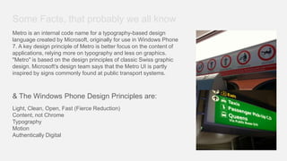
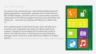
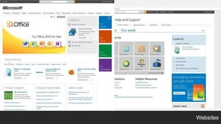
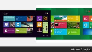
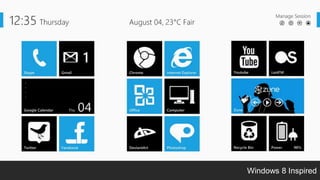
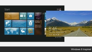
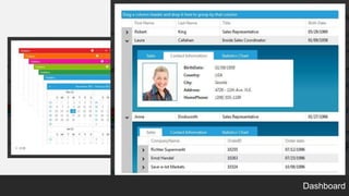
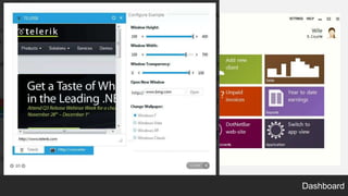
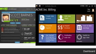
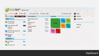
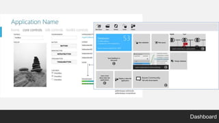
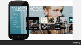
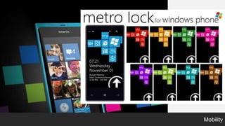
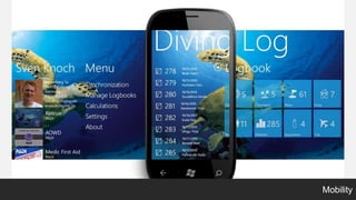
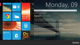
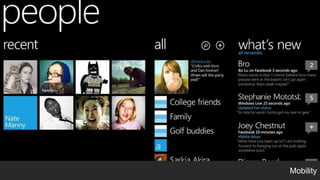
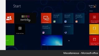
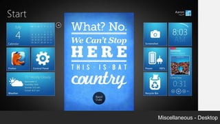
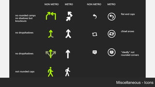
Metro + Metro like
a visual approach
Some Facts, that probably we all know
Metro is an internal code name for a typography-based design
language created by Microsoft, originally for use in Windows Phone
7. A key design principle of Metro is better focus on the content of
applications, relying more on typography and less on graphics.
"Metro" is based on the design principles of classic Swiss graphic
design. Microsoft's design team says that the Metro UI is partly
inspired by signs commonly found at public transport systems.


& The Windows Phone Design Principles are:
Light, Clean, Open, Fast (Fierce Reduction)
Content, not Chrome
Typography
Motion
Authentically Digital
So, why again…
So, being a User experience guy, I also started getting request of
getting applications, dashboards, websites which needs have the
feel of Metro Design, and that’s where my quest started, searched
extensively on the internet to gather more and more information and
references… how other are working with Metro UI or Metro Like
UI…

And I gathered quite a hand full of visuals, which will help me in
enormous way to generate new ideas. And after couple of my
projects, I thought of accumulating all the references so that in
future I can refer the same. In this process this documentation
emerged, and it’s more of a visual references of Metro UI or Metro
Like of the screen shots are taken from Internet and it includes couple of my project
most UI.
Websites
Websites
Websites
Websites
Apps
Apps
Apps
Apps
Apps
Windows 8 Inspired
Windows 8 Inspired
Windows 8 Inspired
Dashboard
Dashboard
Dashboard
Dashboard
Dashboard
Dashboard
Mobility
Mobility
Mobility
Mobility
Mobility
Miscellaneous - Microsoft-office
Miscellaneous - Desktop
Miscellaneous - Icons
Miscellaneous - Keyboard
Hope you like it

                   Thank You

Metro + Metro Like