1. Overall I am very pleased with the media product I have created. It fits the conventions of most
music magazines whilst challenging some conventions of the pop genre to create a product that
looks professional and unique; two aspects a magazine needs to stand out in the market these days.
The masthead on my magazine is conventionally positioned left aligned at the top of the magazine
whilst the date issue number and barcode follows to the right. The name ‘Upbeat’, immediately
informs its audience of the magazines genre. The clean and mature look to the front cover of
‘Upbeat’ conveys the message that the magazine is not perhaps the typical pop magazine which
tends to have a target audience of around 9 to 16 years but that of 16+. I wanted to ensure the
front page was not cluttered with puffs, which I have found usually contain content related to gos sip
rather than the music itself, therefore I have used minimal text that entices the audience by its
content without looking childish.
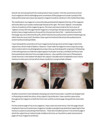
I have followed the conventions of music magazines by having a clear central image in which the
subject has a direct mode of address. However, I have made my magazine more unique by using a
more creative style to my photography by using a close up shot along with using tools in Photoshop
in the editing process to make the subject appear much paler to relay a confident and fierce look
that would attract attention from my target audience. I also used the clone tool in Photoshop to
create more hair in the bottom left above the subject’s shoulder which enabled the cover lines to
stand out so they were not lost which shows my ability in using multiple software.
Another convention I have followed is keeping a consistent house style. I used the eye dropper tool
in Photoshop to match the colour of my subject’s lips to the text. I have used this same colour
throughout the magazine on both the front cover and the contents page along with the same style
font.
For the contents page of my music magazine, I have used a lot more text as I feel this page should
emphasize how much content your magazine includes so people know what they’re getting for their
money as a pose to just putting a few features. I have also included a picture in my contents page in
which the subject has an indirect mode of address this time as I found this is what most contents
pages of music magazine tend to do.