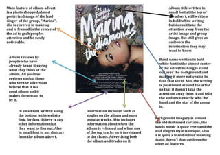
1. Main feature of album advert
is a photo shopped,almost
posterizedimage of the lead
singer of the group, “Marina”,
she is covered in make up
and is framed in the center of
the ad to grab peoples
attention and be easily
noticeable.
Album title written in
small font at the top of
the advert, still written
in bold white writing
but doesn’t take the
attention away from the
artist image and group
image. But still gives an
audience the
information they may
want to know.
Album reviews by
people who have
already heard it saying
what they think of the
album. All positive
reviews so that those
who see the advert can
believe that it is a
good album and it
makes them want to
by it.
In small font written along
the bottom is the website
link, for fans if there is any
other information that
they want to fins out. Also
in small font to not distract
from the album advert.
Band name written in bold
white font in the almost center
of the advert making is stand
out over the background and
making it more noticeable to
fans that see it. Also the writing
is positioned around the artist
so that it doesn’t take the
attention away from it and tells
the audience exactly who the
band and the star of the group
is.
Information included such as
singles on the album and most
popular tracks. Also includes
information about when the
album is released and when one
of the top tracks on it is released
to the charts. Advertising both
the album and tracks on it.
Background imagery is almost
like old-fashioned curtains, the
bands music is quite retro and the
lead singers style is unique. Also
it is quite a bland colour meaning
that it doesn’t distract from the
other ad features.