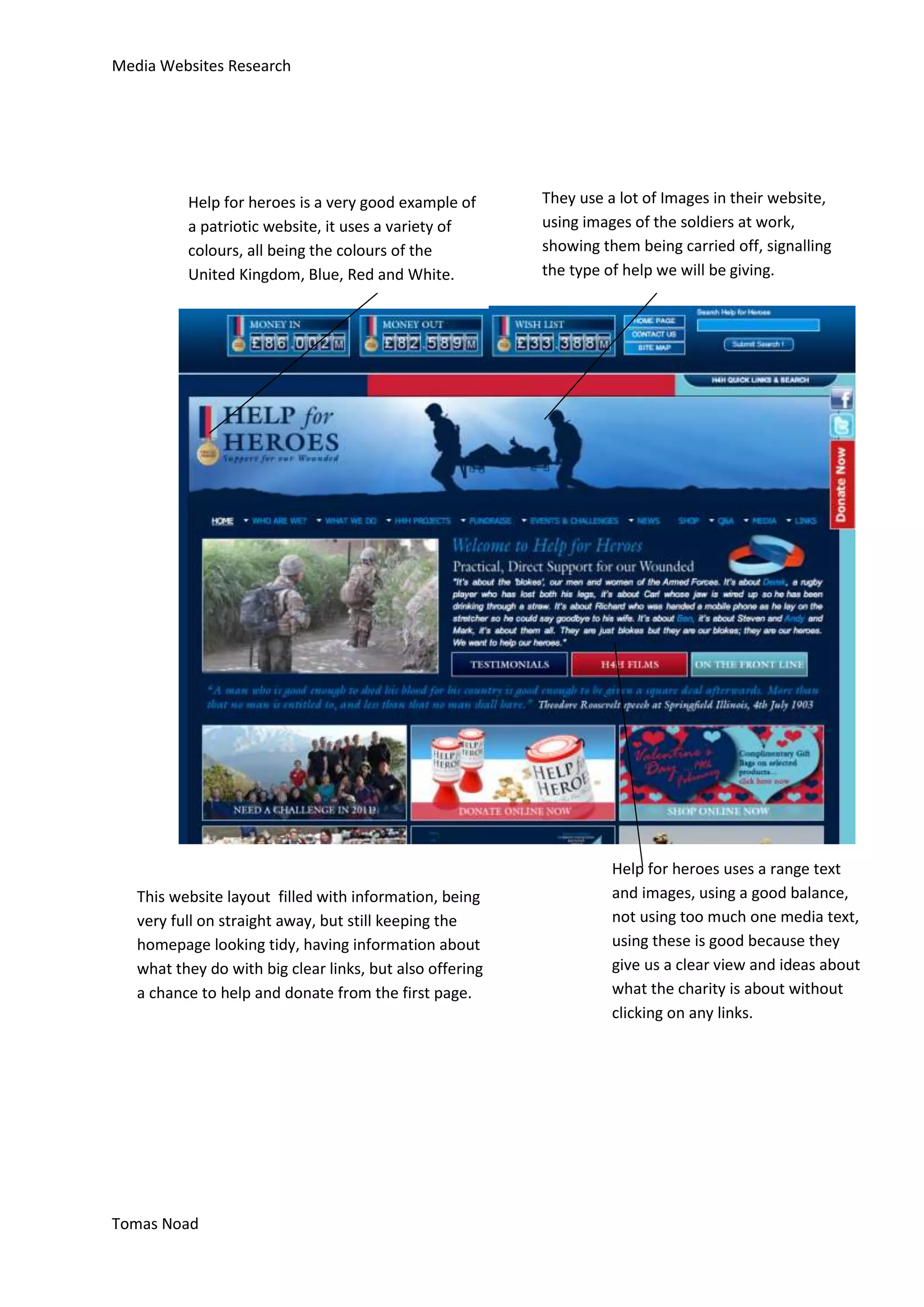
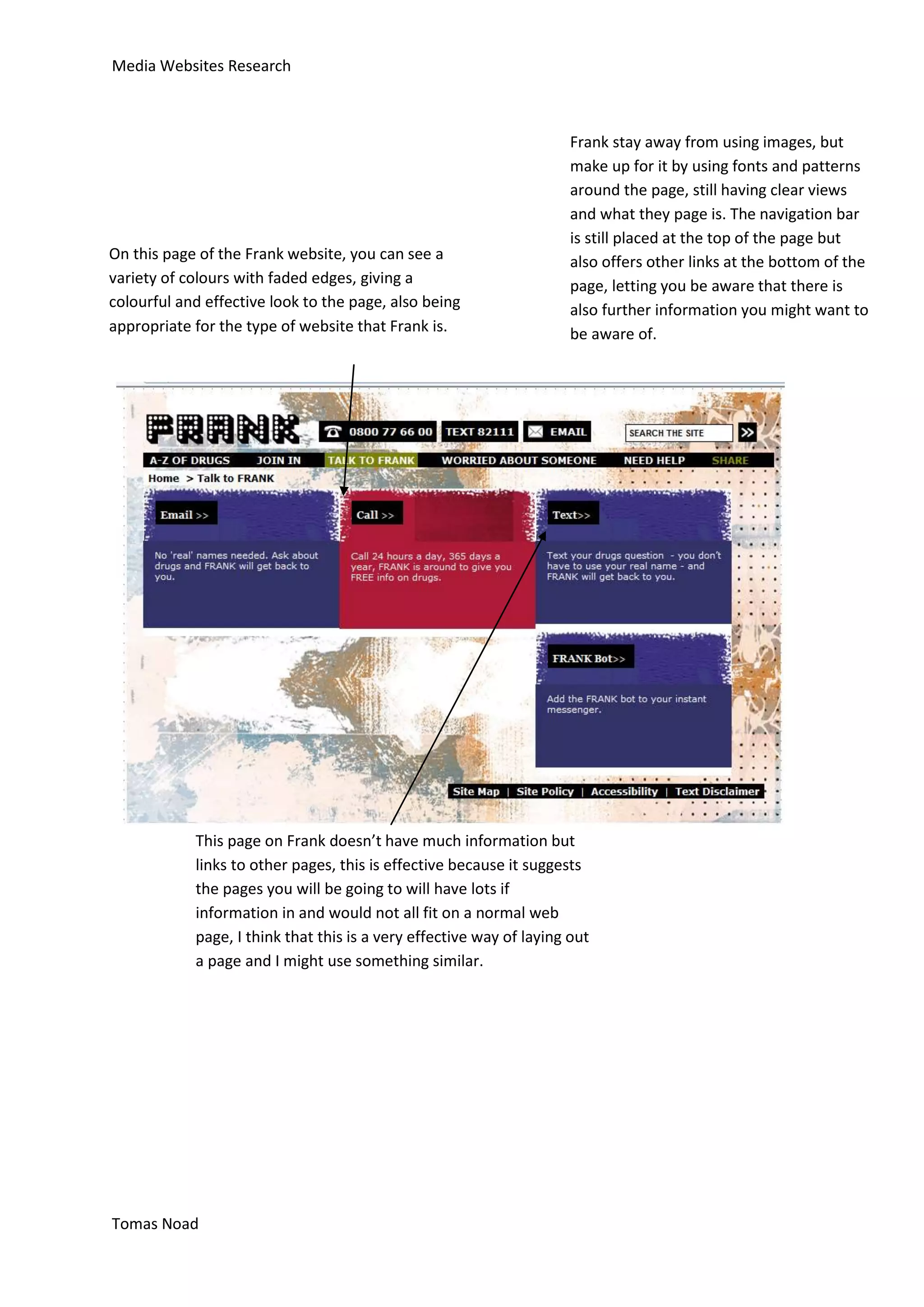
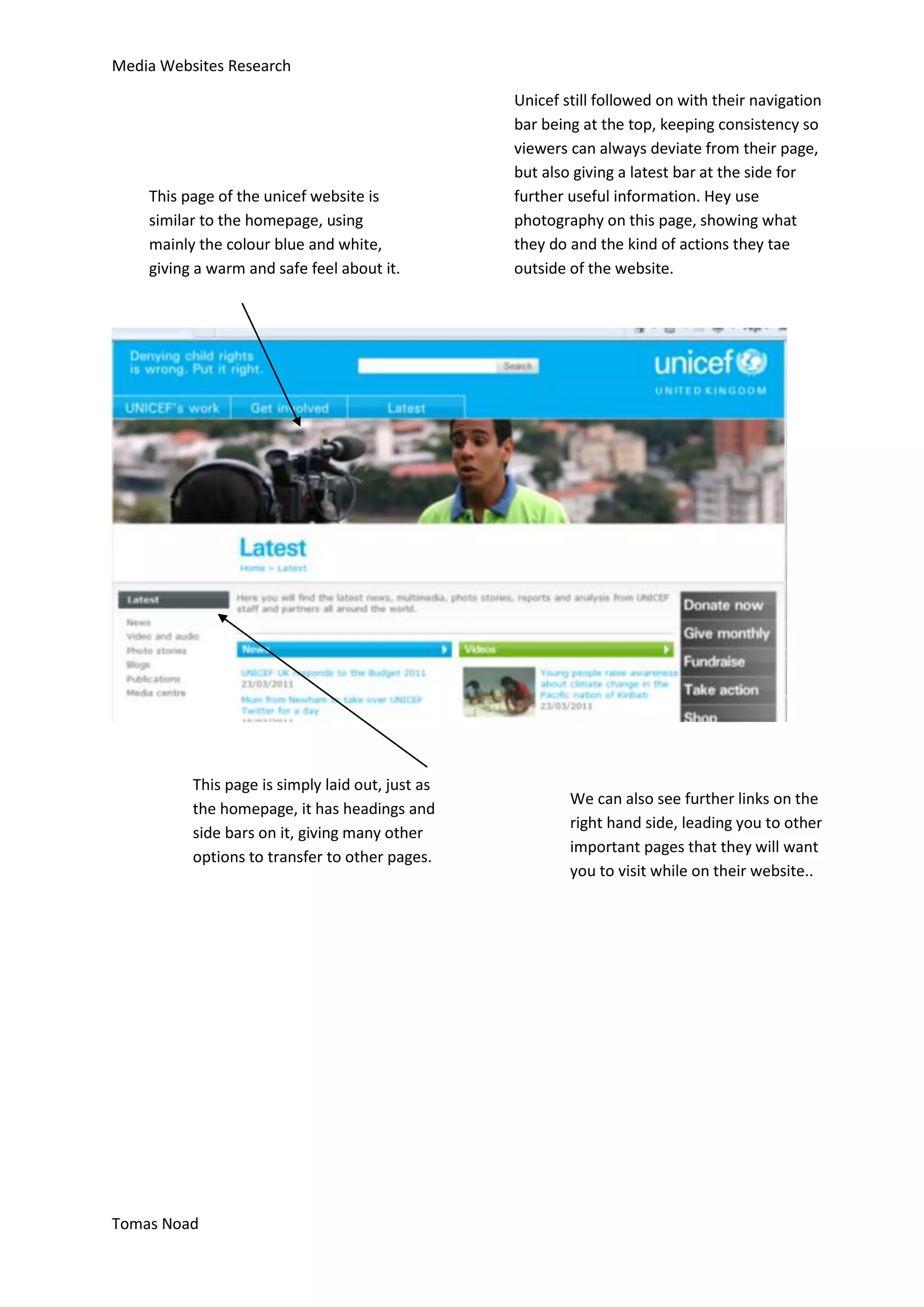
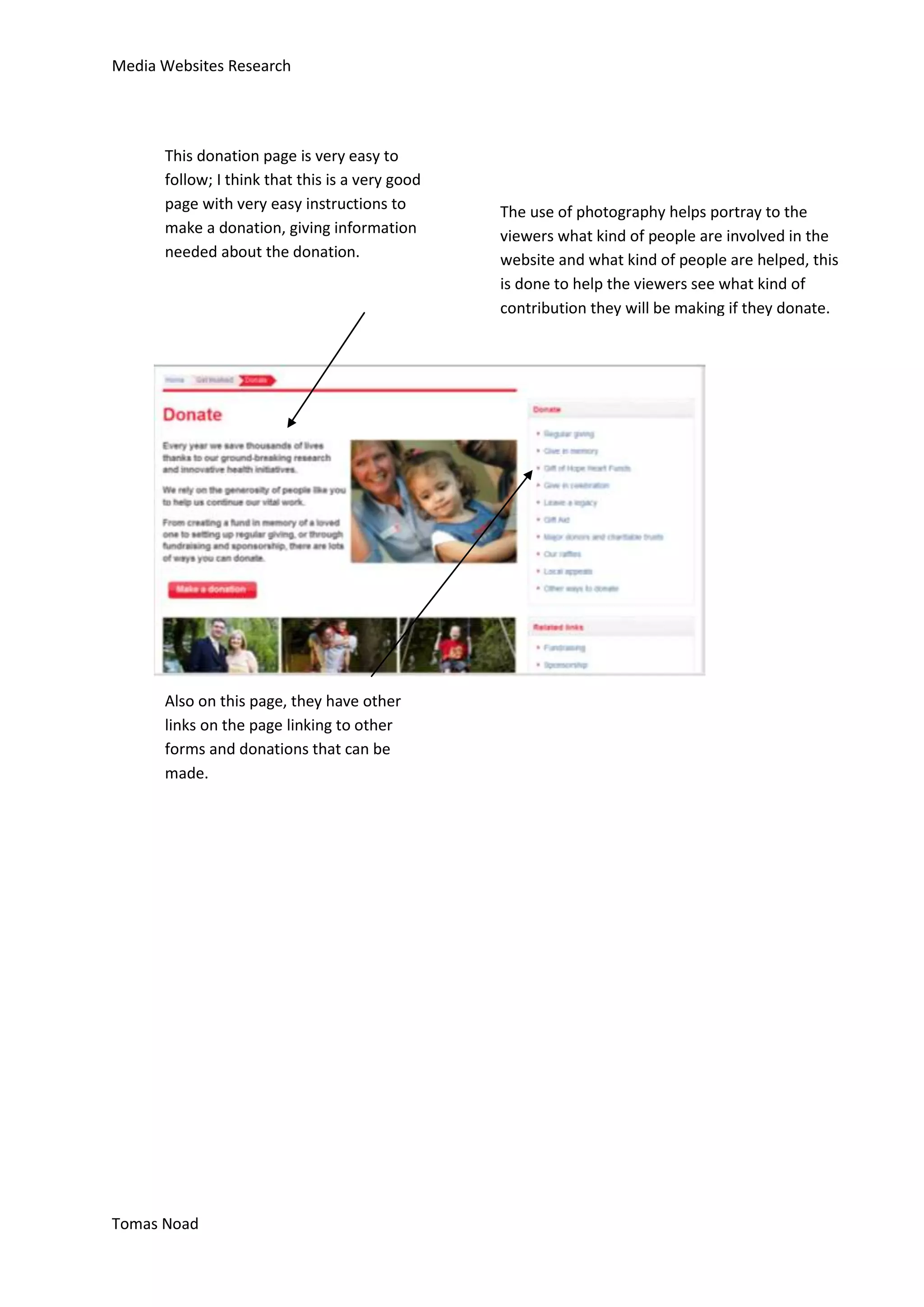
Media Websites Research


                                                                        The layout of this site is very compact,
                                                                        but still readable, having all the links
        This website uses good texts and effects on the                 to other pages in boxes close together,
        front page, it having colourful front home page,                this is a very effective convention
        using many different colours, this website looks                because of the type of website that it
        appealing to all audiences and looks very easy to               is, being a drug website, the images
        navigate. Having clear titles and images leading                and layout used can be stereotypically
        you to other pages.                                             linked to drug users.


The navigation bar is placed at the top
                                                 The font used is very clear and -
for easy access to all the pages, this
website in particular has drop downs,            precise, but still being exciting and
so if you hover over any of the links,           not boring, having text that stands
you will see a drop down to a variety            out for audiences.
of pages that you may wish to attend.
This is a very effective tool as it is
more user friendly and makes it a lot
easier to find the information you are
searching for.


  Tomas Noad
Media Websites Research
                                                          The layout of this page is very easy and very
 Unicef is a charity to help people in poverty,           neatly laid out, being very easy to follow and
 they use their own imagery, showing how they             view all pages and links on the page. Having
 help, and their main colour is blue. Blue is a           links on the top for the navigation bar, but also
 colour that is calm and helpful, showing that            having secondary links on the right hand side,
 their charity is willing to do all to help.              leading you to other pages that may be of
                                                          importance to you.


                                        Their layout is basic having one main image at the
                                        top of the page, with many other images at the
                                        bottom, they have a lot of text and information
                                        on the front page, they use this to give
                                        background information on the website and let
                                        customers and viewers know what the website is
                                        about.
Tomas Noad
Media Websites Research


                                                  This website uses a very unusual, it uses an animation
                                                  on the main webpage, this is a very useful and effective
                                                  affect, it brings the audience together and because of
                                                  the type of fish that it is (zebra fish), because they are a
                                                  fish that heal their own hearts, so they link to the type
                                                  of charity that it is.


The British heart foundation uses very patriotic
colours, blue, red and white, all being very calm              The overall layout of this homepage is very
relaxing colours, because of the patriotic colours, it         unique, having the animation as the
seems more appealing for all views, I feel that this is        centrepiece, but having links at both the top
a very effective idea that I might use as well.                and the bottom, being very clear which links
                                                               lead to what pages, using a bold clear font.
                                                               The images used are also very important as
                                                               they help show viewers in more detail what
                                                               they are intending do, having a link with a
                                                               picture over it, showing in advance some
                                                               basic information about what that page and
                                                               the charity offer.


    Tomas Noad
Media Websites Research


          Help for heroes is a very good example of       They use a lot of Images in their website,
          a patriotic website, it uses a variety of       using images of the soldiers at work,
          colours, all being the colours of the           showing them being carried off, signalling
          United Kingdom, Blue, Red and White.            the type of help we will be giving.


                                                                    Help for heroes uses a range text
   This website layout filled with information, being               and images, using a good balance,
   very full on straight away, but still keeping the                not using too much one media text,
   homepage looking tidy, having information about                  using these is good because they
   what they do with big clear links, but also offering             give us a clear view and ideas about
   a chance to help and donate from the first page.                 what the charity is about without
                                                                    clicking on any links.


Tomas Noad
Media Websites Research


                                                                      Frank stay away from using images, but
                                                                      make up for it by using fonts and patterns
                                                                      around the page, still having clear views
                                                                      and what they page is. The navigation bar
                                                                      is still placed at the top of the page but
On this page of the Frank website, you can see a                      also offers other links at the bottom of the
variety of colours with faded edges, giving a                         page, letting you be aware that there is
colourful and effective look to the page, also being                  also further information you might want to
appropriate for the type of website that Frank is.                    be aware of.


            This page on Frank doesn’t have much information but
            links to other pages, this is effective because it suggests
            the pages you will be going to will have lots if
            information in and would not all fit on a normal web
            page, I think that this is a very effective way of laying out
            a page and I might use something similar.


Tomas Noad
Media Websites Research

                                                  Unicef still followed on with their navigation
                                                  bar being at the top, keeping consistency so
                                                  viewers can always deviate from their page,
                                                  but also giving a latest bar at the side for
    This page of the unicef website is            further useful information. Hey use
    similar to the homepage, using                photography on this page, showing what
    mainly the colour blue and white,             they do and the kind of actions they tae
    giving a warm and safe feel about it.         outside of the website.


          This page is simply laid out, just as
                                                          We can also see further links on the
          the homepage, it has headings and
                                                          right hand side, leading you to other
          side bars on it, giving many other
                                                          important pages that they will want
          options to transfer to other pages.
                                                          you to visit while on their website..


Tomas Noad
Media Websites Research


      This donation page is very easy to
      follow; I think that this is a very good
      page with very easy instructions to        The use of photography helps portray to the
      make a donation, giving information        viewers what kind of people are involved in the
      needed about the donation.                 website and what kind of people are helped, this
                                                 is done to help the viewers see what kind of
                                                 contribution they will be making if they donate.


      Also on this page, they have other
      links on the page linking to other
      forms and donations that can be
      made.


Tomas Noad
Media Websites Research


                                                             His page is very well laid out, having bars to help show
      This help for heroes page, is about
                                                             information and links, being very clear and bold fonts
      fundraising, it has many images and
                                                             with smaller writing so you can still be aware of the
      information showing how they can
                                                             task ahead of you. The colours are a big thing on this
      raise money for their charities, this
                                                             page, sticking with their colour blue but using darker
      is effective because it lets viewers
                                                             shades and lighter shades to make certain sections
      know how they can get involved
                                                             such as the Titles and the links stand out.
      with the charity.


They have kept their navigation               This page also has many other
bar at the top but doing this                 options, not just about looking for
have made the title different as              fundraisers, but also how you
well, making it longer and stand              yourself can start up a fundraiser,
out more, having a slogan to                  raising money yourself for the help
help get their point across to                for heroes charity.
viewers.


  Tomas Noad

Resarch

  • 1.
    Media Websites Research The layout of this site is very compact, but still readable, having all the links This website uses good texts and effects on the to other pages in boxes close together, front page, it having colourful front home page, this is a very effective convention using many different colours, this website looks because of the type of website that it appealing to all audiences and looks very easy to is, being a drug website, the images navigate. Having clear titles and images leading and layout used can be stereotypically you to other pages. linked to drug users. The navigation bar is placed at the top The font used is very clear and - for easy access to all the pages, this website in particular has drop downs, precise, but still being exciting and so if you hover over any of the links, not boring, having text that stands you will see a drop down to a variety out for audiences. of pages that you may wish to attend. This is a very effective tool as it is more user friendly and makes it a lot easier to find the information you are searching for. Tomas Noad
  • 2.
    Media Websites Research The layout of this page is very easy and very Unicef is a charity to help people in poverty, neatly laid out, being very easy to follow and they use their own imagery, showing how they view all pages and links on the page. Having help, and their main colour is blue. Blue is a links on the top for the navigation bar, but also colour that is calm and helpful, showing that having secondary links on the right hand side, their charity is willing to do all to help. leading you to other pages that may be of importance to you. Their layout is basic having one main image at the top of the page, with many other images at the bottom, they have a lot of text and information on the front page, they use this to give background information on the website and let customers and viewers know what the website is about. Tomas Noad
  • 3.
    Media Websites Research This website uses a very unusual, it uses an animation on the main webpage, this is a very useful and effective affect, it brings the audience together and because of the type of fish that it is (zebra fish), because they are a fish that heal their own hearts, so they link to the type of charity that it is. The British heart foundation uses very patriotic colours, blue, red and white, all being very calm The overall layout of this homepage is very relaxing colours, because of the patriotic colours, it unique, having the animation as the seems more appealing for all views, I feel that this is centrepiece, but having links at both the top a very effective idea that I might use as well. and the bottom, being very clear which links lead to what pages, using a bold clear font. The images used are also very important as they help show viewers in more detail what they are intending do, having a link with a picture over it, showing in advance some basic information about what that page and the charity offer. Tomas Noad
  • 4.
    Media Websites Research Help for heroes is a very good example of They use a lot of Images in their website, a patriotic website, it uses a variety of using images of the soldiers at work, colours, all being the colours of the showing them being carried off, signalling United Kingdom, Blue, Red and White. the type of help we will be giving. Help for heroes uses a range text This website layout filled with information, being and images, using a good balance, very full on straight away, but still keeping the not using too much one media text, homepage looking tidy, having information about using these is good because they what they do with big clear links, but also offering give us a clear view and ideas about a chance to help and donate from the first page. what the charity is about without clicking on any links. Tomas Noad
  • 5.
    Media Websites Research Frank stay away from using images, but make up for it by using fonts and patterns around the page, still having clear views and what they page is. The navigation bar is still placed at the top of the page but On this page of the Frank website, you can see a also offers other links at the bottom of the variety of colours with faded edges, giving a page, letting you be aware that there is colourful and effective look to the page, also being also further information you might want to appropriate for the type of website that Frank is. be aware of. This page on Frank doesn’t have much information but links to other pages, this is effective because it suggests the pages you will be going to will have lots if information in and would not all fit on a normal web page, I think that this is a very effective way of laying out a page and I might use something similar. Tomas Noad
  • 6.
    Media Websites Research Unicef still followed on with their navigation bar being at the top, keeping consistency so viewers can always deviate from their page, but also giving a latest bar at the side for This page of the unicef website is further useful information. Hey use similar to the homepage, using photography on this page, showing what mainly the colour blue and white, they do and the kind of actions they tae giving a warm and safe feel about it. outside of the website. This page is simply laid out, just as We can also see further links on the the homepage, it has headings and right hand side, leading you to other side bars on it, giving many other important pages that they will want options to transfer to other pages. you to visit while on their website.. Tomas Noad
  • 7.
    Media Websites Research This donation page is very easy to follow; I think that this is a very good page with very easy instructions to The use of photography helps portray to the make a donation, giving information viewers what kind of people are involved in the needed about the donation. website and what kind of people are helped, this is done to help the viewers see what kind of contribution they will be making if they donate. Also on this page, they have other links on the page linking to other forms and donations that can be made. Tomas Noad
  • 8.
    Media Websites Research His page is very well laid out, having bars to help show This help for heroes page, is about information and links, being very clear and bold fonts fundraising, it has many images and with smaller writing so you can still be aware of the information showing how they can task ahead of you. The colours are a big thing on this raise money for their charities, this page, sticking with their colour blue but using darker is effective because it lets viewers shades and lighter shades to make certain sections know how they can get involved such as the Titles and the links stand out. with the charity. They have kept their navigation This page also has many other bar at the top but doing this options, not just about looking for have made the title different as fundraisers, but also how you well, making it longer and stand yourself can start up a fundraiser, out more, having a slogan to raising money yourself for the help help get their point across to for heroes charity. viewers. Tomas Noad