1. Technique Example & Effect
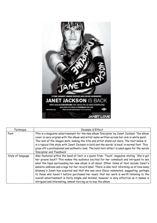
Font This is a magazine advertisement for the new album ‘Discipline’ by Janet Jackson. The album
cover is very original with the album and artist name written across her arm in white paint.
The rest of the images dark, making the title and artist stand out more. The text below is
in a typical film style with Janet Jackson in bold and the words ‘is back’ in normal font. This
gives off a professional and authentic look. The bold text affect is used again for the words
‘Discipline’ and ‘Feedback’
Style of language Also featured within the band of text is a quote from 'Touch' magazine stating 'She's got
her groove back’? This makes the audience excited for her comeback and intrigued to see
what the hype surrounding her new album is all about. Other items of text include Janet's
website address and a logo for her record label. There is also text informing us of how many
Grammy's Janet has acquired and that she was once Oscar nominated, suggesting, perhaps
to those who haven't before purchased her music that her work is worth listening to the
overall advertisement is fairly simple and minimal, however is very effective as it makes is
intrigued and interesting, almost forcing us to buy the album
2. Image They have purposely made Janet Jackson look sexually appealing by wetting her hair and
limiting her clothing, the grey scale affect also brings out Janet’s features, giving her a
serious and sexy image. This particular magazine advertisement is largely dominated by the
black and white image of Janet Jackson, in which she is marketing her come-back album
'Discipline'. Within the image, Janet is wearing long, black leather gloves upon which her
name and the name of her album have been written in white paint. This white stands out
against the black of her gloves, making it clearly visible as to what she is trying to
advertise. Janet is wearing leather, or PU type clothing, which often represents sexual
ideas and connotations. The way in which she is holding her arms across her body somewhat
portrays that she is trying to tone down this sexuality slightly.
Colour The colour if the advert is black and white, it is simple yet effective this makes the picture
look more professional as the use of black and white sticks out because it is different from
other posters.
Layout The layout is very simple, the artist is at the top and takes up most of the page and the
information is at the bottom this is because the audience can recognise the artist first then
the information first, also this makes the artist look more important.
Information Another piece of text is used to highlight Janet’s fame and success ‘5-time Grammy award
winner and Oscar nominated’. This reinforces the fact Janet is a successful recording
artist, which is backed up by her awards and nominations. This statement will maybe attract
people who were not originally fans of Janet, therefore gaining a larger fan base.
Other Magazine adverts always have the basic fundamentals, such as: name of album, date of
release, tracks featured on the album, a web address and a quote from a reviewer. This
magazine advert follows these conventions by the small text at the bottom, where it is clear
to see that the album is released on the 25th of February and is also available for download.
Just below it also says ‘includes the singles Feedback and Luv’ this is another typical
convention of magazine advert for an album. Then at the very bottom we see a quote from
Touch Magazine, promoting the album by saying ‘She’s got her groove back’, again another
typical convention which I will be looking to use when it comes to creating my own.