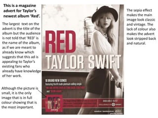
1. Although the picture is
small, it is the only
image that is in full
colour showing that is
the most important.
The sepia effect
makes the main
image look classic
and vintage. The
lack of colour also
makes the advert
look stripped back
and natural.
This is a magazine
advert for Taylor’s
newest album ‘Red’.
The largest text on the
advert is the title of the
album but the audience
is not told that ‘RED’ is
the name of the album,
as if we are meant to
already know which
suggests that this ad is
appealing to Taylor’s
existing fans who
already have knowledge
of her work.
2. Taylors head is above
the text suggesting
that the designer is
replying on the
audience to identify
with Taylors image
before reading the
text.
We also know that
she is an established
artist because the
audience are not
told that ‘Red’ is the
title for Taylors new
album until we reach
the bottom of the
poster.
3. Taylors facial
expression and
body language
here are both
quite serious. She
is not making
direct address
giving the
impression she
doesn’t know the
camera is there.
As the viewer, we
feel as though we
could be looking in
on her private life
supporting the
idea of voyeurism.
The natural lighting
of the image implies
that Taylor is being
herself and natural
around the camera
making herself seem
real and honest –
which are
characteristics Taylor
wants her image to
portray to her fans.
4. It could be argued
that the way Taylor is
dressed (shorts) and
how she is showing
the curves in her
body by the way she
is stood may suggest
that she is trying to
appeal to an older
target audience or
possibly a male fan
base through the use
of feminine ‘sex
appeal’ or the make
gaze.