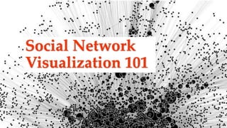
Social Network Visualization 101
•Download as PPTX, PDF•
2 likes•1,974 views

Social Network Visualization 101 for History

Recommended
Recommended
More Related Content
What's hot
What's hot (20)
Viewers also liked
Viewers also liked (20)
Similar to Social Network Visualization 101
Similar to Social Network Visualization 101 (20)
More from librarianrafia
More from librarianrafia (20)
Recently uploaded
Recently uploaded (20)
Social Network Visualization 101
- 2. Contact Information Rafia Mirza | Digital Humanities Librarian @LibrarianRafia | rafia@uta.edu Peace Ossom Williamson | Director for Research Data Services @123POW | peace@uta.edu
- 3. How to viz 1. Determine what to say 2. Find/collect the data you need 3. Wrangle! 4. Clean! (Repeat 3 & 4 many more times) 5. Come to a final product/conclusion
- 4. What is Data Viz?
- 5. Data Visualization The graphical display of abstract information for two purposes: • sense-making • communication https://www.interaction-design.org/literature/book/the-encyclopedia-of-human-computer-interaction-2nd-ed/data- visualization-for-human-perception Others 52% Heather 1% Lydia 6% Peace 13% Kaeli 28% Answering Nursing Questions Most nursing questions are not reaching the nursing team, as we are answering fewer than 50% recorded. 0 20 40 60 80 100 120 12 am 1 2 3 4 5 6 7 8 9 10 11 12 pm 1 2 3 4 5 6 7 8 9 10 11 pm Hourly Question Frequency Chat Questions Total Questions
- 6. Data Visualization The graphical display of abstract information for two purposes: • sense-making • communication 5 11 36 58 61 102 202 409 0 100 200 300 400 500 In-Person Ask a Librarian Blank Phone Appointment Drop-In Email Chat Number of questions per semester How Nursing Questions are Received Chat is the primary method, followed by emails. Together, they make up 70% of incoming nursing questions. https://www.interaction-design.org/literature/book/the-encyclopedia-of-human-computer-interaction-2nd-ed/data- visualization-for-human-perception
- 7. Data Visualization The graphical display of abstract information for two purposes: • sense-making • communication https://www.interaction-design.org/literature/book/the-encyclopedia-of-human-computer-interaction-2nd-ed/data- visualization-for-human-perception Potential Actions: • Put nursing librarians on chat • Inform staff on chat how to answer common questions • Make contact methods clear to nursing students • Be available during hours questions are most often asked
- 8. What is Network Viz?
- 9. Network Visualization http://www.markowetzlab.org/pics/dyNet_fig2.jpg Data visualization involving the visual display of networks via nodes and edges. node edge
- 10. Network Visualization http://www.markowetzlab.org/pics/dyNet_fig2.jpg Specifying relationships through nodes and edges. node edge
- 14. Types of Network Visualizations • Bibliographic networks (co- authoring, citation network) • Social networks • Biological networks • Political relationships • Sports (passing, setting up plays) • Power distributions
- 15. What is SNA? How does it relate to the discipline of History?
- 17. Social network analysis (SNA) • “Social network analysis (SNA) is the process of investigating social structures through the use of network and graph theories. It characterizes networked structures in terms of nodes (individual actors, people, or things within the network) and the ties, edges, or links (relationships or interactions) that connect them.” • via Wikipedia • History of Network Analysis (link to ppt)
- 18. Social network analysis in History • Networks in Historical Research • “The use of formal network methods for historical research is much more recent, with only a few exceptions dating back beyond thirty years.” • Historical Network Research: Network analysis in the historical disciplines • “Among historians, the term network has been used in a metaphorical sense alone for a long time. It was only recently that this has changed.”
- 19. Social network analysis in History • Visualizing Historical Networks Website • “Kindred Britain is a network of nearly 30,000 individuals — many of them iconic figures in British culture — connected through family relationships of blood, marriage, or affiliation. It is a vision of the nation’s history as a giant family affair.”
- 20. International Review of Social History
- 21. What types of networks are there?
- 22. Types of Networks Examples • Undirected • Directed • Weighted
- 23. Types of Networks Examples • Undirected • Directed • Weighted
- 24. Types of Networks Examples • Undirected • Directed • Weighted
- 26. How do you structure your data to do network viz?
- 27. Setting Up the File Node 1 Node 2 Peace Rafia Peace David Rafia Peace Peace Rafia David
- 28. Setting Up the File Source Destination Weight B A 1 B E 1 C A 1 C E 1 C D 1 A B C D E
- 29. Setting Up the File A B C D E A 0 0 0 0 0 B 1 0 0 0 1 C 1 0 0 1 1 D 0 0 0 0 0 E 0 0 0 0 0 A B C D E
- 30. Setting Up the File Source Destinations B A E C A D E A B C D E
- 31. Setting Up the File NodeID Attr1 Attr2 A yellow 1 B green 3 C orange 5 D yellow 3 E blue 1 A B C D E
- 32. Attractiveness Ensure the following: • Related nodes are close • Groups of related nodes are clustered together • Sufficient empty space between nodes, minimal overlapping http://www.markowetzlab.org/pics/dyNet_fig2.jpg
- 33. Attractiveness
- 35. 2012
- 36. Star Wars social networks: The Force Awakens Evelina Gabasova
- 37. Quality function to be minimized: • xi – location of node i • aij – weight of edge between notes i and j • α and β – attraction and repulsion parameters Statistics
- 38. β = -7 β = -6 β = -5 β = -4 β = -3
- 39. Attraction = 2 Repulsion = -1
- 40. Attraction = 2 Repulsion = 0
- 41. Attraction = 2 Repulsion = 1
- 42. A Co-Citation Network for Philosophy Kieran Healy
- 43. Applications Fun • Truthy & Hoaxy • Moviegalaxies • LinkedIn InMaps Socilab
- 44. Applications Creating • Gephi • Cytoscape • NodeXL • Sci2 • igraph FILE TYPE Edge List/ Matrix XML Edge Weight Attributes Viz Attributes Hierarchal Graphs CSV DL Ucinet DOT Graphviz GDF GEXF GML GraphML NET Pajek
- 45. Gephi: The Open Graph Viz Platform Gephi is the leading visualization and exploration software for all kinds of graphs and networks. Gephi is open-source and free.
- 46. Introduction to Network Analysis Thomas Padilla & Brandon Locke
- 47. Examples • Sample data sets • snap.stanford.edu/data • www- personal.umich.edu/~mejn/ netdata • wiki.gephi.org/index.php/da tasets Visual complexity
- 48. Questions?
Editor's Notes
- Learning Outcomes Understand the basic use of visualizations in network analysis What is Data Viz? Network Viz? SNA What types of Networks are there? How do you structure your data to do a viz? Recognize visualization file setup and structure What applications can you use? Distinguish systems or programs that create network visualizations What applications can you use? What are some tools/programs you can use?
- Data visualization is the graphical display of abstract information for two purposes: sense-making (also called data analysis) and communication. Important stories live in our data and data visualization is a powerful means to discover and understand these stories, and then to present them to others. Image: 1st one: Area chart: showing how many questions received each hour of the day 2nd one: pie chart: what % of questions coming form nursing dept., who is answering Sense making, data that otherwise you could not see patterns in if you had not visualized
- Communication: now communicating for purpose, marketing, argument, etc. Bar charts: shows most ? Coming in chat or email, could use to make argument need to increase staff on those
- Can also do both. What is your end goal? What is your thesis? If no purpose then not very useful. The information is abstract in that it describes things that are not physical. Statistical information is abstract. Whether it concerns sales, incidences of disease, athletic performance, or anything else, even though it doesn't pertain to the physical world, we can still display it visually, but to do this we must find a way to give form to that which has none. This translation of the abstract into physical attributes of vision (length, position, size, shape, and color, to name a few) can only succeed if we understand a bit about visual perception and cognition. In other words, to visualize data effectively, we must follow design principles that are derived from an understanding of human perception.
- So, what is a network? A network is any collection of objects in which some pairs of these objects are connected by links/edges (Easley & Kleinberg, 2011). Networks are critical to modern society, and a thorough understanding of how they behave is crucial to their efficient operation. Fortunately, data on networks is plentiful; by visualizing this data, it is possible to greatly improve our understanding. Our focus is on visualizing the data associated with a network and not on simply visualizing the structure of the network itself.
- In this visualization, the focus is on specifying relationships among a collection of items. A network consists of nodes, edges, and possibly spatial information. Statistics are associated with the nodes and the edges. Nodes (or objects) are connected by links (or edges). The edge statistics may be directed, or pointed, or undirected. The network may have a natural spatial layout as does a geographical trade-flow network, or may be abstract as in a personal communications network. Network data may categorical, such as the type of node or edge, or quantitative such as a edge’s capacity. The data may be static, such as a network’s capacity, or time varying, such as the network flow in several time periods.
- Modern network visualization goes back to Jacob L. Moreno’s “Sociograms” of the 1930s. He standardized the usage of circles and lines to represent agents and their relations (1932). He introduced shapes to mark different groups of nodes and used arrow heads to show directionality of connections (1934). Decades before computer programs were available, Moreno positioned the nodes to reveal social structure (1934). In subsequent years, important nodes were arranged centrally in radial layouts (Lundberg and Steele, 1939) or were drawn with larger circles (Loomis, 1946). Contextual information played an ever greater role in network visualizations—Roethlisberger and Dickson (1939) positioned nodes based on their physical location; Davis, Gardner, and Gardner (1941) used socio-economic variables to position the nodes; and Sampson (1968) mapped positive and negative sentiment towards agents to node positions. However, some remarkable network visualizations had already been published as early as the late nineteenth century. These visualizations include Alexander Macfarlane’s visual representation of British marriage prohibitions (1883) and John Hobson’s approach of visualizing two-mode data by showing the overlap of directors among South African companies (1894). For this poster presentation, we have re-created the above mentioned visualizations as well as other historic network figures. All of them represent milestones in the development of network visualizations that guide contemporary network visualizations through today.
- Bernfeld – circle of girl friends. Four figures show different relations. Line thickness represents intensity. Moreno – class structure, 5th grade. Girls (circles) and boys (triangles). Links show two best friends. Top line represents group border
- Roethlisberger – observed friendship ties and cliques in a factory. Position reflects the location of their workspace. Davis – a group of women in Old City, 1936. Women participating at social events. Rows and columns were rearranged to show groups.
- Many kinds of network viz, but what is you lens/methadology/purpose
- In the 1960s, Eugene Garfield created the “historiograph”, a technique to visualize the history of scientific fields using a network of citations or historical narratives laid out temporally from top to bottom.1 Garfield developed a method of creating historiographs algorithmically, and his contemporaries hoped the diagram would eventually be used frequently by historians. The idea was that historians could use these visuals to quickly get a grasp of the history of a discipline’s research trajectories, either for research purposes or as a quick summary in a publication.
- Undirected: no direction, mutual, so no arrows Facebook friends Who lived in same era
- Twitter is directed (not mutual), has arrows, Twitter you can follow , but they don’t follow back, Hierarchical relations, , leaders such as kings, queens, generals, etc. Communication (letters, epistles, etc)
- Weighted when you weigh size of edge by intensity. So example, Facebook likes, maybe you like everything someone posts, (thick line) but they only like a 1/3 of what you post (thinner line)
- Adjacency: Facebook, twitter, how one node connects to another Affiliation: two/multiple nodes , how one type of node is connected to another type of node (could show people and party affiliation)
- You are going to need to figure out what tool you are using, so you are going to set up file in a way that the tool can read. Here are some examples of what that will look like
- One type of file set up Example: 1st column, originator node, to destination node Peace is listed in two rows, because point to different names Example: who writes each other letters ?
- One type of file set up Similar file set up to previous, but weight added Has different headers Headers dictated by what you want to show and how program you are using want file structured
- One type of file set up Column names will be reflected in viz, do you want to name column a A or Alison? Example: All potential recipient listed across top All potential originators listed across left
- For this file type all destination need to be on same line
- For this file, type, program says if you want nodes to have color, and size you have to add that as an attribute
- Best practices is Attractiveness may depend on the type of visualization (static versus interactive) and the type of network (size and density) How people parse information
- Attractiveness may depend on the type of visualization (static versus interactive) and the type of network (size and density)
- Degree – how many other nodes are directly reached by this node? Betweenness – how likely is this node to be the direct route between two other nodes in the network? Closeness – how fast can this node reach every other node in the network? Eigenvector – how well is this node connected to other well-connected nodes?
- Network metrics This is a viz that shows degree and betweeness of Forrest and Abbie Degree – how many other nodes are directly reached by this node? Betweenness – how likely is this node to be the direct route between two other nodes in the network? Forrest has high degree and betweeness, so he is in middle of network (and example of how you might manually adjust viz to crate understanding, manually made his dot bigger) Abbi has low.
- Star Wars social networks: The Force Awakens http://evelinag.com/blog/2016/01-25-social-network-force-awakens/#.WIGLFMtMHqA “ The nodes in the network represent the individual characters, and they are connected by a link if they both speak within the same scene. The width of each link represents the frequency of co-occurrence of the two corresponding characters, and the size of each node represents the number of scenes where the character speaks.” Closeness – how fast can this node reach every other node in the network? Shows how many times characters have talked to each other (how fast you can reach 1 to the other) Eigenvector – how well is this node connected to other well-connected nodes? Rd-d2 has high eigenvector
- We will be using Google fusion tables to create a basic summary table and a chart. Network viz don’t just happens, stats are involved that determine how layout is going to be
- This is repulsion and attraction settings Alpha attraction Beta is repulsion As attraction increases, nodes get closer together As repulsion increases, nodes move further apart
- Decrease repulsion Very sparse networks may benefit from negative repulsion -low repulsion leads to more uniform and less clustered layouts, which may be attractive for static visualizations
- Often, this is the best layout for interactive visualizations Reduced repulsion here, if you wanted networks/clusters to be closer together
- Default values which usually work reasonably well for both static and interactive visualizations. Coauthor network This is a setting, what do you want your attraction and repulsion settings to be This is Default
- My LinkedIn network: Left – college, Right – librarians, Lower – UTA nursing faculty, dots – random people (running partner, best friend since HS, personal trainer)