CBD Belapur Individual Call Girls In 08976425520 Panvel Only Genuine Call Girls
Explore Color Theory and Its Uses in Design
1. Elements of Design: Color
(Reference Source: http://desktoppub.about.com/library/weekly/aa091197.htm)
Color is not essential to a good design. However, color is an added dimension that can evoke moods
and make powerful statements when used wisely. Explore the uses of value, technical aspects of color,
and color selection and symbolism.
Color
Color is not essential to a good design. Black and white and shades of gray can create 'color' that is
just as effective as reds, blues, and greens. However, color is an added dimension that can evoke
moods and make powerful statements when used wisely.
In Lesson 1 we'll look at value - an element found in all designs. In Lesson 2 we'll briefly discuss the
technical aspects specifying and printing of color. Lesson 3 covers the selection of color and color
schemes. Each lesson contains tips on using color effectively. This is a basic course on color as an
element of design.
Lesson 1 - Value
Value is present in all design. It is the lightness or darkness of an object, regardless of color. Value is
relative to the background color and other items on the page.
Use value to:
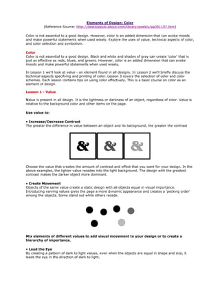
• Increase/Decrease Contrast
The greater the difference in value between an object and its background, the greater the contrast
Choose the value that creates the amount of contrast and effect that you want for your design. In the
above examples, the lighter value recedes into the light background. The design with the greatest
contrast makes the darker object more dominant.
• Create Movement
Objects of the same value create a static design with all objects equal in visual importance.
Introducing varying values gives the page a more dynamic appearance and creates a 'pecking order'
among the objects. Some stand out while others recede.
Mix elements of different values to add visual movement to your design or to create a
hierarchy of importance.
• Lead the Eye
By creating a pattern of dark to light values, even when the objects are equal in shape and size, it
leads the eye in the direction of dark to light.
2. 2
In the above example, the first set of all dark lines are static. The middle example leads the eye in a
downward direction (dark to light). Reversing the values of the lines leads the eye upward.
Use color to change the effect of value:
Color has the power to override the effects of value. In a high contrast black & white design,
introducing a single, small bit of color will change the focus and balance of the design.
The eye is drawn to that spot of color even if other elements are designed to draw the eye
in some other direction or the objects are otherwise equal. That's the power of color.
Personal Assignment (This is not a required IMED1341 assignment)
Find two to three color samples that illustrate the use of value to create contrast (either high contrast
or low contrast) and to create random or directed (leading) movement. For each sample, look at the
purpose and focus of the piece and decide if, in your opinion, the use of value
1) causes elements of the design to stand out or recede;
2) directs the eye to specific information; or,
3) creates a mood (Describe that mood. Is it quiet elegance, high tech, or playful? Is it high energy or
calm and soothing?)
With paper and pencil or in your favorite graphics program, experiment with using value. Draw simple
shapes such as circles and squares. Place objects of light to dark on light and dark backgrounds. Mix
objects of different values and create static and dynamic groupings. Experiment with using light type
on dark backgrounds. Which combinations of light and dark values are easiest to read?
Draw a pattern of uniform black squares or circles on a piece of white paper. Now draw that same
pattern but make one of the circles or squares red — just one. How does it change the overall effect?
Lesson 2 - Technical Aspects of Color
Before you can go choosing red over blue or mixing light and dark colors, you need to know how color
works in print and on digital displays.
In the five pages of supplemental material for this lesson you'll explore color wheels, tints and shades,
complementary colors, CMYK, hexadecimal numbers, and other terminology and concepts that are
important both in selecting appropriate colors for your designs and for specifying those colors whether
you are printing to your desktop, a commercial printer, or putting pages on the Web.
While there is a lot of material covered, color is an extremely complex topic and this lesson is only
meant to get you acquainted with some basic color concepts.
• 1: Color Wheels
• 2: RGB & CMYK
3. 3
• 3: Hues, tints, shades, saturation
• 4: Perception
• 5: Specifying Color
Personal Assignment (This is not a required IMED1341 assignment)
With paper and pencil or in your favorite graphics program recreate the color wheels discussed in part
1, above. For each color, write down the adjacent and the complementary or contrasting colors for
each. Draw your own color swatches (or tear bits of color from magazines) and place together
'clashing' colors to see if they really do clash.
If you have access to multiple browsers and/or more than one computer, visit the same Web site with
each browser and each computer and look at the way pages, especially colors, display differently on
each.
Color Talk (http://desktoppub.about.com/library/weekly/aa091197.htm)
Color wheels
by Jacci Howard Bear
Did you know that the color wheel you learned in school isn't the same as the colors used for the
Web? It's not even the way colors are mixed for printing? Well, ok, same colors, just different
arrangements and mixes.
• The traditional primary colors are RED, YELLOW, and BLUE.
• Mix two primary colors to get the complementary colors.
• The traditional complementary colors are ORANGE (Red plus Yellow), GREEN (Yellow plus Blue),
and PURPLE (Blue plus Red).
In grade school you probably had plenty of opportunities to mix primary colors and make new colors.
It was magic!
The way we see color is a bit different. You've probably seen a prism break a beam of light into a
rainbow of colors. The visible spectrum of light breaks down into three color regions: RED, GREEN,
and BLUE.
• Add RED, GREEN, and BLUE (RGB) light to create WHITE light. Because you ADD the colors together
to get White, we call these the additive primaries.
• Subtract one of the colors from the other three and you are left with yet another color. RGB minus
RED leaves CYAN. RGB minus the BLUE leaves YELLOW. RGB minus GREEN leaves MAGENTA. These
are called the subtractive primaries (CMY).
Try mixing GREEN and BLUE paint and I bet you don't end up with a nice CYAN. Why? Because the
color we see is reflected light and light and ink don't work in quite the same way.
4. 4
Now put all this aside for a bit and look at the way we try to reproduce color in print and on the Web.
Color Talk
rgb and cmyk
by Jacci Howard Bear
Your computer monitor emits light so it stands to reason that the computer uses the three color
regions of RED, GREEN, and BLUE to reproduce the colors we see.
Working with images destined for the screen or the Web, we designate colors by the amount of RED,
GREEN, or BLUE in the color. In your graphics software these numbers might look like this:
255 RED 255 GREEN 0 BLUE
A number between 1-255 designates the amount of each color RED, GREEN, or BLUE.
In order for your computer to understand these numbers we translate them into 6 digit hexidecimal
numbers or triplets.
255 RED 255 GREEN 0 BLUE becomes FFFF00. The first pair (FF) is the Red, The second pair (FF) is
the Green, and 00 is the Blue. FF is the hexidecimal equivalent of 255 and 00 is the hexidecimal
equivalent of 0.
In print, we try to reproduce the colors we see. Remember how color (light) is made by subtracting
differing amounts of other colors from the additive primaries (RGB)? Well, in printing when we are
mixing (adding) inks together the colors don't come out as we might expect.
Therefore, we start with the subtractive primaries (CYM) and mix those in varying amounts (plus
BLACK abbreviated as K) to get the colors we see printed in magazines and books.
Colors are mixed in percentages such as:
50% CYAN 100% YELLOW 25% MAGENTA
This CMY(K) color model is only one of many ways we can express color for print — but we'll save that
topic for another feature.
There are other color-related terms which we'll address briefly. The overview on the next page will
help you see how the different terms work together and interact to describe the colors we see in the
world, in print, and on the Web.
Color Talk
hues, tints, shades, and saturation
by Jacci Howard Bear
5. 5
There are more colors that we can see and create than just Red, Green, Blue, Cyan, Yellow, and
Magenta. Although we often depict the color wheel as shown above — with blocks of solid color. It is
really millions of colors that blend one into another as we move around the wheel. Similar to this color
wheel:
Each of those individual colors is a hue. Red is a hue. Blue is a hue. Purple is a hue.
You can change the saturation of a hue by adding black (shadow) or white (light). The amount of
saturation gives us our shades and tints.
Add varying amounts of black to get shades. Think of the coming darkness and the darkening
shadows to remember that a hue plus black equals a shade.
Add varying amounts of white to lighten a hue. The light hues are tints.
Color Talk II
our perception of color
by Jacci Howard Bear
If you thought the primary colors were Red, Blue, and Yellow, with
complementary colors of Purple, Green, and Orange, then you need to take a look at part 1 of this
feature because for this discussion we rely on the additive and subtractive colors, RGB and CMY.
Several factors affect the way we perceive color. One of those factors can be shown by the position of
colors on the color wheel in relation to other colors. These color wheels (below) take out the all or
some of the transitional colors so that you can more readily see the relationship of the colors to one
another.
• Adjacent colors (next to each other) harmonize with one another. They work well together
(usually). For example Green and Yellow or Purple and Magenta. Generally one of the colors
6. 6
has a little touch of the other in it (i.e. with the Blue/Magenta pair, Magenta is made up of Red
and Blue).
• Colors separated by another color are contrasting colors. You may also see these referred to
as complementary. Red and Green are contrasting colors. The more transitional colors
separating two colors, the greater the contrast. For example, Magenta and Orange is not as
high contrast as Magenta and Yellow.
• Colors that are directly opposite from one another are said to clash. You'll note that these
clashes occur between primary/complementary or ADDITIVE/SUBSTRACTIVE pairs such as
Blue and Yellow or Green and Magenta.
While these terms can be useful, they can also be deceiving.
• The term harmonize sounds nice, pleasant. But some harmonizing colors may appear washed
out (yellow/green) or too dark and similar (blue/purple) to work well together.
• While contrast is often needed to provide optimum readability (such as high contrast between
background and text) contrasting colors on the color wheel when printed side by side can
appear to vibrate and be very tiring on the eye.
• Although it sounds bad, sometimes clashing colors can work together in a design depending
on the amount of color and how close they appear together on the page or screen.
Some of the ambiguities of these color combinations can be alleviated with the introduction of black
and white, dark and light, shades and tints. Previously we defined shades as the addition of BLACK to
a hue (color) and tint as the addition of WHITE to a hue.
In using adjacent or harmonizing colors, you can achieve a greater degree of legibility by adding black
or white to one of the hues.
WHITE is the ultimate light color and contrasts well with dark colors such as red, blue, or purple.
BLACK is the ultimate dark color and makes lighter colors such as yellow really pop out.
Any single or multiple colors can change — or rather our perception of them changes — due to the
other surrounding colors, the proximity of the colors to each other, and the amount of light.
A light color appears even lighter when it is adjacent to a dark color (including black). Two similar
colors side by side may appear as two distinct colors but placed far apart they start to look like the
same color.
7. 7
The amount of light we perceive in a color is also affected by the surface on which it is printed. A shiny
RED corvette printed in a magazine ad on slick, glossy paper is not going to look the same as the RED
corvette printed in the newspaper ad. The papers absorb and reflect light and color differently.
Additionally, our color choices are often dictated by the emotions that specific colors and color
combinations evoke. But once we have the colors we want, getting them to print or display as
intended is the next step.
Color Talk II
Specifying color
by Jacci Howard Bear
Choosing the most pleasing or effective color combinations is only part of the equation in working with
color. You must also be able to specify the colors you want. For printing there are a number of ways to
specify color and it can vary depending on the number of colors used and how you use them. We'll
just go through a few of the possibilities.
• You can achieve a large variety of effects using a single color (1/C) by specifying that the color
be screened (tints). These tints are percentages of the solid color (100%) as depicted below.
• Combine solids and screened tints of two or more colors (2/C, 3/C, 4/C etc.). In the example,
below, the colors are all combinations of a single color plus black (K) (top three are cyan,
bottom three are magenta). (for printing purposes black is a color) They are also percentages.
• To match a color exactly (or as near as printing can get) you can use a system such as the
Pantone Matching System. There are others as well. Color mixes are numbered for easy
reference. Your graphics program may have color palettes named for some of the more
popular color-matching systems. These allow you to choose colors for your design that
correspond to the color-matching system your printer uses.
• In four-color process printing, to reproduce full-color continuous-tone color, we use four
specific colors. These process colors are cyan (C), yellow (Y), magenta (M) (the SUBTRACTIVE
colors from our color wheel), and black (K). The perception of millions of colors is achieved not
by mixing these colors of ink but by printing thousands of tiny dots of each color in different
sizes and patterns. The viewers eye "mixes" the colors and sees more than the four colors of
CMYK (or sometimes, CYMK).
• In four-color process printing, rather than specifying specific colors, you create separations
[def.] — a different copy of your artwork for each of the four colors. Each copy is printed one
on top of the other to create the optical effect of full-color.
8. 8
Obviously this is only a quick overview. Hundreds of books and articles have been written about the
process of specifying and printing in color.
In many ways specifying color for the Web is actually much simpler than printing in color. Just as four-
color process printing relies on how our eyes interpret dots of cyan, magenta, yellow, and black in
varying patterns, our computer screen relies on how our eyes interpret dots of red, green, and blue.
Color on the Web is specified in terms of the amount of red, green, and blue in the color. Black is the
presence of 100% of all three. White is the absence of all three.
In our graphics program these amounts of red, green, and blue are specified with numbers for 0-255
(255 being the pure 100% value of the color).
255 RED 255 GREEN 0 BLUE
In order for your computer to understand these numbers we translate them into 6 digit hexidecimal
numbers or triplets.
255 RED 255 GREEN 0 BLUE becomes FFFF00. The first pair (FF) is the Red, The second pair (FF) is
the Green, and 00 is the Blue. FF is the hexidecimal equivalent of 255 and 00 is the hexidecimal
equivalent of 0.
It would appear that there are 256 possible color combinations that you can see on your computer
monitor.
Simple enough, until we start talking about browser safe colors and cross-platform color appearance.
The truth is, different browsers interpret colors slightly differently and the same color will not appear
the same on all computer screens. It's very much like the way a printed color looks different on
different types of paper.
In creating color graphics or specifying colors for backgrounds and text for display on the Web there
are some things you can do that will help ensure that your colors will look acceptable to the majority
9. 9
of viewers. See our extensive collection of links to color selection, color on the Web, and other color
topics.
Lesson 3 - Color Selection & Use
Perhaps the most fun and most challenging aspect of design is choosing the right colors. The right
colors can bring a design to life, or destroy an otherwise excellent piece. However, color can't rescue a
piece that isn't well-designed in the first place. It's not a cure-all.
Colors fall into three general categories: warm, cool, and neutral. The way we mix those colors along
with attention to value, can add interest, enhance the design concept, or convey specific messages.
This lesson is not intended as an in-depth study of color symbolism and color schemes but it will help
to acquaint you with some of the basics of mixing and matching colors.
The first page of the supplemental material is a general overview but it also covers warm, cool, and
neutral colors briefly and recaps some previous discussion of harmonizing, contrasting, and clashing
color combinations. Then each subsequent page covers a single color or related colors. Learn about
the emotions of each color and ways in which that color is typically used.
(Note: If you've read this material before - it was first added to the site in October 2000 -
read it again. There has been some new material added, including additional colors.)
• Warm, Cool, Neutral Colors
• Red, Pink
• Yellow, Gold
• Orange
• Blue
• Green, Teal
• Purple, Lavender
• Brown, Tan, Beige
• Gray, Silver
• Black, White
Personal Assignment (This is not a required IMED1341 assignment)
Find examples of warm, cool, and neutral color palettes. Find 2-3 examples on the web that you
consider excellent use of color. Find 2-3 examples that you consider poor use of color. What makes
each example work or not work? Look for overuse of color, color pairings that clash horribly, and
unusual color combinations that 'work.' Compare the colors used and purpose of the piece to the
general color symbolism described in the supplemental material. Is there a connection or did that
piece 'fly in the face of convention' and use those colors in an unexpected way?
This assignment consists of 4 multiple choice and/or fill-in-the-blank and/or True/False questions and
two brief essay question on color plus a bonus question.
1. Generally the eye is lead from:
a. lighter to darker b. darker to lighter c. bottom to top
2. The additive primaries minus green leaves:
a. CYAN b. YELLOW c. MAGENTA d. BLUE
3. Another name for hexidecimal colors, used to specify Web colors is ______________.
4. Adding white to red produces a shade of red. True or False
5. Describe the relationship between Yellow and Purple.
6. Choose any two or three colors that you like as a potential color palette for some imaginary
piece you might design. Describe those colors (you can use descriptive terms such as
burgundy red or use the hexidecimal or CMYK values (or other color systems you may be
familiar with such as Pantone colors, not covered in this lesson). Describe how those colors
work together. Describe whether you would be likely to use equal or varying amounts of each.
Describe the mood or emotions that this color combination evokes. Describe how you might
use value, tints, and shades with these base colors. Use your imagination and describe the
colors in as much detail as you can along with why you chose that combination.
7. Bonus: In CMYK, the K represents Black. Why K? (The answer is in the Glossary)
10. 10
Color Symbolism
it's a colorful, colorful world
by Jacci Howard Bear
Color is more than a combination of red, green, and blue or cyan, magenta,
yellow, and black. It is non-verbal communication.
Colors have symbolism and meanings that go beyond ink. As you design
brochures, logos, and Web sites, it is helpful to keep in mind how the eye
and the mind perceive certain colors.
Sometimes colors create a physical reaction (red has been shown to raise
blood pressure) and at other times it is a cultural reaction (in the U.S.
white is for weddings, in some Eastern cultures, white is the color for
mourning and funerals). Colors follow trends as well. Avocado, a shade of
green, is synomous with the 60s and 70s in the minds of some consumers.
On the next few pages we'll explore the symbolism of different colors.
Cool Colors (calming): Blue, Green (& White)
Warm Colors (exciting): Red, Yellow, Orange (& Black)
Mixed Cool/Warm Colors: Purple
Neutral Colors (good for backgrounds): Brown, Tan, Beige, Gray, Silver, Black, White
The relationship of adjacent, complementary, and clashing colors is more fully explained here. Below
is a brief synopsis.
• Adjacent or harmonizing colors appear next to each other on the color wheel.
harmonizing (adjacent) colors often work well together but if too close in value they can appear
washed out or not have enough contrast
• Complementary colors are separated by another color on the color wheel.
complementary colors printed side by side can cause visual vibration making them a less then
desirable combination
• Clashing colors are directly opposite each other on the color wheel
All About Red and Pink
Love and War
Red is hot. It's a strong color that conjures up a range of seemingly conflicting emotions from
passionate love to violence and warfare. Red is Cupid and the devil. A stimulant, it's the hottest of the
warm colors.
Studies show that red can have a physical effect, increasing the rate of respiration and raising blood
pressure. Use red to grab attention and to get people to take action.
11. 11
Red is power, hence the red 'power tie' and the 'red carpet' for celebrities and VIPs (very important
people). Use red when you don't want to sink into the background. Use red to suggest speed
combined with confidence and perhaps even a dash of danger. Red is the color of happiness and
properity in China and is often used to attract good luck. It is often the color worn by brides in the
East.
In combination with green, red is a Christmas color — a joyful season. In some cultures, red denotes
purity, joy, and celebration.
Pink is a softer, less violent red. Pink is the sweet side of red. Both colors denote love but while red is
hot passion, pink is romantic and charming. Use pink to convey playfulness (hot pink flamingoes) and
tenderness (pastel pinks).
Red Goes With...
spinning the color wheel
Take a look at red on the color wheel.
• Harmonizing colors for red: Magenta and Yellow
harmonizing colors (adjacent) often work well together but if too close in value they can appear
washed out or not have enough contrast
• Complementary colors for red: Purple and Green
complementary colors printed side by side can cause visual vibration making them a less then
desirable combination
• Opposite color for red: Cyan (Blue)
colors that are opposite each other on the color wheel are said to clash — not always a bad
combination if used carefully
Red Color Combinations
color palettes with CMYK formulas
These color palettes feature shades of red. Although I've made a few suggestions here and there
about the 'amount' of each color to use, experiment. For best results don't use even amounts of each
color in the palette. Choose one or two dominant colors and use the rest for accents. Keep in mind
that due to the differences between color in print and on the Web that these colors may not appear
the same on paper as they appear here on the screen.
These aren't just random color combinations. Each of these are based on actual historic and modern
formulas used in posters, packaging, ads, and other design work over the past century. For a much
more comprehensive selection of color combinations refer to The Designer's Guide to Color
Combinations by Leslie Cabarga.
C10Y100K15 | C50Y100K20 | C10M100Y80 | C40K100 | White
This isn't a Christmas red and green.
12. 12
C10M100Y100 | C100M5Y100 | M10Y100 | C40K100
Another red and green combo. Use lots of black and a bit of yellow to create an eye-popping look.
C100M40K30 | C85Y70K45 | M15Y70 | M70Y65 | C30M100Y70K30
Rich maroon, teal, and green team up for this palette.
M65Y25 | M30Y10 | C65M10 | M50Y45 | White | C40K100
Your pastels won't be washed out with a judicial dose of black to make those pinks pop.
C13Y12 | M15Y100K11 | M50Y10K25 | C15M100Y30 | C40K100 | White
Medium and dark pinks with a mustard yellow, with a little bit of black and white.
C4M65Y100 | C80M10Y40 | M90Y50 | C30M100Y80K20 | C20M40Y85K5 | C45
Shades of pink with a burst of orange. Placing the blue between the orange and pink helps avoid
visual vibrations.
C10M15Y25K2 | C30M20Y40K13 | C8M90Y100K3 | C40K100
Using the gray and beige colors in place of white with black and red softens this color scheme.
(Ummm... I mixed that black wrong, it should be black not the gray it appears on screen)
M100Y100 | M20Y100 | C40K100 | White
Use the yellow sparingly against red or use a touch of red against a background of yellow for two
entirely different eye-popping looks. (same as above, that should be black not dark gray)
13. 13
Keep it simple with just two colors plus white - in this case a deep maroon red and a peachy pink.
[See more Limited Color Palettes]
All About Yellow and Gold
Hope and Happiness
Yellow is sunshine. It is a warm color that, like red, has conflicting symbolism. On the one hand it
denotes happiness and joy but on the other hand it's the color of cowardice and deceit.
Use the color to lift spirits and project optimism. For years yellow ribbons were worn as a sign of hope
as women waited from their men to come marching home from war. Today, they are still used to
welcome home loved ones. Because of the high visibility of bright yellow, it is often used for hazard
signs and some emergency vehicles.
14. 14
Use yellow to perk up a more subdued palette of blues and grays. Use lemon yellow with orange to
carry out a healthy, summery, citrus theme.
A cousin to yellow (and orange and brown) is gold. While green may be the color of money (U.S.
money, that is) gold is the color of riches. While 'all that glitters is not gold' the color gold still
suggests grandeur, and perhaps on the downside, the excesses of the rich. Glittery gold denotes
richness from money while an earthy, orange gold can suggest more emotional riches from family and
friends
Yellow Goes With...
spinning the color wheel
Take a look at yellow on the color wheel.
• Harmonizing colors for yellow: Red and Green
harmonizing colors (adjacent) often work well together but if too close in value they can appear
washed out or not have enough contrast
• Complementary colors for yellow: Magenta and Cyan
complementary colors printed side by side can cause visual vibration making them a less then
desirable combination
• Opposite color for yellow: Blue
colors that are opposite each other on the color wheel are said to clash — not always a bad
combination if used carefully
Yellow Color Combinations
color palettes with CMYK formulas
These color palettes feature shades of yellow. Although I've made a few suggestions here and there
about the 'amount' of each color to use, experiment. For best results don't use even amounts of each
color in the palette. Choose one or two dominant colors and use the rest for accents. Keep in mind
that due to the differences between color in print and on the Web that these colors may not appear
the same on paper as they appear here on the screen.
These aren't just random color combinations. Each of these are based on actual historic and modern
formulas used in posters, packaging, ads, and other design work over the past century. For a much
more comprehensive selection of color combinations refer to The Designer's Guide to Color
Combinations by Leslie Cabarga.
M100Y100 | M20Y100 | C40K100 | White
Use the yellow sparingly against red or use a touch of red against a background of yellow for two
entirely different eye-popping looks.
15. 15
C80M100Y100K15 | M60Y80K10 | M35Y100 | M15Y35K25 | C40K100
A mellow, earthy yellow blends nicely with dark brown and orange.
C65Y35K15 | M90Y100 | M35Y100 | Y70 | C10K35 | C40K100
The orange and yellows of sunflowers with light green are the centerpiece of this palette.
Y100 | M100 | C100 | C50Y100 | C70M70
Here's a psychedelic look for you: pure yellow, magenta, cyan, green, and purple.
C100Y100K50 | K40 | C10M25Y80 | C40K100 | White
The harmonizing colors of green and yellow are accompanied by black and white.
M27Y100K6 | C100M43K18 | White
Opposites attract - blue and yellow - while white adds light to this slightly dark palette.
M9Y45K5 | C95M80Y30K15 | C45M40Y10K5 | M80Y100
More attraction between yellow and blue (both a light and a darker blue) with a dash of orange thrown
in.
Y65 | C10M45Y45 | C40M30Y30 | White
Pastel gone bad? This washed out combo of pale yellow, pale pink, gray, and white just might work for
you.
16. 16
Seven colors in shades of yellow, brown, and green combine for this Victorian era color scheme. [See
more Victorian Color Palettes]
17. 17
A rather tame mix of colors for the 1960s (compared to other color combos of the time) it does have a
nice bright yellow. [See more Sixties Color Palettes]
All About Orange
Flamboyant and Energetic
Orange is vibrant. It's a combination of red and yellow so it shares some common attributes with
those colors. As a warm color it is a stimulant -- stimulating the emotions and even the appetite. It
denotes energy, warmth, and the sun. But orange has a bit less intensity or aggression than red,
calmed by the cheerfulness of yellow.
If you want to get noticed without screaming, consider orange — it demands attention. The softer
oranges such as peach are even friendlier, more soothing. Peachy oranges are less flamboyant than
their redder cousins but still energetic.
Orange brings up images of autumn leaves, pumpkins, and (in combination with Black) Halloween. It
represents the changing seasons so in that sense it is a color on the edge, the color of change
between the heat of summer and the cool of winter. You might use shades of orange to indicate
transition or a bridge between two opposing factors.
Orange is also a citrus color. It can conjure up thoughts of vitamin C and good health and while
orange is often synonymous with autumn, the brighter oranges are a summer color.
Orange is mentally stimulating as well as sociable. Use it to get people thinking or to get them talking.
Orange Goes With...
spinning the color wheel
18. 18
Take a look at orange on the color wheel.
• Harmonizing colors for orange: Red and Yellow
harmonizing colors (adjacent) often work well together but if too close in value they can appear
washed out or not have enough contrast
• Complementary colors for orange: Dark Pink and Yellow-Green
complementary colors printed side by side can cause visual vibration making them a less then
desirable combination
• Opposite color for orange: Medium Blue
colors that are opposite each other on the color wheel are said to clash — not always a bad
combination if used carefully
Orange Color Combinations
color palettes with CMYK formulas
These color palettes feature shades of orange. Although I've made a few suggestions here and there
about the 'amount' of each color to use, experiment. For best results don't use even amounts of each
color in the palette. Choose one or two dominant colors and use the rest for accents. Keep in mind
that due to the differences between color in print and on the Web that these colors may not appear
the same on paper as they appear here on the screen.
These aren't just random color combinations. Each of these are based on actual historic and modern
formulas used in posters, packaging, ads, and other design work over the past century. For a much
more comprehensive selection of color combinations refer to The Designer's Guide to Color
Combinations by Leslie Cabarga.
C65Y35K15 | M90Y100 | M35Y100 | Y70 | C10K35 | C40K100
The orange and yellows of sunflowers with light green are the centerpiece of this palette.
C7M5Y10 | C7M90Y100 | C100M85Y10K6 | C40M25Y25K7 | C40K100
Bold blue and orange are tamed by shades of gray from silvery to charcoal.
M45Y100 | C40K100 | M3Y15
Orange and black (or charcoal gray) don't have to be just for Halloween. Pale yellow provides a lighter
note.
19. 19
M50Y100 | C100M37K15 | C25M10K4 | White
Opposites attract in this orange-blue palette. Vary the look by using orange as the accent or the
medium blue as the accent.
C4M65Y100 | C80M10Y40 | M90Y50 | C30M100Y80K20 | C20M40Y85K5 | C45
Shades of pink with a burst of orange. Placing the blue between the orange and pink helps avoid
visual vibrations.
C100M40 | M47Y100 | C10M95Y5
Orange with a complementary pink and an opposite of blue to suggest the sixties.
C70M5Y100 | M100Y100 | C53M100 | White
Red and green isn't just for Christmas. Make it an orangy red and throw in a dash of purple and white
for a vibrating sixties color scheme.
C25M80Y90Y25 | C65M3Y65K15 | C5M85Y90 | C5M55Y85 | M20Y40 | C40K100
An earthy palette of brown, green, and orange.
20. 20
A modern mix of peach, orange, yellow, and dusky purple. [See more Current/Modern Color Palettes]
All About Blue
Calm and Cool
Blue is calming. A natural color, from the blue of the sky, blue is a universal color. In many diverse
cultures blue is significant in religious beliefs, brings peace, or is believed to keep the bad spirits
away.
The cool, calming effect of blue makes time pass more quickly and it can help you sleep. Blue is a
good color for bedrooms.
A deep royal blue or azure conveys richness and perhaps even a touch of superiority. Navy blue is
almost black. It conveys importance and confidence without being somber or sinister, hence the blue
power suit of the corporate world and the blue uniforms of police officers. Long considered a
'corporate' color, blue is associated with intelligence, stability, unity, and conservatism.
Combine a light and dark blue to convey trust and truthfulness — banker's colors. Mix blue with green
for a natural, watery palette. Lighter sky blue and robin's egg blue, especially when combined with
neutral tans or beige are environmentally friendly color combinations.
Although blue is a year-round color, pastel blues, especially along with pinks and pale yellows suggest
Spring. Throw in a dash of blue to cool down a hot red or yellow scheme. Or warm up a blue palette
with a dash of attention-grabbing red.
Blue Goes With...
21. 21
spinning the color wheel
Take a look at blue on the color wheel.
• Harmonizing colors for blue: Magenta and Cyan
harmonizing colors (adjacent) often work well together but if too close in value they can appear
washed out or not have enough contrast
• Complementary colors for blue: Red and Green
complementary colors printed side by side can cause visual vibration making them a less then
desirable combination
• Opposite color for blue: Yellow
colors that are opposite each other on the color wheel are said to clash — not always a bad
combination if used carefully
Blue Color Combinations
color palettes with CMYK formulas
These color palettes feature shades of blue. Although I've made a few suggestions here and there
about the 'amount' of each color to use, experiment. For best results don't use even amounts of each
color in the palette. Choose one or two dominant colors and use the rest for accents. Keep in mind
that due to the differences between color in print and on the Web that these colors may not appear
the same on paper as they appear here on the screen.
These aren't just random color combinations. Each of these are based on actual historic and modern
formulas used in posters, packaging, ads, and other design work over the past century. For a much
more comprehensive selection of color combinations refer to The Designer's Guide to Color
Combinations by Leslie Cabarga.
C90M50K30 | C70K25 | C10K40 | C100K40 | C100M90Y90
These blues and gray create a dark, conservative look.
C100M75 | C80M5Y10 | C65M3Y10 | C15Y5 | M40Y75 | C100M50 | C40K100 | White
Brighten this combo of shades of blues with a dash of orange.
C100M40 | M47Y100 | C10M95Y5
Shades of the sixties with blue, orange, and pink.
22. 22
M50Y100 | C100M37K15 | C25M10K4 | White
Vary the look here by using orange as the accent or the medium blue as the accent.
C60M20Y5K10 | M75Y80 | White
It's still orange and blue but with a more subdued look. A dash of bright white keeps it from being too
subdued.
M9Y45K5 | C95M80Y30K15 | C45M40Y10K5 | M80Y100
More attraction between yellow and blue (both a light and a darker blue) with a dash of orange thrown
in.
C60M100 | C30M50 | C15M25 | C70M50Y25K10 | C100M85Y35K15 | C40M20Y10K5
Show your passion for purple and your bias toward blue with this cool color palette.
C35Y7K3 | C55Y10K5 | C80Y15K7 | C100Y20K20 | Y100 | M40Y35 | C40K100
Accent these blues with a dash of yellow and pink.
23. 23
Brown joins blue-green shades in this color palette of the Atomic Age. [See more Atomic Age era color
palettes]
24. 24
Eight - count 'em - eight brights and browns make up this nature-inspired palette - including a bright
and a light blue. [See More Earthy Color Palettes]
All About Green and Teal
Life and Renewal
Green is life. Abundant in nature, green signifies growth, renewal, health, and environment. On the
flip side, green is jealousy or envy (green-eyed monster) and inexperience.
Green is a restful color with some of the same calming attributes of blue. Like blue, time moves faster
in a green room.
With both a warming and cooling effect, green denotes balance, harmony, and stability. Green with
blue produces echoes of nature -- water and forest and can denote new beginnings and growth.
Green with tan or beige says 'organic' or 'recycled.' Green can convey quiet contemplation. In the
U.S. green is money and good luck.
Green is associated with Spring and (when combined with red) Christmas. For designers, it important
to remember that for all the positive attributes of green there are many strong negatives or opposites
associated with the color as well. Know your audience before using green.
Teal, a mix of blue and green, is a bit livelier than either color alone. It carries a touch of
sophistication and richness.
Green Goes With...
spinning the color wheel
25. 25
Take a look at green on the color wheel.
• Harmonizing colors for green: Cyan and Yellow
harmonizing colors (adjacent) often work well together but if too close in value they can appear
washed out or not have enough contrast
• Complementary colors for green: Blue and Red
complementary colors printed side by side can cause visual vibration making them a less then
desirable combination
• Opposite color for green: Magenta
colors that are opposite each other on the color wheel are said to clash — not always a bad
combination if used carefully
Green Color Combinations
color palettes with CMYK formulas
These color palettes feature shades of green. Although I've made a few suggestions here and there
about the 'amount' of each color to use, experiment. For best results don't use even amounts of each
color in the palette. Choose one or two dominant colors and use the rest for accents. Keep in mind
that due to the differences between color in print and on the Web that these colors may not appear
the same on paper as they appear here on the screen.
These aren't just random color combinations. Each of these are based on actual historic and modern
formulas used in posters, packaging, ads, and other design work over the past century. For a much
more comprehensive selection of color combinations refer to The Designer's Guide to Color
Combinations by Leslie Cabarga.
C100Y100K50 | K40 | C10M25Y80 | C40K100 | White
The harmonizing colors of green and yellow are accompanied by black and white.
C65Y100 | C40K100 | White
A grassy green with nothing but black and white.
C65Y100 | C40K100 | White
A pale green with nothing but black and white.
26. 26
C100M70Y90 | C80M30Y50 | C60M10Y50
Three shades of teal form this monochromatic palette.
C23M20Y25 | M53 | C35M85 | C50Y90 | C60M100K10
Relive the sixties with these pretty pinks and a yellowish green.
C70M5Y100 | M100Y100 | C53M100 | White
Red and green isn't just for Christmas. Make it an orangy red and throw in a dash of purple and white
for a vibrating sixties color scheme.
C25M80Y90Y25 | C65M3Y65K15 | C5M85Y90 | C5M55Y85 | M20Y40 | C40K100
An earthy palette of brown, green, and orange.
C40M75Y80 | M10Y35 | C40Y70K10 | C100Y50
Shades of brown and tan are enlivened with a bright teal.
27. 27
Tints of peach and green team up for this Art Deco era combination. [See more Art Deco era color
palettes]
All About Purple and Lavender
Royalty and Spirituality
Purple is royalty. A mysterious color, purple is associated with both nobility and spirituality. The
opposites of hot red and cool blue combine to create this intriguing color.
Deep or bright purples suggest riches while lighter purples are more romantic and delicate. Purple is
associated with creativity and moodiness, perhaps because of the conflicting red and blue base.
A deep eggplant purple with neutral tans or beige is an earthy, conservative color combination with a
touch of the mystery that purple provides.
Purple has a special, almost sacred place in nature: lavender, orchid, lilac, and violet flowers are often
delicate and considered precious. Purple might suggest something unique or extremely special, but
with an air of mystery.
Lavender has long been a favorite flower and color of genteel ladies. This shade of purple suggests
refinement. Lavender may be a good choice when you are targeting women and want to invoke
feelings of nostalgia or romance.
Purple Goes With...
28. 28
spinning the color wheel
Take a look at purple on the color wheel.
• Harmonizing colors for purple: Magenta and Blue
harmonizing colors (adjacent) often work well together but if too close in value they can appear
washed out or not have enough contrast
• Complementary colors for purple: Dark Pink and Medium Blue
complementary colors printed side by side can cause visual vibration making them a less then
desirable combination
• Opposite color for purple: Green
colors that are opposite each other on the color wheel are said to clash — not always a bad
combination if used carefully
Purple Color Combinations
color palettes with CMYK formulas
These color palettes feature shades of purple. Although I've made a few suggestions here and there
about the 'amount' of each color to use, experiment. For best results don't use even amounts of each
color in the palette. Choose one or two dominant colors and use the rest for accents. Keep in mind
that due to the differences between color in print and on the Web that these colors may not appear
the same on paper as they appear here on the screen.
These aren't just random color combinations. Each of these are based on actual historic and modern
formulas used in posters, packaging, ads, and other design work over the past century. For a much
more comprehensive selection of color combinations refer to The Designer's Guide to Color
Combinations by Leslie Cabarga.
C40M5Y30 | C100M15Y80 | C50M30 | C67M75Y10K13 | C80M55 | C40K100 | White
Opposites of purple and green make an attractive match with black and white added to the party.
C70M5Y100 | M100Y100 | C53M100 | White
Throw a reddish orange in the middle of green and purple.
C35M50Y25K25 | M35Y35K3 | C30M35K25 | C80M30Y5K15
These dusky shades of purple, pink, and blue have an earthy tone.
29. 29
C23M20Y25 | M53 | C35M85 | C50Y90 | C60M100K10
Relive the sixties with these pretty pinky purples and yellowish green.
C60M100 | C30M50 | C15M25 | C70M50Y25K10 | C100M85Y35K15 | C40M20Y10K5
Show your passion for purple with this selection of purples and blues. (Notice the formulas for the
purples, each half of the one before it)
C80M75K10 | M35Y85 | M15Y35 | White
Golden yellows pops when placed on a background of purple. (Yes, it looks bluer on the Web but it
really is purple in print.)
C50M60 | C100M20K20 | C15M50Y55 | White
This peachy palette includes a mild purple and medium blue.
Y100 | M100 | C30M100K13 | C100M100
No shrinking violets here.
30. 30
A modern mix of peach, orange, yellow, and dusky purple. [See more Current/Modern Color Palettes]
31. 31
Deep purple, green, and browns show the typical Victorian era use of many colors - 7 here. [See More
Victorian era color palettes]
All About Brown
Down-to-Earth
Brown is a natural, down-to-earth neutral color. It is found in earth, wood, and stone.
While brown conveys a wholesome earthiness, it's darkest and lightest shades from chocolate brown
to pale beige and golden-brown are rich, refined, even elegant. It is a warm color that can stimulate
the appetite. Some of the positive attributes of brown are simplicity, friendliness, dependability, and
health.
Brown and its lighter cousins in tan, taupe, beige, or cream make excellent backgrounds helping
accompanying colors appear richer, brighter.
Shades of brown coupled with green are an especially earthy pair, often used to convey the concept of
recycling or earth-friendly products.
Beige, can take on some of the attributes of yellow or pink when touched with those shades.
The other neutrals: Gray, Silver, Black and White
32. 32
Brown Color Combinations
color palettes with CMYK formulas
These color palettes feature shades of brown. Although I've made a few suggestions here and there
about the 'amount' of each color to use, experiment. For best results don't use even amounts of each
color in the palette. Choose one or two dominant colors and use the rest for accents. Keep in mind
that due to the differences between color in print and on the Web that these colors may not appear
the same on paper as they appear here on the screen.
These aren't just random color combinations. Each of these are based on actual historic and modern
formulas used in posters, packaging, ads, and other design work over the past century. For a much
more comprehensive selection of color combinations refer to The Designer's Guide to Color
Combinations by Leslie Cabarga.
C40M65Y70K50 | C30M90Y100 | C20M13Y13 | C40M40Y70K3 | C40K100
Shades of brown and a touch of gray with a dark earthy orangy red.
C40M75Y80 | M10Y35 | C40Y70K10 | C100Y50
Earthy doesn't mean lifeless. These shades of brown and tan are enlivened with a bright teal accent.
C25M80Y90Y25 | C65M3Y65K15 | C5M85Y90 | C5M55Y85 | M20Y40 | C40K100
Here's a wonderfully earthy palette of brown, green, and orange.
M10Y20K15 | K45 | M40Y40K70 | White
Neutrals combine for an unusual look. Make the gray a splash of metallic silver ink and it's not so dull
a combo as you might think.
M90Y100 | C15M35Y60K3 | C30M55Y100K30 | C40K100 | White
Black and brown create a strong neutral background for a splash of orange-red. Use a touch of white
to provide light and contrast.
C7M5Y15 | M40Y25 | C30M55Y60K15 | C50K100
A pale pink and light brown work nicely together with a beige and black for this neutral art deco color
scheme. Use more of the pink to wake it up a bit.
M30Y80 | M50Y100 | C15M40Y60K20 | C50K100 | White
33. 33
A light brown brings out the earthiness of these citrus orange shades. Lighten with a touch of white for
accent.
C80M100Y100K15 | M60Y80K10 | M35Y100 | M15Y35K25 | C40K100
A dark chocolate brown as a background works nicely with this orangey brown and yellow. The gray
adds a touch of lightness.
Seven colors in shades of yellow, brown, and green combine for this Victorian era color scheme. [See
more Victorian Color Palettes]
All About Gray, Silver
Elegant Neutral
Gray is a neutral, balanced color. It is a cool, conservative color that seldom evokes strong emotion
although it can be seen as a cloudy or moody color.
Dark, charcoal gray carries with it some of the strengh and mystery of black. It is a sophisticated color
without some of the negative attributes of black.
Silver, especially a shiny, metallic silver, is cool like gray but livelier, more playful. Silver coupled with
turquise evokes the Southwest (U.S.). Silver can also denotes riches, just as gold does. Silver can be
earthy, natural or sleek and elegant.
34. 34
Taupe, a grayish brown neutral is a conservative, slightly earthy color.
Gray and silver work well with other cool colors such as blue or teal.
Gray Color Combinations
color palettes with CMYK formulas
These color palettes feature shades of gray. Although I've made a few suggestions here and there
about the 'amount' of each color to use, experiment. For best results don't use even amounts of each
color in the palette. Choose one or two dominant colors and use the rest for accents. Keep in mind
that due to the differences between color in print and on the Web that these colors may not appear
the same on paper as they appear here on the screen.
These aren't just random color combinations. Each of these are based on actual historic and modern
formulas used in posters, packaging, ads, and other design work over the past century. For a much
more comprehensive selection of color combinations refer to The Designer's Guide to Color
Combinations by Leslie Cabarga.
C30M10Y5K20 | C10M10Y50 | M30Y70 | C10M35Y15K25 | M85Y85K10 | C40K100
Try these orange and yellows against a background of bluish gray.
C80M50Y15K15 | C25M15Y5Y5 | White
A grayish blue with a bluish gray on a background of white.
C65Y35K15 | M90Y100 | M35Y100 | Y70 | C10K35 | C40K100
The orange and yellows of sunflowers with light green are the centerpiece of this palette. Put them all
on a backdrop of medium gray.
C7M5Y10 | C7M90Y100 | C100M85Y10K6 | C40M25Y25K7 | C40K100
Bold blue and orange are tamed by shades of gray from silvery to charcoal.
M10Y20K15 | K45 | M40Y40K70 | White
Neutrals combine for an unusual look. Make the gray a splash of metallic silver ink and it's not so dull
a combo as you might think.
M50Y85K25 | C25M15Y20K9 | M10Y20K17 | C40K100
Another neutral palette with gray, brown, and a dose of black.
35. 35
M30Y30K90 | M20Y20K75 | M10Y10K40 | M5Y5K20 | White
You could call this monochromatic palette shades of gray or tints of black. All with a dash of white to
brighten.
M40Y100 | C100M65Y10K6 | C80Y40K20 | C10M30Y60K10 | C5M5Y10K5
Where white might overwhelm this bright blue and teal try a pale gray.
All About Black and White
Dark and Light
Black and White are opposites that share the attribute of neutrality.
Considered the negation of color, black is conservative, goes well with almost any color except the
very dark. It also has conflicting connotations. It can be serious and conventional. Black can also be
mysterious, sexy, and sophisticated. In most Western countries black is the color of mourning. Among
young people, black is often seen as a color of rebellion. Black is both positive and negative.
Black is the ultimate dark color and makes lighter colors such as yellow really pop out. Photographs
often look brighter against a black background.
White is purity, cleanliness, and innocence. Like black, white goes well with almost any color. It
especially contrasts well with dark colors such as red, blue, or purple. In most Western countries white
is the color for brides. In the East, it's the color for funerals. White is often associated with hospitals,
especially doctors, nurses, and dentists.
In most cases white is seen as a neutral background color and other colors, even when used in smaller
proportion, are the colors that convey the most meaning in a design.
To the human eye, white is a brilliant color that can cause headaches for some. Too much white can
be 'blinding.' Some neutral light beiges and creams carry the same attributes as white but are more
subdued, less brilliant than plain white.
Black and White Color Combinations
color palettes with CMYK formulas
These color palettes feature black and white and almost-black and almost-white shades. Although I've
made a few suggestions here and there about the 'amount' of each color to use, experiment. For best
results don't use even amounts of each color in the palette. Choose one or two dominant colors and
use the rest for accents. Keep in mind that due to the differences between color in print and on the
Web that these colors may not appear the same on paper as they appear here on the screen.
These aren't just random color combinations. Each of these are based on actual historic and modern
formulas used in posters, packaging, ads, and other design work over the past century. For a much
more comprehensive selection of color combinations refer to The Designer's Guide to Color
Combinations by Leslie Cabarga.
36. 36
Y70 | C5M20Y100 | C40K100
It's no mellow yellow when you add black. Put it between the two yellows to make them each stand
out.
M45Y100 | C40K100 | M3Y15
A charcoal black and a pale yellow, almost ivory shade team up with orange.
C65Y100 | White | C40K100
Team black and white with just about any color, such as this grassy green. And don't just relegate
black to accent - try a black background with several doses of green then touches of white as
highlights.
C12M95Y60 | C75M6Y20 | C4M5Y2 | C40K100
The palest pink stands in for white in this palette with a 50s flavor.
M40Y10 | C50Y10 | C40K100
Another red/blue/black look uses light red (pink) and light blue as highlights and accents with lots of
black.
M75Y100 | C22M30Y55K5 | C15M70Y75K20 | White | C40K100
Black with brown and earthy orange? Sure! And don't just relegate black to small doses either.
M65Y25 | M30Y10 | C65M10 | M50Y45 | White | C40K100
Your pastels won't be washed out with a judicial dose of black to make those pinks pop.
M30Y30K90 | M20Y20K75 | M10Y10K40 | M5Y5K20 | White
You could call this monochromatic palette shades of gray or tints of black. All with a dash of white to
brighten.
37. 37
Black and white with pink and red in a Sixties-inspired color palette. [See more Sixties era color
palettes]
38. 38
C O L O R G A L L E R Y
(Source: http://graphicdesign.about.com/library/color/blweb9.htm)
Web Colors
Color Combination 1
Cool pastels
Color Combination 2
Fall sky and leaves
Color Combination 3
Warm with subtleties
Color Combination 4
Bright pastels
Color Combination 5
Cool fall colors
Color Combination 6
Psychedelic, halloweeny colors
Color Combination 7
Warm fall colors
Color Combination 8
Bright and hot
Color Combination 9
Very corporate, but with enough
color contrast to be visually appealing.
Color Combination 10
Corporate and subdued.
Color Combination 11
Grass and moon tones.
Color Combination 12
Think conservative and businesslike.
39. 39
Color Combination 13
Black and white, with just a little bit of tan. Very
professional.
Color Combination 14
Corporate, but friendly.
Color Combination 15
Lively and colorful tropical colors.
Color Combination 16
Think primary colors.
Color Combination 17
High contrast and risky.
Color Combination 18
Bright fall colors for eye-catcher areas.
Color Combination 19
Subdued healthy colors.
Color Combination 20
Water and sand.
Color Combination 21
Think Halloween.
Color Combination 22
I used this conbination for a chamber of
commerce.
Color Combination 23
I used this combination for a car club.
Color Combination 24
Lilacs and lavenders.
40. 40
Color Combination 25
Spring, leaves, and forest colors.
Color Combination 26
Warm and cool: fire and water.
Color Combination 27
Hearts and valentines.
Color Combination 28
Corporate with a heart of gold.
Color Combination 29
Corporate and subdued.
Color Combination 30
Think metallic.
Color Combination 31
Royal and rich.
Color Combination 32
Corporate taking another tact from the standard
red, blue and gray variations.
Color Combination 33
Bright, bold and beautiful.
Color Combination 34
Bold Spring colors.
Color Combination 35
Very corporate.
Color Combination 36
The sea meets the sky at dawn.
Color Combination 37
The colors of spring flowers blanketed the
countryside.
41. 41
Color Combination 38
Rich, royal colors.
Color Combination 39
Fields of wheat under a blue sky.
Color Combination 40
Fall neutrals with a neon green.
Color Combination 41
Halloween.
Color Combination 42
The sky at sunrise over the ocean.
Color Combination 43
Good for a bold gaming/gothic type look
Color Combination 44
Early dawn out on the sandstone hills of the
desert.
Color Combination 45
The painted hills of the Southwestern desert.
Color Combination 46
Adobe homes in the Spring, at sunset.
Color Combination 47
Fall colors for sky, distant trees in a painting.
Color Combination 48
Soothing and efficient.
Color Combination 49
Clean and Corporate, but friendly. Also like
evening stars and sky.
42. 42
Color Combination 50
Energetic colors that don't overpower.
Color Combination 51
They look full of dignity, fashion like.
Color Combination 52
Early morning sunrise at sea.
Color Combination 53
A moonlight sky.
Color Combination 54
Earthtones.
Color Combination 55
Picking berries in the early morning light.
Color Combination 56
Elegance from Italian fresco.
Color Combination 57
Sunshine off a Siamese cat's eyes.
Color Combination 58
Cutting Edge Yet Professional.
Color Combination 59
Tim Burtonesq — a dark and brooding world.
Color Combination 60
" Sharp dresser"
Color Combination 61
" Combination of communication"
Color Combination 62
43. 43
" Rainy day in early spring"
Color Combination 63
" A desert theme"
Color Combination 64
" Sporty."
Color Combination 65
Metallic: gold, silver, bronze and copper.
Color Combination 66
Ghost and goblins at Halloween.
Color Combination 67
These colours were from a scanned 1954 paint
sample card that I used to design a retro web
site (put into websafe colours). They look great
together.
Color Combination 68
A sophisticated yet trendy mix of colors that
work surprisingly well together.
Color Combination 69
" My basic interest is using most tones from
black to white and between them."
Color Combination 70
Autumn tones.
Color Combination 71
" Think army"
Color Combination 72
" Festive and bright"
Color Combination 73
Gunmetal
44. 44
Color Combination 74
The sparkle of diamonds.
Color Combination 75
The neon lights of Las Vegas.
Color Combination 76
Kind of a corporate web feel.
Color Combination 77
Cool Water.
Color Combination 78
Seashore theme: Banner of ocean waves with
seaweed text.
Color Combination 79
Emeralds and sapphires.
Color Combination 80
Utterly 'cool' blue.
Color Combination 81
American patriotism
Color Combination 82
Go Cal bears!
Color Combination 83
'Old Florida' colors - blue sky & water, with sand
and other dulled tones.
Color Combination 84
The first and last values are especially good
when using object transparency tools. This tool
really gives them a muted, cool look.
Color Combination 85
Bold and exciting.
45. 45
Color Combination 86
A nice grey theme with purple headings.
Color Combination 87
Eggplant.
Color Combination 88
This means business with a light touch.
Color Combination 89
This is very simple & useful color combination -
Black for text, white for background and red for
marking. And also you can use any light-gray
color for marking some text fields and so on.
Color Combination 90
Playful Royalty.