Principles Of Power Point Design- Readability Improvement
•Download as PPTX, PDF•
5 likes•3,879 views

The document provides tips for designing effective PowerPoint presentations, including using readable backgrounds, limiting the amount of text per slide, and formatting slides for proper readability from a distance. Key recommendations include avoiding textured backgrounds that interfere with readability, spreading content across multiple slides to avoid overcrowding, and following formulas for appropriate font and graphic sizes based on expected viewing distances. The document emphasizes clear, audience-focused design principles for presentations.

Recommended
More Related Content
What's hot
What's hot (20)
Viewers also liked
Viewers also liked (20)
Similar to Principles Of Power Point Design- Readability Improvement
Similar to Principles Of Power Point Design- Readability Improvement (20)
More from John Fallon
More from John Fallon (20)
Recently uploaded
Recently uploaded (20)
Principles Of Power Point Design- Readability Improvement
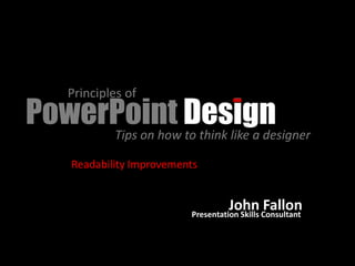
- 1. Principles of PowerPoint Design Tips on how to think like a designer Readability Improvements John Consultant Presentation Skills Fallon
- 2. Isn’t this the kind of slide that you would like to look at in a presentation for an hour or more? Bad Color Schemes
- 3. Backgrounds with Images and small amount of text
- 4. Textured backgrounds may interfere with the readability of the text / images that may be on the slide and disrupt the entire message. Textured Backgrounds
- 5. •People tend to put every word they are planning to say on their PowerPoint slides •This eliminates the need to memorize your talk •Ultimately this makes your slides over crowded, wordy and boring •You will lose your audience’s attention before you even reach the bottom of your first slide Spread out content by adjusting the paragraph spacing
- 6. 1. Stand Properly 2. Take a deep breath Alignment… best is text to left
- 7. In learning to sing, your first concern fending off objects thrown from the audience Creating an order of importance
- 9. For text, use the formula--- font size times 2 This is the distance that the audience will be able to see the font on the screen Font Size 44 times 2 = 88 feet For graphics (screen), use the formula--- screen size times 8 This is the distance that the audience will be able to see the graphics on the screen Graphic (screen) size 6 ft. times 8 = 48 feet Font / Graphic Size