
More Related Content
What's hot
What's hot (20)
Similar to Double page spread analysis
Similar to Double page spread analysis (20)
Recently uploaded
Recently uploaded (14)
Double page spread analysis
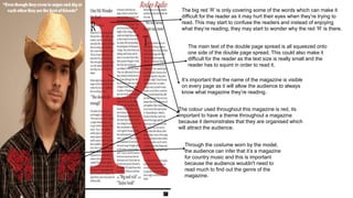
- 1. The big red ‘R’ is only covering some of the words which can make it difficult for the reader as it may hurt their eyes when they’re trying to read. This may start to confuse the readers and instead of enjoying what they’re reading, they may start to wonder why the red ‘R’ is there. The main text of the double page spread is all squeezed onto one side of the double page spread. This could also make it difficult for the reader as the text size is really small and the reader has to squint in order to read it. It’s important that the name of the magazine is visible on every page as it will allow the audience to always know what magazine they’re reading. The colour used throughout this magazine is red, its important to have a theme throughout a magazine because it demonstrates that they are organised which will attract the audience. Through the costume worn by the model, the audience can infer that it’s a magazine for country music and this is important because the audience wouldn't need to read much to find out the genre of the magazine.
- 2. The colour pink will attract more females than males as its known as a girly colour. Through the colour pink, the audience can infer that the genre of this magazine is pop and also infer that the target audience for this magazine are young girls (11-15) As shown from this image, there's not many text to read which is perfect for the audience as they are young people and they wont get bored of reading. In addition the colour of the text is not just black which is a good thing as the mixture of colours will keep the audience intrigued. The facial expressions on the artists demonstrates that this magazine s aimed at people as she looks quite immature. This will attract the target audience as they may be able to relate with her. The layout of this double page will look appealing to the target audience because they won’t get confused when reading as all the text is on one page and there’s a picture on the other.