Ecosystem Interactions Class Discussion Presentation in Blue Green Lined Styl...
Research and planning - Dominic Rose
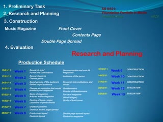
1. AS G321: Foundation Portfolio in MediaDominic Rose 6023 1. Preliminary Task 2. Research and Planning 3. Construction Front Cover Music Magazine Contents Page Double Page Spread 4. Evaluation Research and Planning Production Schedule 07/03/11 CONSTRUCTION Week 9 10/01/11 Week 1 Research brief Forms and Conventions Deconstruction real and AS magazines 14/03/11 Week 10 17/01/11 Audience of the genre Researchgenres Choose genre CONSTRUCTION Week 2 21/03/11 Research into institutions and values Week 11 CONSTRUCTION 24/01/11 Social groups of the audience Define target audience Week 3 28/03/11 Week 12 EVALUATION 31/01/11 Questionnaire Results of Questionnaire Week 4 Choose an institution that would produce your magazine 04/04/11 Week 13 EVALUATION 07/02/11 Name of magazine Articles within magazine Focus of magazine (band / singer) Week 5 Drafts of front cover 14/02/11 Week 6 Casting of band / singer Locations of photo shoots Week 7 21/02/11 Draftsof contents Drafts of double page spread Week 8 28/02/11 Front cover layout Contents layout Double page spread layout Photos for magazine
2. A2 G321: FoundationPortfolio in MediaDominic Rose 6023 Week 110/1/11 Main task: the front page, contents and double page spread of a new music magazine.
51. A2 G321: FoundationPortfolio in MediaDominic Rose 6023 Week 324/1/11 ‘Indie’ stereotype Indie, short for independent, applies to independent media, usually film or documentary and is also, more commonly, applied to a sub-culture which involves generally music, behaviour and in a few cases, style of dress. These people are also referred to as ‘Indie Kids’ or ‘Indie Rockers’, of which most dislike these terms as it labels them in a certain group. Most dislike the mainstream and the ‘in-trend’ and wear, listen to and do what they feel like without following fashions and rules. Indie is often connected to rockers, and are at a long lasting ‘social war’ with chavs. http://www.urbandictionary.com/define.php?term=indie&page=2 My target audience for my magazine are 14 – 21 year olds, predominantly male (as the indie groups are predominantly male), that are of the ABC1s on the social grading scale because they have the disposable income to be able to afford the magazine and afford the ‘indie’ lifestyle. They dislike the mainstream and strife to be different through clothing, behaviour and listening to indie and alternative music. They are at a ‘social war’ with chavs and dislike; rap, dance and popular music.
52.
53. IPC Media – (NME)Q - provide new music of substance to its wide audience. Kerrang! - provide rock knowledge to it’s regular audience whilst pleasing its younger audience Mojo - provide music from the achieves to iPods to provide its audience with great knowledge of all music Values – audience of 16 – 24 year old men, that live and breath music providing knowledge of music from the broad to the specific NME – provide contemporary music and music knowledge to all it’s readers. Values – audience of 14 – 20 year olds that try to keep up with the mainstream
*PRESS BUTTON*Hello, I am Dominic Rose, candidate number 6023 and this is my AS G321: Foundation Portfolio in MediaThis is my Research and Planning of my main task, print, creating a music magazine front cover, contents page and double page spread.*PRESS BUTTON*My production schedule shows the time and when each of my tasks need to be done to ensure that my preliminary task was produced on time.These make sure that I have enough time for construction and evaluation and that all work is in on time.*PRESS BUTTON*
*PRESS BUTTON*Week 1 commencing 10th January 2011*PRESS BUTTON*My first task was to research the brief so that I clearly understood what I was doing.*PRESS BUTTON*The brief from the OCR website was; ‘Main task: the front page, contents and double page spread of a new music magazine’. I decided to buy or at least look at as many music magazines as I could so I would be familiar with what was expected of me to produce, and this is my mood board. *PRESS BUTTON*
*PRESS BUTTON*The next task of week 1 was to research forms and conventions of music magazines, so I understand exactly how these magazines are put together and how they are distributed. *PRESS BUTTON*Firstly I looked into the forms and conventions of the music magazines front cover. I summarised my research into these 9 points.The masthead is eye catching and at the top of the magazine . Encapsulates the magazines audience and purpose.Subjects face can be easily and clearly seen with eye contactLarge dominant full page image of one the main articles in the magazineTitle of main articles is the across the cover in a slanted angleBright colour schemeThumbnails of other important articlesPriceTeasing commentsPuff, with information either advertising the magazine or products to do with the magazine*PRESS BUTTON*Then I looked into the forms and conventions of the contents page. Similar to the front cover I summarised this into 6 points.Page title at the top of the page with date and issue numberQuotes from various articles‘Features’ sectionImages from various articles, the main article having the largest image.Continuous colour scheme throughout Page number giving reference to location of articles, with name of articles.*PRESS BUTTON*
*PRESS BUTTON*A double page spread can consist of either Reviews, Interviews or Advertisements.I have decided to produce an interview for my double page spread, because there is plenty of exemplar material which are interviews and because I feel this enables me to focus on one subject instead of making reviews which will be and several subjects.*PRESS BUTTON*The forms and conventions of a music magazine interview are;Page title at the top of the page indicating what the page containsHeading or quote that drags across both pagesExtra information about intervieweeContinuous colour scheme throughout double pagesPage numbersAn image taking up almost a whole pageA quote from the article standing out from the rest of the text.*PRESS BUTTON*I then looked into the distribution of music magazines, where they are sold and how a consumer can get hold of the magazine.Across Britain or InternationalSpecific regions such as countiesBought in specialist magazine or music storesBought in newsagentsViewed onlineSubscription, to a consumers door
*PRESS BUTTON*My last task of week 1 was to deconstruct previous AS and professional magazines.Here are my deconstructions of front covers.I have decided to show the similarities and differences between them to make it clear, along with my forms and conventions what to include in my magazine.Similarities Clear mastheads, AudienceBoth have mastheads that are clear so a consumer can read and know what the magazine is called, they both show what audiences of the magazines, Scratch’s being male and Inspired being female Clear main articleThis is shown through the use of the main image being central and taking up the most of the space on the front cover. This is linked with the large text (lil Wayne and Pixie Simms) showing the link between image and article Genre; Rap / PopThe pop genre is shown in the puff in the top right hand corner (I heart pop music) showing a younger audience and predominantly females. The rap genre is shown through the articles and the images having a DJ decks and a male singer show a stereotypical rapper image. Bright colour schemeBoth bright colour schemes also used to target an audience with bright and light colours for Inspired and dull greys and blues for scratch showing the female and male audiencesDifferences ExclusivesIn Inspired there are exclusives making the magazine more higher profile making a target audience want to buy it more. Scratch does not have this. InstitutionScratch has institution in the left hand corner of the magazine (XXL), the publishing house is a well respected one that it is included on the front cover. Puff, advertisementsInspires has various advertisements including; a free poster and winning a signed copy of Pixie Simms’ album this entices a new audience to buy this new magazine as apposed to reading the magazine online. Background imageThe background image is different in both magazines as the main articles are different. The choice of main articles for the magazine suit the genre and audience perfectly, ultimately selling the magazine to them*PRESS BUTTON*My deconstructions of the contents pages show similarities and differences.Similarities SubscriptionBoth magazines have a section advertising their subscription service, this shows that the magazines distribute the magazines to their audiences. Features section divided into sectionsThis makes life far more similar for the consumer, making them enjoy reading the magazine more. Continuous colour scheme throughoutThis relates the contents page to the magazine so that when a consumer sees that certain colour in a magazine they can instantly recognise it as ‘NME’ or whichever magazine Page numbersThis is much like dividing the features section into sub-sections, it is so that if a reader wants to read a certain article they can go to the contents and then go straight to the articleDifferences WebsiteThe AS magazine has a website in which consumers can contact if anything is wrong, this is a good point to include as this ensures a confidence in the reader that there is someone they can talk to if there are any issues with the magazine Date, Issue numberNME include the date and issue number, this is much like the colour scheme it relates the contents to the rest of the magazine ImagesThe AS magazine only used 1 image on their contents page, this was the image of the front cover for the subscription section, although NME only use 2 images there aren’t any spaces on the page as it is filled with content, the image also shows the main article Main ArticleThe main article in the AS magazine is not clear at all, as there is no image or a clear font showing what the article is about, where as NME has a large image and large text for the title of the article and the description is also in larger font.*PRESS BUTTON*
*PRESS BUTTON*Then I deconstructed Interviews on double page spreads and calculated the similarites and differences between the proffesional magazine and the AS magazineSimilarities Bold titleBoth pieces have a bold title that encapsulate what the interview is about and draw the audiences attention straight to that. Images covering one pageThe Madonna interview is made of 1 image that shows her face in an artistic image, where as the AS interview uses several images. This is because the interviewees of the AS magazine are not as big as Madonna so cannot try and show an image that pushes the boundaries of the interviewees representation. The AS magazine introduces the interviewees and represents them in their genre of music. Continuous colour schemeThe colour scheme throughout the AS magazine shows the target audience using pink and black, tells us that they are targeting ‘punk rock chick’ teenage girls between 15 – 19, the colour scheme for Madonnna is a use of black and white for the interview which ties in with the photograph to the left, the title and sub-title is in a range of blues. Interview in Q&ABoth interviews and in question and answer basis. Interviewer asked a question and then the interviewees answer enables an audience to read the interview as a representation of speech so they can feel involved in the ‘conversation’. In both there is a different style of writing being this be bold or a different colour to differentiate between interviewer and interviewee. Differences Information stretching across both pagesThe AS magazine has the title stretching across both pages this makes it clearer that it is a double page spread than just a picture and an interview Extra informationThe interviewer for Madonna is obviously quite famous because they include their name in the interview in a bold font, although for AS the include extra information about the band, such as their album, tour dates and about posters on the next page Use of DTPThe effects behind the images and title in the AS magazine give the magazine a sense of genre of grunge rock. As the band are new and unseen before this helps an audience identify them Capital letterThe AS magazine uses a capital letter in a different colour and larger than the rest of the interview at the start. This helps an audience identify where the interview starts and stops.
*PRESS BUTTON*Week 2 commencing 17th JanuaryMy first task of week 2 was to research genres of music magazines so that I could make an informed decision when choosing a genre.The first thing I did was make a mind shower of all the music genres these consisted of;PunkDanceRapBluesRockHeavy MetalRnBIndie/AlternativePopClassicalLyrical*PRESS BUTTON*I then looked at that weeks top selling singles to see the types of genres that were top sellingDance / Pop music was the best selling with 23 singles. *PRESS BUTTON*Then I decided to look at the top selling music magazines. These were;MojoQNMEKerrangAnd Metal Hammer.These are all Rock / Indie and Alternative music magazine.It seems that there different audiences between those that are buying music magazines and those that are actually buying music. *PRESS BUTTON*I then choose my magazine genre;I decided I wasn’t going to produce a punk, blues or classical magazine as there would be not a big enough audience for this magazine.I decided I want going to produce a rap, R n B or heavy metal magazine as I wouldn’t be easily accessible to any bands that could appear in my magazine of this genre.Which left me with;DanceRockIndie / AlternativeLyricalWhen choosing between these 4 I wanted to choose a genre that would sell well, but was more unique than the magazines already in distribution.I then finally chose Indie / Alternative because there is already an audience for this type of magazine as these types of consumers read Q and Mojo yet these magazines aren’t specifically targeted at that audience.*PRESS BUTTON*
*PRESS BUTTON*My next task was to look into the audience of Indie / Alternative music.Indie and alternative music can both be found on there own under, Indie Rock and Alternative Rock, both deriving from post-punk and new wave music.I thought that the best place to start would be the best selling and most featured bands and artists in Indie / Alternative.After looking at various websites these were the top 10;Death Cab for CutieFranz FerdinandYeah Yeah YeahsMetricHey MondayModest MouseImogen HeapArctic MonkeysSpoon White Stripes.*PRESS BUTTON*A majority of these band attract 14 – 21 year old teenagers, that want to be different, individual and apart from the ‘mainstream’.These bands don’t singularly target one gender as they are 5 all male bands, 4 mixed bands and 1 female solo artist. Meaning that both genders can relate.*PRESS BUTTON*
*PRESS BUTTON*Week 3 commencing 24th January 2011My first task of the week was to look into the social groups within the Indie / Alternative audience, so that I make sure I represent this audience in my magazine.*PRESS BUTTON*I looked into the Indie stereotype. This is an definition I received from urbandictonary.comIndie, short for independent, applies to independent media, usually film or documentary and is also, more commonly, applied to a sub-culture which involves generally music, behaviour and in a few cases, style of dress. These people are also referred to as ‘Indie Kids’ or ‘Indie Rockers’, of which most dislike these terms as it labels them in a certain group. Most dislike the mainstream and the ‘in-trend’ and wear, listen to and do what they feel like without following fashions and rules. Indie is often connected to rockers, and are at a long lasting ‘social war’ with chavs.To represent this stereotype in my magazine I must make sure it is unique from the other magazines in distribution at the moment.*PRESS BUTTON*My next task was to then define my target audience of my magazine, and here is my definition;My target audience for my magazine are 14 – 21 year olds, predominantly male (as the indie groups are predominantly male), that are of the ABC1s on the social grading scale because they have the disposable income to be able to afford the magazine and afford the ‘indie’ lifestyle.They dislike the mainstream and strife to be different through clothing, behaviour and listening to indie and alternative music. They are at a ‘social war’ with chavs and dislike; rap, dance and popular music.I feel this is a target audience I can achieve within my magazine by following the ideologies of the stereotype.
*PRESS BUTTON*Research institutions and their values was my next task so that I had an idea of the values to put across in my magazine. The 2 institutions I looked into was Bauer Media and IPC because collectivelythey publish Kerrang!, Mojo, Q and NME which are the top selling music magazines.To see the values of these institutions, I research into each magazines individual press pack and their values.*PRESS BUTTON*Q is a magazine that aims to provide new music of substance to its wide audience.Kerrang! is a magazine that aims to provide rock knowledge to it’s regular audience whilst pleasing its younger audienceMojo is a magazine that aims to provide music from the achieves to iPods to provide its audience with great knowledge of all musicNME is a magazine that aims to provide contemporary music and music knowledge to all it’s readers.*PRESS BUTTON*From this research I can conclude that the values of each institution are; In bauer media - an audience of 16 – 24 year old men, that live and breath music providing knowledge of music from the broad to the specificAnd in IPC media - an audience of 14 – 20 year olds that try to keep up with the mainstream.
*PRESS BUTTON*Week 4 commencing 31st January 2011To use the institution knowledge from last week and choose an institution that would produce my magazine so I can apply their values to my magazine.*PRESS BUTTON*I have chosen Bauer Media to be the institution that would produce my magazine because, there is a gap in there market for an indie / alternative magazine, my magazines target audience are greatly involved with the music they listen to so that they stand out, this is much like Kerrang! Bauer Media’s other specialist music magazine. My target audience is within there target audience range. It is similar to the other magazines making it accessible to adopt it’s house style but individual enough for it to have potential to sell singularly and bring in enough revenue to sustain the production of the magazine.*PRESS BUTTON*My second task was to produce a questionnaire for my target audience to fill out so that I have primary research for my magazine. I included questions about if they already buy magazines, if they would buy an indie/alternative magazine and what there favourite groups were I also asked what a suitable name and price would be for my magazine*PRESS BUTTON*
*PRESS BUTTON*My final task for week 4 was to review my results from the questionnaire. I only gave my questionnaire who were in my target audience bracket as I wanted to see if I was targeting the right audience for my magazine.14 – 21 year old, ABC1s, Predominantly male. *PRESS BUTTON*Question 1:Do you already buy a music magazine. YES / NO. If ‘yes’ which magazine(s)My highest percentage was Male – Yes with 40 % and the most frequent response to the the music magazine was, Kerrang!I asked this question because I wanted to see what my immediate audience were buying and who was buying it*PRESS BUTTON*Question 2:Who are your favourite indie / alternative groups?The most popular answers were; MGMT and Mumford & SonsI asked this question because I wanted to see what bands I could use in my articles.*PRESS BUTTON*Question 3:Would you buy a magazine like Kerrang!, Q or Mojo that was singularly devoted to indie / alternative music? YES / NO30% of males said they would and 15% of females said they wouldI asked this question because I wanted to see if my product was sellable in my immediate audience.*PRESS BUTTON*Question 4: What do you think is a suitable name for this sort of magazineThe 3 suggestions I liked were; Earphones, Your Music, StringsI asked this question so that I had a basis of what to name my magazine.I liked these 3 names because they each represent a different part of indie / alternative music.*PRESS BUTTON*Question 5: What price do you think is suitable for this sort of magazine?The answers ranged between £1.50 to £3.50 depending on the thickness of the magazineI asked this question so I could see what my audience could afford to pay and what they were whiling to pay for my magazineFrom my questionnaire results I have realised that My target audience for my magazine is niche compared to mass as only a small percentage would buy it, therefore my distribution would be different to that of Q, Mojo and Kerrang! I should feature MGMT and Mumford and Sons somewhere in my work to appeal to an up to date audience, my name for my magazine should be something personal to the audience member as they are the ‘individual’ who is buying it and my price should be between £1.50 and £3.50
*PRESS BUTTON*Week 5 commencing 7th February 2011The first task was to decide on a name of my magazineSo I took the names that I got from my questionnaire;EarphonesYour MusicStringsAnd put them in a mind showerWith different titles stemming from Rock, Indie and Personal Beliefs*PRESS BUTTON* I chose 6 names out of the 15 in my mind shower,ChordAMPIndividualTracksPlaylistListenEach name had relevance to the magazine but no so much to the audience.I needed to make the name more personal to the audience so that they felt that the magazine was individually made for there interests.So I played around with a few names and then looked back at my preliminary task ‘iLevel’ *PRESS BUTTON*and decided to use the ‘I’ for interactive in my name, this automatically gives the name a younger feel as it is interacting with an audience that are technologically able, with the use of iPods, iPhones and iTunes*PRESS BUTTON*I finally decided on ‘iListen’This uses the interactive I for a younger audienceIt’s relatable to an audience as it’s for people who really listen to music, not the people who listen to music. I Listen could also be taken to mean individual listen.
*PRESS BUTTON*My next task was to decide what articles would be in my magazineI looked back across my research to the sort of articles I could include with regard to BandsMGMTMumford and SonsDeath Cab for CutieFranz FerdinandYeah Yeah YeahsMetricHey MondayModest MouseImogen HeapArctic MonkeysSpoon White StripesThen other articles not related to bands could be;Dislike of mainstream‘Social War’ with chavsBeing IndividualThen other ideas for articles are;New MusicUnsigned ArtistsFestivals, Gigs and ToursPosters (advertisements)SubscriptionMy main article will be on a band for my double page spread which will also be featured heavily on my front cover and contents pageThere will then be articles about various other artistsAnd a culture section which shall show the ‘social war’ on chavs debate*PRESS BUTTON*My final task of week 5 was to decide on what the focus of the magazine was on.I mind showered my various thoughts and decided to make this a summer issue of iListen because;I have easy access to the beach to show that it is summery and warm,I can then talk about festival line-ups and the hype surrounding them Yet I am going to keep my focus on New music and unsigned artistsI feel that producing a summer issue will attract my audience because, Indie’s do enjoy summer and the festival season as they love music, so having an issue which provides all this information and entertainment as well will entice my audience to buy the magazine.*PRESS BUTTON*
*PRESS BUTTON*The construction on my band – The Kick.It is made up of a female front woman / singer, and a male drummer and guitaristThe reasoning for this is because this is a band that my target audience can relate to. The sex appeal of the singer will draw them in and having a male band backing her makes it see as though it’s more of a male rock style band.I took my inspiration from this from Hey Monday and Metric.The Kick have just obtained their record deal, keeping with the unsigned artists and new music theme and they are in the festivals promoting, bringing in this summer feel. There single is out in august and they are ones to watch this is why they are on the front cover.There sound is indie rock and there views are that bands should write there own music and this is why they dislike shows such as X Factor and Glee “mainstream shows”*PRESS BUTTON*
*PRESS BUTTON*Week 6 commencing 14thFeburary 2011Now that I have decided on my band I needed to cast it.First was my front woman / singer. I needed to have a girl who has ‘stage presences’ and looks like she belongs on the front of a magazine. She also needs to be beautiful enough to draw a mans attention to the magazine when walking past.*PRESS BUTTON*Candidate 1; The attitude of this girl is good, yet I feel she is too mainstream to be in an Indie band because; her hairstyle is copying that of Rihanna, the clothing is of something that Fearne Cotton and the glasses are attaching onto the geek chic culture that is now far becoming mainstream. Candidate 2; Would certainly make heads turn, yet I feel she may be a bit too provocative, as we are looking for sexy but not a slut. I feel she would over shadow the men in the band behind her.Candidate 3; Has a grasp of stage presence and the idea of ‘indie’ she is individual and still attractive. Her top picture shows a great example of what she would look like in a photo shoot and these action shots are just what I need. I am casting Candidate 3. Isabella Joyner*PRESS BUTTON*When casting my drummer and guitarist it did not take much trouble, I need two boys that wouldn’t steal focus from Issy, look comfortable in the band and had the individualised spirit involved in being in an Indie / Alternative bandDrummer, George Schofield and Guitarist, Ross Wilkes are both already in a band called ‘the Virus’ so they already have access to drum sticks and a guitar and can play them. They aren’t unattractive men so girls may find them attractive but they are not so attractive that they steal focus from Issy. The Kick has now been cast
*PRESS BUTTON*After casting my band I now need to choose a location of my photo shoot for the magazine.I need to have an easily accessible beach with grungy scenery;Appley Beach is the perfect scenery, as the beach is clear golden sand which I can use to show the summer issue. The tower and the walls are worn down, grimy and roughed up much like the scenery of the punk era, of which indie / alternative rock stemmed from. The woods behind Appley Beach provide an excellent second location for a photo shoot only minutes away, these means that the photo shoot can all be shot in one day. *PRESS BUTTON*I have decided that I am going to take my photo shoot on the 5th March these gives my ‘band’ enough pre-warning to make the date, this also means that it should be sunny and bright so that I can see my ‘band’ in full view.If the weather is poor on this day then a second photo shoot will be on the 6th March.
*PRESS BUTTON*My last task for week 6 was to draft 3 front covers and choose my final front coverHere are my 3 front cover draftsDraft one shows the kicks upon a sea wall, the shot is from a low angle so that an audience is looking up at them as the next best thingThe title is bold and across the whole top of the page as a bannerThe main article (the kick) is down the bottom upon the sea wall.I like this shot yet I feel that this does not engage with an audience ask there is no eye contact, this is breaking a form and convention of the front cover*PRESS BUTTON*Draft two shows the kick on the beach with Issy in front and Ross and George in the background. This shows a variety of shot distances in one image. Issy being a close up and Ross and George being medium long shot. The title is to the left of the cover with artistic graphicsThe main article is just over IssyI like this shot because Issy is engaging the audience with eye contact and is ‘sexualised’ which is what will attract my audience, also the beach keeps the Summer Issue theme*PRESS BUTTON*Draft three shows the kick in no specific background with Issy at the front and the boys behind her in standing up, this shows a variety of shot distances.The title is across the page like a banner yet without the red block behind itThe main article is placed much draft two.I like this shot as it really engages with the audience yet without a background the summer Issue theme doesn’t work and becomes a more mainstream magazine.*PRESS BUTTON*I’m choosing Draft 2 to be my final front cover as it shots a variety of distances within one shot, it contextualises the Band in the summer issue scene and shows my DTP skills in editing the title.
*PRESS BUTTON*Week 7 commencing 21st February 2011My task leads on from last week as I am drafting my contents pageHere are my three draftsIn each of three drafts they include;iNside and editors letter at the topA picture of the Kick with there name beside itA subscription sectionA festival sectionAnd the features section is divided into different headings *PRESS BUTTON*I have chosen draft 3 because this spreads the images evenly through the page so it is not just clogged with writing*PRESS BUTTON*
*PRESS BUTTON*To carry on from the previous tasks I was then to draft my double page spread.Each draft has the title ‘The Kick, englands answer to hey Monday?’A captial letter at the beginning paragaph. Photographs showing the kick on a bench (encapsulating the genre of the piece)The differences between the images are that, Draft 1 has images like photos thrown out of a photo album across the pageDraft 2 has its images organised more neatly and so ever image can be seen.Draft 3 has the images across the bottom and a main image in the corner, and with the main article name across the page.I have chosen draft 1, this because it follows the forms and conventions of a magazine interview and I can use my DTP skills to enhance the pictures on the left page
*PRESS BUTTON*Week 8 commencing 28th February 2011My task was to produce layouts for the front cover, contents and double page spread.Front Cover My front cover includes all the research I have found, The bands such as MGMTBauer MediaIndividualised listening*PRESS BUTTON*ContentsMy contents page includes a contents of interest to my audienceIncluding avoiding mainstreamTour dates and festivalsThe interview with The Kick*PRESS BUTTON*Double Page SpreadMy double page spread keeps the focus on an issue to do with the band, discussing there relatableness to Hey Monday My band answered this in a way which is how ‘indies’ would answer that they are individual As quoted ‘We aren’t Hey Monday or there tribute band’ – Issy*PRESS BUTTON*
*PRESS BUTTON*The final task for my research and planning was to take photos for my magazine;Here are my photos,*PRESS BUTTON*
*PRESS BUTTON*These are the photos I have chosen to go on each page of my magazine*PRESS BUTTON*
*PRESS BUTTON*I am Dominic Rose, candidate number 6023 and this is my AS G321: Foundation Portfolio in MediaAnd that brings my research and planning presentation to a closeThank-you for watching