
Recommended
More Related Content
What's hot
What's hot (20)
Viewers also liked
Viewers also liked (20)
Similar to DJ Mag/Mixmag Case Studies
Similar to DJ Mag/Mixmag Case Studies (20)
More from db04803167
Recently uploaded
Recently uploaded (20)
DJ Mag/Mixmag Case Studies
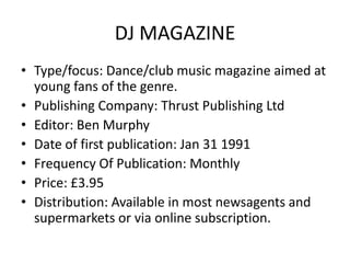
- 1. DJ MAGAZINE • Type/focus: Dance/club music magazine aimed at young fans of the genre. • Publishing Company: Thrust Publishing Ltd • Editor: Ben Murphy • Date of first publication: Jan 31 1991 • Frequency Of Publication: Monthly • Price: £3.95 • Distribution: Available in most newsagents and supermarkets or via online subscription.
- 2. DJ MAGAZINE • Front cover: The front cover of DJ Mag features a bold, clear masthead in the top left corner, with most of the page being taken up by the medium cover photo. Below the magazine logo there is the slogan ‘Living & Breathing Dance Music’ along with the website URL. The right side of the page includes a list of cover lines, displayed with a red/blue 3D effect to make the words stand out properly. As always, there is a barcode with issue information above it, along with another cover line saying ‘172 TUNES Reviewed’. The free gift given with the magazine, a CD titled ‘Manufactured Superstars 2012 A Space Odyssey’, is placed so that it does not obscure the main cover line ‘The Ambition of Annie Mac’, although there are a few further cover lines beneath the CD.
- 3. DJ MAGAZINE
- 4. DJ MAGAZINE • Contents page: The contents page for this issue of DJ Mag features many standard conventions of contents pages. On the left side of the page, there is a list of the most notable features in the magazine, accompanied by their page numbers plus a brief description of what the feature includes. In the middle column, there is a list of all the other features of the magazine, which are accompanied by page numbers but not by descriptions (although they are categorised into ‘tech’, ‘music’ etc.). On the far right of the page, there is a column filled with an arrangement of pictures, with the respective page number displayed in one of the corners of the image. There is also a masthead at the top of the page saying ‘Contents’, aswell as a small credit in the bottom left corner ‘Cover Pic: Chris Davison’, which is big enough to be legible but not obscure the image of Annie Mac that it overlaps with.
- 5. DJ MAGAZINE
- 6. DJ MAGAZINE • Double-page spread: Various common conventions of a double-page spread appear in DJ Magazine, including most clearly a very large picture of the person the article is focused on, which is spread out over the two pages. The page on the left features no main text whatsoever, and is taken up with the main image plus the article title and a sub-heading. (Along with a credit: ‘Words: Claire Hughes’) The first letter of the actual article itself is much larger than the rest of the text, taking up nine lines of the main text, which is a common way of starting a magazine article. Also notable is the fact that the article itself is split up into various different sections, such as ‘Jungle Roots’ and ‘Wake Up Call’
- 7. DJ MAGAZINE
- 8. DJ MAGAZINE • I will utilise some aspects of DJ Magazine when making my own music magazine. The contents page in particular uses a lot of common conventions which I will likely use in my own contents page, such as the use of images in a column with corresponding page numbers placed over them. I also like the fairly clean look of the cover page, featuring a lot of cover lines and information without looking too complex and cluttered, so I may take inspiration for my own cover page aswell.
- 9. MIXMAG • Type/Focus: Dance/clubbing magazine aimed at younger people who frequent nightclubs, and general fans of the genre. • Publishing Company: Development Hell Ltd • Editor’s name: Nick Decosemo • Date of first publication: 1 February 1983 • Frequency of Publication: Monthly • Price: £4.50 • Distribution: Available in most newsagents/supermarkets or online through subscription.
- 10. MIXMAG • Cover page: The cover page of Mixmag is fairly similar to DJ Magazine, with a few differences. There is a bold, large masthead, taking up the full top section of the page (as opposed to DJ’s with was just in the corner.) with a slogan placed just above it (The world’s biggest dance music and clubbing magazine) Oddly, the biggest cover line to accompany the cover photo is placed in the middle of the page, as opposed to on the side or at the bottom like most music magazines. Barcode and issue information are seen as standard in the bottom right corner of the page, and the cover photo is a medium shot placed in the centre, albeit with a colour effect placed around the border of the person pictured. Another difference from DJ Mag is that the cover lines feature both a title and a subtitle as opposed to just a title on Dj’s front cover.
- 11. MIXMAG
- 12. MIXMAG • Contents Page: Mixmag’s contents page is far more simplistic than DJ Mag’s. For a start, there is only one image seen on Mixmag’s contents page, as opposed to the 6 or 7 that you see on the DJ contents. Another difference is that Mixmag features all of their features in the same list, in order of page number, and at the bottom there is a small section advertising the free CD given away with the magazine. Some similarities occur with the style of the contents text, as both magazines feature the article title followed by a short description/subtitle roughly 1/2 lines long. There is also a masthead at the top of the page giving the name of the magazine, the month of publication and the title ‘Contents’
- 13. MIXMAG
- 14. MIXMAG • Double-page Spread: Mixmag also follows may conventions of double-page spread articles. The page on the right is fully taken up by a picture of the featured artist Carl Cox, accompanied by a quote from the man himself The main text itself, on the left side of the page (As opposed to DJ’s format where the text was on the right and the picture on the left.) is in a straightforward interview format, with the questions displayed in bold font and the answers from Cox in standard font. There is also a large banner at the top of the page with the name of the feature ‘VIP Q&A’, and the intro to the interview is in very prominent bold text at the top of the left page.
- 15. MIXMAG
- 16. MIXMAG • There are some aspects of Mixmag which I will use for my own music magazine creation. In particular, I think Mixmag’s double-page spread format looks better than DJ Magazine’s, so my own design will look closer to Mixmag’s format. I also like certain aspects of their cover design, such as the colourful effect placed around the cover photo, although overall I prefer the design of DJ Magazine’s cover. I will not be using Mixmag’s contents page as the basis for my own as I personally think its look too simplistic and boring for a music magazine.