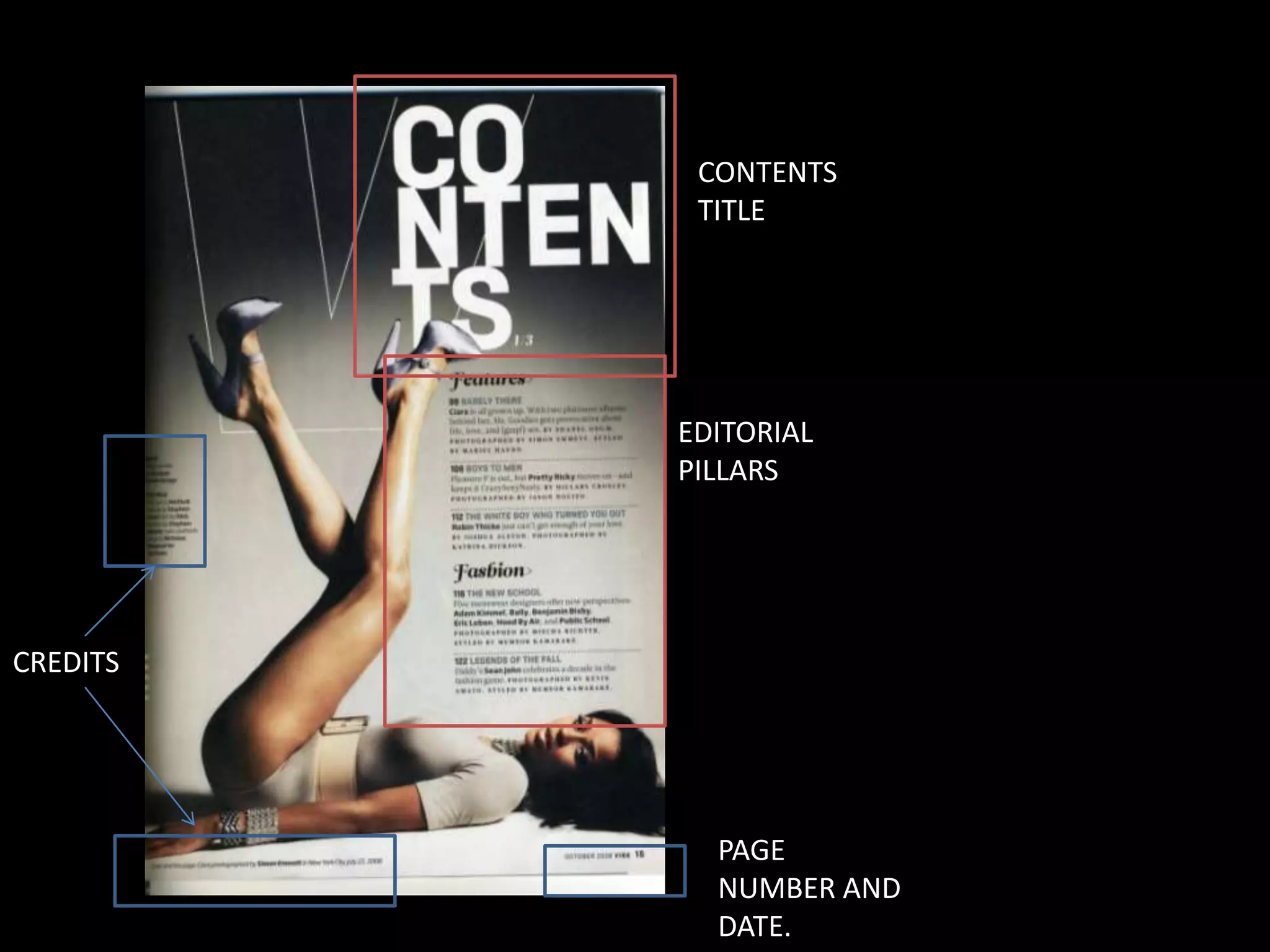
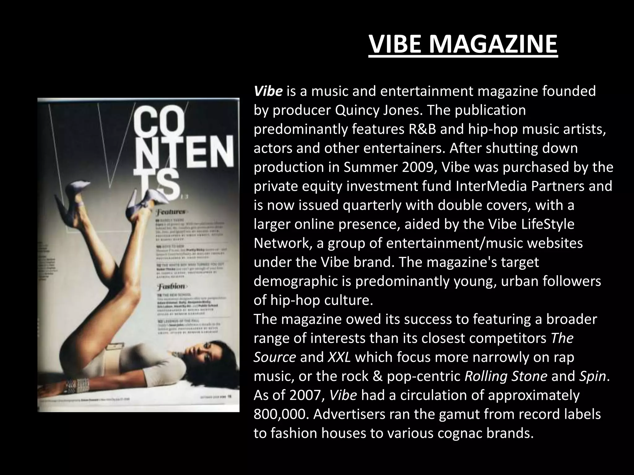
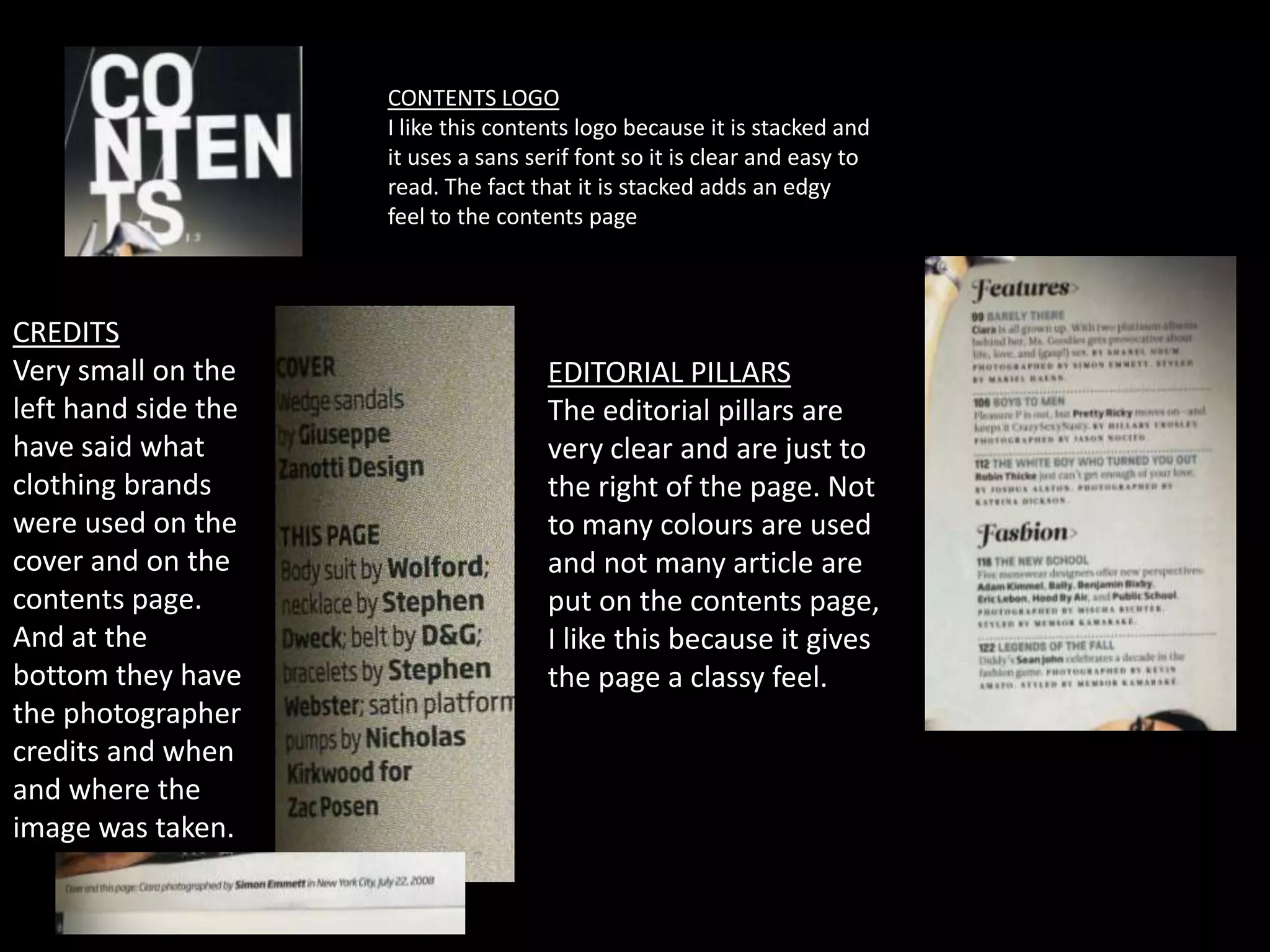
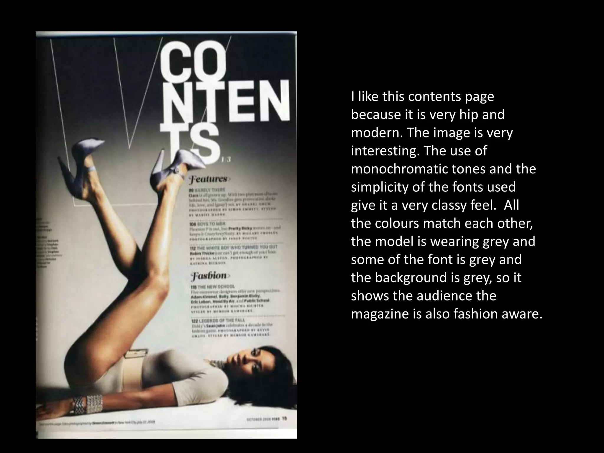
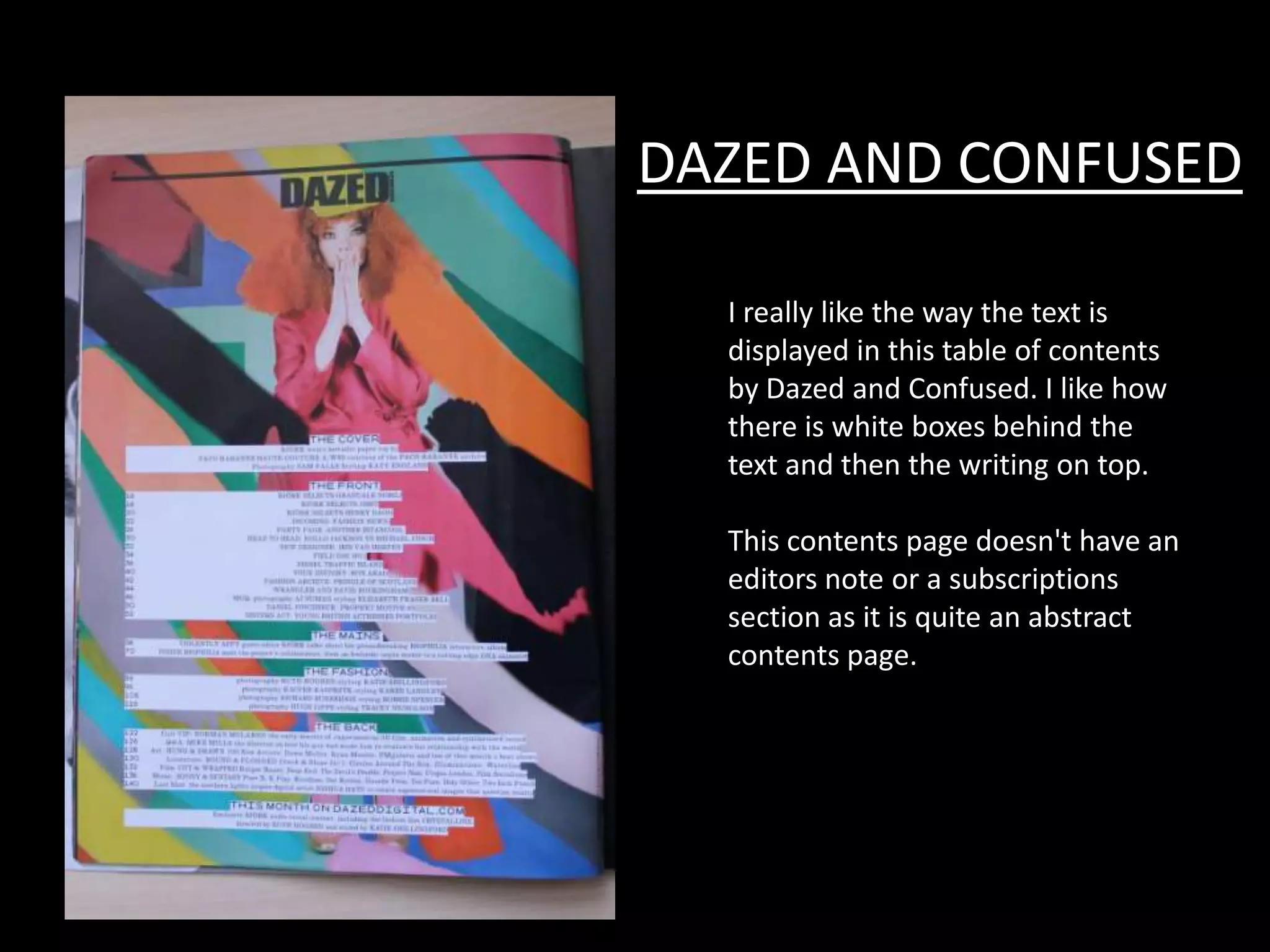
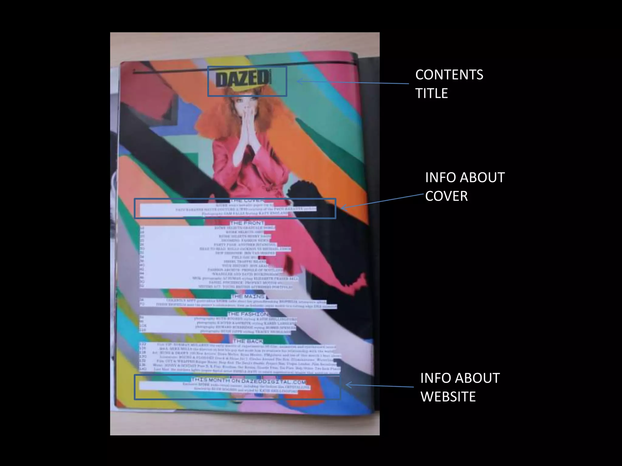
TABLE OF CONTENTS ANALYISIS
CONTENTS
           TITLE


          EDITORIAL
          PILLARS


CREDITS


            PAGE
            NUMBER AND
            DATE.
VIBE MAGAZINE
Vibe is a music and entertainment magazine founded
by producer Quincy Jones. The publication
predominantly features R&B and hip-hop music artists,
actors and other entertainers. After shutting down
production in Summer 2009, Vibe was purchased by the
private equity investment fund InterMedia Partners and
is now issued quarterly with double covers, with a
larger online presence, aided by the Vibe LifeStyle
Network, a group of entertainment/music websites
under the Vibe brand. The magazine's target
demographic is predominantly young, urban followers
of hip-hop culture.
The magazine owed its success to featuring a broader
range of interests than its closest competitors The
Source and XXL which focus more narrowly on rap
music, or the rock & pop-centric Rolling Stone and Spin.
As of 2007, Vibe had a circulation of approximately
800,000. Advertisers ran the gamut from record labels
to fashion houses to various cognac brands.
CONTENTS LOGO
                     I like this contents logo because it is stacked and
                     it uses a sans serif font so it is clear and easy to
                     read. The fact that it is stacked adds an edgy
                     feel to the contents page


CREDITS
Very small on the                     EDITORIAL PILLARS
left hand side the                    The editorial pillars are
have said what                        very clear and are just to
clothing brands                       the right of the page. Not
were used on the                      to many colours are used
cover and on the                      and not many article are
contents page.                        put on the contents page,
And at the                            I like this because it gives
bottom they have                      the page a classy feel.
the photographer
credits and when
and where the
image was taken.
I like this contents page
because it is very hip and
modern. The image is very
interesting. The use of
monochromatic tones and the
simplicity of the fonts used
give it a very classy feel. All
the colours match each other,
the model is wearing grey and
some of the font is grey and
the background is grey, so it
shows the audience the
magazine is also fashion aware.
DAZED AND CONFUSED

  I really like the way the text is
  displayed in this table of contents
  by Dazed and Confused. I like how
  there is white boxes behind the
  text and then the writing on top.

  This contents page doesn't have an
  editors note or a subscriptions
  section as it is quite an abstract
  contents page.
CONTENTS
TITLE


 INFO ABOUT
 COVER


INFO ABOUT
WEBSITE

Table of contents analyisis

  • 1.
  • 2.
    CONTENTS TITLE EDITORIAL PILLARS CREDITS PAGE NUMBER AND DATE.
  • 3.
    VIBE MAGAZINE Vibe isa music and entertainment magazine founded by producer Quincy Jones. The publication predominantly features R&B and hip-hop music artists, actors and other entertainers. After shutting down production in Summer 2009, Vibe was purchased by the private equity investment fund InterMedia Partners and is now issued quarterly with double covers, with a larger online presence, aided by the Vibe LifeStyle Network, a group of entertainment/music websites under the Vibe brand. The magazine's target demographic is predominantly young, urban followers of hip-hop culture. The magazine owed its success to featuring a broader range of interests than its closest competitors The Source and XXL which focus more narrowly on rap music, or the rock & pop-centric Rolling Stone and Spin. As of 2007, Vibe had a circulation of approximately 800,000. Advertisers ran the gamut from record labels to fashion houses to various cognac brands.
  • 4.
    CONTENTS LOGO I like this contents logo because it is stacked and it uses a sans serif font so it is clear and easy to read. The fact that it is stacked adds an edgy feel to the contents page CREDITS Very small on the EDITORIAL PILLARS left hand side the The editorial pillars are have said what very clear and are just to clothing brands the right of the page. Not were used on the to many colours are used cover and on the and not many article are contents page. put on the contents page, And at the I like this because it gives bottom they have the page a classy feel. the photographer credits and when and where the image was taken.
  • 5.
    I like thiscontents page because it is very hip and modern. The image is very interesting. The use of monochromatic tones and the simplicity of the fonts used give it a very classy feel. All the colours match each other, the model is wearing grey and some of the font is grey and the background is grey, so it shows the audience the magazine is also fashion aware.
  • 6.
    DAZED AND CONFUSED I really like the way the text is displayed in this table of contents by Dazed and Confused. I like how there is white boxes behind the text and then the writing on top. This contents page doesn't have an editors note or a subscriptions section as it is quite an abstract contents page.
  • 7.
    CONTENTS TITLE INFO ABOUT COVER INFO ABOUT WEBSITE