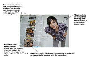
1. Two separate columns
with images in between.
it divides the writing
so it doesn’t seem as
much as it would all
lumped together.
There again is
an image that
takes up half
of the person of
who is being
interviewed.
Quotation from
the interview:
would urge the readers
want to read on the
typeface is a type writer
style and makes it stand out Past front covers and posters of the band in question,
more. they seem to be popular with the magazine.
2. The black and white
and grey theme is
still ongoing through
the magazine and makes
the whole magazine
look a lot more
intelligent and calm.
Brief explanation of
what is talked about
during the interview
to draw the readers
in.
Brought out quote to hopefully make the reader read on.
its brought out by a bold larger font than the article and has
wide space around it so it is easier to read and see.
3. The red banners reoccur to draw attention to other details that will be coming up wether
in this issue or the next, it draws attention because red is a colour that stands out to most
people because it could mean danger, so people look and notice it more.
The black and white
theme continues
while there is a
large image,
complete with
smaller images
at the bottom of the
page, so there is a
A small article variety to look at.
in two columns
with a circle
with facts in.
the overload of pictures in this double page
spread could be because the writer didn’t have
much to write about, and they tried to fill up space.