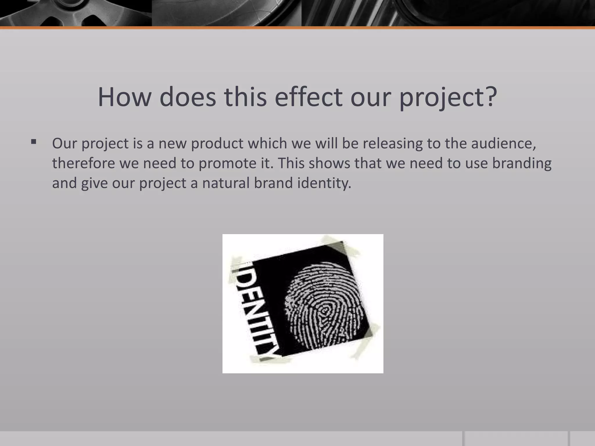
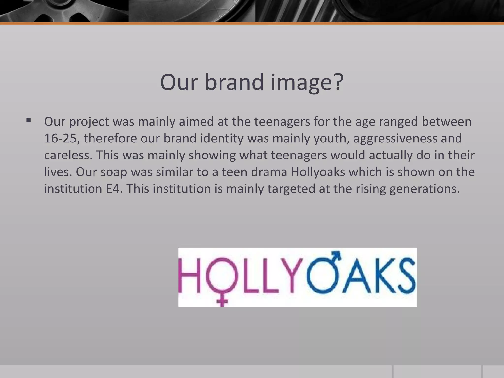
1) The document discusses the branding and identity of the project "Spicer's Life", a soap opera targeted at teenagers.
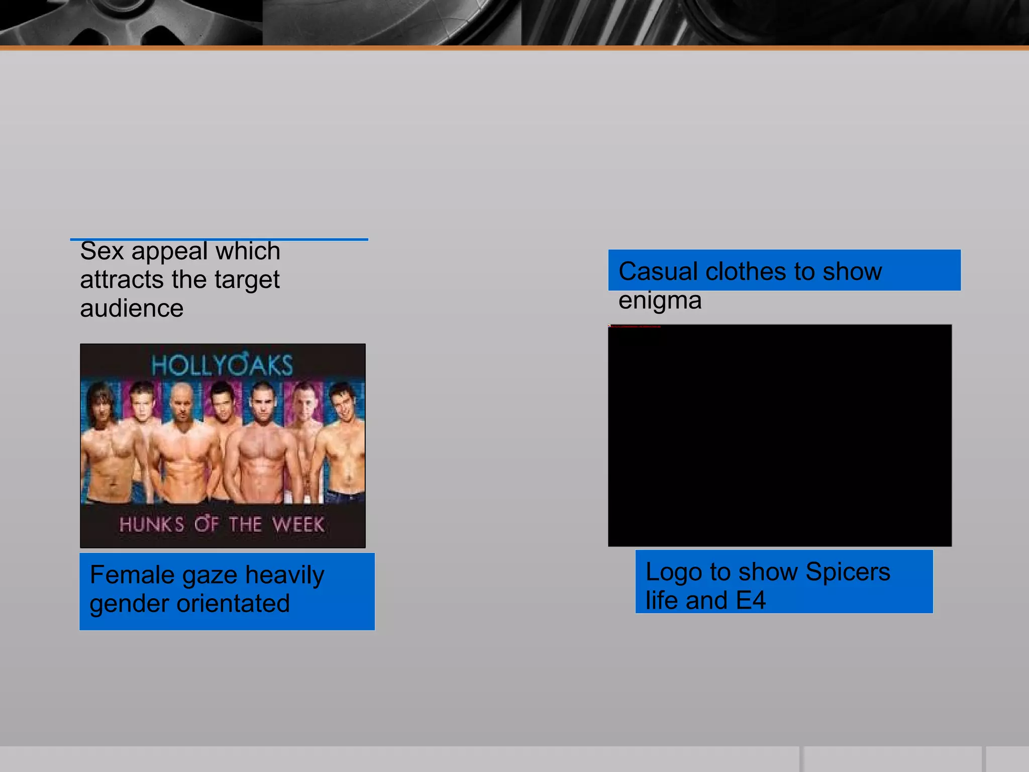
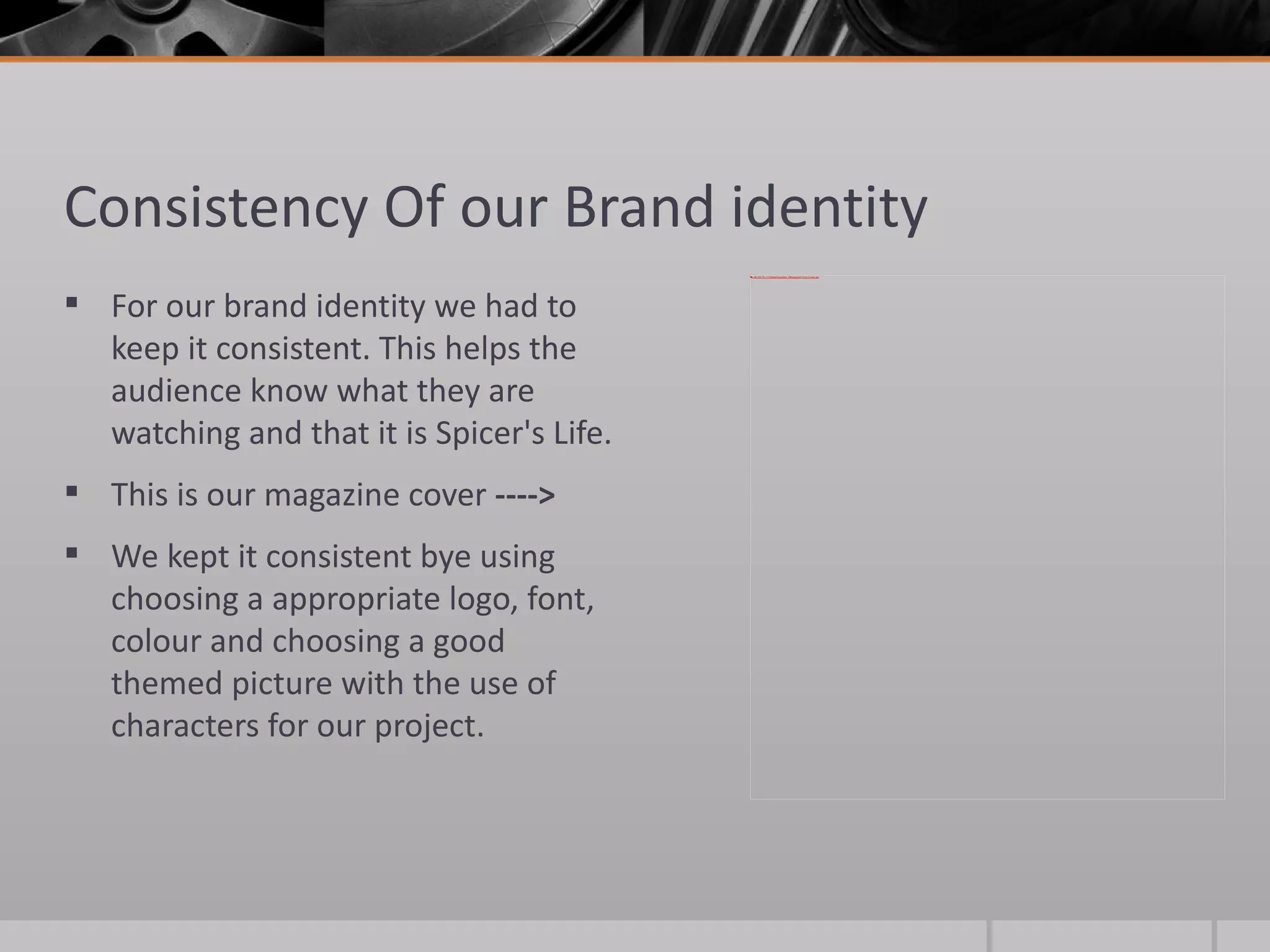
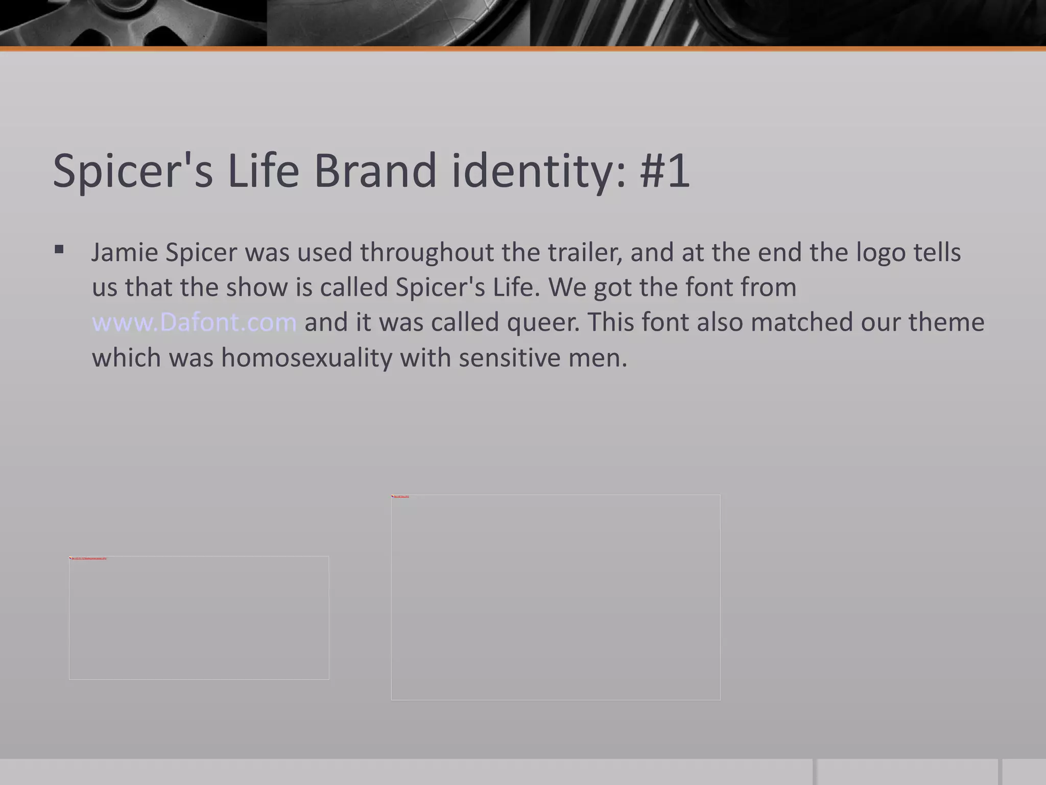
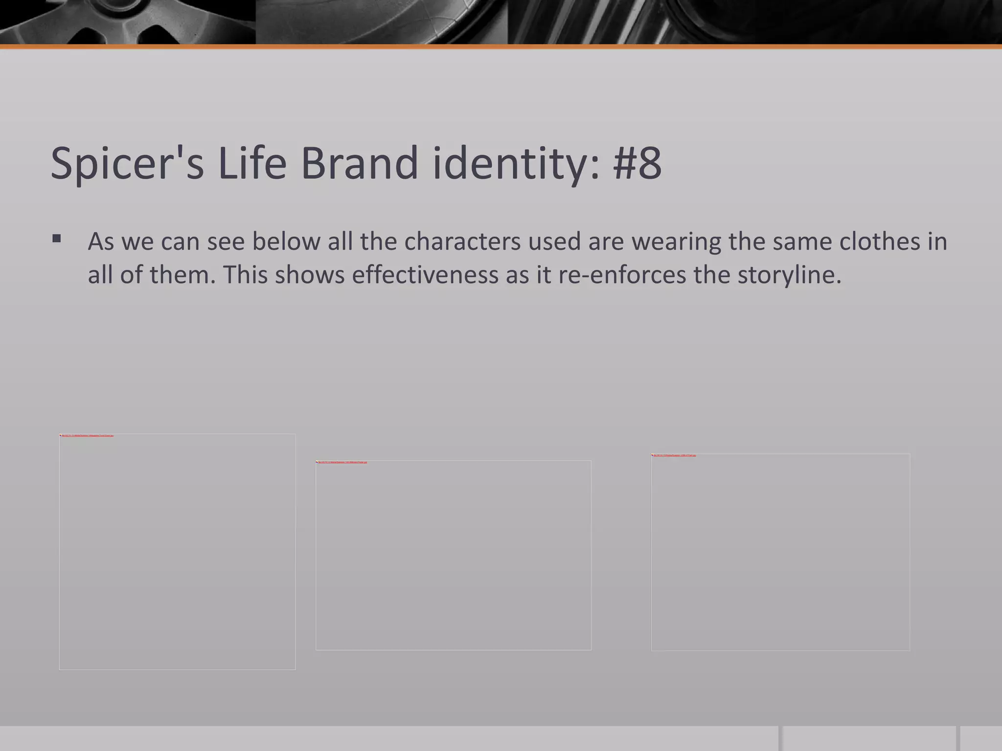
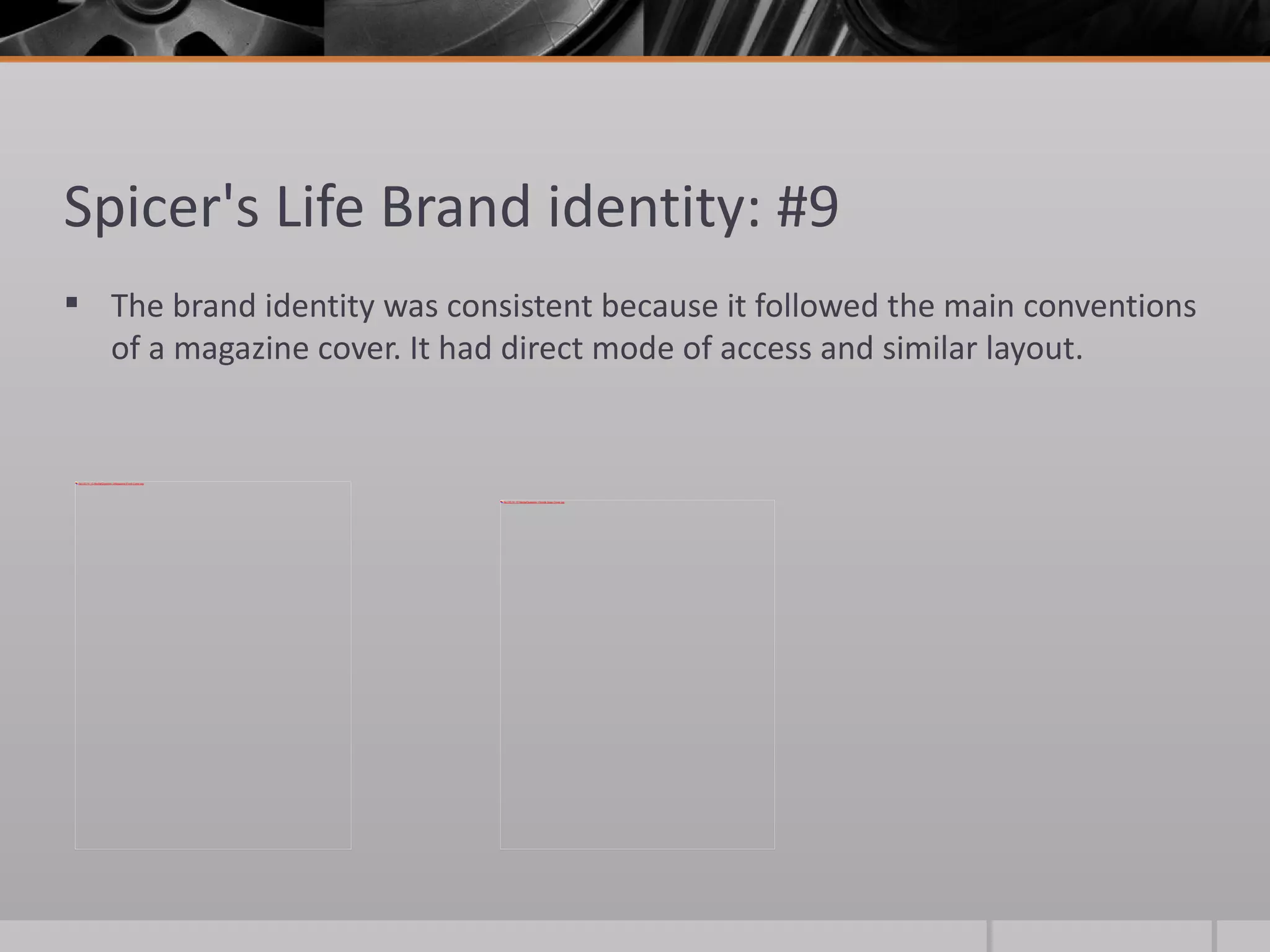
2) Consistency was key to the branding - the same fonts, colors, logos and characters were used across the trailer, magazine covers, and other ancillary materials.
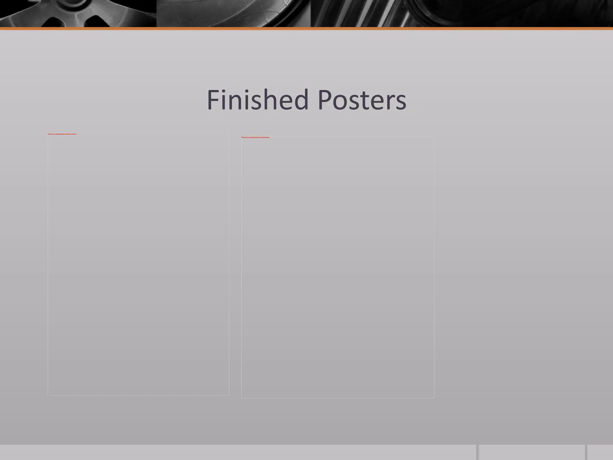
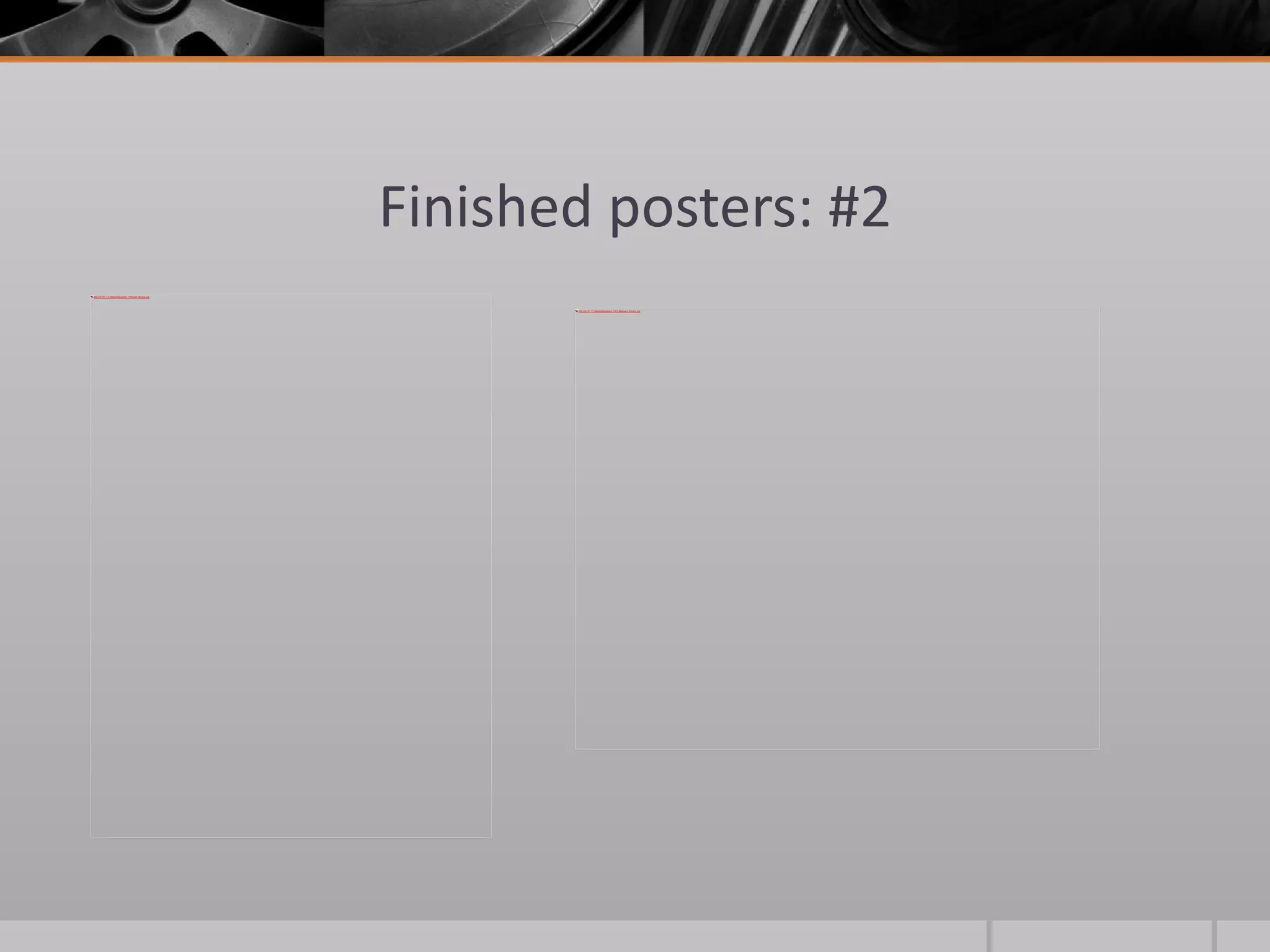
3) By maintaining a consistent youthful, casual branding identity focused on the main character Jamie Spicer, the project aims to effectively promote itself and stand out to its target audience.


![Vibe Coding vs. Spec-Driven Development [Free Meetup]](https://cdn.slidesharecdn.com/ss_thumbnails/vibecodingvsspecdrivendevelopment-251209105622-43f455e7-thumbnail.jpg?width=640&height=640&fit=bounds)


