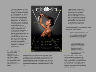
1. The main image is of the artist.
The image is of the artist so the
readers can recognise who she
is. This is attract all her fans as
they would know who she is.
She placed on the middle and
on the centre this is done by a
medium shot. By applying this
the focus is mostly on the artist
portraying the idea that Delilah
is the importance of this
magazine advertisement. The
flowers on the body could
reflect the idea of what type of
person she may be. The
position of her hand holding her
hair up tight could show the
idea of ‘From the roots up’. As
you can see she’s pulling her
hair up the sub-heading. The
artist hair has white which
connects then colour scheme of
the whole CD magazine
advertisement.
The background is set to be a simple black/grey colour.
By adding the black to the background this would allow
the other important information to stand out more. It
also allows the main image and the text to be more eye
catching to the readers. By not adding any other image
to the background it doesn’t take away the focus of the
main
The release date is placed at the
bottom of the main image so it can
catch the readers attention straight
away as the readers would mostly look
at the image so therefore, by placing
the release date next to the image it
would be more effective in catching the
audience attention.
The colour scheme of this is kept the same
using three simple colours.
The artist name ‘Delilah’ is in a
different front from the rest of
the text which could suggest
that the album is different to
the rest of the different albums.
Also, the name is also connected
with triangle, can you see this as
the triangle Is going through the
name. By doing this its shows
the edginess side of the album.
By adding rating at the bottom this would
make the audience feel as if the album
has a very good outcome so therefore,
they would want to buy they album
because it has a good star rating.
The website is placed at
the bottom of the
advertisement. By
adding the website at
the bottom it would
allow the audience to
visit the website so they
can find out more
information about the
album.
The record label logo is at the
bottom see the audience are
able to know which record label
she’s in. This would attract the
audience who would be
interested in that album so
therefore, they would buy the
album because the record label
is well known to them.
2. The main image of Jessie J is taking half
of the space. This is done so that the
audience can be attracted straight away
as they would recognise the artist. The
type of colours that Jessie J is wearing
(clothes and make-up) fits into the whole
theme of the magazine advertisement
for example the top, nails etc. All this
goes with the scheme. The black lipstick
that Jessie J is wearing could connote
that she may be a strong personthis is
shown through a medium close-up as
you can see her strong facial expressions
The artist name is bold and
placed at the centre of the
page. By doing this it would
grab the audiences
attention. The font of the
name is in a different style
this could suggest that
Jessie j is a different type of
artist.
The background at the part of the
page is white so that the text cab
stand out more making it easier for
the audience to read.
The release date is in capitals so
that it stand out more. By making it
bold is shows that its important so
that the audience can quickly see
when the album is out so that we
can go and buy it as soon as
possible. The colour that used goes
with the theme
Some songs on the album
have been added in order
to attract the audience
more showing that the
album has different type
songs on the album.
The colours that doesn’t really convey the femininity
of Jessie J as most the colour are seen be dark and
edge. The dark darks and the look that Jessie J has
going on suggest that shes young and out going, her
mouth open signifies that she may have some sort
of attitude which may be represented in her album.
The audience that this would
appeal to would be young
teenagers as Jessie J herself looks
young and edge, because of this
look the young age would be
more attacked to buy her album.
This album looks like tires set for
people in working class. Jessie J
isn't represented as being in
upper class or middle class so
therefore the working class group
would most kindly be appealed to
this album.
The album name is at the bottom of the
artist name. Its called ‘ Who you are’ this
may be a personal title Jessie J but on the
other hand it also connotes being you, being
yourself as a person. This song was also
Jessie j first single which is very important to
her so therefore Jessie J called the album to
‘who you are’.
Jessie J website at bottom so the audience
are aware or different way they can find
information about the album. This would
make it easier for her fans are technology
is used for mostly everything. The website
also allows the audience to find out more
details about the album and dates about
tours, performances etc.
Band logo/ record label logo at the
bottom would attract the audience who
are aware of there company so therefore
would take the interest of listening and
buying the album.
3. The artist name is at the top
of the advert in bold and also
in capital letters this makes it
stand more for the audience
to see and also, by making it
bold and in capital letter is
shows that Jay-z high states
and it also emphasis the
importance of the artist.
The main image isn't of Jay-z it includes many
different musical instruments would may
suggest that the album is full of different type
of beats and instruments which would make it
appeal to any different type of audiences. It
would also reflects the idea that Jay-Z is a man
who likes to use with different type of
instruments showing his passion for music. On
the other hand the main image doesn’t show a
image of JAY-Z which signifies that he's a well
known artist about the world so therefore
there doesn’t have to be a main of him in order
to know who the advert is about as his is name
is placed sat the top in bold and many people
are aware of the name ‘JAY-Z’
The background is a simple grey colour
which allows the other text to stand out
more it also shows that Jay-Z is a simple
man and doesn’t give any very much this
would make the audience want to buy
the album to find out what it includes.
The red strips on the main image reflects
the record label logo as the ‘roc’ in roc
nation is in red. By doing this Jay-Z want
to show that importance of the record
label. Also this includes three strips, the
album name is called ‘The blueprint 3’ so
therefore by adding the three strips
symbolizes the 3 in the album name.
The release date is in bold making it
stand out more. The release date is
the one of the most important thing
about the CD magazine
advertisement so therefore its in
bold portraying the importance of it.
The record label is placed at the
bottom of the date so that the
audience can see it and know what
record label it is. Again because Jay-Z
is well known the text of it isn't that
big as the audience would already
know that record label jay-Z is with.
The website at that the bottom
for the audience to visit and
find out furthermore
information about jay-Z and his
album.
The album name is at the up
of the release date so the
audience know that which
album is being released on
that date. The text is all in
capital letters conveying that
the album is important.
This CD magazine advertisement is
seen to appeal to teenagers but also
older audiences as Jay-Z works with
different type of music attracting
many different audiences.