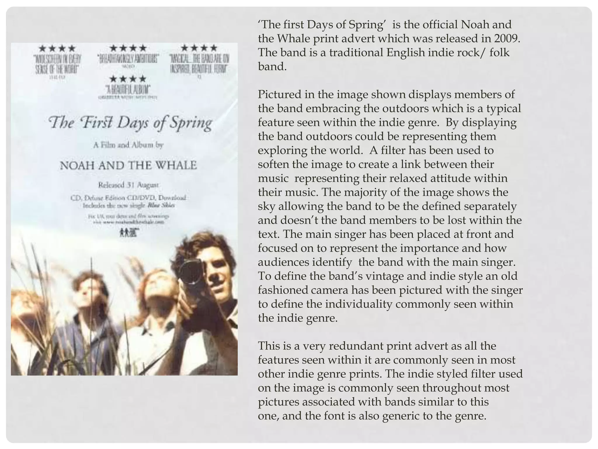
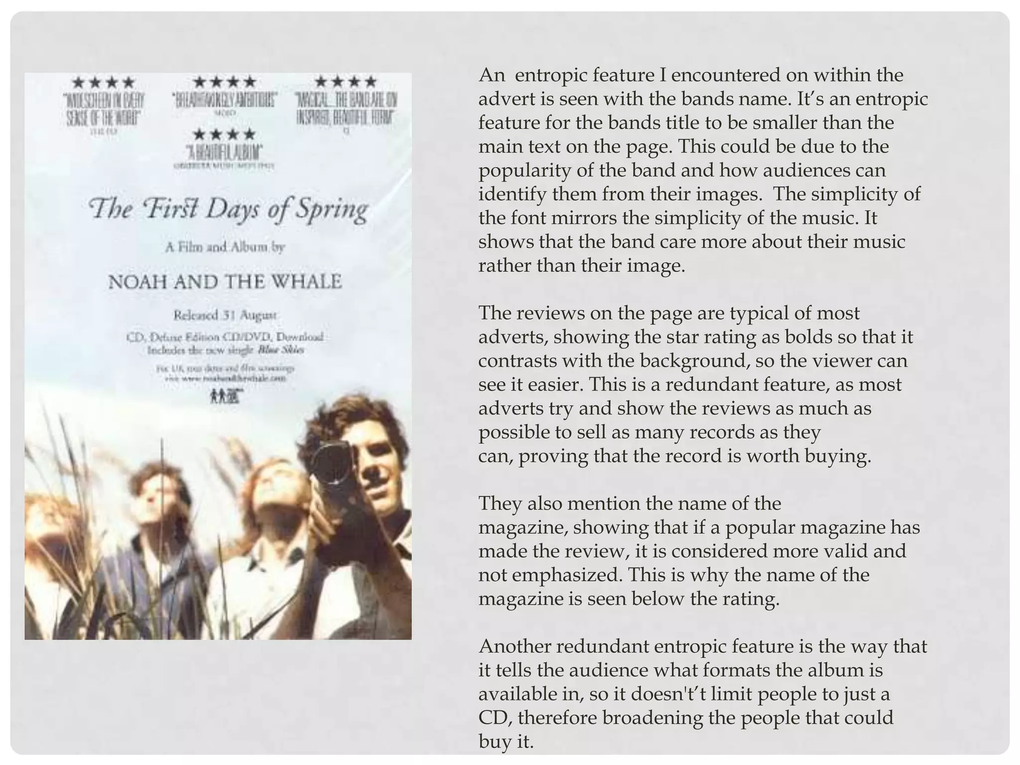
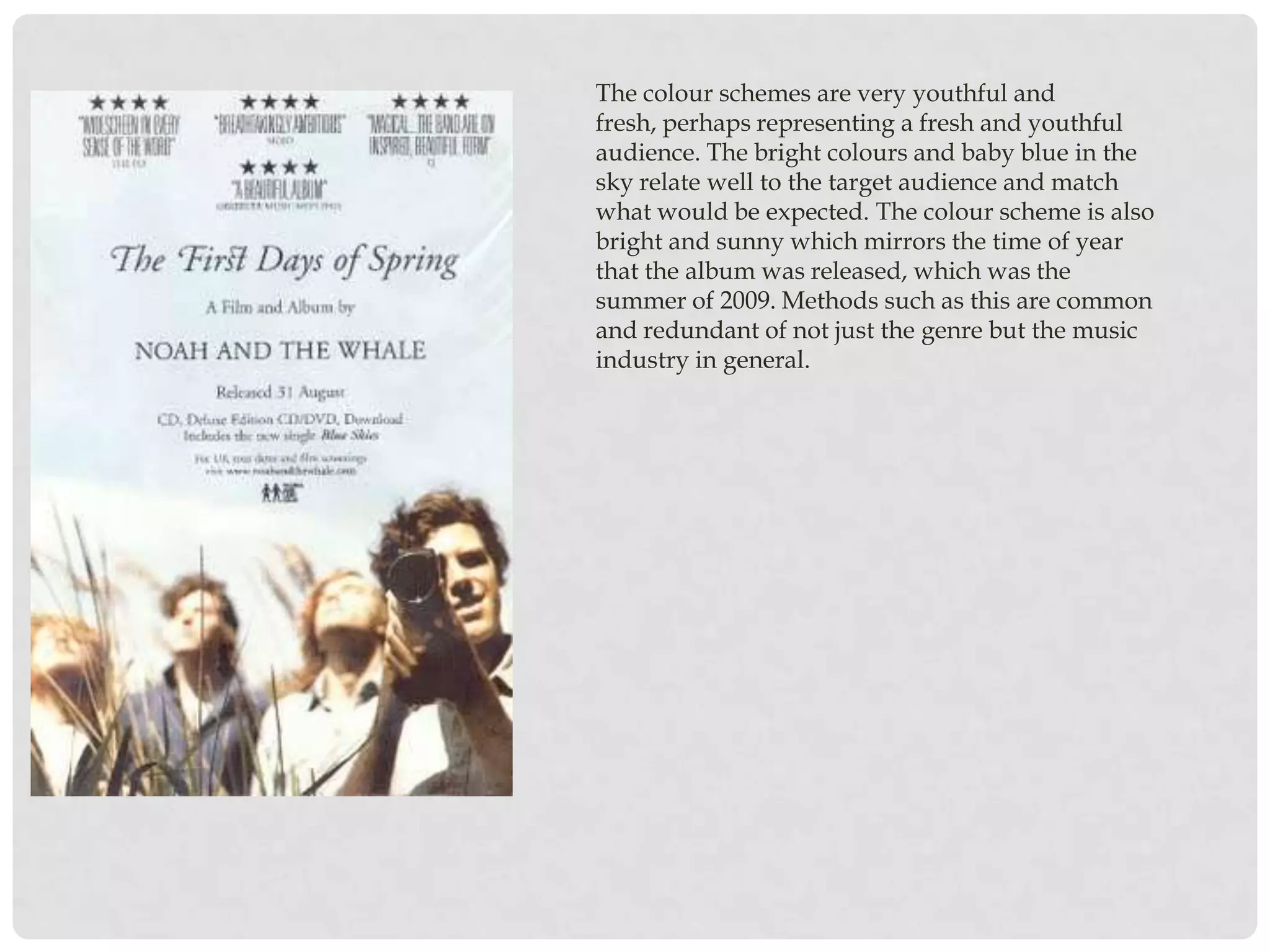
PRINT ADVERT
  ANALYSIS
NOAH AND THE WHALE
‘The first Days of Spring’ is the official Noah and
the Whale print advert which was released in 2009.
The band is a traditional English indie rock/ folk
band.

Pictured in the image shown displays members of
the band embracing the outdoors which is a typical
feature seen within the indie genre. By displaying
the band outdoors could be representing them
exploring the world. A filter has been used to
soften the image to create a link between their
music representing their relaxed attitude within
their music. The majority of the image shows the
sky allowing the band to be the defined separately
and doesn’t the band members to be lost within the
text. The main singer has been placed at front and
focused on to represent the importance and how
audiences identify the band with the main singer.
To define the band’s vintage and indie style an old
fashioned camera has been pictured with the singer
to define the individuality commonly seen within
the indie genre.

This is a very redundant print advert as all the
features seen within it are commonly seen in most
other indie genre prints. The indie styled filter used
on the image is commonly seen throughout most
pictures associated with bands similar to this
one, and the font is also generic to the genre.
An entropic feature I encountered on within the
advert is seen with the bands name. It’s an entropic
feature for the bands title to be smaller than the
main text on the page. This could be due to the
popularity of the band and how audiences can
identify them from their images. The simplicity of
the font mirrors the simplicity of the music. It
shows that the band care more about their music
rather than their image.

The reviews on the page are typical of most
adverts, showing the star rating as bolds so that it
contrasts with the background, so the viewer can
see it easier. This is a redundant feature, as most
adverts try and show the reviews as much as
possible to sell as many records as they
can, proving that the record is worth buying.

They also mention the name of the
magazine, showing that if a popular magazine has
made the review, it is considered more valid and
not emphasized. This is why the name of the
magazine is seen below the rating.

Another redundant entropic feature is the way that
it tells the audience what formats the album is
available in, so it doesn't’t limit people to just a
CD, therefore broadening the people that could
buy it.
The colour schemes are very youthful and
fresh, perhaps representing a fresh and youthful
audience. The bright colours and baby blue in the
sky relate well to the target audience and match
what would be expected. The colour scheme is also
bright and sunny which mirrors the time of year
that the album was released, which was the
summer of 2009. Methods such as this are common
and redundant of not just the genre but the music
industry in general.

Presentation1

  • 1.
    PRINT ADVERT ANALYSIS NOAH AND THE WHALE
  • 2.
    ‘The first Daysof Spring’ is the official Noah and the Whale print advert which was released in 2009. The band is a traditional English indie rock/ folk band. Pictured in the image shown displays members of the band embracing the outdoors which is a typical feature seen within the indie genre. By displaying the band outdoors could be representing them exploring the world. A filter has been used to soften the image to create a link between their music representing their relaxed attitude within their music. The majority of the image shows the sky allowing the band to be the defined separately and doesn’t the band members to be lost within the text. The main singer has been placed at front and focused on to represent the importance and how audiences identify the band with the main singer. To define the band’s vintage and indie style an old fashioned camera has been pictured with the singer to define the individuality commonly seen within the indie genre. This is a very redundant print advert as all the features seen within it are commonly seen in most other indie genre prints. The indie styled filter used on the image is commonly seen throughout most pictures associated with bands similar to this one, and the font is also generic to the genre.
  • 3.
    An entropic featureI encountered on within the advert is seen with the bands name. It’s an entropic feature for the bands title to be smaller than the main text on the page. This could be due to the popularity of the band and how audiences can identify them from their images. The simplicity of the font mirrors the simplicity of the music. It shows that the band care more about their music rather than their image. The reviews on the page are typical of most adverts, showing the star rating as bolds so that it contrasts with the background, so the viewer can see it easier. This is a redundant feature, as most adverts try and show the reviews as much as possible to sell as many records as they can, proving that the record is worth buying. They also mention the name of the magazine, showing that if a popular magazine has made the review, it is considered more valid and not emphasized. This is why the name of the magazine is seen below the rating. Another redundant entropic feature is the way that it tells the audience what formats the album is available in, so it doesn't’t limit people to just a CD, therefore broadening the people that could buy it.
  • 4.
    The colour schemesare very youthful and fresh, perhaps representing a fresh and youthful audience. The bright colours and baby blue in the sky relate well to the target audience and match what would be expected. The colour scheme is also bright and sunny which mirrors the time of year that the album was released, which was the summer of 2009. Methods such as this are common and redundant of not just the genre but the music industry in general.