1. Recipe Card 1 – Analysis (Festive Filo)
Advantages:
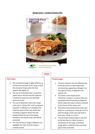
The centralised image is highly effective as
it shows the outcome of the recipe so that
the consumer knows what the final
product will appear as.
The use of minimalistic text is a positive
aspect due to the fact that the audience
may become weary of such extended
amounts of text.
The use of alliteration within the recipe
card such as “festive filo” and “sumptuous
seasonal” is effective as it reinstates the
informal nature of the card, whilst also
including a linguistic device that will
initially attract the eye of the viewer.
Therefore, the stated recipe card will be
promoted.
The ‘blurred focus’ image is effective as it
highlights the ‘dish’ that the recipe is
centred around.
Disadvantages:
The font utilised is not very effective due
to the fact that it is rather bland and
uninteresting, appearing as though it is a
mere generic font, as opposed to an
original one.
The theme of the recipe card is
‘Christmas’, however, no colours that are
associated with this period are featured,
which makes the colour scheme irrelevant
to the theme of the recipe card.
The festive themed decoration (stars and
bells) are unnecessary as they do not fit in
with the design of the card and make it
look quite ‘cheap’ in a sense.
The text itself could be larger in size due
to the fact that it is rather minute in
comparison to the large, centralised
image which is utilised as the main focal
point of the card itself.
FRONT