1. Recipe Card 3– Analysis (Tangy Leek and Ginger Soup)
FRONT
Advantages:
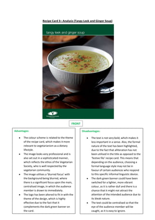
The colour scheme is related to the theme
of the recipe card, which makes it more
relevant to vegetarianism as a dietary
lifestyle.
The image looks very professional and is
also set out in a sophisticated manner,
which reflects the ethos of the Vegetarian
Society, who is well respected by the
vegetarian community.
The image utilises a ‘blurred focus’ with
the background being blurred, where
there is a significant focus upon the main,
centralised image, in which the audience
member is drawn to immediately.
The logo has been altered to fit in with the
theme of the design, which is highly
effective due to the fact that it
complements the dark green banner on
the card.
Disadvantages:
The text is not very bold, which makes it
less important in a sense. Also, the formal
nature of the text has been highlighted,
due to the fact that alliteration has not
been utilised in the title as opposed to the
‘festive filo’ recipe card. This means that
depending on the audience, choosing a
formal language style may not be in
favour of certain audiences who respond
to this specific informal linguistic device.
The dark green banner could have been
switched for a lighter, more vibrant
colour, as it is rather dull and there is a
chance that it might not attract the
attention of the intended audience due to
its bleak nature.
The text could be centralised so that the
eye of the audience member will be
caught, as it is easy to ignore.