
Recommended
More Related Content
What's hot
What's hot (20)
Similar to Advertisement Analysis.
Similar to Advertisement Analysis. (13)
Recently uploaded
Recently uploaded (20)
Advertisement Analysis.
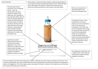
- 1. The advert gives factual information such as ‘4500 kids will die….help’, the advertisement have been focused on children as the adults have more sympathy to the vulnerable children than the adults. By using the significant number and the timeframe of the death number of children. The person that have seen the advert will think of the stated situation as catastrophically which will lead the target audience to feel sympathetic and donate the money to the charitywater.org We can see a long shot of a baby bottle filled in with dirty and undrinkable water. The background is bold white, and it might’ve been used to keep the advertisement simple and easily readable and catching. Two fonts are used to differentiate the help that is needed and the charity organisation name, this is effective as it creates the visual memory within the target audience which later on will be recognised on different platforms and forms of media. The issue statement and the financial information is written in different sizes which may be connoted as the charity is more focused on spreading the issue of the children death from water related diseases and that they need help as this statement is written in the biggest size. The ‘$20 can give a person clean water for 20 years’ is written in the smallest size out of the three , this may be because they want to show that The bottles lid is blue, it’s the symbolization of trust and loyalty as it is due to it being the colour of the sky and sea. Connotation in this advert may be that charitywater.org is trying to convey that they are loyal and trustful charity organisation where you can donate the money for people without the access to the clean and drinkable water. Alternatively the lid can simply connote water as this is the colour of the sea. Veera Serebrova Photo-realism is used in this advert, however usually we would expect to see the baby milk inside the baby bottle whereas here it’s filled with filthy water. Which grabs the audience’s attention do to what they see is abnormal and they would want to find out what is the advert about.
- 2. Ser Veera Sereebbrroovvaa We can see a school kid crossing the road and his face is synchronised with the baby at the back of the seat. The sign near that says ‘think of both sides’ shows that the adults at the front seat doesn’t pay attention to neither of the sides which may connote ignorance from the adults as the ‘victims’ that are laid out on the photo are the children. The common mistakes of a driver has been used, we can see a driver talking on the phone and not paying attention to the road which is the common cause of the traffic incidents. This may have been used to show what the targeted audience should not do. And also for the people who are along on the passenger’s seat to not distract the driver while the vehicle is moving. The high key lighting is focused on the front window where the children are. This may have been made to make a focus on the victims of the traffic incident. On the other side the low key lighting have been used on the adults to make them in the shadow which may connote that they are behind the traffic incident which makes them guilty. This reason for this advertisement campaign is to spread the message and the awareness of ignorant drivers and obeying the traffic laws. Photo-realism is used within this advert which makes it factual and realistic. The writing at the bottom says that the drivers should be more aware of the children during the school holidays as the factual information states that the ‘number of car accidents involving children are increased during school holidays’ which makes the drivers aware of the situation. The fact that the children faces were synchronised may also connote that as a driver and the parent yourself you would not want you child to be involved in the traffic accident and no near the parent want their child to be the victim in that situation, which also traumatises the child that is at the back seat.
- 3. Post modernism can be seen within the picture frame as we can see the two children, one is holding a kinder surprise which and the other child is holding a weapon. This is effective as it is abnormal to see a child with a weapon. Photo-realism have been used to portray the factuality of the issue. The setting of the photo is a school classroom, the classroom and the times table refers to the age of the children shown on the picture. The stereotypical view is broken when the boy holds the kinder surprise and the girl holding a gun. The writing at the top that’s says ‘one child is holding something that’s been banned in America to protect them. Guess which one’ creates a rhetorical feeling as it is obvious for the audience that the gun violence is really high is also brings out the shock of the issue. The red shirt and the slogan at the top helps the audience to recognise the banned material. The ethnicity of both children are different and this may be done to refer that it doesn’t matter what’s your background is as the America is really multicultural which suggests that the ethnicity and the gun culture issue in America doesn’t link together as any background can be a victim of a gun violence. The fact that the girl is holding the gun upward can suggest that the issue is rising in recent years. And the fact that the female gender is holding a gun can also connote that the females are being victimised or even be the cause of the gun violence uprising. The word ‘demand’ is highlighted by the explanation mark to highlight the issue and that it went out of control as now the young people are being involved and violated by this issue.