Report
Share
Recommended
More Related Content
What's hot
What's hot (6)
Viewers also liked
Viewers also liked (20)
Superconductivity and Spin Density Wave (SDW) in NaFe1-xCoxAs
Superconductivity and Spin Density Wave (SDW) in NaFe1-xCoxAs
User participation in ERP Implementation: A Case-based Study
User participation in ERP Implementation: A Case-based Study
On the Adjacency Matrix and Neighborhood Associated with Zero-divisor Graph f...
On the Adjacency Matrix and Neighborhood Associated with Zero-divisor Graph f...
CLEARMiner: Mining of Multitemporal Remote Sensing Images
CLEARMiner: Mining of Multitemporal Remote Sensing Images
Enhancing Data Staging as a Mechanism for Fast Data Access
Enhancing Data Staging as a Mechanism for Fast Data Access
An Improved Image Fusion Scheme Based on Markov Random Fields with Image Enha...
An Improved Image Fusion Scheme Based on Markov Random Fields with Image Enha...
Similar to Advert Analysis
Similar to Advert Analysis (6)
Recently uploaded
💉💊+971581248768>> SAFE AND ORIGINAL ABORTION PILLS FOR SALE IN DUBAI AND ABUDHABI}}+971581248768
+971581248768 Mtp-Kit (500MG) Prices » Dubai [(+971581248768**)] Abortion Pills For Sale In Dubai, UAE, Mifepristone and Misoprostol Tablets Available In Dubai, UAE CONTACT DR.Maya Whatsapp +971581248768 We Have Abortion Pills / Cytotec Tablets /Mifegest Kit Available in Dubai, Sharjah, Abudhabi, Ajman, Alain, Fujairah, Ras Al Khaimah, Umm Al Quwain, UAE, Buy cytotec in Dubai +971581248768''''Abortion Pills near me DUBAI | ABU DHABI|UAE. Price of Misoprostol, Cytotec” +971581248768' Dr.DEEM ''BUY ABORTION PILLS MIFEGEST KIT, MISOPROTONE, CYTOTEC PILLS IN DUBAI, ABU DHABI,UAE'' Contact me now via What's App…… abortion Pills Cytotec also available Oman Qatar Doha Saudi Arabia Bahrain Above all, Cytotec Abortion Pills are Available In Dubai / UAE, you will be very happy to do abortion in Dubai we are providing cytotec 200mg abortion pill in Dubai, UAE. Medication abortion offers an alternative to Surgical Abortion for women in the early weeks of pregnancy. We only offer abortion pills from 1 week-6 Months. We then advise you to use surgery if its beyond 6 months. Our Abu Dhabi, Ajman, Al Ain, Dubai, Fujairah, Ras Al Khaimah (RAK), Sharjah, Umm Al Quwain (UAQ) United Arab Emirates Abortion Clinic provides the safest and most advanced techniques for providing non-surgical, medical and surgical abortion methods for early through late second trimester, including the Abortion By Pill Procedure (RU 486, Mifeprex, Mifepristone, early options French Abortion Pill), Tamoxifen, Methotrexate and Cytotec (Misoprostol). The Abu Dhabi, United Arab Emirates Abortion Clinic performs Same Day Abortion Procedure using medications that are taken on the first day of the office visit and will cause the abortion to occur generally within 4 to 6 hours (as early as 30 minutes) for patients who are 3 to 12 weeks pregnant. When Mifepristone and Misoprostol are used, 50% of patients complete in 4 to 6 hours; 75% to 80% in 12 hours; and 90% in 24 hours. We use a regimen that allows for completion without the need for surgery 99% of the time. All advanced second trimester and late term pregnancies at our Tampa clinic (17 to 24 weeks or greater) can be completed within 24 hours or less 99% of the time without the need surgery. The procedure is completed with minimal to no complications. Our Women's Health Center located in Abu Dhabi, United Arab Emirates, uses the latest medications for medical abortions (RU-486, Mifeprex, Mifegyne, Mifepristone, early options French abortion pill), Methotrexate and Cytotec (Misoprostol). The safety standards of our Abu Dhabi, United Arab Emirates Abortion Doctors remain unparalleled. They consistently maintain the lowest complication rates throughout the nation. Our Physicians and staff are always available to answer questions and care for women in one of the most difficult times in their lives. The decision to have an abortion at the Abortion Cl+971581248768>> SAFE AND ORIGINAL ABORTION PILLS FOR SALE IN DUBAI AND ABUDHA...
+971581248768>> SAFE AND ORIGINAL ABORTION PILLS FOR SALE IN DUBAI AND ABUDHA...?#DUbAI#??##{{(☎️+971_581248768%)**%*]'#abortion pills for sale in dubai@
Recently uploaded (20)
Axa Assurance Maroc - Insurer Innovation Award 2024
Axa Assurance Maroc - Insurer Innovation Award 2024
Apidays New York 2024 - The Good, the Bad and the Governed by David O'Neill, ...
Apidays New York 2024 - The Good, the Bad and the Governed by David O'Neill, ...
Bajaj Allianz Life Insurance Company - Insurer Innovation Award 2024
Bajaj Allianz Life Insurance Company - Insurer Innovation Award 2024
Tata AIG General Insurance Company - Insurer Innovation Award 2024
Tata AIG General Insurance Company - Insurer Innovation Award 2024
ProductAnonymous-April2024-WinProductDiscovery-MelissaKlemke
ProductAnonymous-April2024-WinProductDiscovery-MelissaKlemke
Mastering MySQL Database Architecture: Deep Dive into MySQL Shell and MySQL R...
Mastering MySQL Database Architecture: Deep Dive into MySQL Shell and MySQL R...
Automating Google Workspace (GWS) & more with Apps Script
Automating Google Workspace (GWS) & more with Apps Script
Repurposing LNG terminals for Hydrogen Ammonia: Feasibility and Cost Saving
Repurposing LNG terminals for Hydrogen Ammonia: Feasibility and Cost Saving
Why Teams call analytics are critical to your entire business
Why Teams call analytics are critical to your entire business
+971581248768>> SAFE AND ORIGINAL ABORTION PILLS FOR SALE IN DUBAI AND ABUDHA...
+971581248768>> SAFE AND ORIGINAL ABORTION PILLS FOR SALE IN DUBAI AND ABUDHA...
From Event to Action: Accelerate Your Decision Making with Real-Time Automation
From Event to Action: Accelerate Your Decision Making with Real-Time Automation
TrustArc Webinar - Stay Ahead of US State Data Privacy Law Developments
TrustArc Webinar - Stay Ahead of US State Data Privacy Law Developments
Advert Analysis
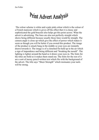
- 1. Joe Fuller The colour scheme is white and a pale pink colour which is the colour of a French manicure which is gives off the effect that it is classy and sophisticated the gold bracelet also helps get this point across. What the advert is advertising. The lines are also not perfectly straight which shows being different because usually those lines would be straight. The camera angle is close up which give the effect of power which makes it seem as though you will be better if you owned this product. The image of the product is smack bang in the middle so your eyes are instantly drawn towards it. The image is of a clenched fist held up in the air which a sign of impendence and being different and “breaking the mould”. The lighting is lighter around the hand so it draws your eyes in. The fonts for the titles are bold so it makes them stand out. The fonts for the rest of it are a sort of messy pencil-written text which fits with the background of the advert. The title says “Sheer Strength” which insinuates your nails will be strong.