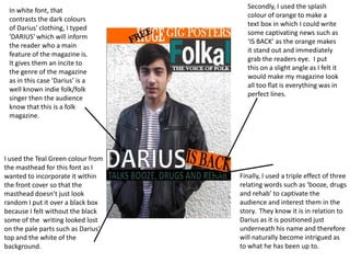
1. Secondly, I used the splash
In white font, that
colour of orange to make a
contrasts the dark colours
text box in which I could write
of Darius' clothing, I typed
some captivating news such as
'DARIUS' which will inform
‘IS BACK’ as the orange makes
the reader who a main
it stand out and immediately
feature of the magazine is.
grab the readers eye. I put
It gives them an incite to
this on a slight angle as I felt it
the genre of the magazine
would make my magazine look
as in this case ‘Darius’ is a
all too flat is everything was in
well known indie folk/folk
perfect lines.
singer then the audience
know that this is a folk
magazine.
I used the Teal Green colour from
the masthead for this font as I
wanted to incorporate it within Finally, I used a triple effect of three
the front cover so that the relating words such as ‘booze, drugs
masthead doesn’t just look and rehab’ to captivate the
random I put it over a black box audience and interest them in the
because I felt without the black story. They know it is in relation to
some of the writing looked lost Darius as it is positioned just
on the pale parts such as Darius’ underneath his name and therefore
top and the white of the will naturally become intrigued as
background. to what he has been up to.