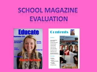
2. Front cover The front cover of my school magazine does follow most of the codes and conventions for a magazine. Some of these codes and conventions involve ; one main image which dominates the cover. The image is of a medium close up, which I have followed for my magazine cover. Also I have followed the codes and conventions by using a masthead, a main cover line which is normally located in a larger text which I have done so. However some codes and conventions were not follow such as barcodes, website address, free gifts offers, etc. If I was to re-create this front cover page again I would make sure I would include these to make the cover not look so empty.
3. To create my front cover, I used specific software to make my front cover look more professional. I used Photoshop to create the front cover. As I inserted the photo and then inserted text, which then I edited to make the cover unique. Also the different tasks done for the task, I had to use prezi.com and other different types of slideshow software’s.
4. Looking at my magazine front cover I can see strengths but I can also see weaknesses which could be improved. Strengths being my main image is of the correct size as a medium close up. Also I think my title is a strength point as I have made it as my own, with shadowing behind. However some of my weaknesses are is that I could have included more cover lines as the cover looks a bit bare.
5. Contents page In my school magazine contents page, same as front cover, I have followed a selection of codes and conventions to follow. Some of these include, there is one main image and a number of smaller images, contents in laid out in columns, word contents is at the top, category headings e.g. regulars and features. There are also more codes and conventions I had followed. Some codes and conventions I didn’t follow that I should have done are, page numbers on images to anchor the image with the text, sometimes images have captions on.
6. To create my contents page, I used a professional software package called Quark express, which is used by all major magazine companies. I think quark was suitable to use as it was very easy to use once shown and it had all the tools needed to create the contents page.
7. There are both strengths and weaknesses in my contents page. Strengths to this piece of work is the quality and layout of the images used and also the colour scheme is appropriate and relevant. Weaknesses include the amount of white space and there should be more text on the page. To improve this I would have to think of some more articles to add in.