Mastering MySQL Database Architecture: Deep Dive into MySQL Shell and MySQL R...
Q5 done
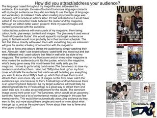
1. How did you attract/address your audience? The language I used throughout my magazine also addresses the audience. For example, the use of foul and humorous language connects with my target audience as they also are likely to use that type of language and vocabulary. A mistake I made when creating my contents page was choosing not to include an editors letter. If I had included one it would have added to the connection made between the reader and the magazine. Although an editors letter wasn’t present I think my use of images and content connected with the audience. I attracted my audience with many parts of my magazine, them being; colour, fonts, give aways, content and images. The give away I used was a “Festival Essential Guide”, this would appeal to my target audience as going to festivals would most probably be in their summer schedule. The fact that I have directly addressed them with something they are interested will give the reader a feeling of connection with the magazine. The use of fonts and colours attract the audience by simply catching their eye. Although I didn’t use bright colours I used fonts that stood out and that were different and I used colours that fitted in well with the style of my magazine. The content on my front cover and on every other magazine is what makes the audience buy it. It’s the quotes, who’s in the magazine, what's being given away this month/week that really sells you the magazine. I chose to go for a big band name (The Banshees) to draw my readers in and attract them. I also had “Biffy’s live bust up” on my front cover which tells the audience that inside we will be telling you everything you want to know about Biffy’s bust up, which then draws them in and attracts them even more. My use of images on the front cover catch the audiences eye, one because of the V Festival logo and two because there is an upcoming band featured. As my target audience will most likely be attending festivals the V Festival logo is a great way to attract them and catch their eye. It is also an advertisement for the tickets. The dominant image on my front cover is of The Banshees, which would be an upcoming band who have had a lot of controversial media coverage in the past few weeks/months. This would then automatically attract the audience as they want to find out more about these people and want to know about what they get up to, and as the cover says “Know about their rise to fame and what goes on backstage”.