Separation of Lanthanides/ Lanthanides and Actinides
Comments
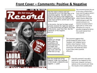
1. Front Cover – Comments: Positive & Negative
This comment praises the use
of my colour scheme that I
have used throughout which I
am happy with as that
illustrates that my chosen
colour scheme reflects the
indie/rock genre well. The
second comment is to
improve my button which I
agree with as I think some
alterations to it such as
possibly changing the text as
this could improve front
cover overall.
This comment suggests that I
should change the colour of the
‘Kasabian’ and ‘Coldplay’ text to
another colour however, I think
this colour fits well with my colour
scheme but I will tweak the colour
to see if does make a positive
difference.
From this comment I may add a
website for my magazine on the
front cover, however I do have a
website on the convents and I think
this may be a more suitable place.
2. Contents Cover – Comments: Positive &
Negative
I will take this
comment on board
as it suggests that I
should make the
review section
smaller and add
more images. This is
one of the
improvements that I
noticed, therefore I
will change this
section.
This is another improvement that I
will change as I did think my
subscription section was a bit weak,
therefore I will improve this section
and add small images of my next
magazine issue.
This comment also says
to improve my review
section, as a result I will
change this section as it
has been mentioned
more than once.
4. Double Page Spread - Comments: Positive &
Negative
The improvement is to add
an effect to my text and
possibly to change the
colours of the quotation.
When I go to edit the
double page spread I will
add an effect on the text to
make it slightly stand out.
This comment praises the image I have
used which I am happy about as I think
this image is really eye catching for my
reader.
This is another comment that praises the image I have
used as they state that the image is very eye catching and
interesting therefore I know that the outcome of the
image is positive. It does suggest to have the name of my
magazine in the top left hand corner which I will do to
make the page look more professional.
6. Article - Comments: Positive & Negative
This comment says to make the ‘Laura
Alexander’ a lighter colour, which I will change
as I do think it is difficult to see against the
darker image.
This comment suggest to add an effect on
either the article heading or the text on top
of the image, this is something I will change
adding an effect will enable my text to stand
out more. The positive is that they like how
my page is evidently split into two, I am also
happy with this as I think it makes my page
look more professional.
This is something that I will attempt to
change, as this will make my magazine
look more authentic and professional
for my reader.
This person likes the image that I have used in my article, this is
because I made the model not look directly into the camera as this
makes my model seem more intriguing and interesting for the
reader also the lighting used in the image looks very effective. This
person also suggests to add a pull quote and an ‘exclusive’ which I
will add as I did forget to include this, by adding this again will make
my magazine fit into the conventions of a typical magazine further.