Retail Kpi Dashboard Showing Sales Revenue Customers And Out Of Stock Items
•
0 likes•10 views

You can download this product from- https://www.slideshare.net/SlideTeam1/project-phases-architecture-powerpoint-diagram slideteam.net has the world's largest collection of Powerpoint Templates. Browse and Download now! Description of this above product - Presenting this set of slides with name - Retail Kpi Dashboard Showing Sales Revenue Customers And Out Of Stock Items. This is a six stage process. The stages in this process are Percentage, Product, Management, Marketing, Business.

Recommended
Recommended
More Related Content
Similar to Retail Kpi Dashboard Showing Sales Revenue Customers And Out Of Stock Items
Similar to Retail Kpi Dashboard Showing Sales Revenue Customers And Out Of Stock Items (20)
More from SlideTeam
More from SlideTeam (20)
Recently uploaded
Recently uploaded (14)
Retail Kpi Dashboard Showing Sales Revenue Customers And Out Of Stock Items
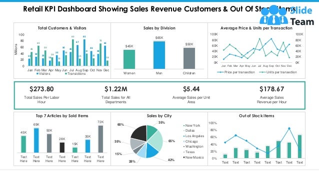
- 1. Retail KPI Dashboard Showing Sales Revenue Customers & Out Of Stock Items 45K 65K 50K 28K 15K 35K 72K Text Here Text Here Text Here Text Here Text Here Text Here Text Here Top 7 Articles by Sold Items 35% 65% 42% 28% 15% 35% 60% Sales by City New York Dailas Los Angeles Chicago Washington Texas New Maxico 0% 20% 40% 60% 80% 100% Text Text Text Text Text Text Text Text Out of Stock Items 24 30 25 18 35 50 45 67 85 48 39 65 45 65 50 28 15 35 85 24 40 25 72 18 0 20 40 60 80 100 Jan Feb Mar Apr May Jun Jul Aug Sep Oct Nov Dec Millions Total Customers & Visitors Visitors Transictions 0K 20K 40K 60K 80K 100K 0K 20K 40K 60K 80K 100K Jan Feb Mar Apr May Jun Jul Aug Sep Oct Nov Dec Average Price & Units per Transaction Price per transection Units per transection $45K $65K $50K Women Men Children Sales by Division Total Sales for All Departments $1.22M Average Sales per Unit Area $5.44 Average Sales Revenue per Hour $178.67 Total Sales Per Labor Hour $273.80 This graph/chart is linked to excel, and changes automatically based on data. Just left click on it and select “Edit Data”.
- 2. All images are 100% editable in PowerPoint Change color, size and orientation of any icon to your liking”
- 3. 1. Select the Graph and right click -> Select "Edit Data" 2. An excel matrix will automatically show up 3. Enter the values based on your requirements and hit enter 4. The Graph/Chart shape will automatically adjust according to your data, and anytime you can go and change the value again Edit Excel-linked Chart This is a Data Driven Chart/Graph and the shape automatically adjusts according to your data 1 2 3
- 4. Edit Color 1. Select the shape to change the color and Right click the object( click any object which you want to change color) 2. Choose Format Data Series in the dialog box. 3. Choose “Fill” in the Format Shape box then “Solid” or “Gradient” depending on the appearance of the object. Change colour as shown in the picture. 1 2 3
- 5. Select From Thousands Of Editable Icons On Every Topic These icons are available at the Icons section on www.slideteam.net