Accessibility is important for anyone with a presence on the web. Here are five simple things you can do to make your web pages more accessible.
These are the slides from a talk given at WordCamp Buffalo on May 5, 2018.
You know it's important for your web project to be accessible to people who use all kinds of assistive technology to access the internet. But all the guidelines for web accessibility you can find don't go much beyond "make sure all your images have alt text", and all the resources you can find treat "accessibility" as a synonym for "making your site work in a screen reader". You know there are other things you should be doing and other forms of assistive technology you should be accomodating, but all the best practices documents are a complicated morass of contradicting information (if you can find best practices documents at all.)
Have no fear! This tutorial gives you a number of concrete steps to take to make things more accessible.
This presentation has downloadable notes and exercises available at http://denise.dreamwidth.org/tag/a11y . Video of the talk should be available later.
If you’re familiar with accessibility, you may know some of the basics already. We’ll review some newer or more obscure techniques that can help prime you to look at the new hotness features with a more critical eye. Instead of pushing code techniques, we’ll discuss the logic behind these approaches, giving you the opportunity to turn some of these concepts over in your own head instead of just walking away with a shallow checklist.
Slides from my May 23 webinar for the ADA Great Lakes Center. Overview of the state of things for WordPress and accessibility and the principles of web accessibility.
NewBCamp08 was a first-time unconference for web newbies. There were "tracks" for web development, social media, etc. For more info: newbcamp.com
This presentation addresses: What are web standards? Why use them? Why haven't we been using them all along? What are Microformats? How can you use the URL as a UI?
Responsive is the new buzzword!
The main idea here is to:
* kill the buzzword, and replace it with some accurate truth
* and talk about the very difficult industrialization of the wireframing process, and some ideas for solutions to it (experimental part!)
RESS: An Evolution of Responsive Web DesignDave Olsen
Responsive web design has become an important tool for front-end developers as they develop mobile-optimized solutions for clients. Browser-detection has been an important tool for server-side developers for the same task for much longer. Unfortunately, both techniques have certain limitations. I’ll show how both front-end and server-side developers can take advantage of the new technique called RESS (Responsive Web Design with Server Side Components) that aims to be combine the best of both worlds for delivering mobile-optimized content.
Introduction to Responsive Web Design http://tinyurl.com/9ldo4c6
Includes a sample project built from scratch in Node.js using LESS available on Github
Responsive web design has taken our industry by storm and with good reason: it helps us improve our reach with less effort. But incorporating responsive design is not the goal, meeting our user’s needs is. Responsive design is not an end in itself… it’s just the beginning.
We need to embrace the heterogenous nature of the web—myriad web-enabled devices with vastly different dimensions, screen sizes, networks, and capabilities in use by countless individuals, each with their own special needs—and craft experiences that will work anywhere at any time. We need to build robust systems that adapt in ways far beyond aesthetics.
Designing for Everyone: Building great web experiences for any deviceWindows Developer
"
As the capabilities of the web platform advance, and the pervasiveness of web content proliferates, fundamental design principles are more important than ever: How do you enhance your experience as new capabilities become available in Microsoft Edge and other browsers? You've considered how your content looks and operates on mobile, but how does that design adapt to desktop devices? Is it usable via ""headless"" interfaces like screen readers or Cortana? Does your content adapt gracefully to the constraints of its environment? In this session, Aaron Gustafson will help you think about user experience from its foundation, so you understand what it means to build adaptive web experiences – whether in an app, in a browser, or beyond. We’ll show you some of the newest capabilities coming to Microsoft Edge that let you build differentiated experiences on Windows 10. You’ll walk away practical, cross-platform code examples you can put to use in your projects today, and foundational principles to ensure that your projects are ready for anything. "
Where are (web) designers going with web fonts?Scott Boms
Presented during TypeCon 2011: Surge in New Orleans by Scott Boms (Butter Label/LL&S), Luke Dorny (Newsvine/Butter Label/LL&S) nad Brian Warren (Happy Cog/Butter Label/LL&S).
mLearnCon 2014 - A responsive web solution for a complex online educational p...Amy Som
Describes options for mobile learning delivery and responsive web design, and describes the solution undertaken by the University of Arizona Center for Integrative Medicine
GTM Clowns, fun and hacks - Search Elite - May 2017 Gerry WhiteGerry White
As Google becomes a JavaScript crawler, GTM becomes an incredible way to improve your site for both users and bots. This goes through some very simple methods, and what they can be used for...
How Accessibility Made Me a Better DeveloperBilly Gregory
This is a longer version of my presentation "Responsible Design: Accountable Accessibility" but with a catchier name :)
This talk tells my story of how I went from front end developer who knew nothing about accessibility to an accessibility advocate.
Included in this talk are my "10 Tips" that any developer can use on day one without any experience authoring accessible HTML.
This talk was originally presented at the Accessibility Conference in Guelph, Ontario, Canada on May 29, 2013.
Session presented in the european DrupalCon Dublin 2016. Video can be found here: https://www.youtube.com/watch?v=152J_74KGl0
It's been 6 years since the term Responsive Web Design (RWD) was coined and today is difficult to see new projects without implementing it. But this time has allowed us to see the implementation can be even more important than the technique and the theory. The RWD covers from the performance to the implementation of patterns and "standard" behaviors to improve usability.
In this session I reviewed tools, techniques and concepts to improve our projects:
⁃ Modern Design processes
⁃ Performance
⁃ CSS structuring and optimization (CSS Methodologies and Living Styleguides)
⁃ Fixed-pixel vs relative units (and Viewport Sized Units)
⁃ Responsive Typography and FOUT, FOIT
⁃ Images, Responsive images and SVGs
⁃ Asynchronous loading
⁃ Proxy-based browsers
⁃ Beyond the Mouse
⁃ RWD patterns and Progressively Disclosure
I showed simulations for a better understanding.
This session was aimed to anyone who wanted to improve his RWD knowledge, although a minimal RWD knowledge was expected.
We can pretend that we’re helping others by making websites and software accessible, but we are really making them better for our future selves. Learn some fundamentals of accessibility and how it can benefit you (whether future you from ageing or you after something else limits your abilities).
We’ll review simple testing techniques, basic features and enhancements, coming trends, and where to get help. This is an overall primer for those who aren’t sure where to start nor how it helps them.
Web accessibility refers to the inclusive practice of removing barriers that prevent interaction with, or access to, websites by people with disabilities. When your website is inaccessible, research shows you could be excluding up to 20 percent of your visitors from interacting with your content and functionality. If your university website is inaccessible, you could be preventing access to education, student services, and more.
When your website is accessible, everyone can consume your information freely. Visually-impaired users can visit your website using a screen reader. Those who can’t use a mouse can navigate your site using a keyboard or other input device.
While creating accessible websites involves every step, including design and content, the foundation for good accessibility starts with good markup. Join my workshop to learn more about accessibility and how to program a high-quality user experience that is inclusive and beneficial to all.
This session will highlight the capabilities within AEM 6.2 that allow you to create accessible web content and how to meet the important requirements of WCAG 2.0.
The web standards gentleman: a matter of (evolving) standards)Chris Mills
This talk discusses standards evolution, HTML5 and CSS3 in detail. Starting with the history of HTML and CSS, it goes on to show how HTML5 and CSS3 were developed, why they were necessary, the problems they aim to solve, what the main new features are and why they are so useful, and how we can start using these features in the real world, right now. It also provides advice for the discerning web standards gentleman.
Accessibility is not disability Drupal South 2014Gareth Hall
Accessibility
The web is about information sharing. Why make it hard for users to access your content. Release your site from bad building practices, make it equal access for all and get SEO benefits for free.
Get through to the disabled community
By breaking down disability barriers you open up your content to a wider community currently 600,000+ in NZ.
There are definite dos and don’ts when it comes to building for the disabled. Learn what works for them.
Making Your Site Printable: CSS Summit 2014Adrian Roselli
The push for responsive web design has helped web developers consider how the sites they develop can adapt to different devices, including sizes, screen resolutions, and even contexts.
It should now be easier than ever to respond to a format that has existed since the start of the web -- print.
I'll walk through the process for making your responsive sites respond to the format we most often forget and show you how to use Google Analytics to track what pages are printed from your site.
We can all pretend that we’re helping others by making web sites and software accessible, but we are really making them better for our future selves. Learn some fundamentals of accessibility and how it can benefit you (whether future you from aging or you after something else limits your abilities). We’ll review simple testing techniques, basic features and enhancements, coming trends, and where to get help. This isn’t intended to be a deep dive, but more of an overall primer for those who aren’t sure where to start nor how it helps them.
Tips and tricks for the best user-friendly website ESRI Bulgaria
This presentation gives you some tips and tricks for making the best user-friendly website.
1. Mobile compatibility
2. Accessible to ALL Users
3. Well planned information architecture
4. Well-formatted content that is easy to scan
5. Spell check and broken links
6. Effective navigation
7. SEO and optimization
8. Usable forms
9. Good error handling
10. Fast load times
11. Browser consistency
12. Valid Markup & Clean Code
13. Contrasting color scheme
Follow this tips and you will have a great website
Bridging the Digital Gap Brad Spiegel Macon, GA Initiative.pptxBrad Spiegel Macon GA
Brad Spiegel Macon GA’s journey exemplifies the profound impact that one individual can have on their community. Through his unwavering dedication to digital inclusion, he’s not only bridging the gap in Macon but also setting an example for others to follow.
Italy Agriculture Equipment Market Outlook to 2027harveenkaur52
Agriculture and Animal Care
Ken Research has an expertise in Agriculture and Animal Care sector and offer vast collection of information related to all major aspects such as Agriculture equipment, Crop Protection, Seed, Agriculture Chemical, Fertilizers, Protected Cultivators, Palm Oil, Hybrid Seed, Animal Feed additives and many more.
Our continuous study and findings in agriculture sector provide better insights to companies dealing with related product and services, government and agriculture associations, researchers and students to well understand the present and expected scenario.
Our Animal care category provides solutions on Animal Healthcare and related products and services, including, animal feed additives, vaccination
Instagram has become one of the most popular social media platforms, allowing people to share photos, videos, and stories with their followers. Sometimes, though, you might want to view someone's story without them knowing.
Meet up Milano 14 _ Axpo Italia_ Migration from Mule3 (On-prem) to.pdfFlorence Consulting
Quattordicesimo Meetup di Milano, tenutosi a Milano il 23 Maggio 2024 dalle ore 17:00 alle ore 18:30 in presenza e da remoto.
Abbiamo parlato di come Axpo Italia S.p.A. ha ridotto il technical debt migrando le proprie APIs da Mule 3.9 a Mule 4.4 passando anche da on-premises a CloudHub 1.0.
Understanding User Behavior with Google Analytics.pdfSEO Article Boost
Unlocking the full potential of Google Analytics is crucial for understanding and optimizing your website’s performance. This guide dives deep into the essential aspects of Google Analytics, from analyzing traffic sources to understanding user demographics and tracking user engagement.
Traffic Sources Analysis:
Discover where your website traffic originates. By examining the Acquisition section, you can identify whether visitors come from organic search, paid campaigns, direct visits, social media, or referral links. This knowledge helps in refining marketing strategies and optimizing resource allocation.
User Demographics Insights:
Gain a comprehensive view of your audience by exploring demographic data in the Audience section. Understand age, gender, and interests to tailor your marketing strategies effectively. Leverage this information to create personalized content and improve user engagement and conversion rates.
Tracking User Engagement:
Learn how to measure user interaction with your site through key metrics like bounce rate, average session duration, and pages per session. Enhance user experience by analyzing engagement metrics and implementing strategies to keep visitors engaged.
Conversion Rate Optimization:
Understand the importance of conversion rates and how to track them using Google Analytics. Set up Goals, analyze conversion funnels, segment your audience, and employ A/B testing to optimize your website for higher conversions. Utilize ecommerce tracking and multi-channel funnels for a detailed view of your sales performance and marketing channel contributions.
Custom Reports and Dashboards:
Create custom reports and dashboards to visualize and interpret data relevant to your business goals. Use advanced filters, segments, and visualization options to gain deeper insights. Incorporate custom dimensions and metrics for tailored data analysis. Integrate external data sources to enrich your analytics and make well-informed decisions.
This guide is designed to help you harness the power of Google Analytics for making data-driven decisions that enhance website performance and achieve your digital marketing objectives. Whether you are looking to improve SEO, refine your social media strategy, or boost conversion rates, understanding and utilizing Google Analytics is essential for your success.
APNIC Foundation, presented by Ellisha Heppner at the PNG DNS Forum 2024APNIC
Ellisha Heppner, Grant Management Lead, presented an update on APNIC Foundation to the PNG DNS Forum held from 6 to 10 May, 2024 in Port Moresby, Papua New Guinea.
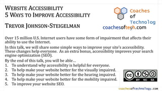
1. coachesoftechnology.com
WEBSITE ACCESSIBILITY
5 WAYS TO IMPROVE ACCESSIBILITY
TREVOR JOHNSON-STEIGELMAN
Over 15 million U.S. Internet users have some form of impairment that affects their
ability to use the Internet.
In this talk, we will share some simple ways to improve your site’s accessibility.
These changes help everyone. As an extra bonus, accessibility improves your search
engine optimization (SEO).
By the end of this talk, you will be able…
1. To understand why accessibility is helpful for everyone.
2. To help make your website better for the visually impaired.
3. To help make your website better for the hearing impaired.
4. To help make your website better for the mobility impaired.
5. To improve your website SEO.
Coaches
of
Technolog
ycoachesoftech.com
4. WHY WORRY ABOUT ACCESSIBILITY?
There are lots of us who have some
type of disability…
• 8.2% - hand mobility
• 3.3% - vision impairment
• 3.1% - hearing impairment
About 15.5 million users
This doesn’t count the temporarily
impaired.
Those who don’t have impairments
still use mobile devices.
5. WHY WORRY ABOUT ACCESSIBILITY?
Unselfish Reasons
Make things a bit easier
for everyone.
Be nice to people.
Selfish Reasons
Sell more Stuff
• More customers
Avoid Legal Issues (ADA)
Search Engine Optimization
8. TAG: YOU’RE IT.
• Heading Tags aren’t just for formatting.
• THESE GIVE STRUCTURE TO THE PAGE.
Context and priority Semantic MEANING
• Tagging is useful for…
COGNITIVELY IMPAIRED
• Visually impaired
• Screen Readers
• Keyboard movement
9. <H1>TAG: YOU’RE IT.</H1>
<h2> Heading Tags aren’t just for formatting. </h2>
<h2>These give structure to the page. </h2>
<h3>Context and priority </h3>
<h2>Tagging is useful for… </h3>
<h3>Cognitively impaired </h3>
<h3>Visually impaired </h3>
<h3>Screen Readers </h3>
<h3>Keyboard movement </h3>
10. <H1>TAG: YOU’RE IT.</H1>
<h2> Heading Tags aren’t just for formatting. </h2>
<h2>These give structure to the page. </h2>
• <h3>Context and priority </h3>
• <h3>Semantic Meaning </h3>
<h2>Tagging is useful for… </h3>
• <h3>Cognitively impaired </h3>
• <h3>Visually impaired </h3>
• <h3>Screen Readers </h3>
• <h3>Keyboard movement </h3>
11. TAG: YOU’RE IT.
Heading Tags aren’t just for formatting.
These give structure to the page.
• Context and priority
• Semantic Meaning
Tagging is useful for…
• Cognitively impaired
• Visually impaired
• Screen Readers
• Keyboard movement
12. <h1>Accessibility</h1>
SEMANTIC MEANING – THINK ABOUT AN OUTLINE
I. Accessibility
<h2>Tags </h2>
<h3>Heading Tags </h3>
<h3>Styles</h3>
<h4><em></h4>
<h4><strong></h4>
<h2>Colors </h2>
<h3>Color Impairment </h3>
<h3>Contrast </h3>
<h3>Color and Meaning</h3>
A. Tags
1. Heading Tags
2. Styles
a) <em>
b) <strong>
B. Colors
1. Color Impairment
2. Contrast
3. Color and Meaning
13. USING TAGS APPROPRIATELY
Use CSS in your child theme
• This gives consistency across the site.
Use header tags <h1>, <h2>, etc. for structure.
• Don’t skip tags.
Use phrase tags for semantic meaning.
• <em> - emphasized text
• <strong> - important text
• <code> - computer code
• <samp> - computer output
• <kbd> - keyboard input
• <var> - variable
19. Provide sufficient contrast.
Specify both foreground
and background.
Be careful of background
gradients and color
combinations.
Be careful of background
images.
Contrast
Contrast
Contrast
Contrast
22. TIPS:
• Make sure that color isn’t the only
way to give meaning.
• Errors, selections, etc.
-2.0
-1.0
0.0
1.0
2.0
0 1 2 3
Disp.(cm)
Time (s)
-2.0
-1.0
0.0
1.0
2.0
0 1 2 3
Disp.(cm)
Time (s)
https://www.webaccessibility.com/best_practices.php
Expressive Traffic Lights
by Pascal Terjan
23. LINKS
Avoid using Long URLS directly as links
• https://www.physicsthisweek.com/topic/magnitude-and-direction/
Use informative link structure in your pages.
Color and Underline
• Underline so that links are visible to all.
• Use blue for unfollowed links.
• Use purple for followed links.
Use Anchor Text.
<a href = “https://www.physicsthisweek.com/topic/magnitude”>Magnitude<a>
24. LINKS AND SCREEN READERS
Most browsers use Tab to move between links.
Screen readers say “Link” before each link.
Links out of context – use Anchor Text.
Here is an article about using links properly.
For more information about links, click here.
List Main point first, extra info later
• Products (opens in new window)
• Link opens in new window: Products
Be careful and concise in your wording
• “Contact Us” vs. “In order to Contact us”
• “About” vs. “To learn more about our company”
25. WHY USE ALTERNATIVE TEXT
Alternative Text is
• a description
• and/or context
http://www.wpbeginner.com/beginners-guide/image-alt-text-vs-image-title-in-wordpress-whats-the-difference/
<img
src=http://www.publicdomainpictures.net/pictures/230
000/velka/albert-einstein-oil-painting-
1505932842nN3.jpg
alt="Albert Einstein, Oil Painting" id="image"
itemprop="image">
Alternative text can be
• part of the alt= attribute
• or present elsewhere in the text.
Albert Einstein, Oil Painting
26.
27. ALT TEXT
Sometimes referred to as “alt tag”
alt attribute in <img> tag
Read by screen readers
Appears on mouse-over.
Replaces missing image.
CAPTIONS
Displayed for Everyone
DESCRIPTION
Shows up on attachment page
SEO related, not accessibility
28. ALT TAG TIPS
Avoid redundancy
Don’t re-copy text that is already there.
Don’t include “Image of…”
Sometimes alt =“” is okay.
• All info is there.
Links
Image-only links must have an alt attribute.
33. BENEFITS
Benefits for Everyone
• Confusing words are spelled out.
• Video can be watched while other noise is present.
• Video can be watched without bothering others.
Benefits for Your Website
• Posted transcript contains keywords for search.
• You can adapt transcript for blog posts.
34. PICKING GOOD FONTS: THE OLD SCHOOL METHOD
Screens
Sans Serif Fonts
Helvetica
Tahoma
Verdana
Print
Serif Fonts
Times New Roman
Georgia
Book Antiqua
35. THESE FONTS ARE ALL SIZED AT 36PT.
I will not use Curlz MT font on my webpages.
I will not use Forte font on my webpages.
I will not use Gigi font on my webpages.
I will not use Jokerman font on my webpages.
I will not use Niagara Engraved font on my webpages.
I will not use Palace Script font on my webpages.
I will not use Vivaldi font on my webpages. Blackboard Chalk
by raindart is licensed
under CC BY-SA
38. ARIA – ACCESSIBLE RICH INTERNET APPLICATIONS
Tags common parts of a web page.
https://www.w3.org/TR/wai-aria-practices/examples/landmarks/banner.html
41. POSSIBLE CITATIONS (NOT ALL CITATIONS USED IN EVERY LECTURE)
H. E. White and D. H. White, Physics and Music: The Science of Musical Sound
(Dover Publications, Mineola, NY, 2014) (Original work published 1980) pp. XXX
OpenStax, College Physics. OpenStax CNX. Sep 27, 2017
http://cnx.org/contents/031da8d3-b525-429c-80cf-6c8ed997733a@9.95
OpenStax University Physics, University Physics Volume 1. OpenStax CNX. Sep 29, 2017
http://cnx.org/contents/d50f6e32-0fda-46ef-a362-9bd36ca7c97d@6.1
OpenStax University Physics, University Physics Volume 2. OpenStax CNX. Sep 29, 2017
http://cnx.org/contents/7a0f9770-1c44-4acd-9920-1cd9a99f2a1e@4.1
OpenStax University Physics, University Physics Volume 3. OpenStax CNX. Sep 29, 2017
http://cnx.org/contents/af275420-6050-4707-995c-57b9cc13c358@5.1
Editor's Notes
The “old school” rule about using sans serif on screens and serif in print is not really needed these days.