Before we start
Please MUTE yourself – we can hear you snore..;-)
20mn presentation – 10mn Q&A
This webinar is recorded
Mobile Usage in a Nutshell:
Over 20% of Google searches are being performed on
a mobile device.
In 2012 more than half of the local searches were
performed on a mobile device.
In the United States, 25% of internet users only access
the internet on a mobile device
61% of people have a better opinion of brands when
they offer a good mobile experience
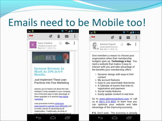
25.85% of all emails are opened on mobile phones,
and 10.16% are opened on tablets.
Source: Smart Insights
Your Website across the web
• Must look good across all devices:
• Mobile Phones, Tablets, Laptops & Large Screens
• 240px, 320px, 480px, 768px & 1024px
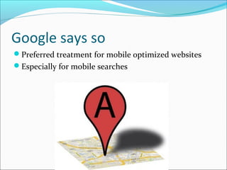
Google says so
Preferred treatment for mobile optimized websites
Especially for mobile searches
Speed with Mobile is key
• Your website needs to open fast
• Test your website speed with GT Metrix
By 2015 over 50% searches will
be done on a mobile device
May get to 30-40% this year
Readable on any device
• Test your website on your phone
• If you can’t read it, then nobody else can either
Less is more with Mobile
 You should have less on your mobile
 Larger fonts, less graphics
 Different experience, different needs
 Clickable Phone Number
 Address links to Google Maps
Emails need to be Mobile too!
Yes we can
Optimized your website for mobile
Call us today for a quote
561-272-8567
Thank you!
Watch Webinar Presentation at
Go to
www.adminesolutions.com/videos
www.adminesolutions.com

Why your website needs to be mobile responsive

  • 2.
    Before we start PleaseMUTE yourself – we can hear you snore..;-) 20mn presentation – 10mn Q&A This webinar is recorded
  • 3.
    Mobile Usage ina Nutshell: Over 20% of Google searches are being performed on a mobile device. In 2012 more than half of the local searches were performed on a mobile device. In the United States, 25% of internet users only access the internet on a mobile device 61% of people have a better opinion of brands when they offer a good mobile experience 25.85% of all emails are opened on mobile phones, and 10.16% are opened on tablets. Source: Smart Insights
  • 4.
    Your Website acrossthe web • Must look good across all devices: • Mobile Phones, Tablets, Laptops & Large Screens • 240px, 320px, 480px, 768px & 1024px
  • 5.
    Google says so Preferredtreatment for mobile optimized websites Especially for mobile searches
  • 6.
    Speed with Mobileis key • Your website needs to open fast • Test your website speed with GT Metrix
  • 7.
    By 2015 over50% searches will be done on a mobile device May get to 30-40% this year
  • 8.
    Readable on anydevice • Test your website on your phone • If you can’t read it, then nobody else can either
  • 9.
    Less is morewith Mobile  You should have less on your mobile  Larger fonts, less graphics  Different experience, different needs  Clickable Phone Number  Address links to Google Maps
  • 10.
    Emails need tobe Mobile too!
  • 11.
    Emails need tobe Mobile too!
  • 12.
    Yes we can Optimizedyour website for mobile Call us today for a quote 561-272-8567
  • 13.
    Thank you! Watch WebinarPresentation at Go to www.adminesolutions.com/videos www.adminesolutions.com