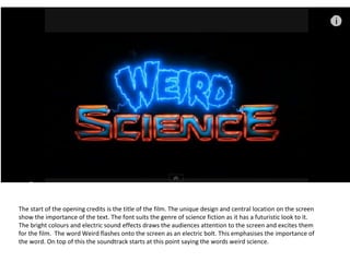
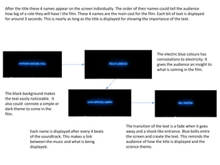
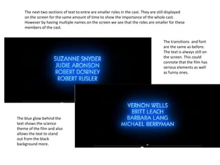
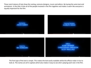
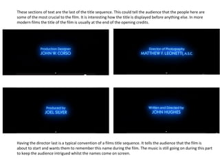
The start of the opening credits is the title of the film. The unique design and central location on the screen
show the importance of the text. The font suits the genre of science fiction as it has a futuristic look to it.
The bright colours and electric sound effects draws the audiences attention to the screen and excites them
for the film. The word Weird flashes onto the screen as an electric bolt. This emphasises the importance of
the word. On top of this the soundtrack starts at this point saying the words weird science.
After the title these 4 names appear on the screen individually. The order of their names could tell the audience
how big of a role they will have I the film. These 4 names are the main cast for the film. Each bit of text is displayed
for around 3 seconds. This is nearly as long as the title is displayed for showing the importance of the text.
The black background makes
the text easily noticeable. It
also could connote a simple or
dark theme to come in the
film.
The electric blue colours has
connotations to electricity. It
gives the audience an insight to
what is coming in the film.
Each name is displayed after every 4 beats
of the soundtrack. This makes a link
between the music and what is being
displayed.
The transition of the text is a fade when it goes
away and a shock like entrance. Blue bolts entre
the screen and create the text. This reminds the
audience of how the title is displayed and the
science theme.
The next two sections of text to entre are smaller roles in the cast. They are still displayed
on the screen for the same amount of time to show the importance of the whole cast.
However by having multiple names on the screen we see that the roles are smaller for these
members of the cast.
The transitions and font
are the same as before.
The text is always still on
the screen. This could
connote that the film has
serious elements as well
as funny ones.
The blue glow behind the
text shows the science
theme of the film and also
allows the text to stand
out from the black
background more.
These next 4 pieces of text show the casting, costume designer, music and editors. By having the same text and
animations in the title it links all of the people involved in the film together and makes it seem like everyone is
equally important for the film.
The font type of the text is simple. This makes the text easily readable whilst the effects make it nice to
look at. The names are all in capitals which also makes it easy to see who’s playing each role in the film.
These sections of text are the last of the title sequence. This could tell the audience that the people here are
some of the most crucial to the film. It is interesting how the title is displayed before anything else. In more
modern films the title of the film is usually at the end of the opening credits.
Having the director last is a typical convention of a films title sequence. It tells the audience that the film is
about to start and wants them to remember this name during the film. The music is still going on during this part
to keep the audience intrigued whilst the names come on screen.

Weird science text analyisis

  • 1.
    The start ofthe opening credits is the title of the film. The unique design and central location on the screen show the importance of the text. The font suits the genre of science fiction as it has a futuristic look to it. The bright colours and electric sound effects draws the audiences attention to the screen and excites them for the film. The word Weird flashes onto the screen as an electric bolt. This emphasises the importance of the word. On top of this the soundtrack starts at this point saying the words weird science.
  • 2.
    After the titlethese 4 names appear on the screen individually. The order of their names could tell the audience how big of a role they will have I the film. These 4 names are the main cast for the film. Each bit of text is displayed for around 3 seconds. This is nearly as long as the title is displayed for showing the importance of the text. The black background makes the text easily noticeable. It also could connote a simple or dark theme to come in the film. The electric blue colours has connotations to electricity. It gives the audience an insight to what is coming in the film. Each name is displayed after every 4 beats of the soundtrack. This makes a link between the music and what is being displayed. The transition of the text is a fade when it goes away and a shock like entrance. Blue bolts entre the screen and create the text. This reminds the audience of how the title is displayed and the science theme.
  • 3.
    The next twosections of text to entre are smaller roles in the cast. They are still displayed on the screen for the same amount of time to show the importance of the whole cast. However by having multiple names on the screen we see that the roles are smaller for these members of the cast. The transitions and font are the same as before. The text is always still on the screen. This could connote that the film has serious elements as well as funny ones. The blue glow behind the text shows the science theme of the film and also allows the text to stand out from the black background more.
  • 4.
    These next 4pieces of text show the casting, costume designer, music and editors. By having the same text and animations in the title it links all of the people involved in the film together and makes it seem like everyone is equally important for the film. The font type of the text is simple. This makes the text easily readable whilst the effects make it nice to look at. The names are all in capitals which also makes it easy to see who’s playing each role in the film.
  • 5.
    These sections oftext are the last of the title sequence. This could tell the audience that the people here are some of the most crucial to the film. It is interesting how the title is displayed before anything else. In more modern films the title of the film is usually at the end of the opening credits. Having the director last is a typical convention of a films title sequence. It tells the audience that the film is about to start and wants them to remember this name during the film. The music is still going on during this part to keep the audience intrigued whilst the names come on screen.
  • 6.
    These sections oftext are the last of the title sequence. This could tell the audience that the people here are some of the most crucial to the film. It is interesting how the title is displayed before anything else. In more modern films the title of the film is usually at the end of the opening credits. Having the director last is a typical convention of a films title sequence. It tells the audience that the film is about to start and wants them to remember this name during the film. The music is still going on during this part to keep the audience intrigued whilst the names come on screen.