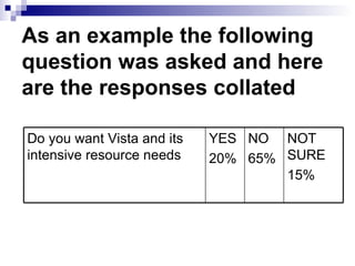
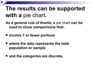
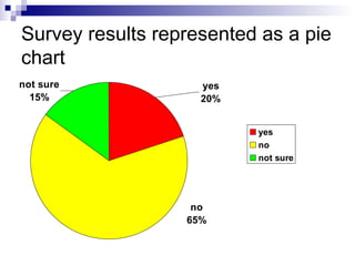
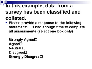
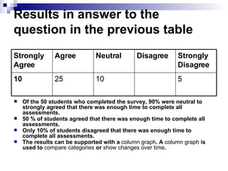
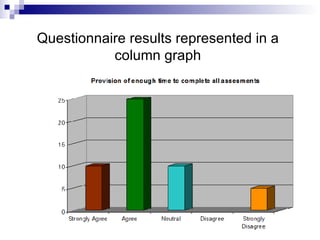
Ensure analysis is accurate and complete Part 1
Overview You should already know about identifying key information sources and gathering data through formal processes. This PowerPoint will help you to ensure analysis is accurate and complete within an information technology environment.
In this topic you will learn how to: analyse and evaluate information gathered for accuracy and consistency document conflicts in information gathered resolve conflicts in information or points of view with stakeholders.
When to Analyse Broadly speaking, you will analyse data as you collect it and/or once it has been collected.
Analysing when collecting data During an interview or workshop you may be collecting and analysing data at the same time. Often you ask a question that prompts a second or third question. In this situation, you are attempting to clarify or classify the initial response received. The follow-up questions are usually either probing questions or classification questions. Workshops typically involve data collection and analysis in real time.
Analysing data already collected  Data collected from several interviews and/or data collected from questionnaires need to be aggregated and collated into meaningful information.  The analysis involves identifying similarities and disparities between data.
Organising and Summarising  Once you have classified data into meaningful categories, it should be documented in tables and summarised in a paragraph. Often data in tables can be visually represented through the use of charts. You need to carefully select the type of chart to match your data.
As an example the following question was asked and here are the responses collated NOT SURE 15% NO  65% YES 20% Do you want Vista and its intensive resource needs
The results can be supported with a  pie   chart .  As a general rule of thumb, a  pie   chart  can be used to show comparisons that: involve 7 or fewer portions where the data represents the total population or sample and the categories are discrete.
Survey results represented as a pie chart
In this example, data from a survey has been classified and collated. Please provide a response to the following statement: I had enough time to complete all assessments (select one box only) Strongly Agree  Agree  Neutral   Disagree    Strongly Disagree 
Results in answer to the question in the previous table Of the 50 students who completed the survey, 90% were neutral to strongly agreed that there was enough time to complete all assessments.  50 % of students agreed that there was enough time to complete all assessments. Only 10% of students disagreed that there was enough time to complete all assessments.  The results can be supported with a  column   graph . A  column   graph  is used to  compare   categories  or  show   changes   over   time .  5 10 25 10 Strongly Disagree Disagree Neutral Agree Strongly Agree
Questionnaire results represented in a column graph
To practise analysing data, complete  Activity 1 – Analyse data .

Week4 Ensure Analysis Is Accurate And Complete

  • 1.
    Ensure analysis isaccurate and complete Part 1
  • 2.
    Overview You shouldalready know about identifying key information sources and gathering data through formal processes. This PowerPoint will help you to ensure analysis is accurate and complete within an information technology environment.
  • 3.
    In this topicyou will learn how to: analyse and evaluate information gathered for accuracy and consistency document conflicts in information gathered resolve conflicts in information or points of view with stakeholders.
  • 4.
    When to AnalyseBroadly speaking, you will analyse data as you collect it and/or once it has been collected.
  • 5.
    Analysing when collectingdata During an interview or workshop you may be collecting and analysing data at the same time. Often you ask a question that prompts a second or third question. In this situation, you are attempting to clarify or classify the initial response received. The follow-up questions are usually either probing questions or classification questions. Workshops typically involve data collection and analysis in real time.
  • 6.
    Analysing data alreadycollected Data collected from several interviews and/or data collected from questionnaires need to be aggregated and collated into meaningful information. The analysis involves identifying similarities and disparities between data.
  • 7.
    Organising and Summarising Once you have classified data into meaningful categories, it should be documented in tables and summarised in a paragraph. Often data in tables can be visually represented through the use of charts. You need to carefully select the type of chart to match your data.
  • 8.
    As an examplethe following question was asked and here are the responses collated NOT SURE 15% NO 65% YES 20% Do you want Vista and its intensive resource needs
  • 9.
    The results canbe supported with a pie chart . As a general rule of thumb, a pie chart can be used to show comparisons that: involve 7 or fewer portions where the data represents the total population or sample and the categories are discrete.
  • 10.
  • 11.
    In this example,data from a survey has been classified and collated. Please provide a response to the following statement: I had enough time to complete all assessments (select one box only) Strongly Agree  Agree  Neutral  Disagree  Strongly Disagree 
  • 12.
    Results in answerto the question in the previous table Of the 50 students who completed the survey, 90% were neutral to strongly agreed that there was enough time to complete all assessments. 50 % of students agreed that there was enough time to complete all assessments. Only 10% of students disagreed that there was enough time to complete all assessments. The results can be supported with a column graph . A column graph is used to compare categories or show changes over time . 5 10 25 10 Strongly Disagree Disagree Neutral Agree Strongly Agree
  • 13.
  • 14.
    To practise analysingdata, complete Activity 1 – Analyse data .