Download to read offline
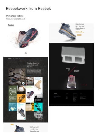
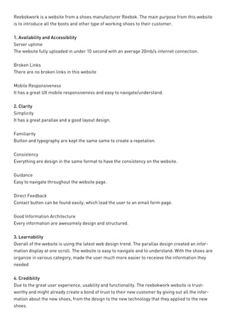
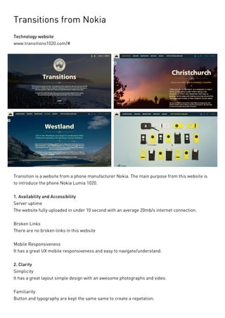

This document contains summaries of several promotional microsites for various companies. Some of the microsites discussed include: - Runbetter, a microsite by Newton Running introducing a new line of running shoes. It focuses on the shoe technology and user testimonials. - Reebokwork, Reebok's microsite for work shoes that organizes products into categories for easy navigation. - Transitions, Nokia's microsite promoting the Lumia 1020 smartphone using high-quality photos and video. - Food Porn Index, a microsite by Bolthouse Farms tracking healthy food hashtags on social media. - Ben The Bodyguard, a microsite by Nerd Communications explaining their phone security services


