Wd131 unit 4 module 3 fundamentals of color interaction
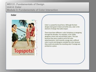
1. Color is a powerful visual force. Although the best
designs look good in black and white also, color is the
element of design that adds impact.
There have been different s color limitations in designing
through the decades. For example, in the 1920s,
designers chose only red and black colors. This was
because they were unable to print full-color
advertisements. Until recently, orange was a difficult
color to print and designers avoided the color because
they could not predict the resulting color if orange was
printed on a piece.
Color
WD131: Fundamentals of Design
Unit 4: Color
Module 3: Fundamentals of Color Interaction
2. The quantity of color used is as important as the mix of colors. In a
previous unit we discussed how different colors convey different
messages.
Consider how that might vary across cultures. Can you think of
examples of color in action for conveying:
•Hot
•Cool,
•New
•Old
•Safe
•Dangerous
•Exciting
•Futuristic,
•Healthy
Used in the creation of the Parthenon in Greece, the Golden Ratio is
considered to contain proportional harmony in both aesthetic beauty
& structural integrity. To determine the Golden Ratio: divide a
rectangle into two parts so that the length of the longer section
divided by the length of the smaller section is also equal to the whole
length divided by the longer section.
Color
WD131: Fundamentals of Design
Unit 4: Color
Module 3: Fundamentals of Color Interaction
4. The Color Wheel:
• Shows the relationship of primary, secondary,
and tertiary colors.
• Complementary colors are separated by another
color on the color wheel.
• Analogous colors lie next to each other.
WD131: Fundamentals of Design
Unit 4: Color
Module 3: Fundamentals of Color Interaction
5. Uses of color wheels:
• Create harmony
• Add contrast
• Avoid color ruts
• Help clients discover the colors they want and need
• Make good designs into great ones
WD131: Fundamentals of Design
Unit 4: Color
Module 3: Fundamentals of Color Interaction